


Tank design
September 09, 2017
Mindsparkle Mag


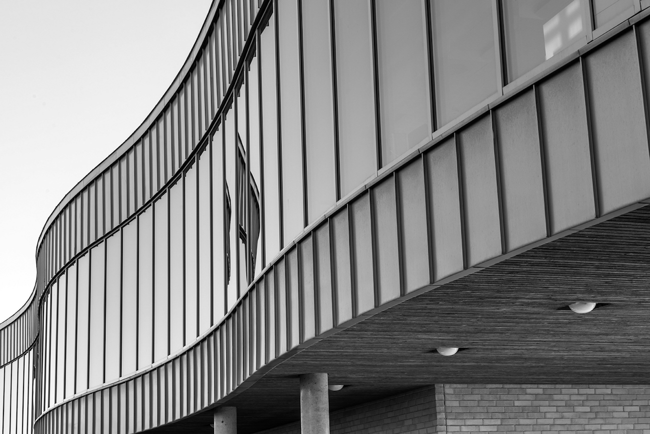
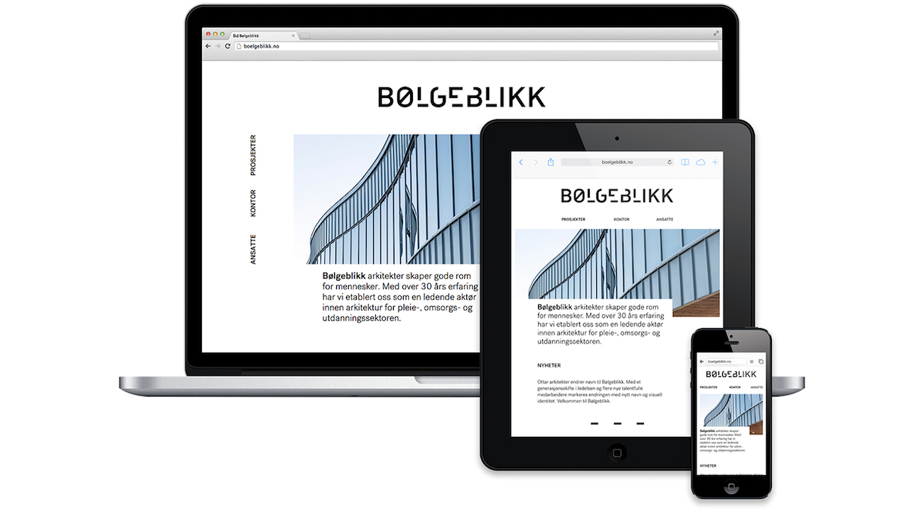
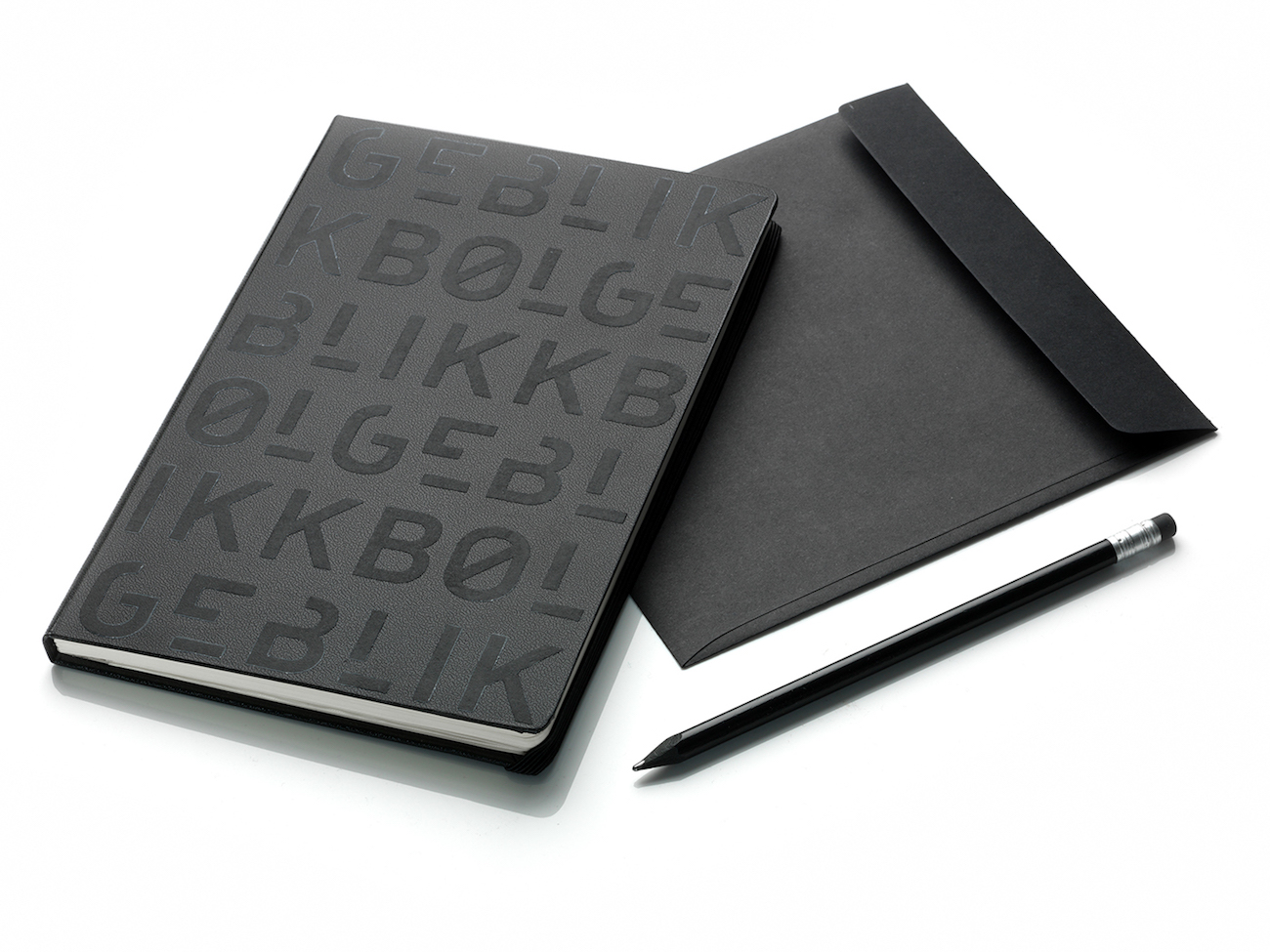
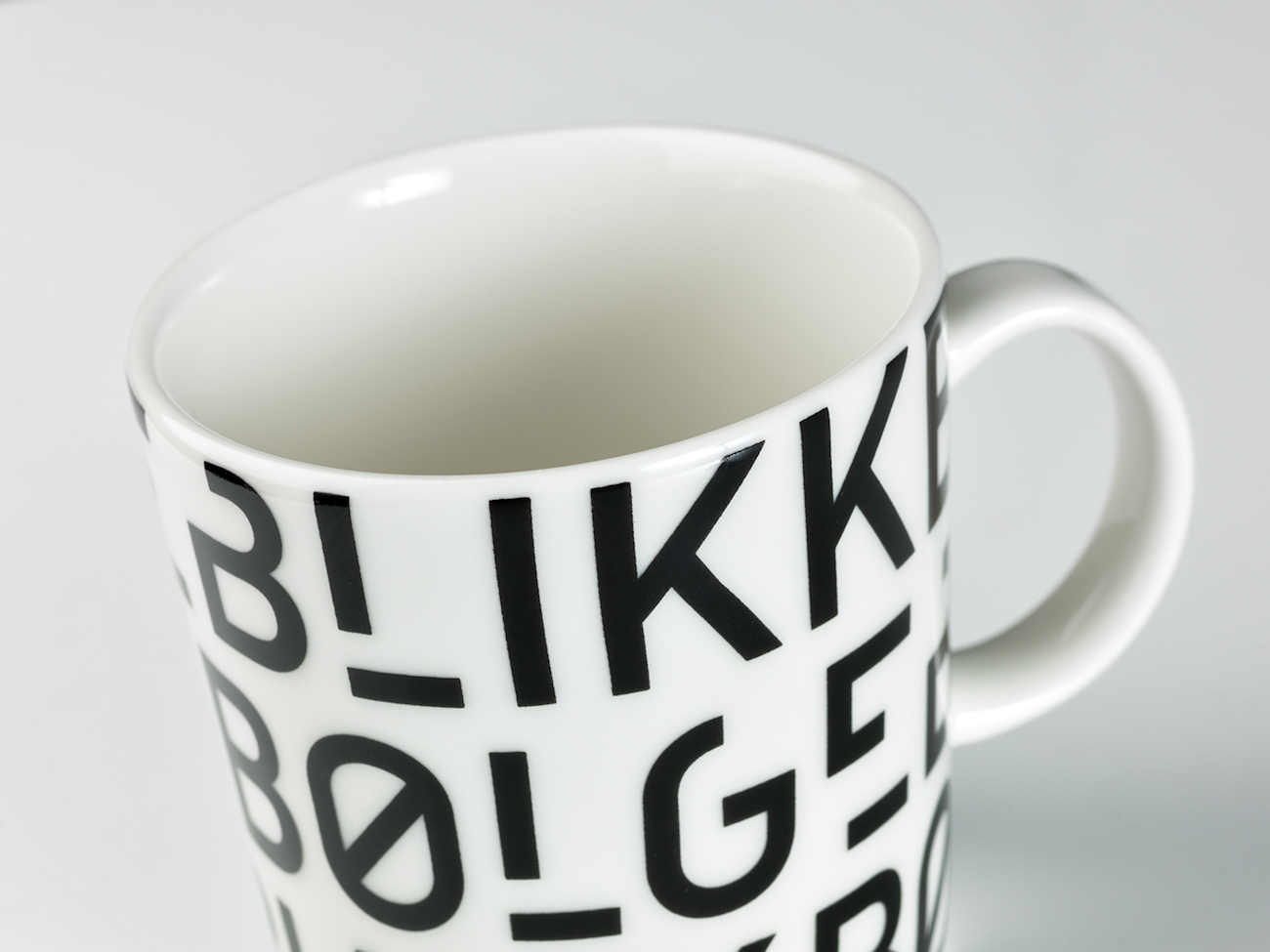
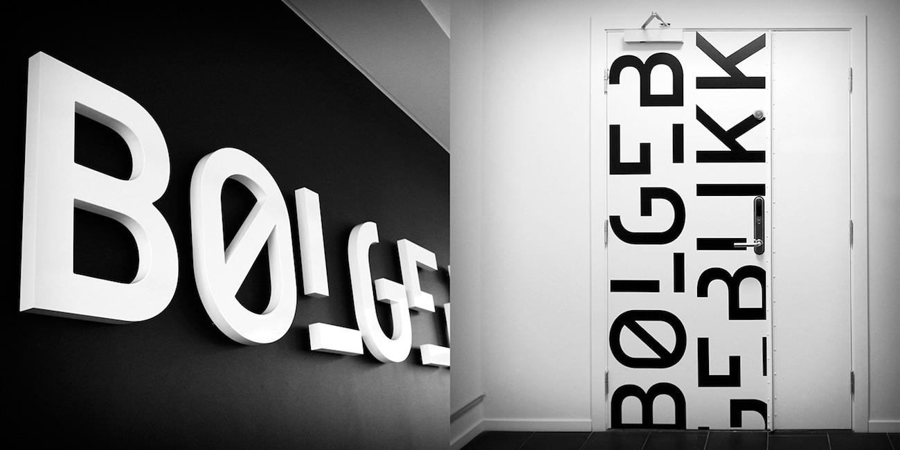
Design agency, Tank, developed a new name, visual identity and website for B/u00f8lgeblikk, a Norwegian architecture agency. Tank was inspired to develop an identity that expressed quality and professionalism while also making reference to the monumental buildings the agency works with.
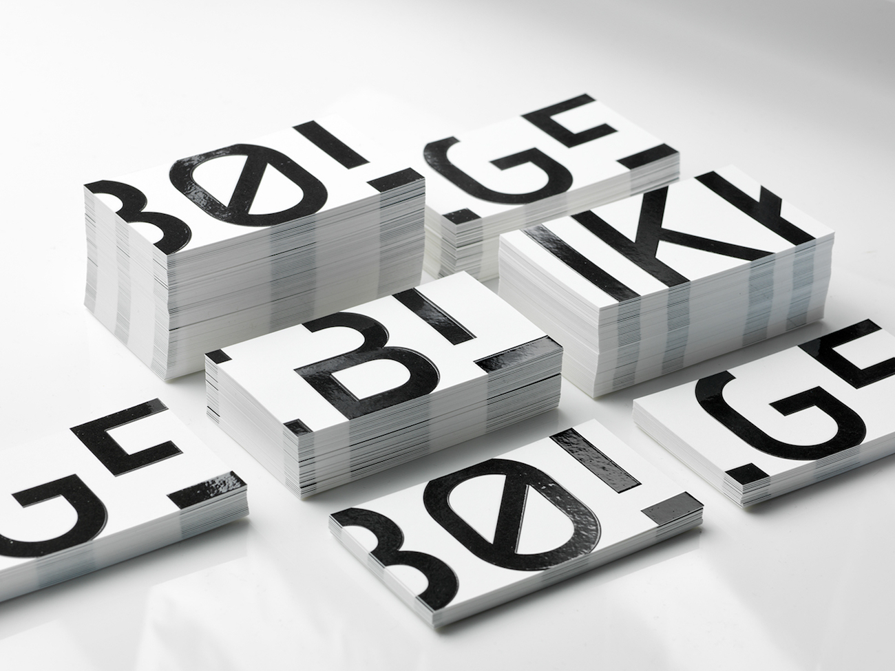
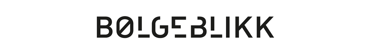
The name B/u00f8lgeblikk, meaning /u2018corrugated iron/u2019, was chosen for its strong connotations to inexpensive, rugged and rough use of materials. The material b/u00f8lgeblikk has also recently experienced a revival among architects because of its unparalleled quality and flexibility.
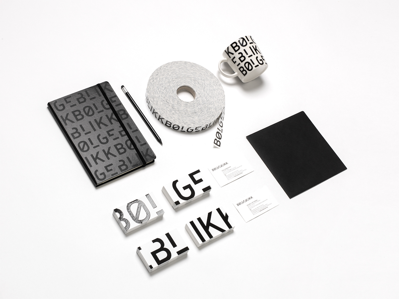
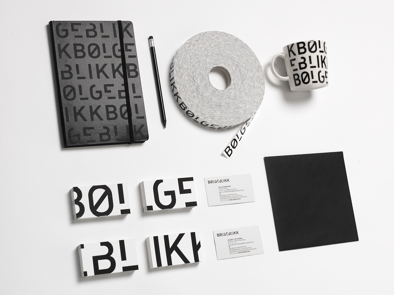
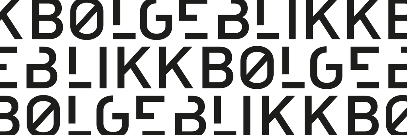
For a complex name, a simple and legible logotype was chosen. Tank say, /u2018By slightly deconstructing the letters, interesting spaces and contrasts appear amongst the letters. When the logo is assembled in patterns, it creates dynamic sections where the legibility of the letters disappears and the importance of the shapes increases./u2019
Creator: Tank design


.webp)


