


DIA Studio
February 10, 2017
Mindsparkle Mag


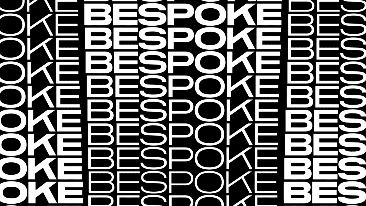
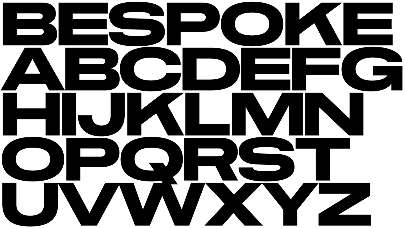
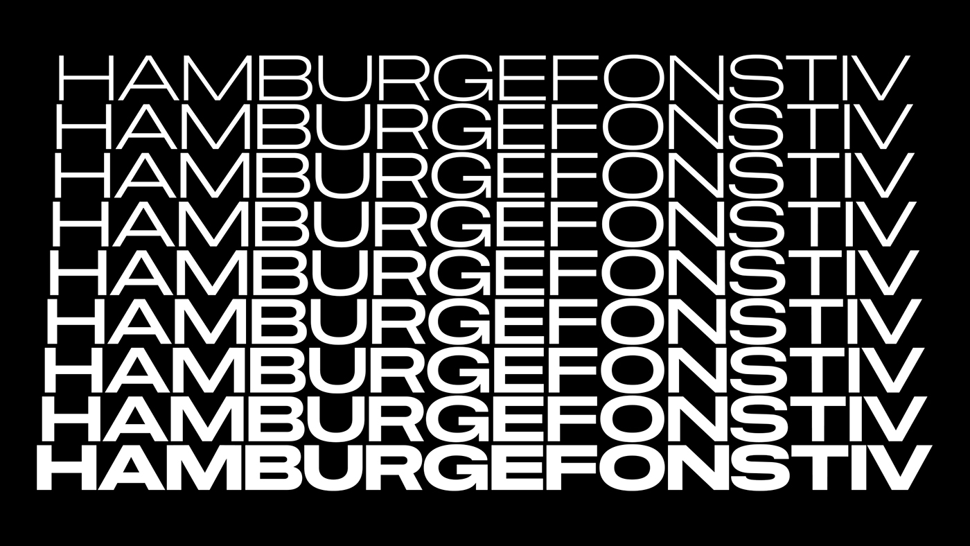
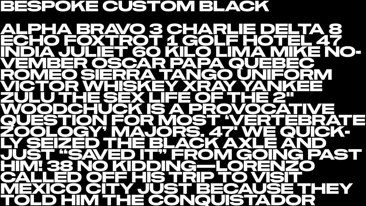
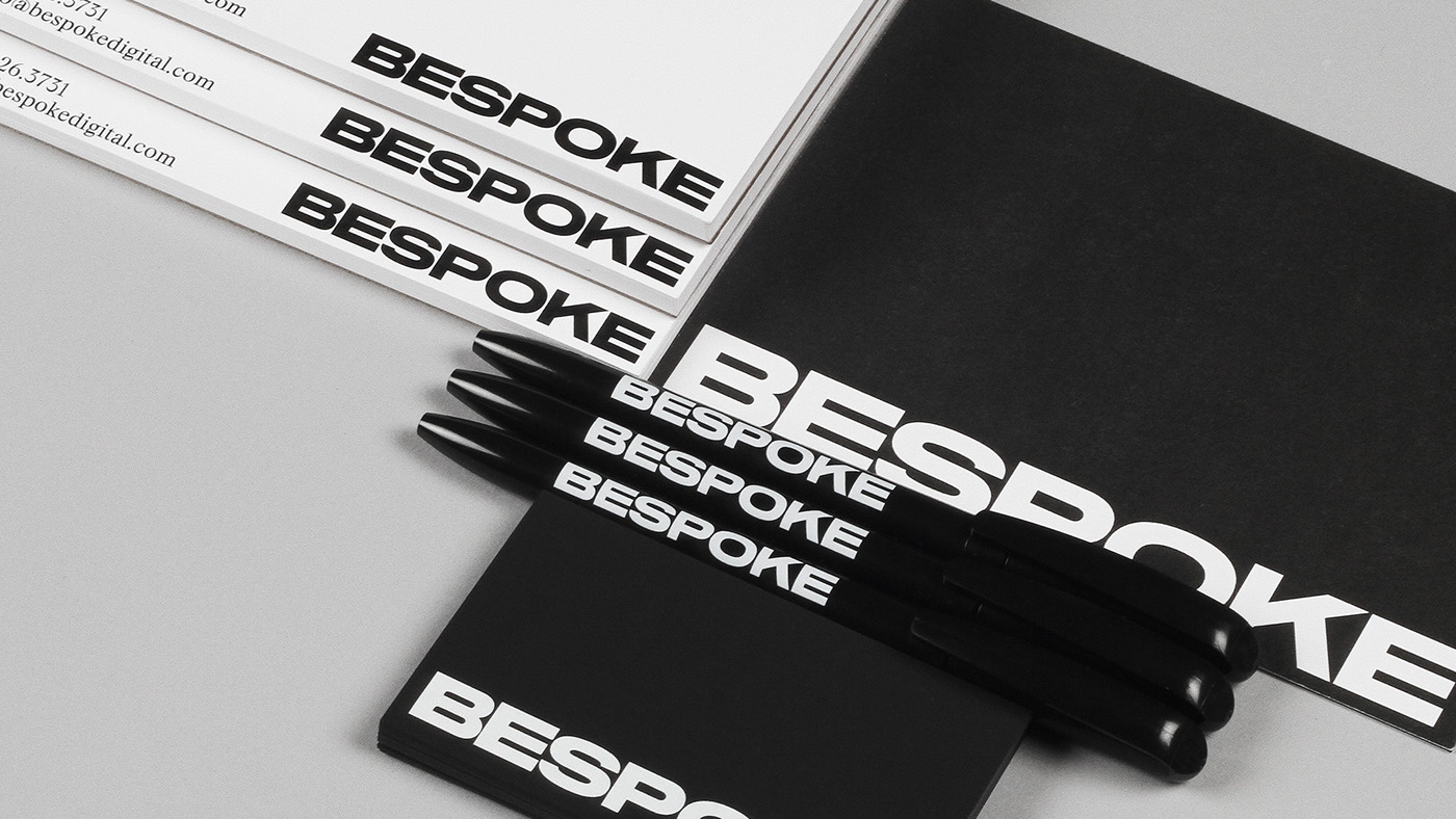
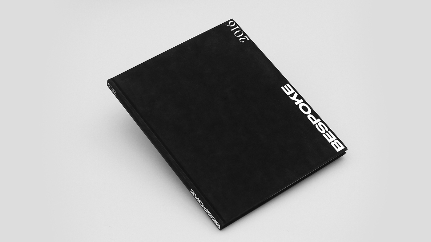
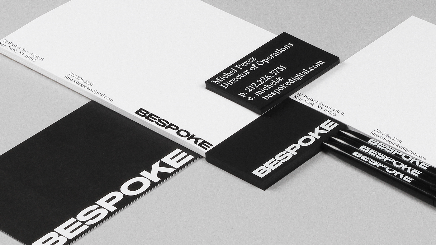
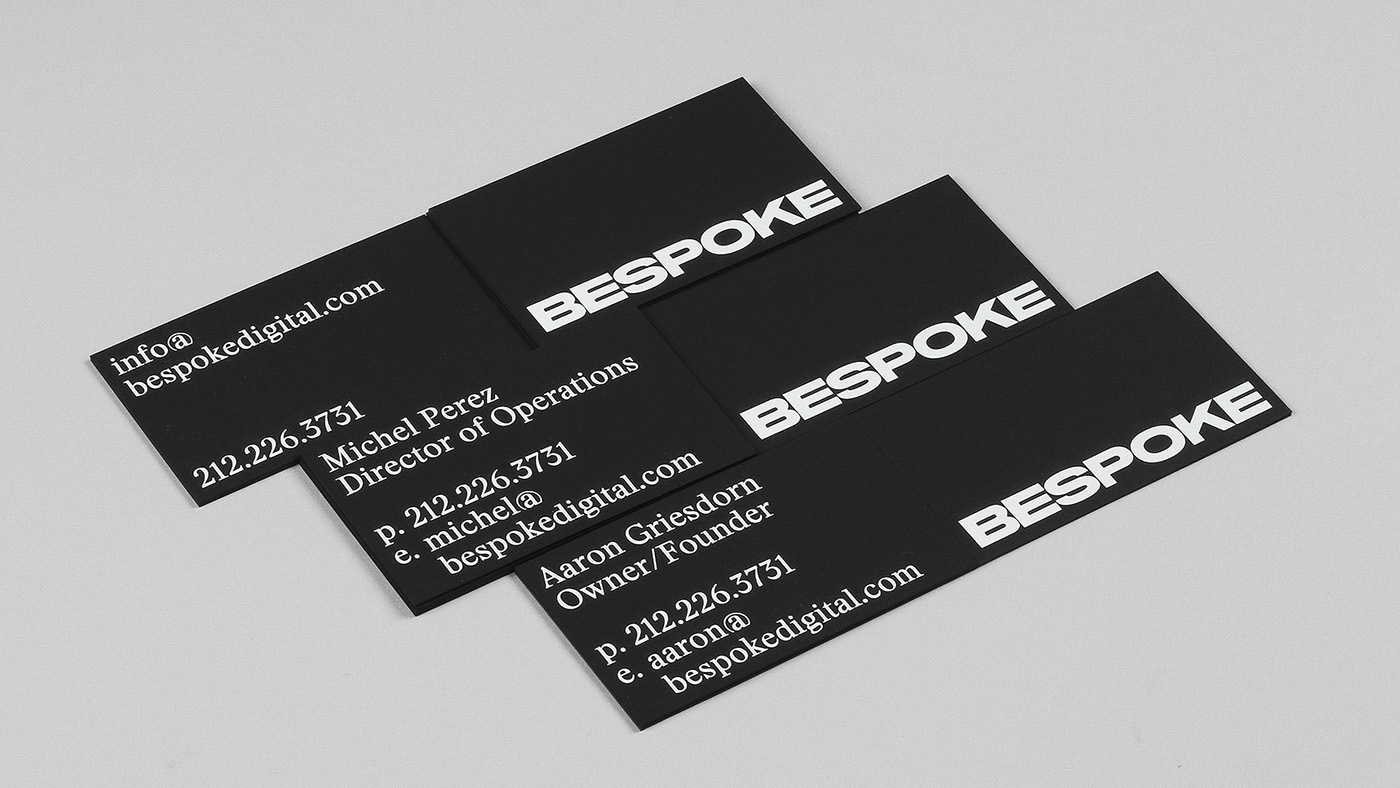
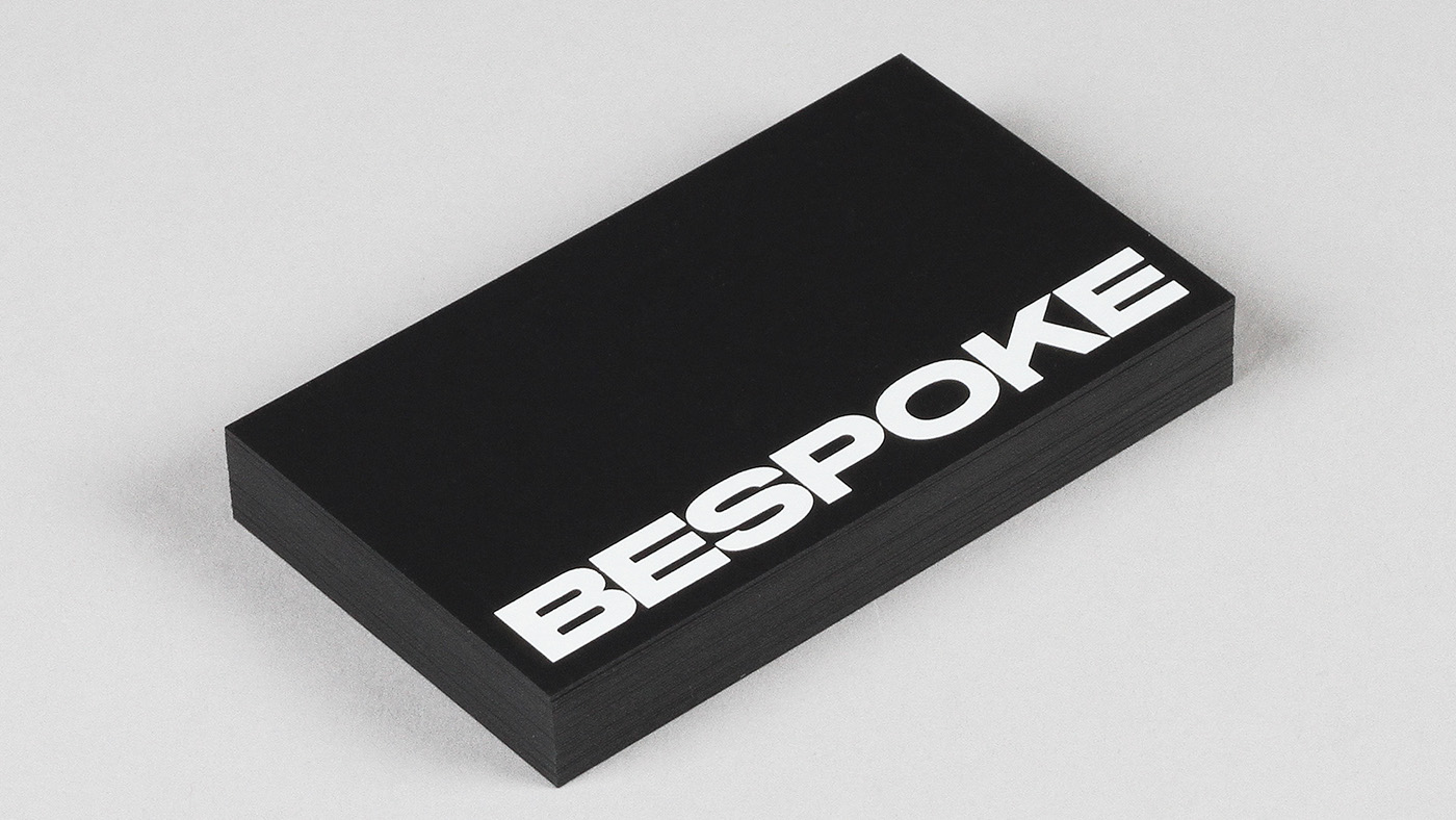
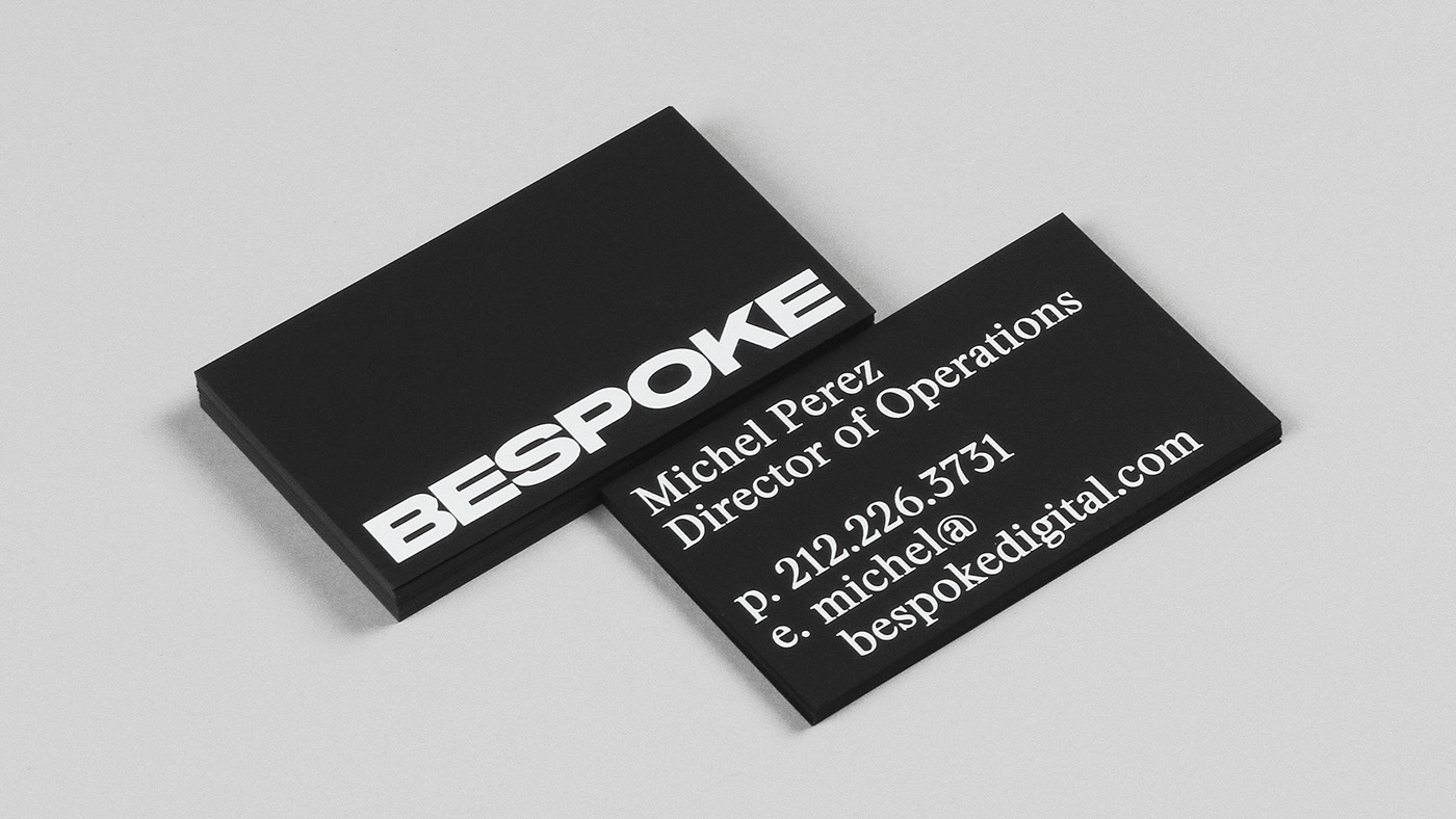
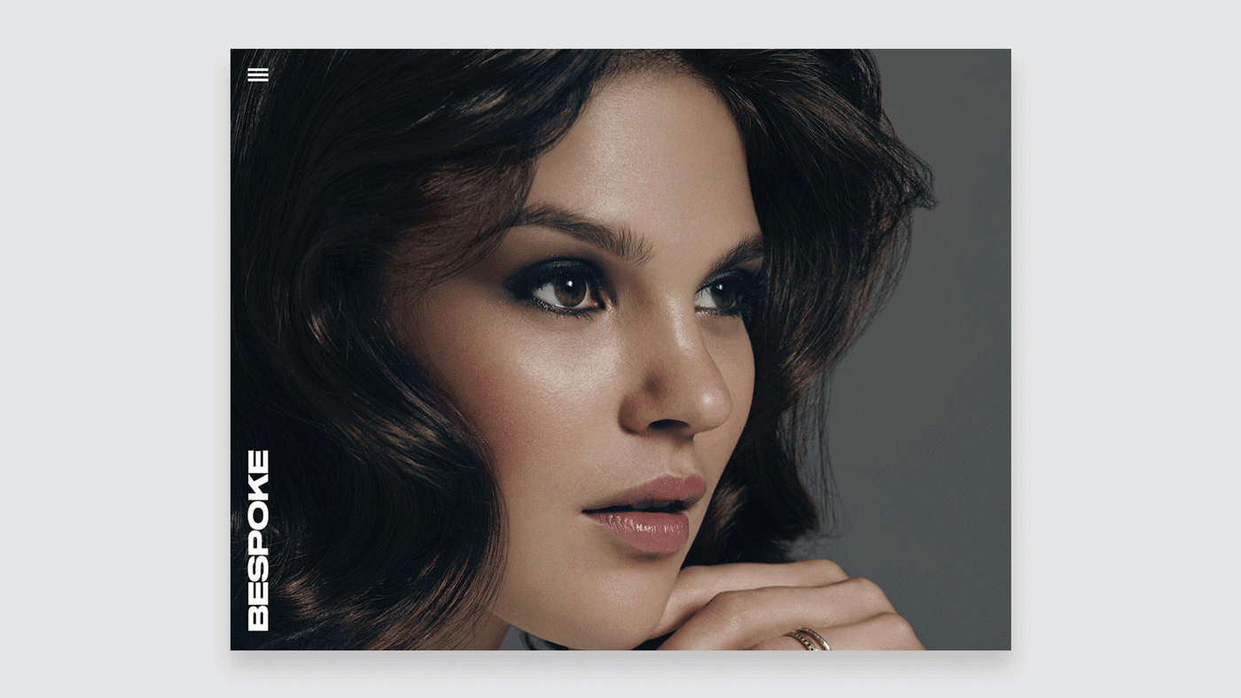
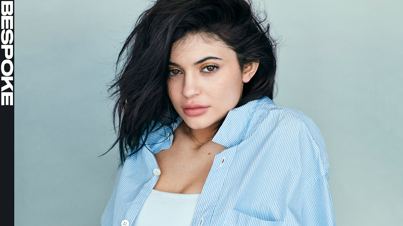
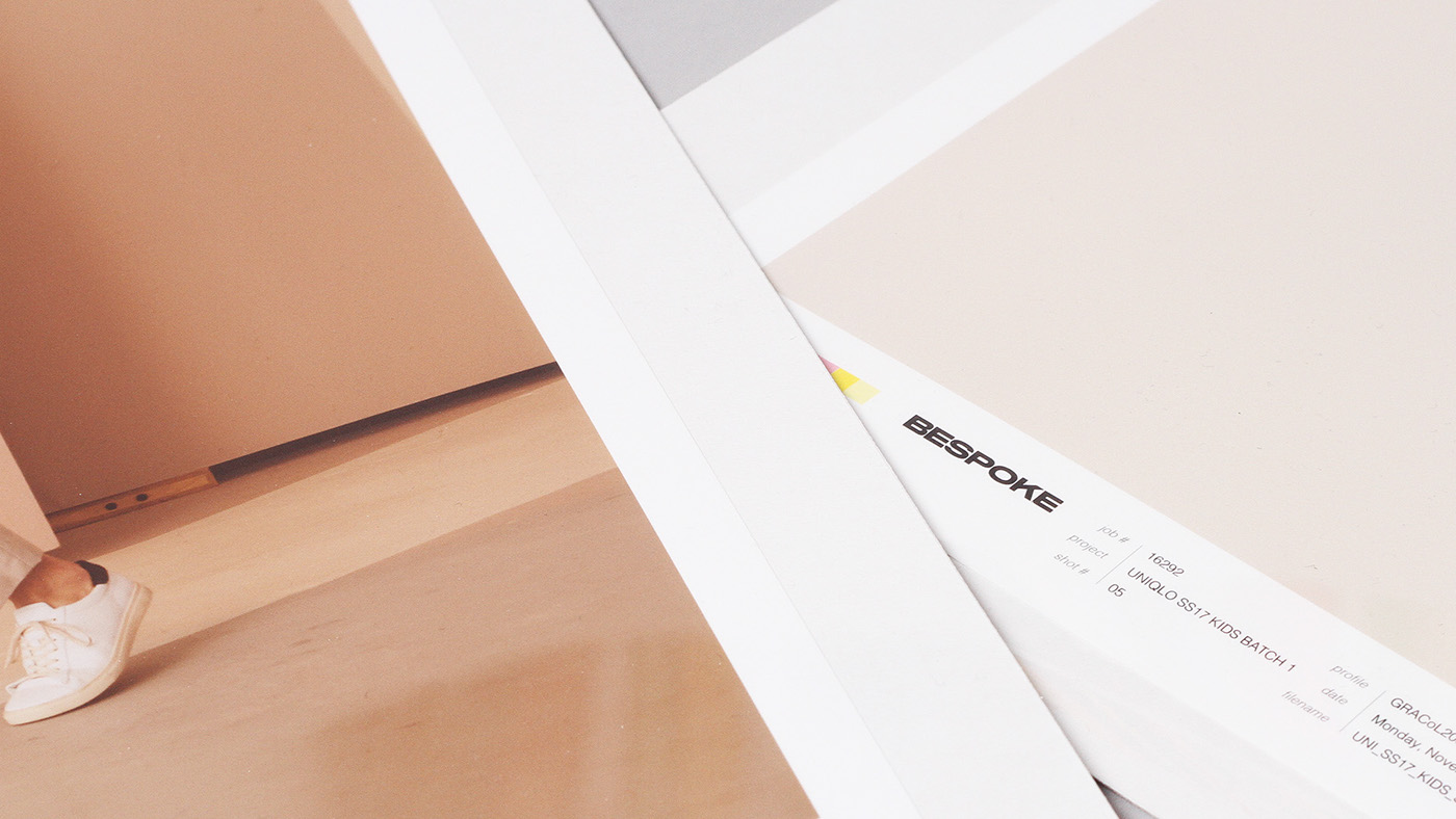
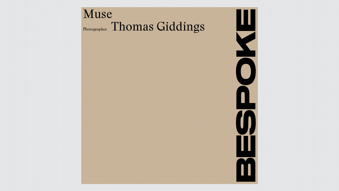
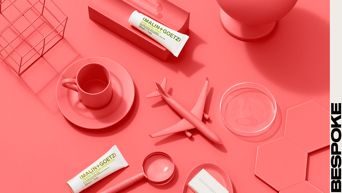
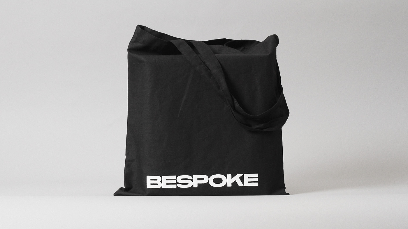
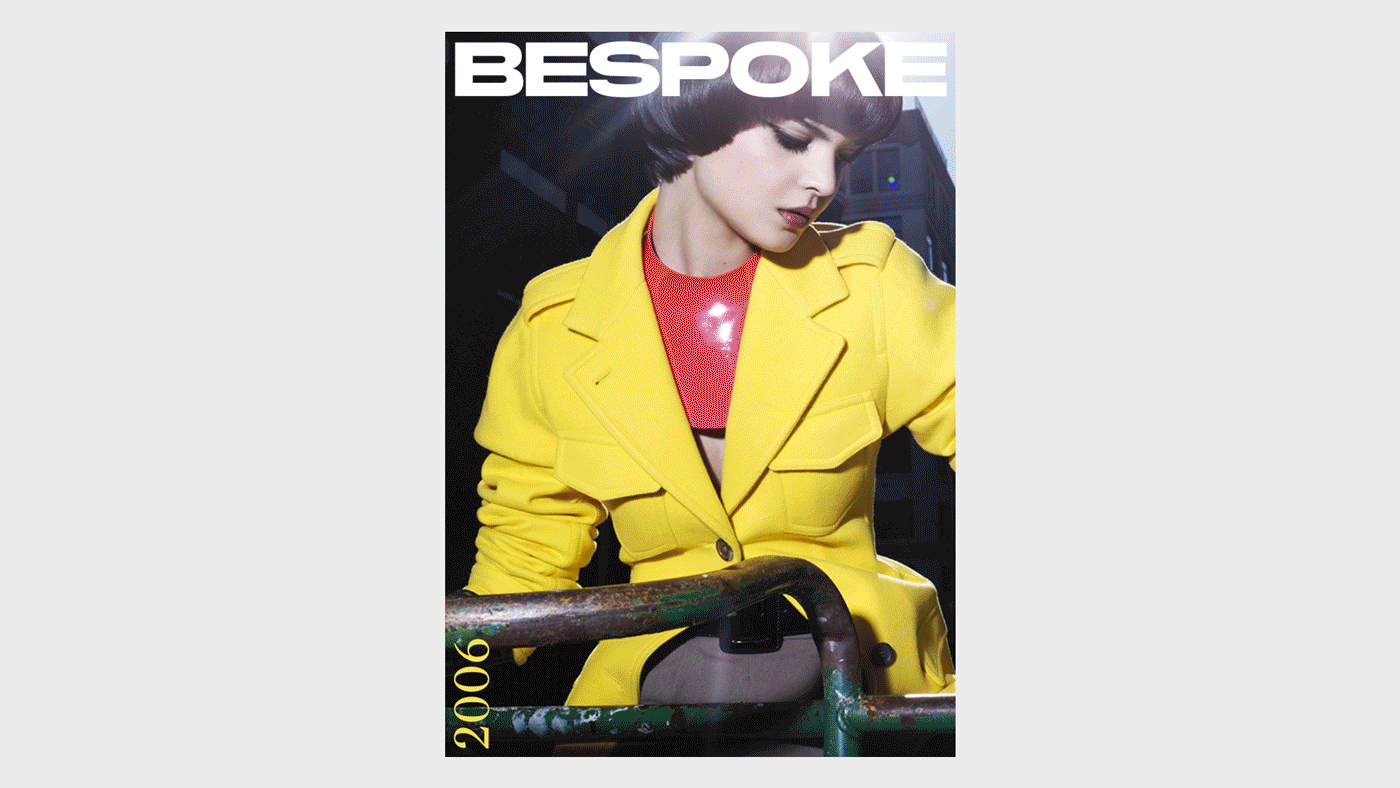
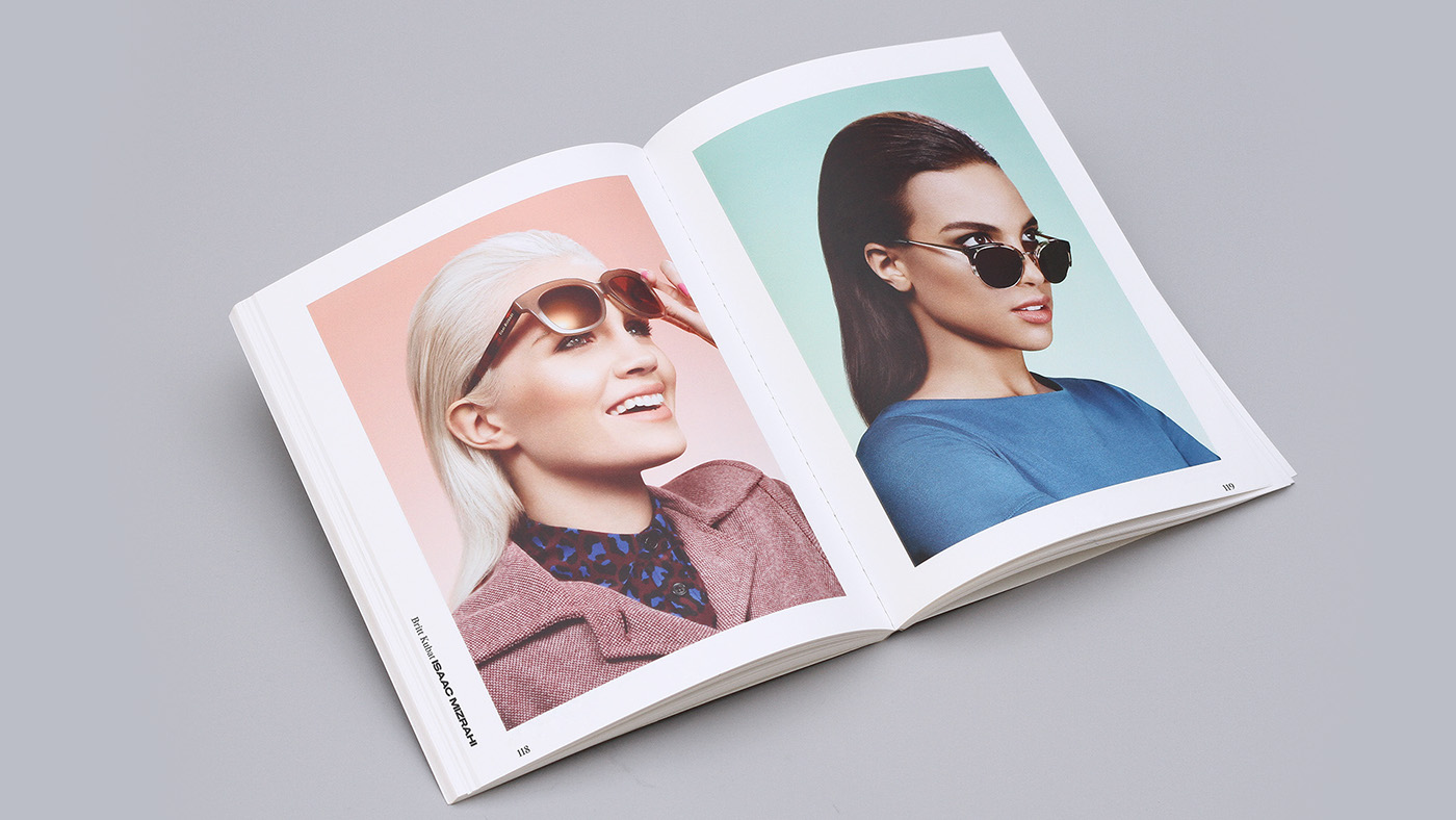
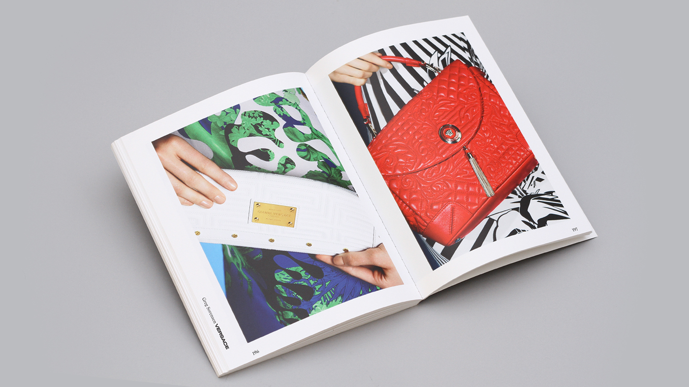
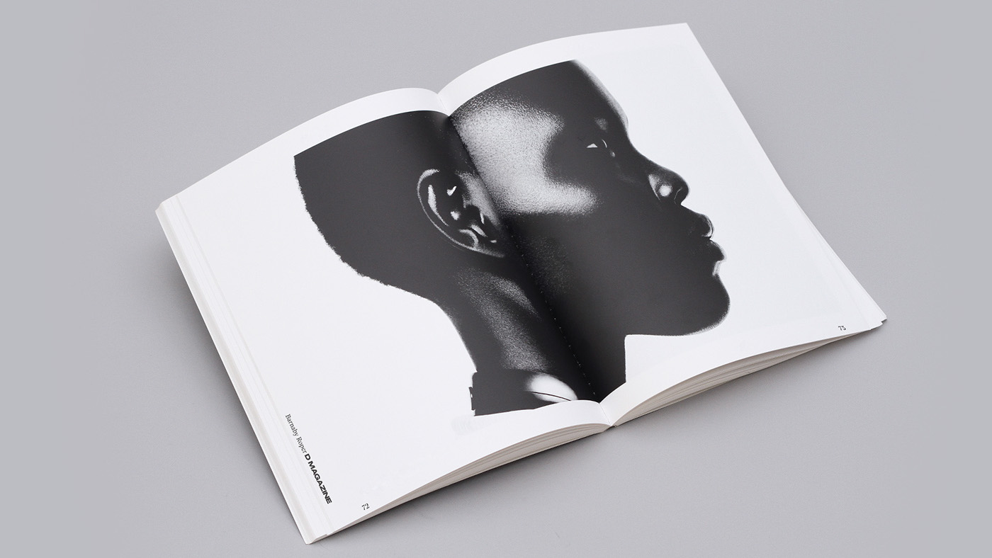
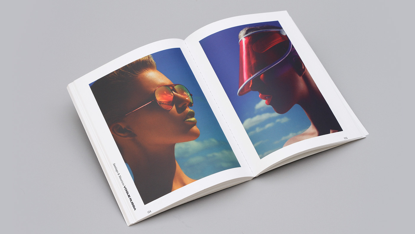
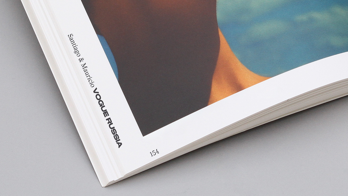
Challenge/u00a0moving into their 10th year of business as the fashion industry/u2019s go to boutique retouching company, Bespoke came to the designers/u00a0looking for a fresh identity to appeal to their growing commercial clientele while not alienating their roots. It was also important to create a bold visual statement that stood out against their competitors and supported their work. Approach to address all of the strategic challenges the designers/u00a0chose to create a minimal typographic language for the Bespoke identity. The designers of DIA drew a custom display typeface family and logotype that serves as the commanding feature of the identity. It/u2019s design references the mechanical nature of Eurostile extended combined with rounded letterforms found in antique grotesk type styles. The custom typeface behaves best with extremely tight margins which informed a architectural approach to the identity/u2019s typography. As a throwback to the original Bespoke identity we kept the colors black and white, or color selected to pair with photography, and used a serif typeface as the workhorse for all text. Outcome Bespoke has an ownable typeface and typographic system with a confident, fashion forward personality and commercial appeal. The identity now stands out among their competitors which has helped into converting more new business interest.
Creator: DIA Studio


.webp)


