


Ragged Edge
August 22, 2018
Mindsparkle Mag


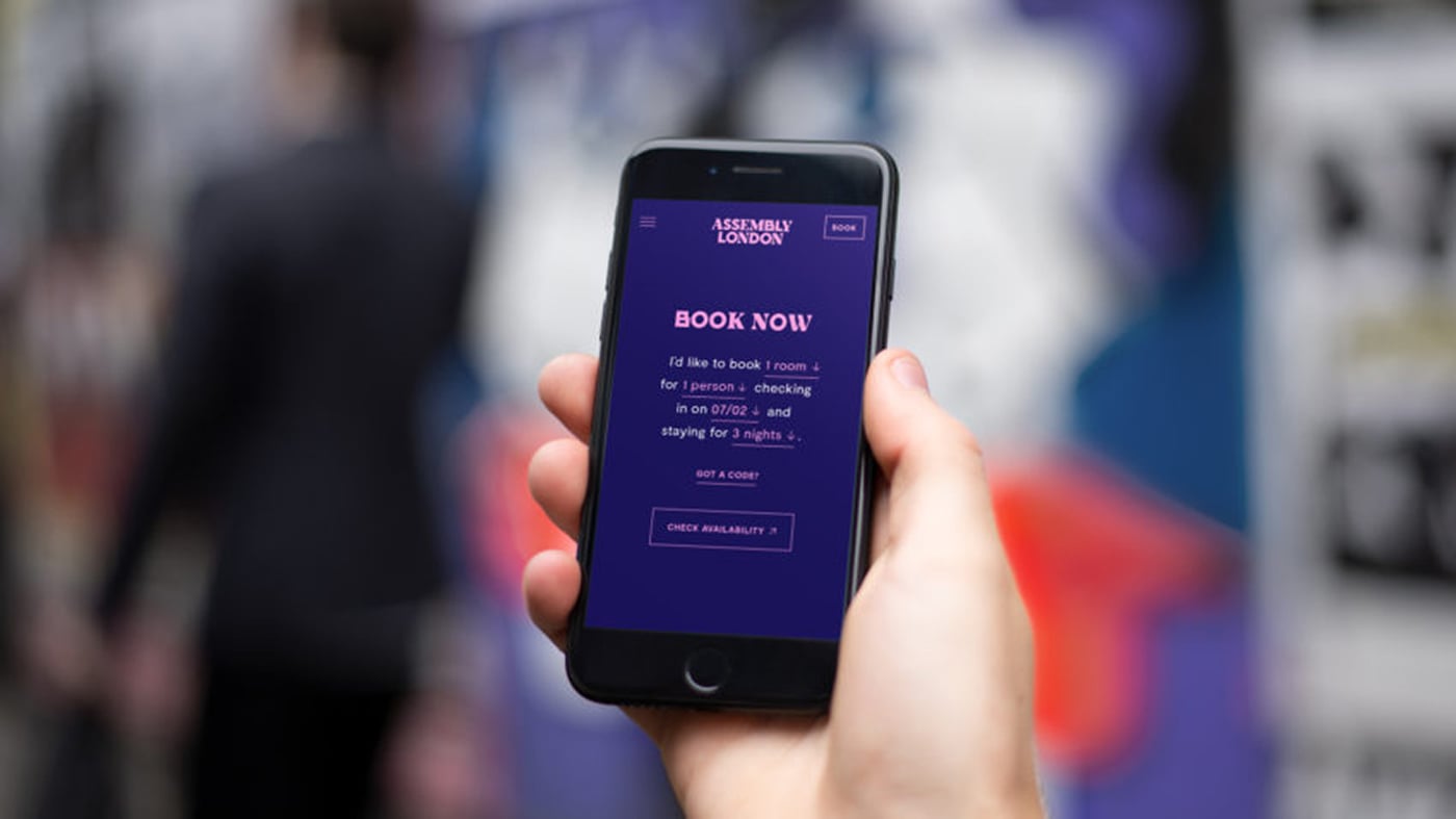
Beautiful branding by Ragged Edge in London for Assembly Hotel also in London.
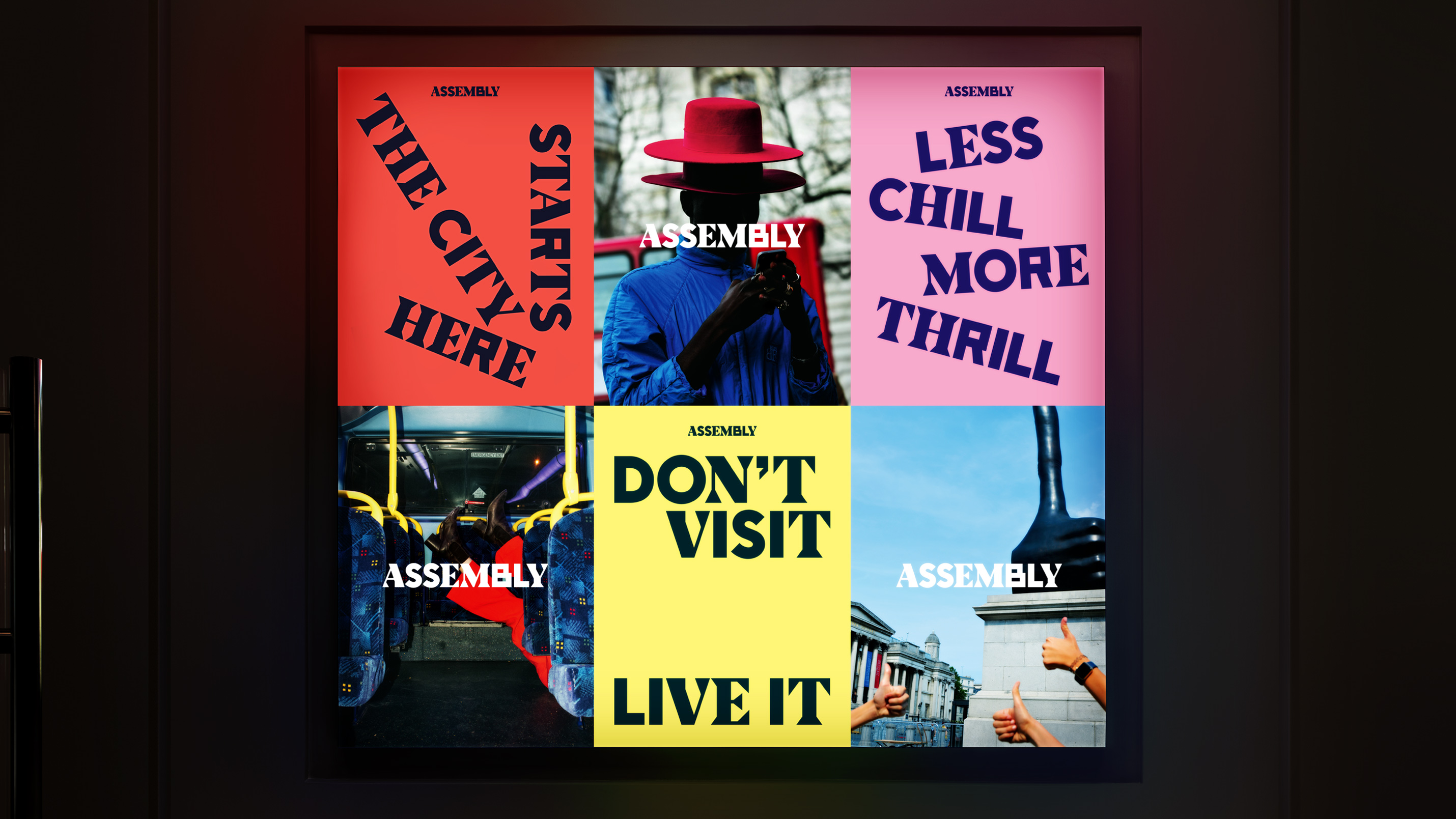
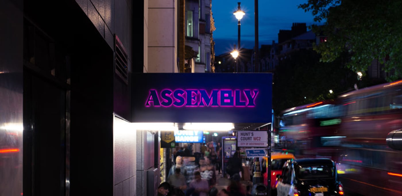
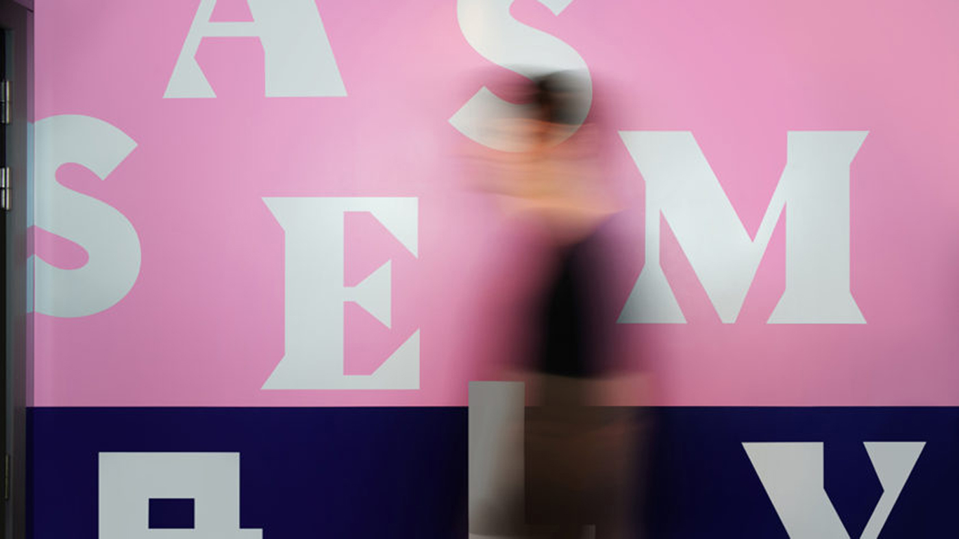
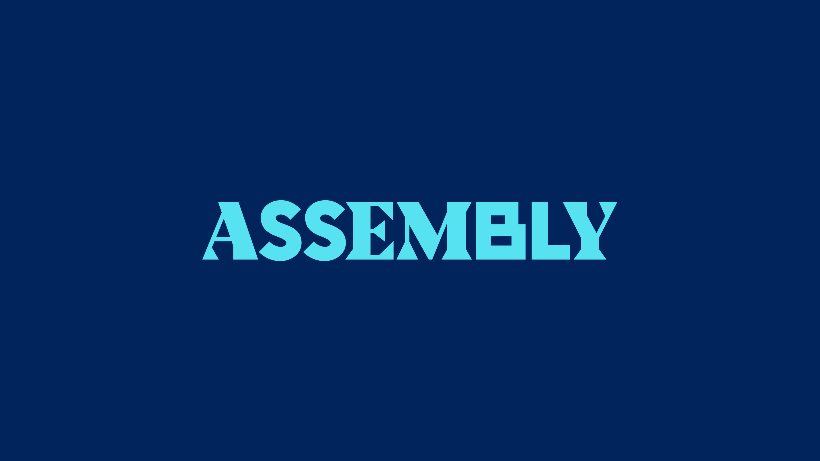
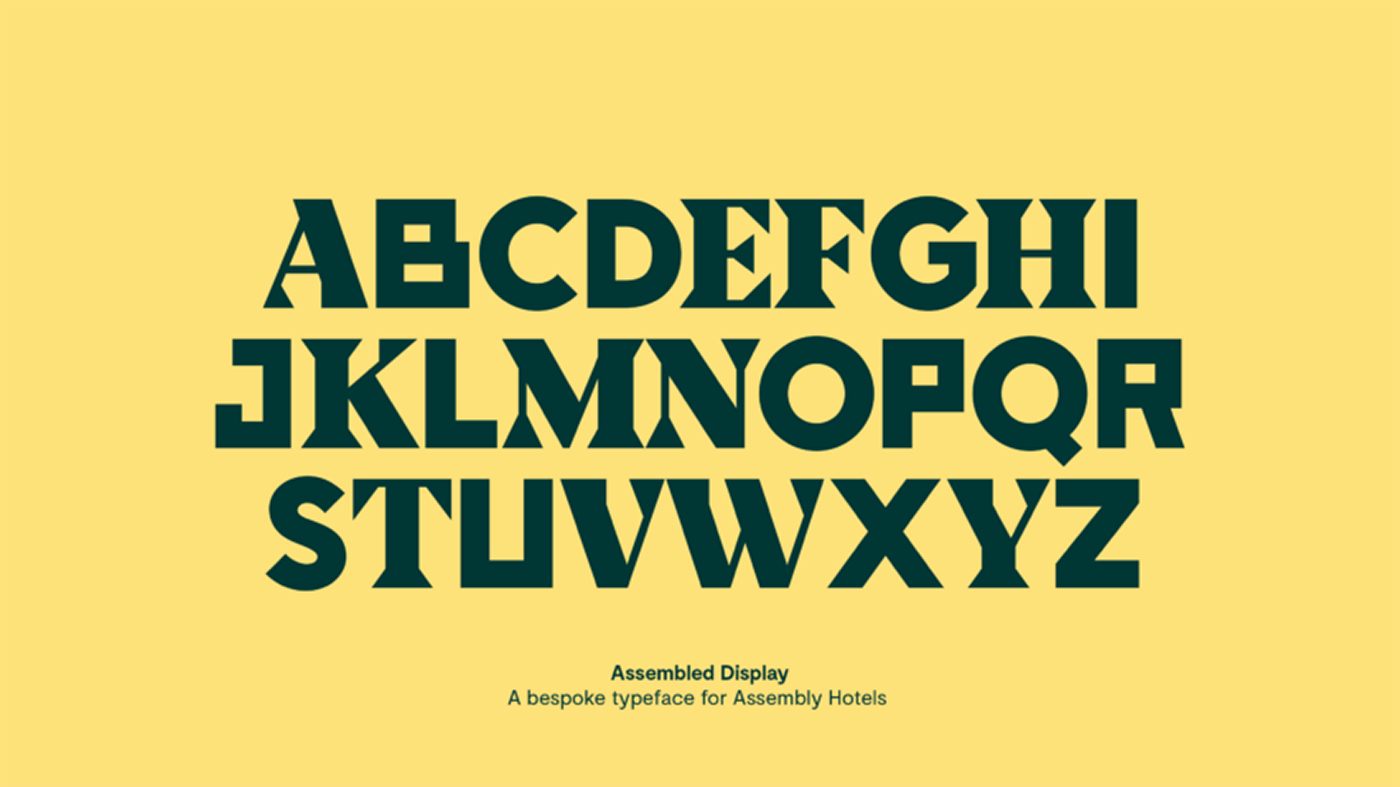
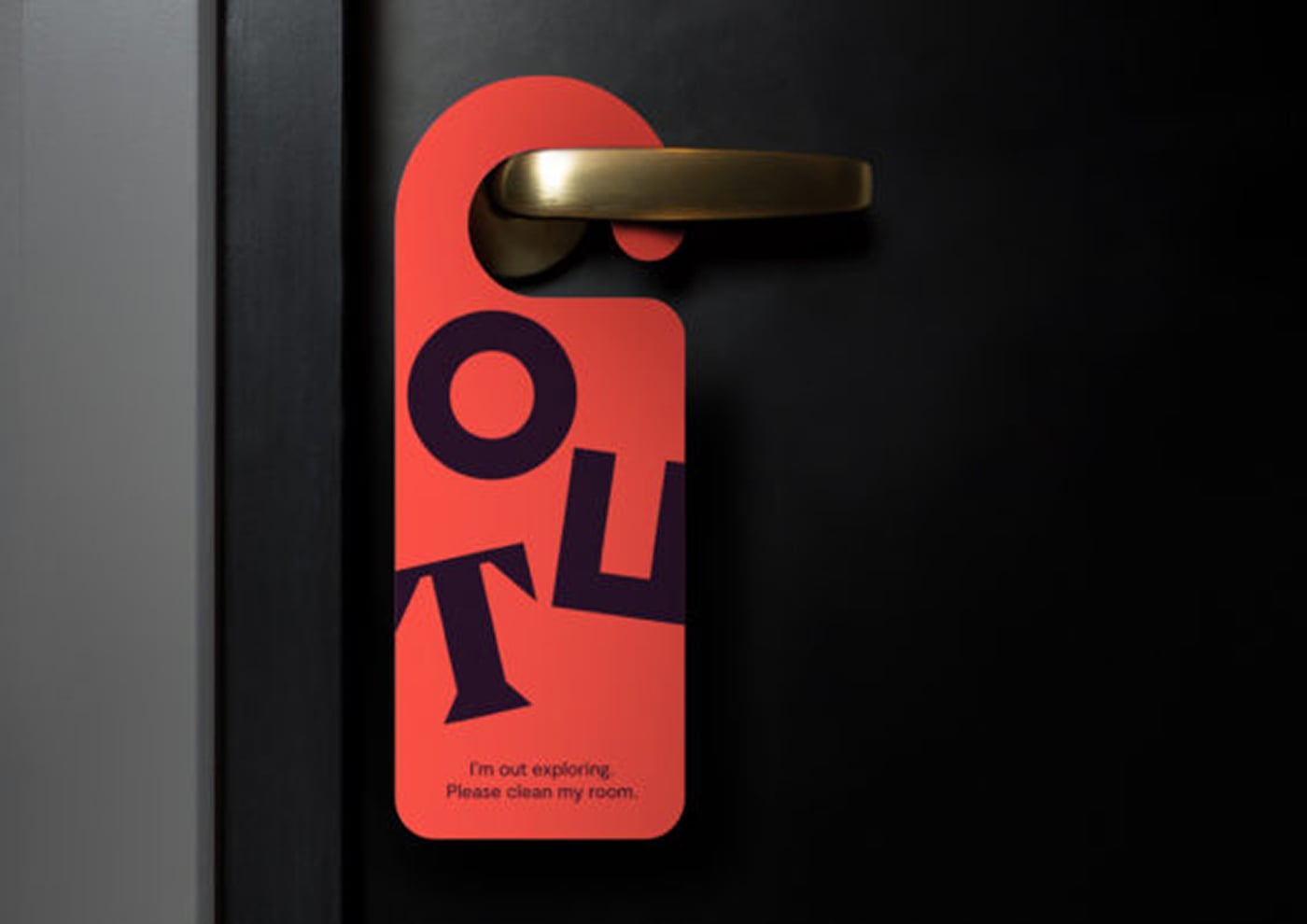
The identity was conceived as the antidote to the cookie-cutter aesthetic favoured by much of the category. It was built around a bespoke typeface designed to reflect the diverse range of experiences on the hotel/u2019s doorstep. The eye-catching letterforms are used playfully throughout the customer experience, scattered across layouts in a visual representation of the brand idea.
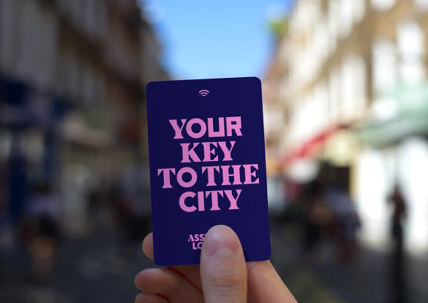
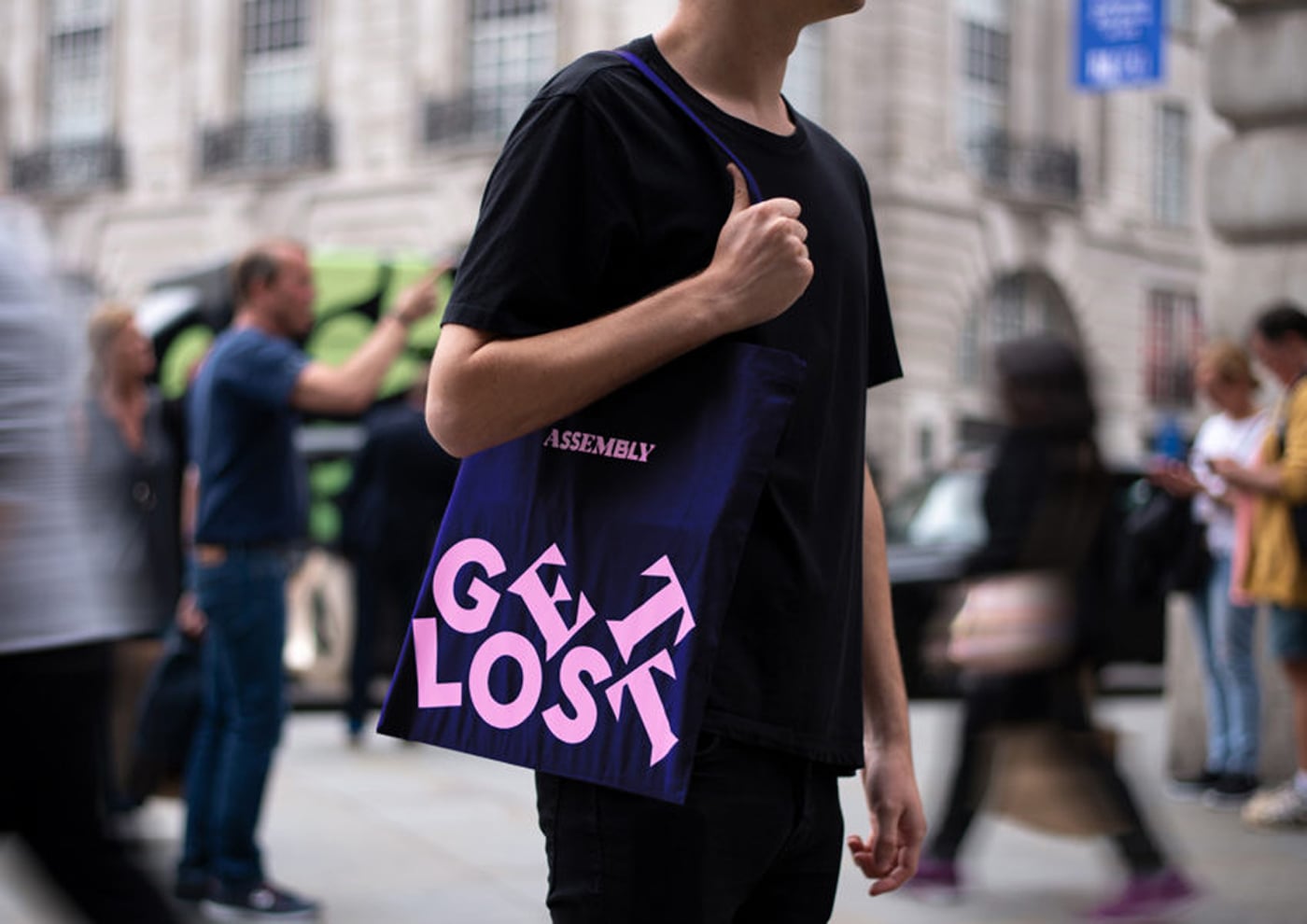
Where other hotels talk about staying in and getting comfortable, Assembly encourages its guests to explore the city. With hero lines like /u201cGet Lost/u201d and /u201cDon/u2019t Visit. Live It./u201d Assembly always sounds punchy, upfront and full of energy.
Photography, capturing candid, smile-in-the-mind moments, comes from everyday city explorers, not professional photographers. And room art, purchased from local artists in the area, is authentically tied to the city.
Creator: Ragged Edge


.webp)


