Plus
Plus

 Menu
Menu


Magno
June 16, 2026
Mindsparkle Mag


After years of collaborating with Starrytale, Magno Gavancho Studio partnered with the brand to expand beyond skincare and into the world of fine fragrance with Wonder Aroma Odyssey. The challenge was to translate Starrytale's distinctive blend of sophistication and mysticism into a premium perfume collection, with an unboxing experience that unfolds layer by layer. The work spanned concept, branding, packaging, photography and art direction.
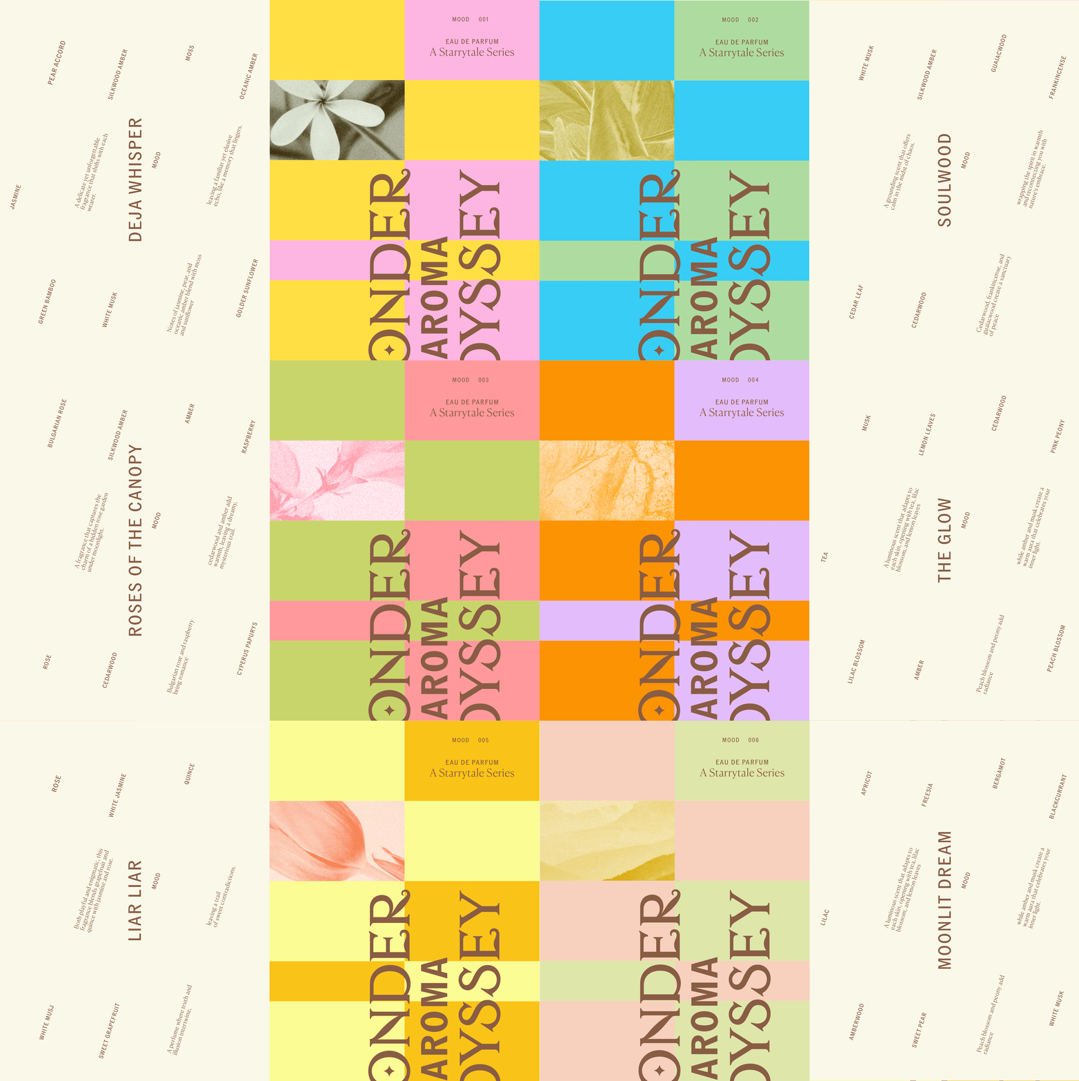

The packaging is built around contrast. A bold, graphic outer structure opens to reveal the soft, organic silhouette of the bottle inside. Custom star-shaped die-cuts appear throughout the outer sleeves, adding depth and texture while reinforcing a visual element that has become synonymous with the Starrytale brand.


Rather than relying on existing bottle formats, the studio designed the glass bottle from the ground up. Its elongated silhouette combines soft curves with sharper geometric details, while vertical ridges across the surface catch the light. At its centre, a star-shaped window highlights the fragrance name, a sculptural spherical cap with subtle veining adds a distinctive finishing touch, and a delicate chain around the neck holds a three-dimensional version of the brand's emblem.


To give each of the seven fragrances its own identity while keeping the collection cohesive, the studio built a flexible design system centred around colour. Vibrant, contrasting palettes create strong shelf presence and pull the range together as a striking visual set. Classic serif typography brings timelessness to the fragrance names, balanced by a clean sans serif for supporting information, while botanical illustrations and subtle celestial details give each scent its own character within the same family.


Credits: Magno
Concept, Branding, Packaging, Photography & Art Direction: Magno Gavancho Studio
Client: Starrytale
More in Brand Identity
Includes freebie bundle, unseen BTS insights and more.