





 Plus
Plus

 Menu
Menu


&Walsh
October 08, 2026
Mindsparkle Mag


Bombas started life as the sock company the internet couldn't stop talking about, and its old line, “the best socks on the internet,” said as much. More than a decade on, the brand also sells underwear, tees, slippers and footwear, and its identity had to grow up with the business. The refreshed brand expression sets out a bigger ambition: to be “the comfort brand you can't live without.”
New York agency &Walsh, led by founder and creative director Jessica Walsh, built the refresh around comfort in both senses of the word. There is the physical kind, like slipping on a fresh pair of socks or dozing off mid-episode in slippers, and the emotional kind that comes from Bombas' one-purchased, one-donated mission. Every part of the new brand identity was asked to carry that same feeling, from storefronts and shopping bags to the checkout page.
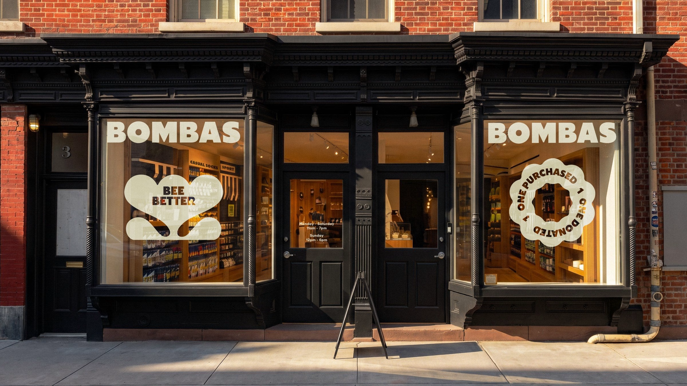
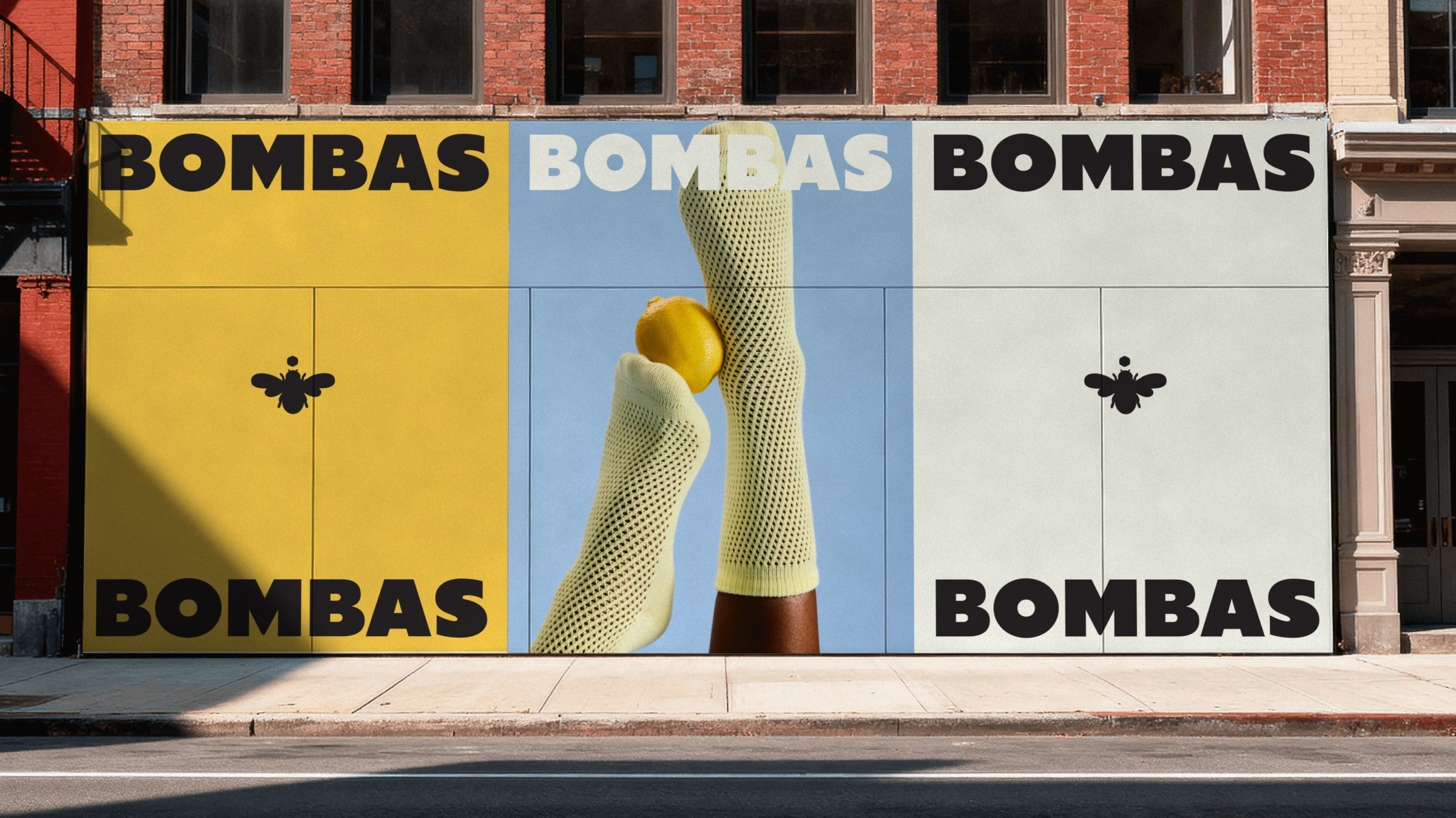
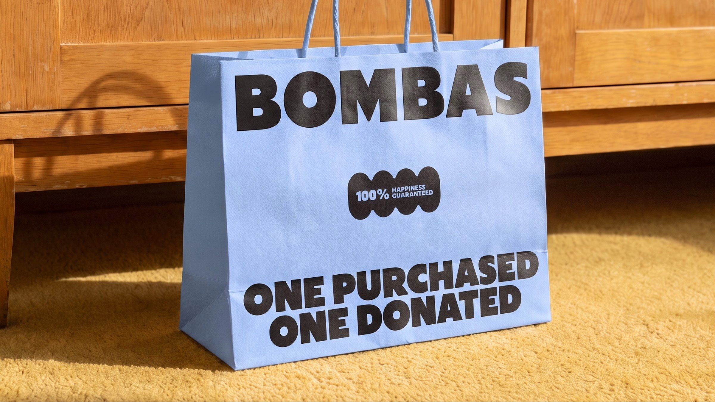
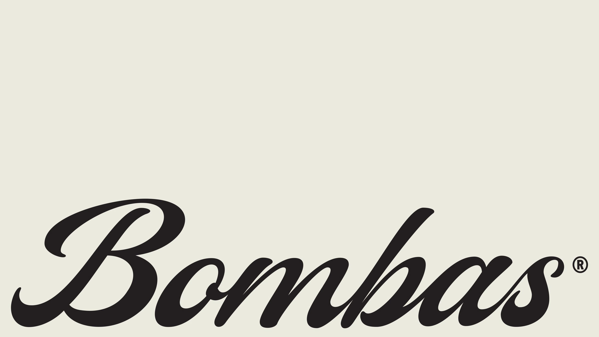
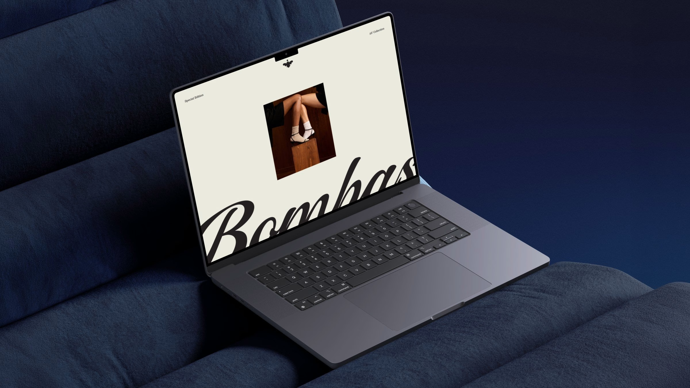
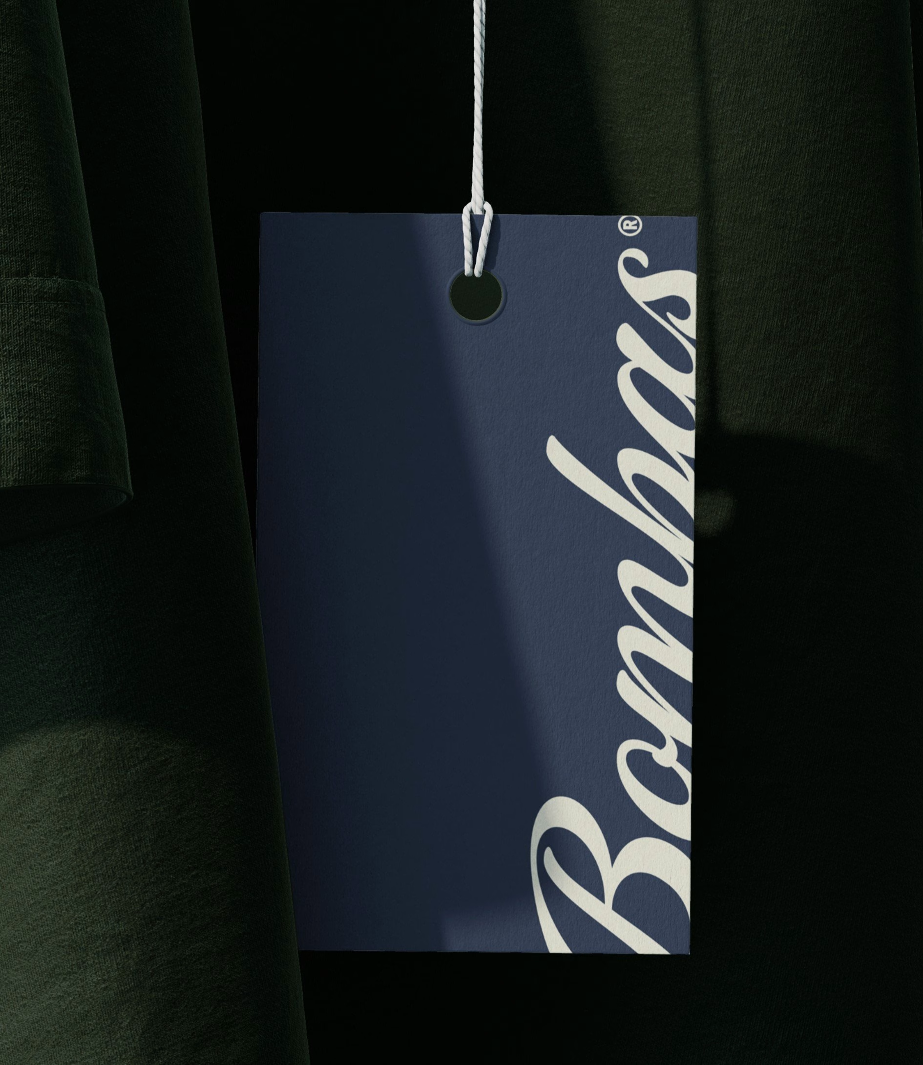
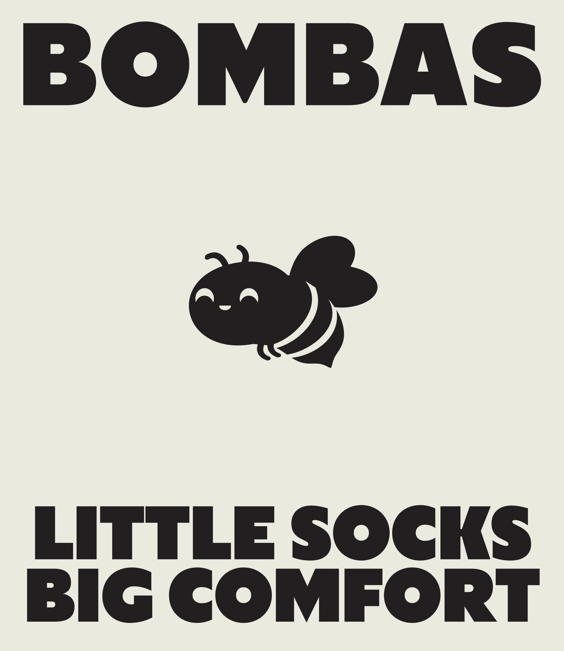
The most visible change is in the letterforms. A heavy, rounded wordmark does the loud work on packaging, hoardings and shop windows, while a looping script logotype gives the brand a softer, more personal voice. The bee, a nod to the bumblebee behind the Bombas name, is redrawn as a compact symbol that sits comfortably on woven labels, gift cards and box lids.
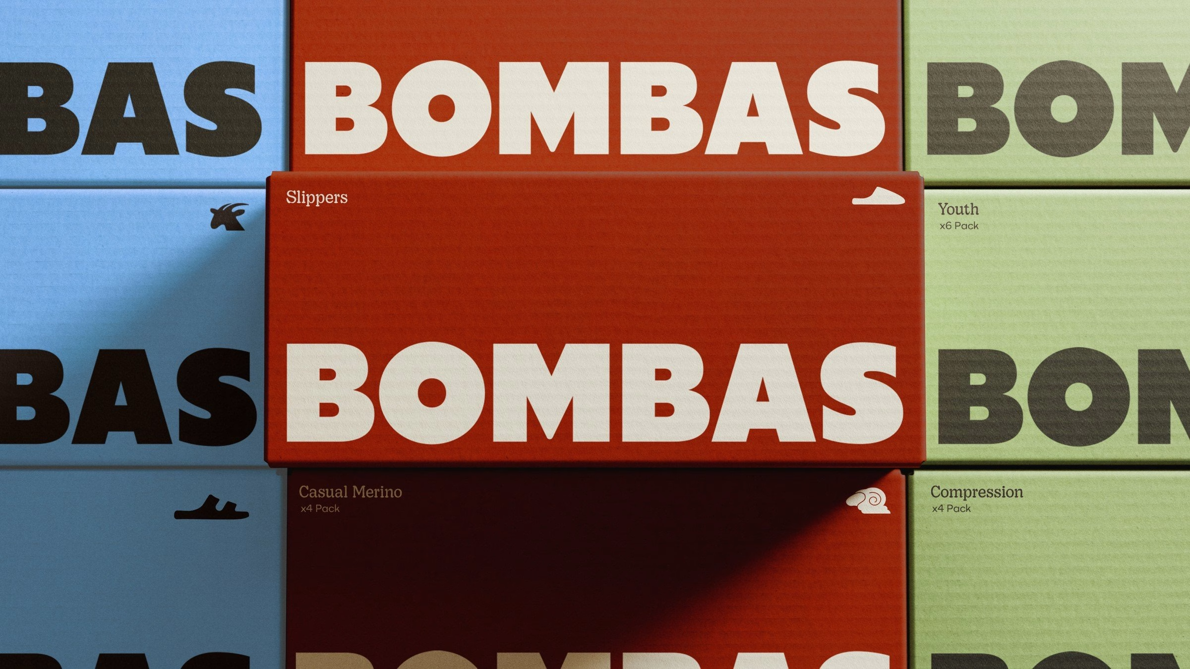
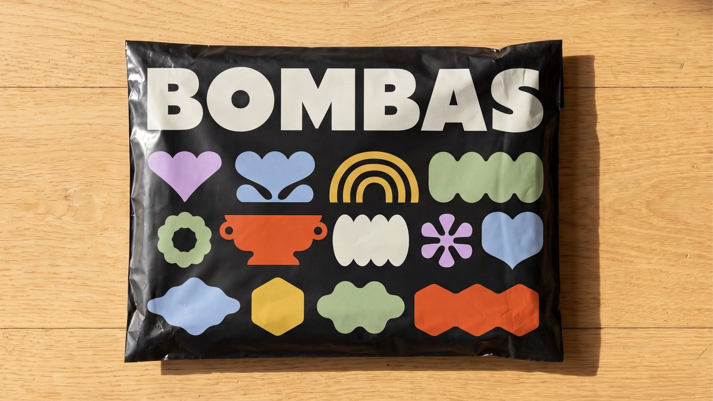

Alongside the type, &Walsh drew an icon set from simple organic shapes, from rainbows and hearts to blobby flowers, that reads as friendly rather than technical. The colour palette was softened too, trading hard contrast for warm oranges, sage greens, sky blues and deep chocolate browns. Art director Carolina Vazquez describes every choice in the system as a way of carrying comfort into how the brand looks and feels, a more grown-up Bombas that hasn't lost what it has always stood for.
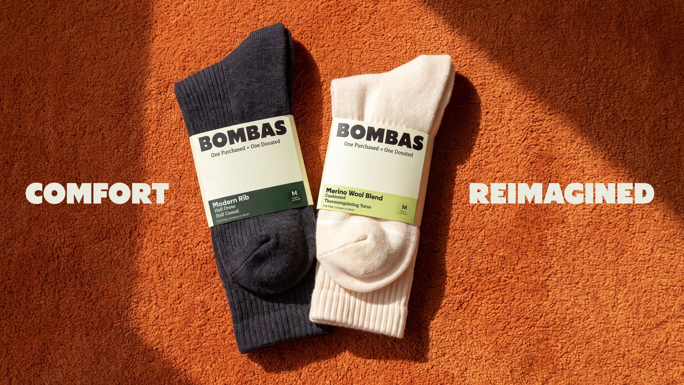
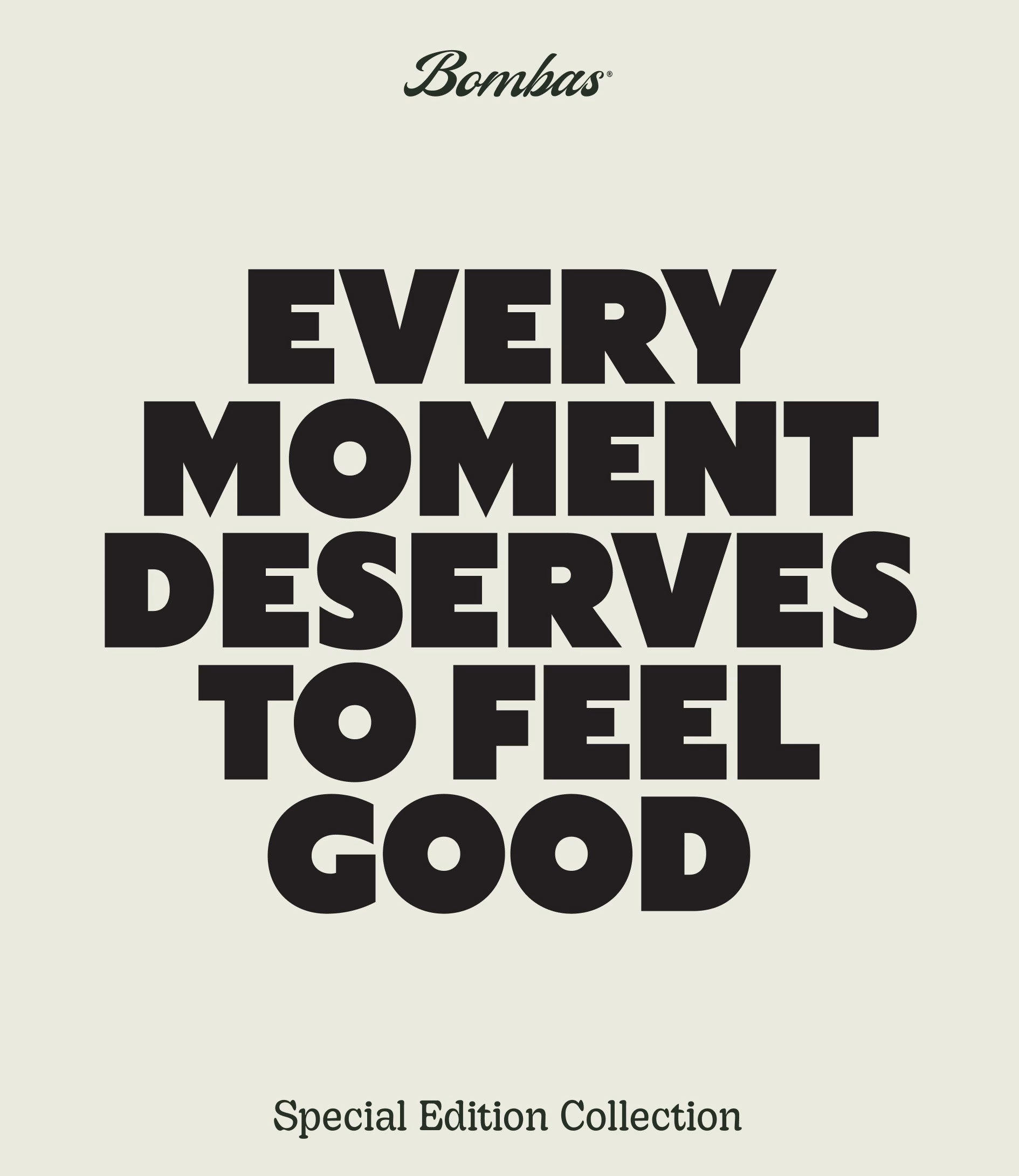
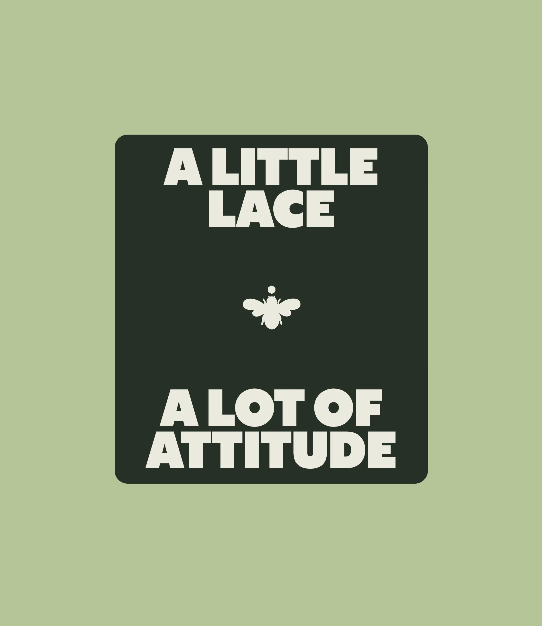
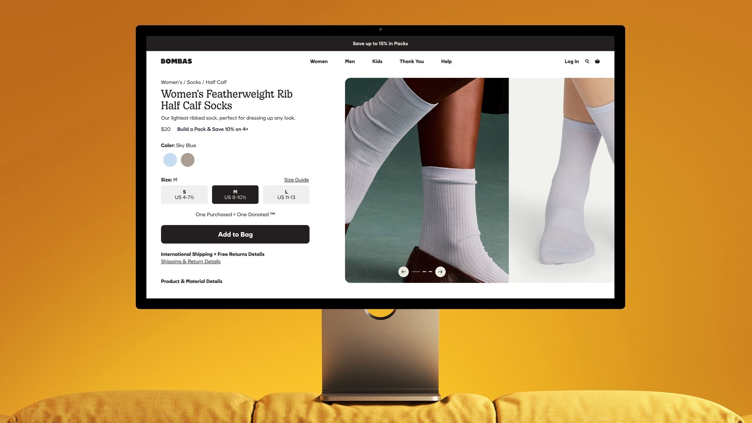
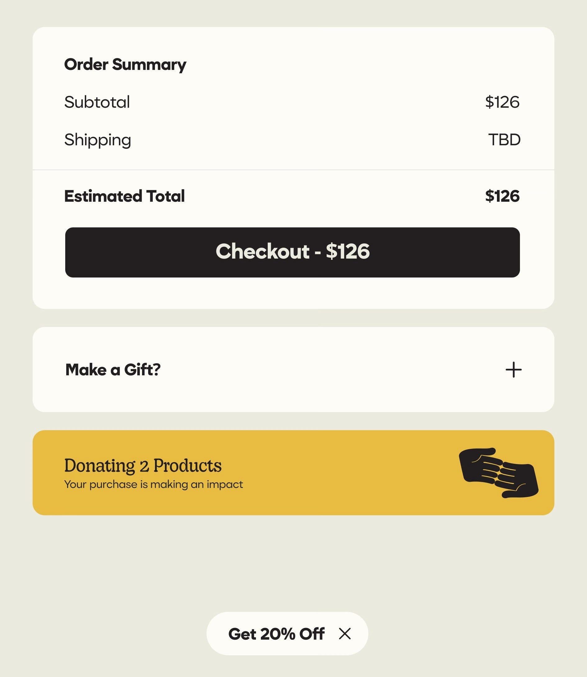
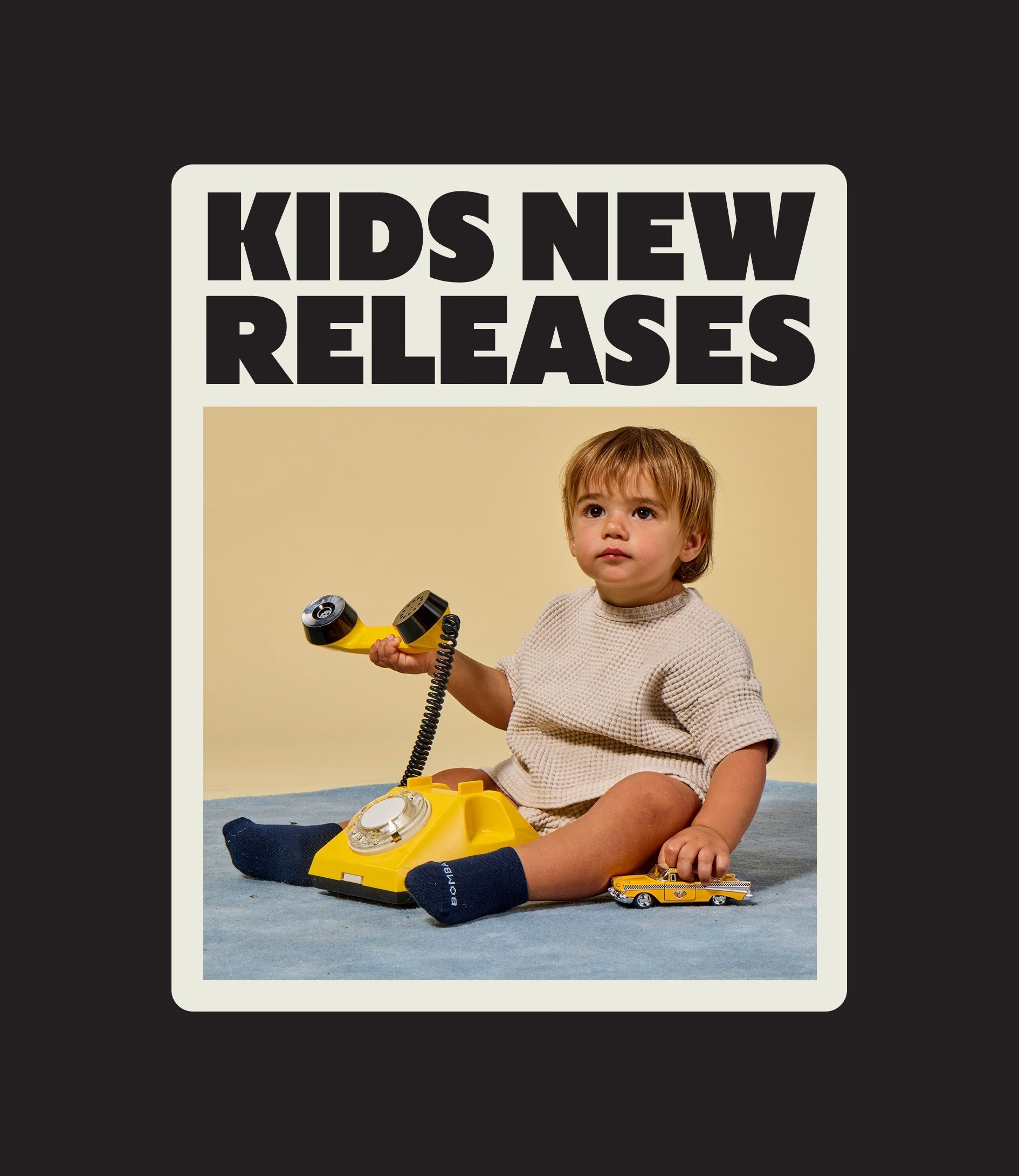
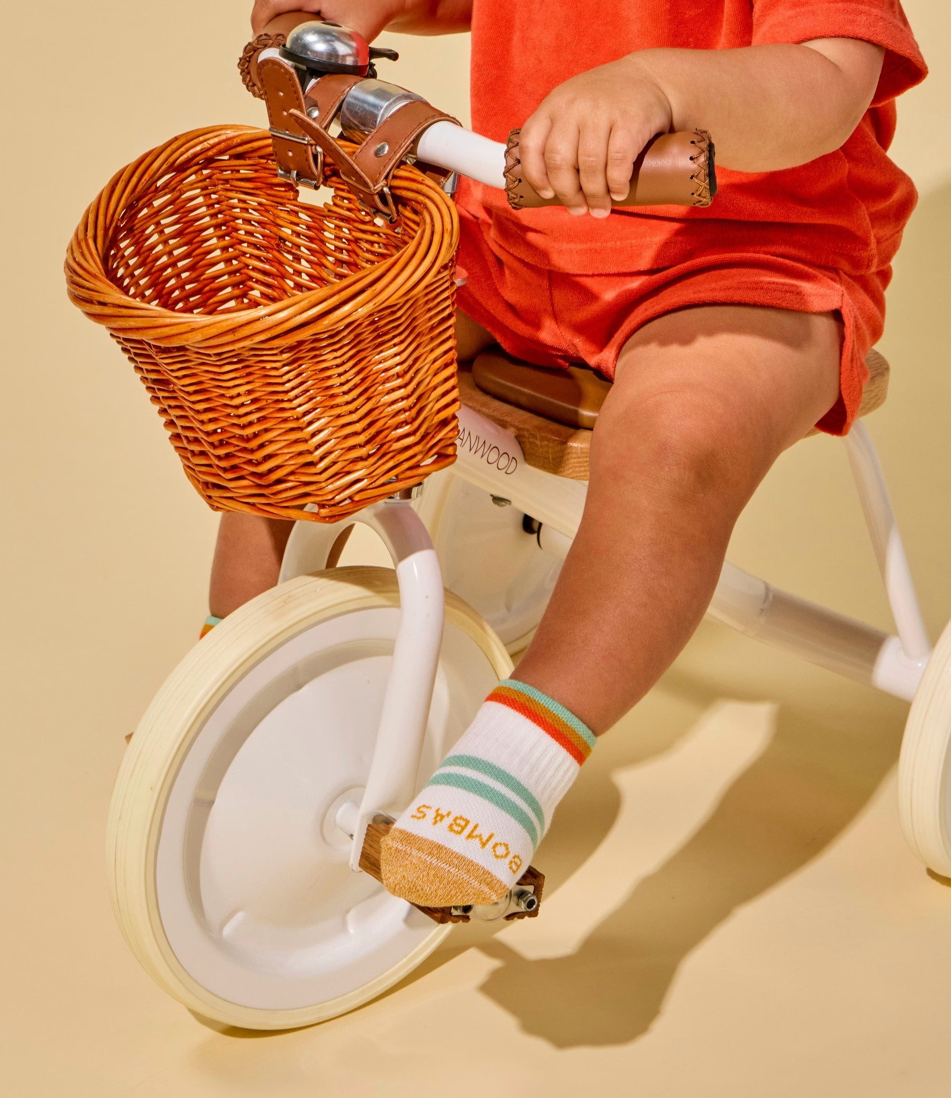
The refresh has rolled out over the past year across Bombas.com, packaging, retail and marketing. On the site, product photography moves towards warm, tactile art direction, with legs and feet set against sofas, rugs and sun-soaked colour fields instead of a plain white backdrop. The same type, icons and palette run through the app, the checkout flow and the donation prompts, so the mission is never far from the moment of purchase.
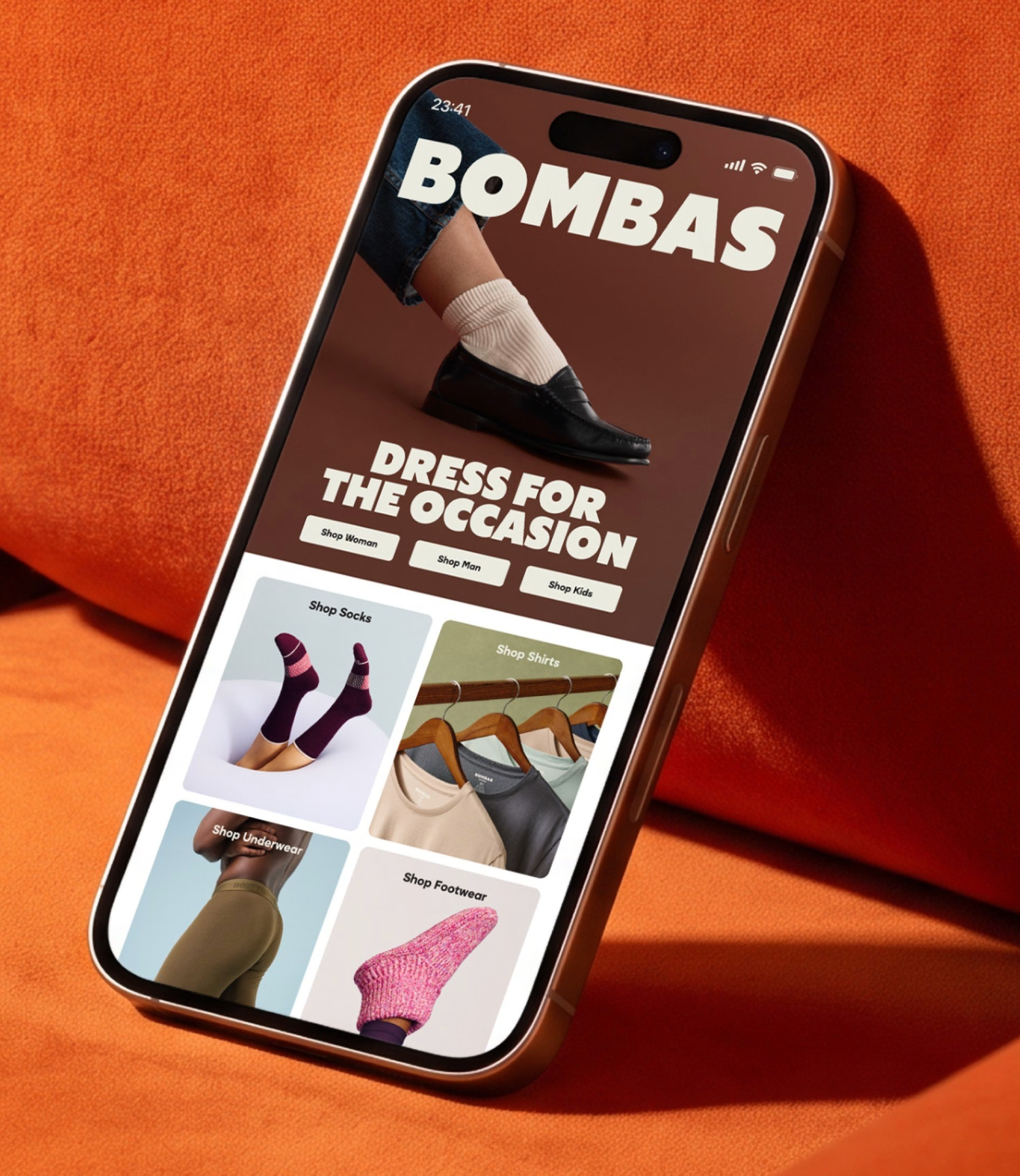
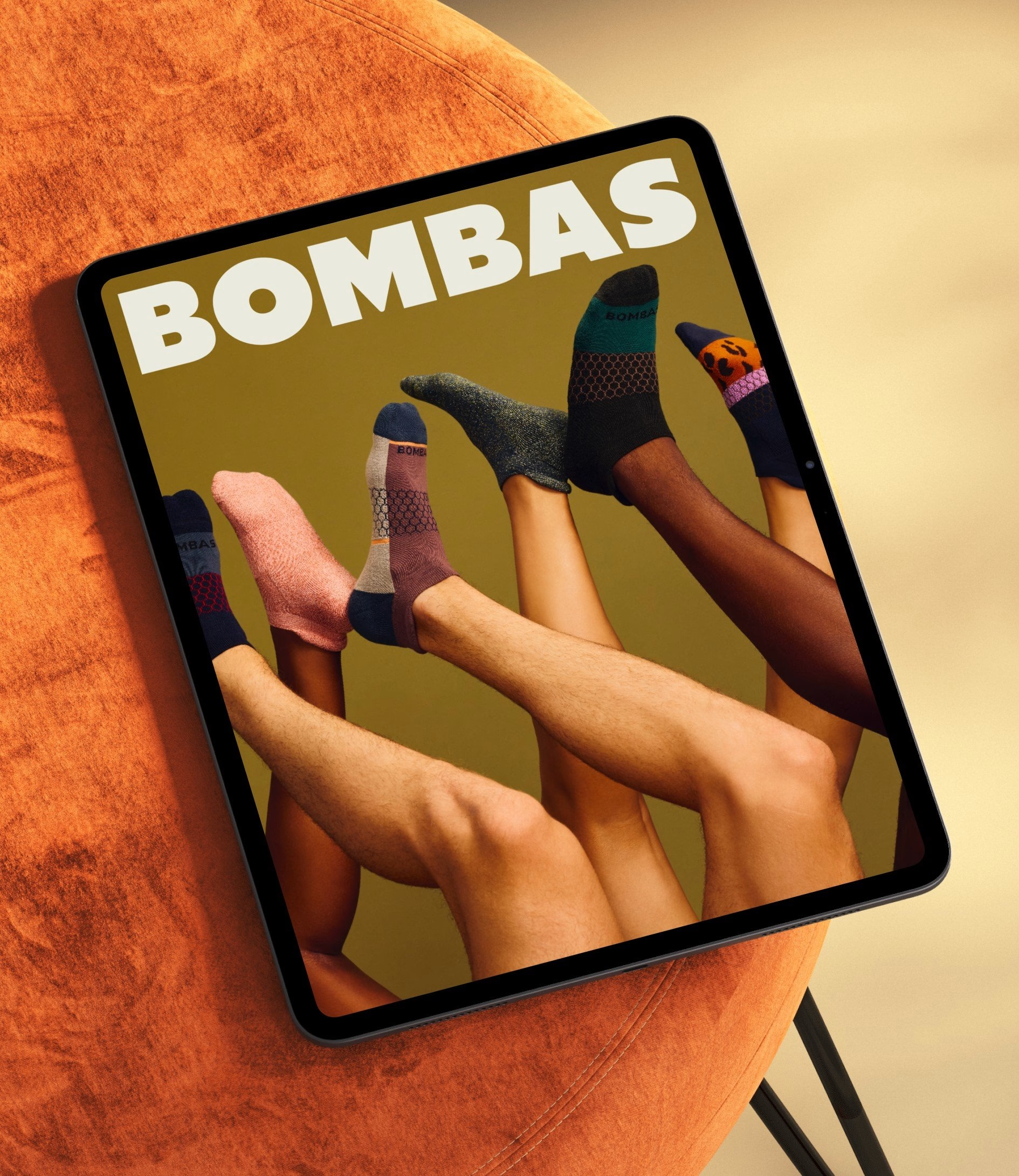
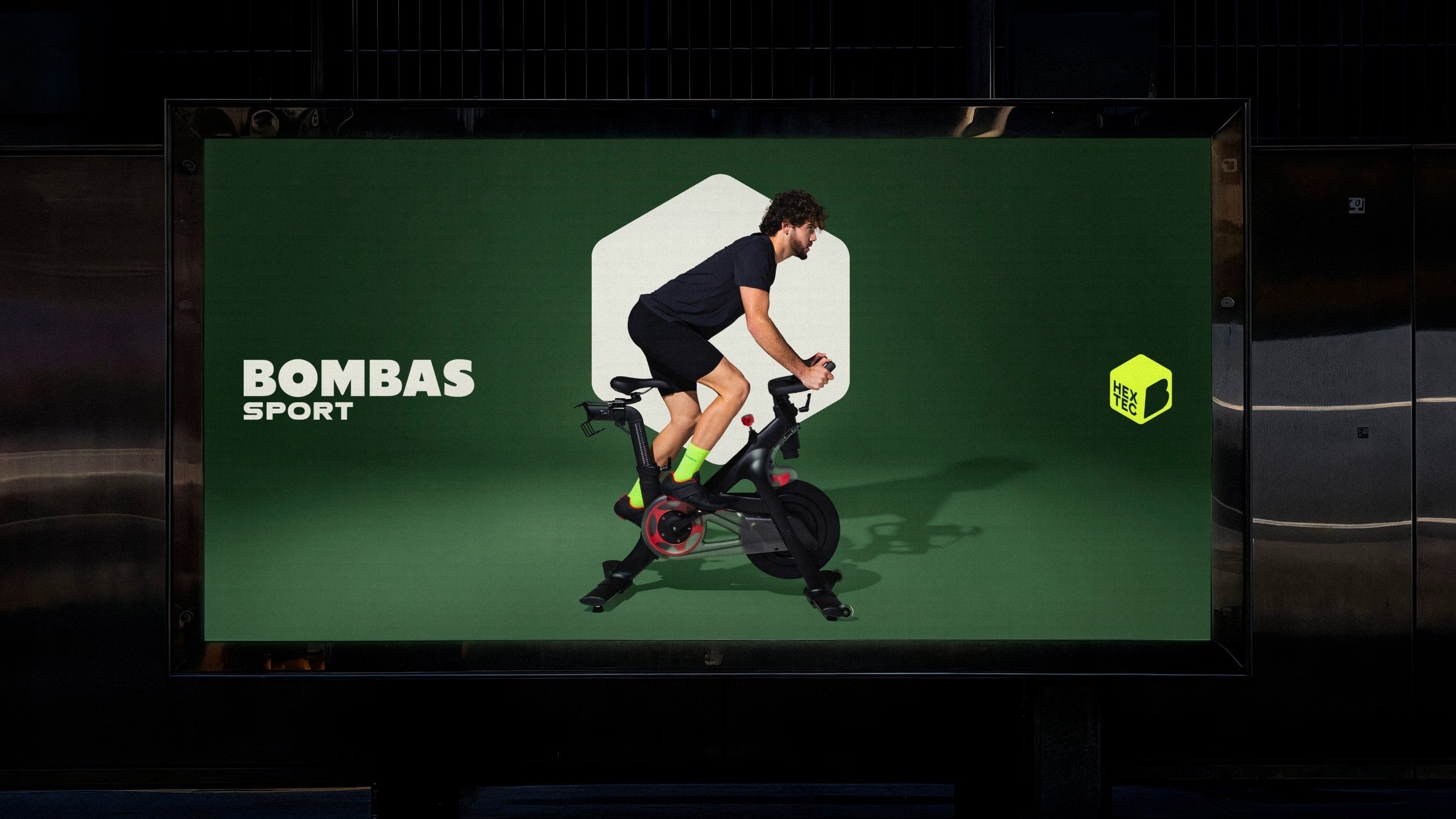
The system also had to hold together a growing family of sub-brands, including Sport, Kids and Dress. Bombas Sport gets the most distinct treatment, with its own palette, art direction, iconography and logo system tuned for performance products. Neon accents, cut-out athletes and kit arranged like still lifes give it more energy than the core brand, while the rounded type keeps it in the family.
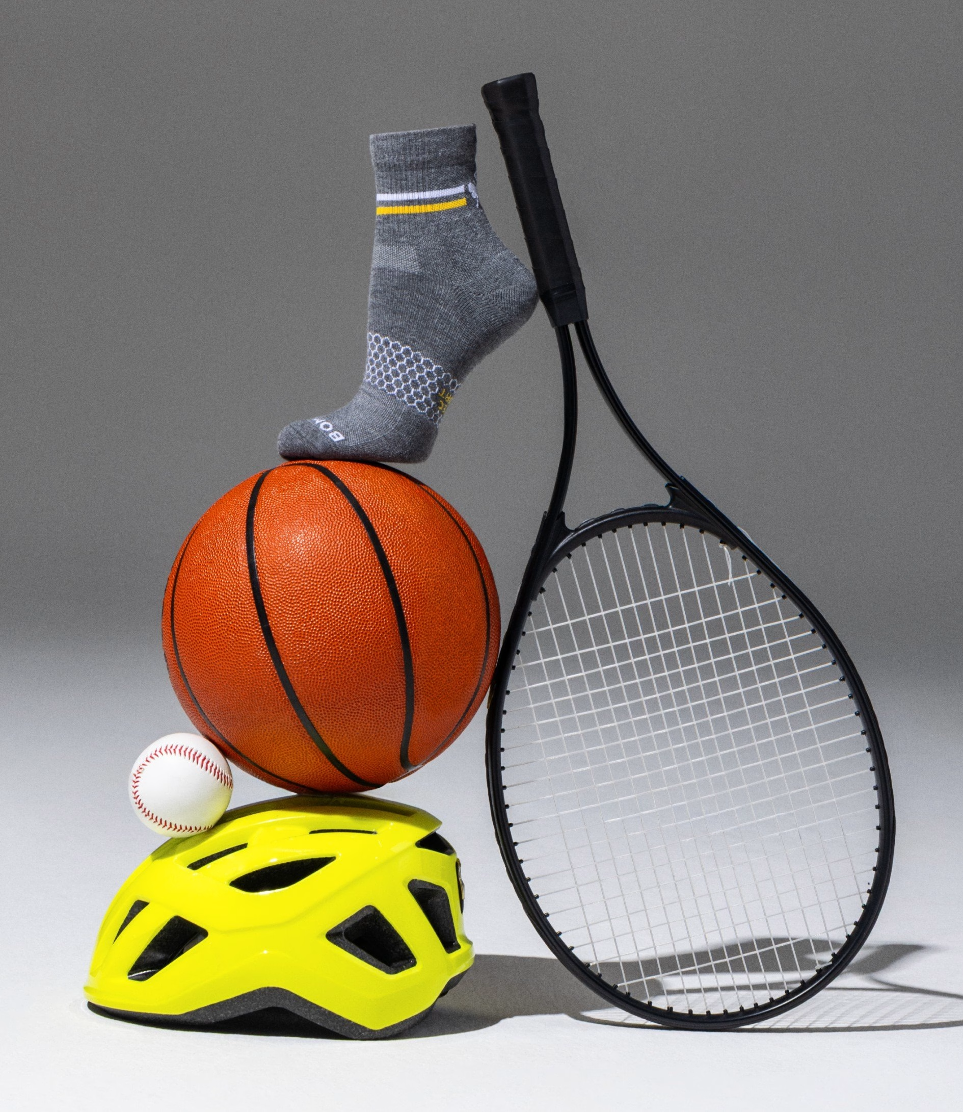
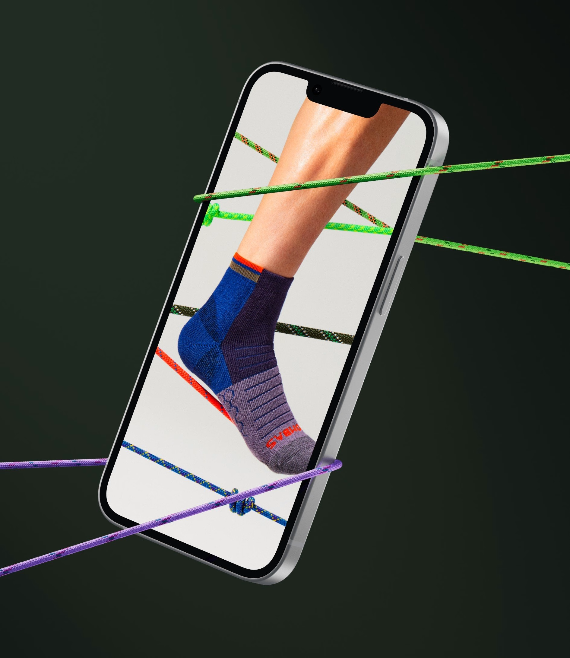
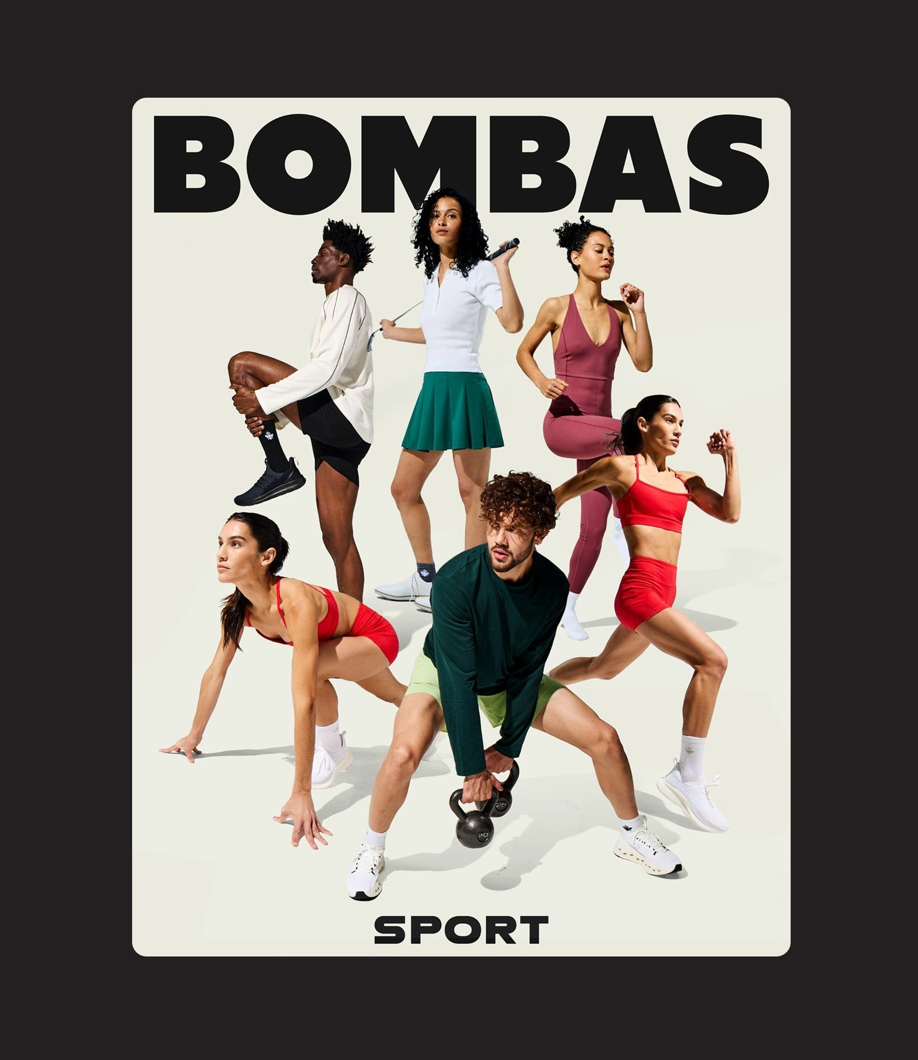
Dress leans on the script logotype and deep greens and navies for a more polished register. Kids goes the other way, with bold “little socks, big comfort” headlines, a cartoon bee and bunny patterns that feel made for a nursery shelf. Both stay recognisably Bombas, and the promise of donating an essential clothing item for every purchase remains the foundation underneath each of them.

For Jessica Walsh, the brief came down to maturity: Bombas has grown up, and its identity needed to reflect the role it now plays in people's lives. Ask anyone who wears the brand, she says, and they describe a deep sense of comfort that comes from the care behind every product. The refreshed identity is &Walsh's attempt to make the brand itself evoke that feeling, and it arrives alongside holiday and sports campaigns the agency created with Bombas.
Credits: &Walsh
Branding & Creative Direction: &Walsh
Creative Director: Jessica Walsh
Brand Strategy & Copywriting: Lauren Walsh
Brand Strategy & Copywriting: Astha Avinash
Associate Creative Director: Lucas Luz
Art Director: Caro Vazquez
Design: Juanse Carvajal
Design: Leandra Rexhepi
Design & Illustration: Julio Zukerman
Video & Animation: Pedro Magalhães & Igor Fajardo
More in Fashion Branding
Stay on top of this week's design. Insights, top picks & more.




