


Badoo Design
August 21, 2017
Mindsparkle Mag


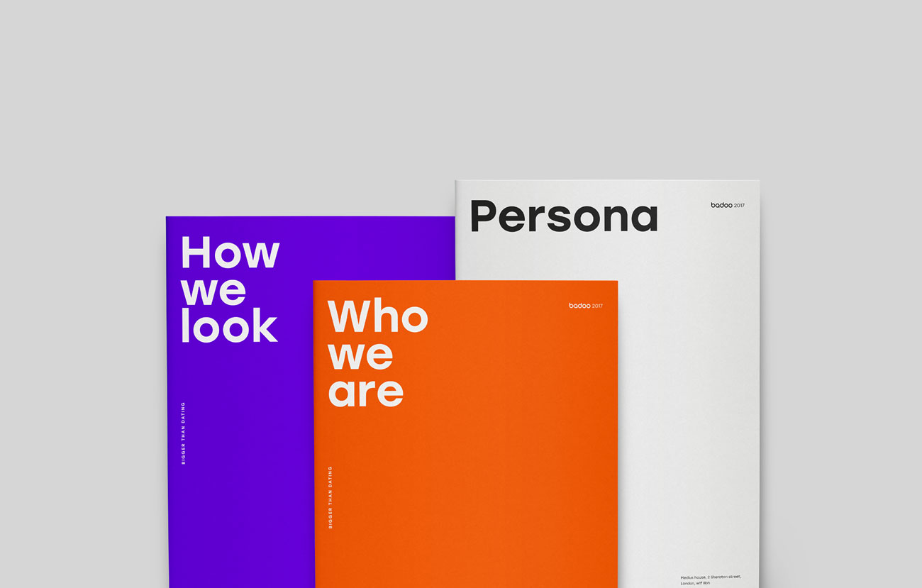
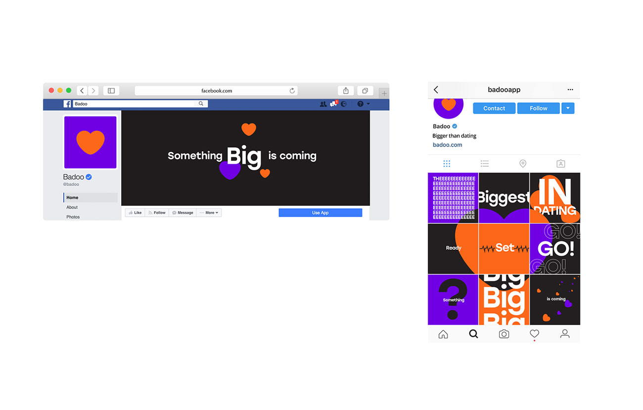
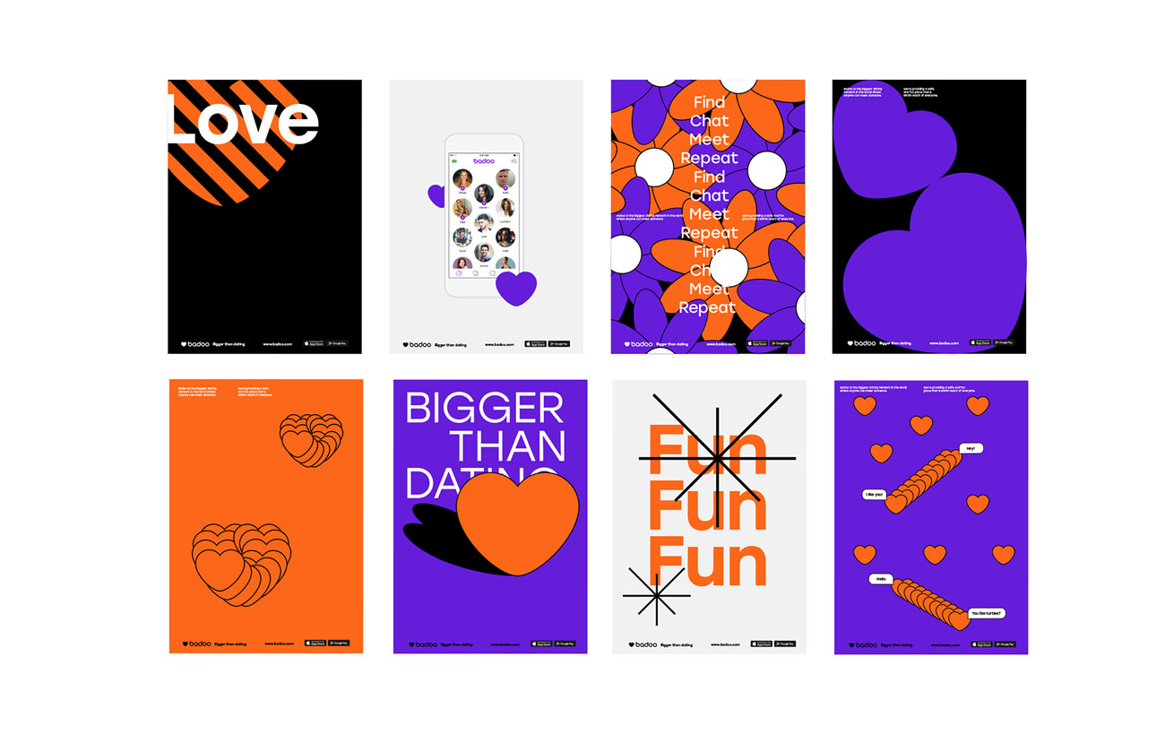
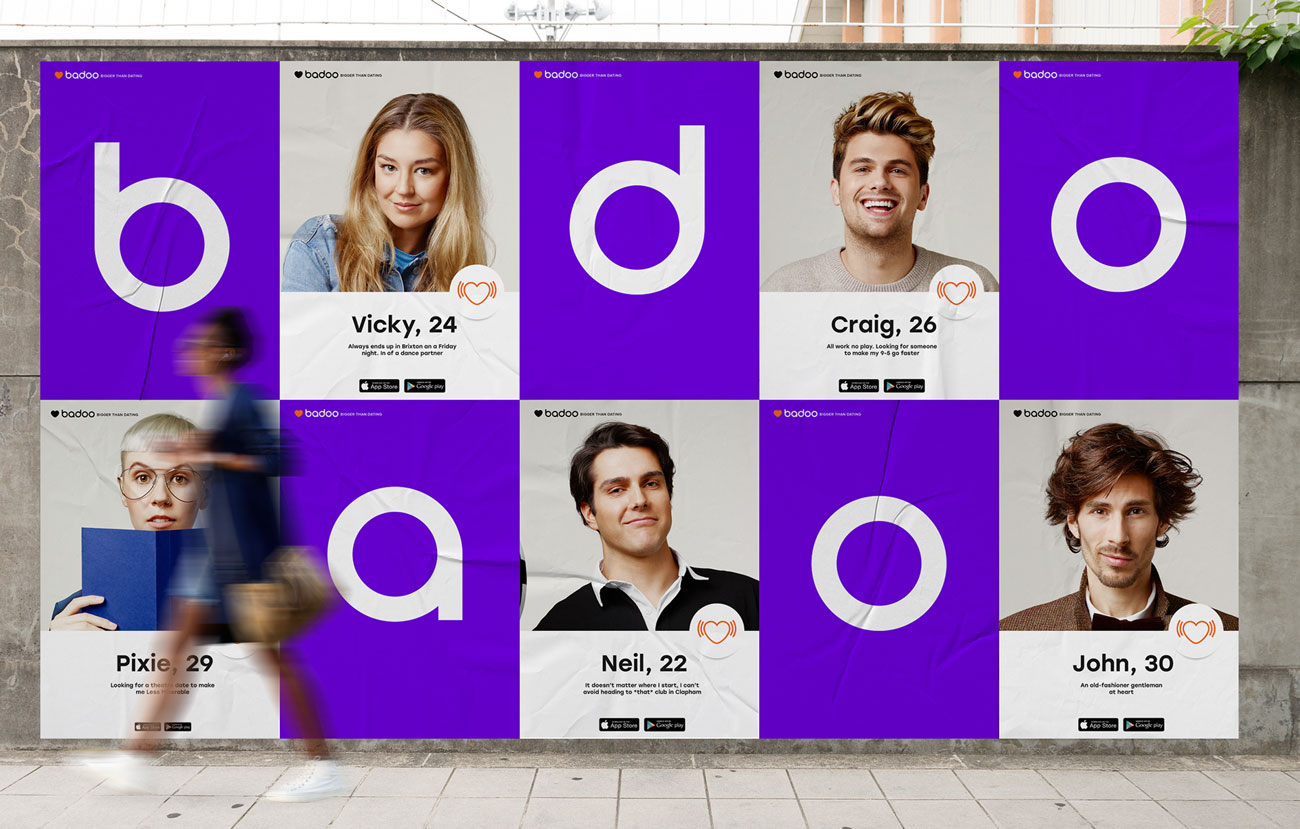
To mark its 10th year, progressive dating app Badoo has rebranded its identity in order to inject a stronger sense of personality and establish consistency across their worldwide branding.
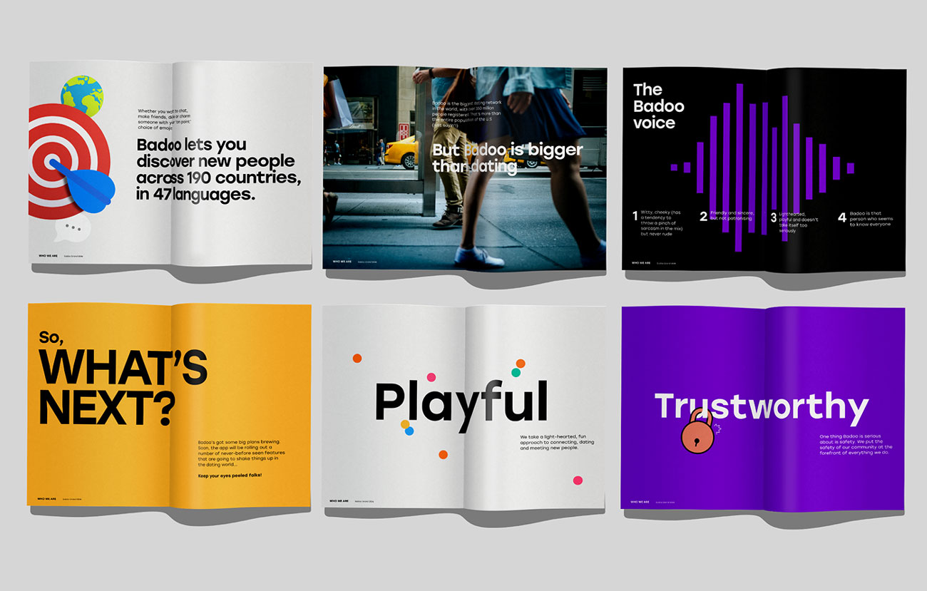
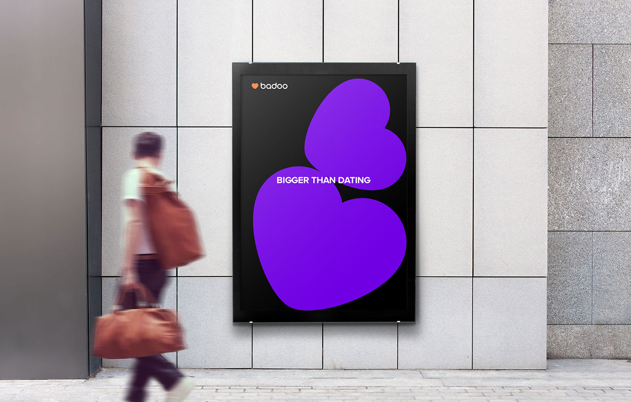
Badoo set to create an identity that would portray themselves as a company who, at their core, connects with their audience on an emotional level, rather than coming across as an impersonal tech company.
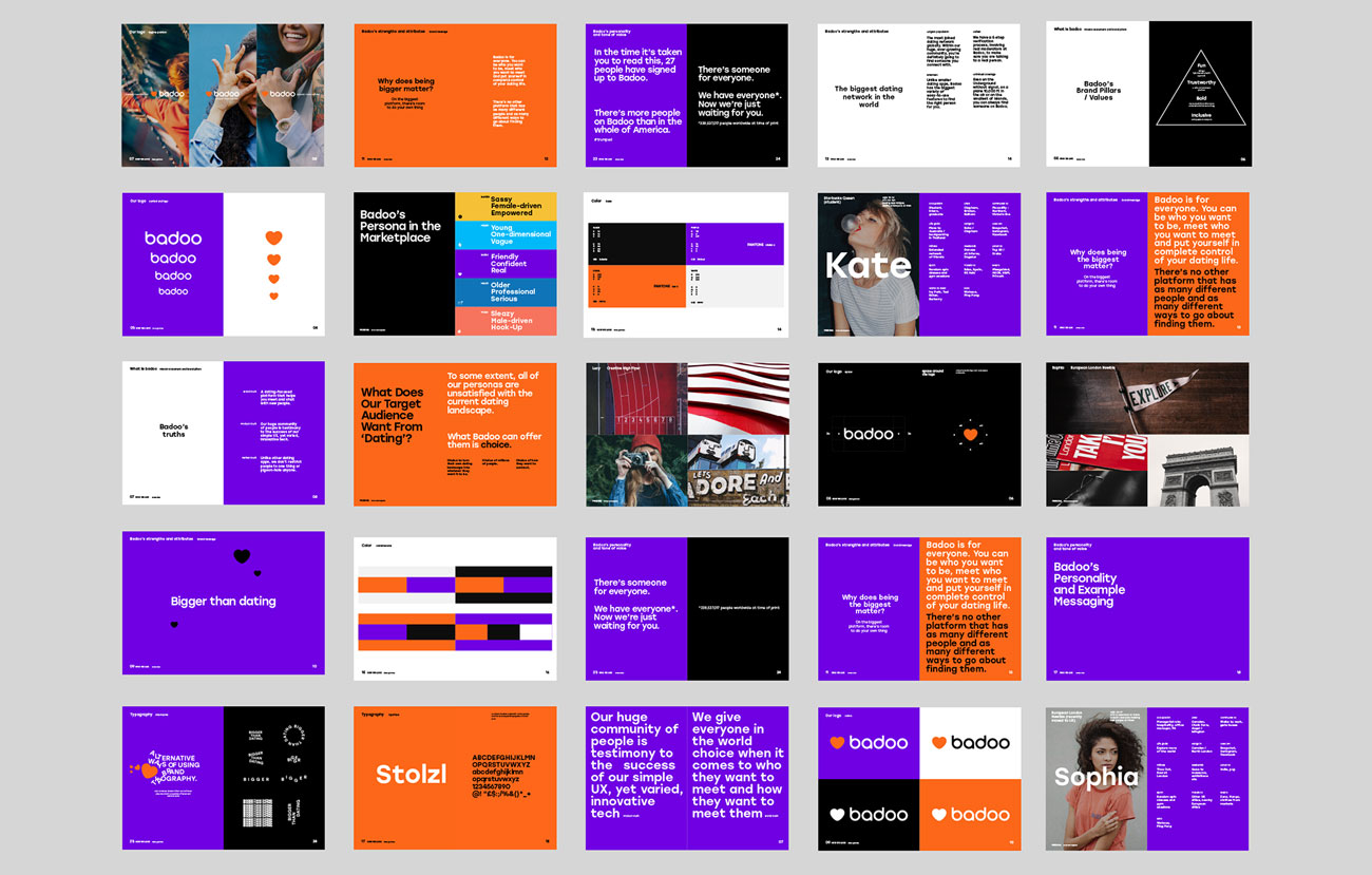
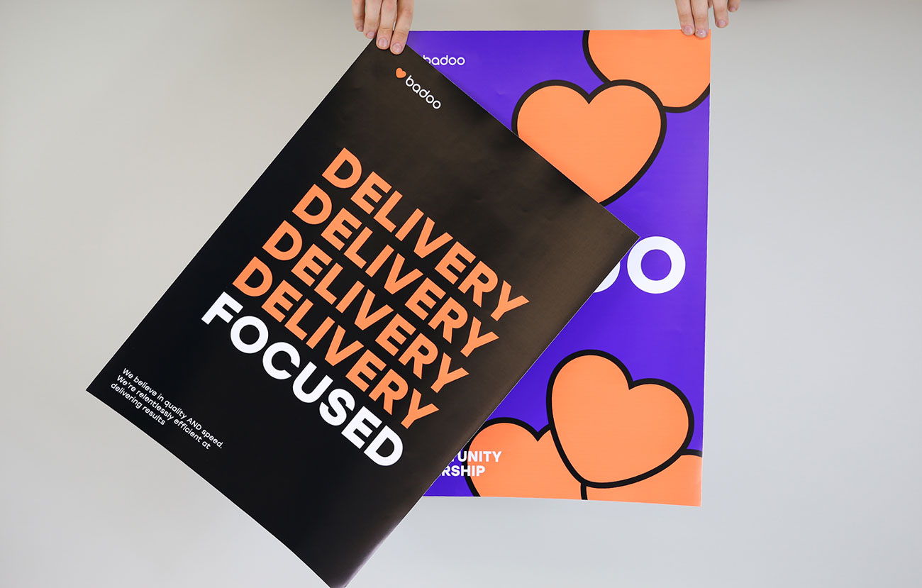
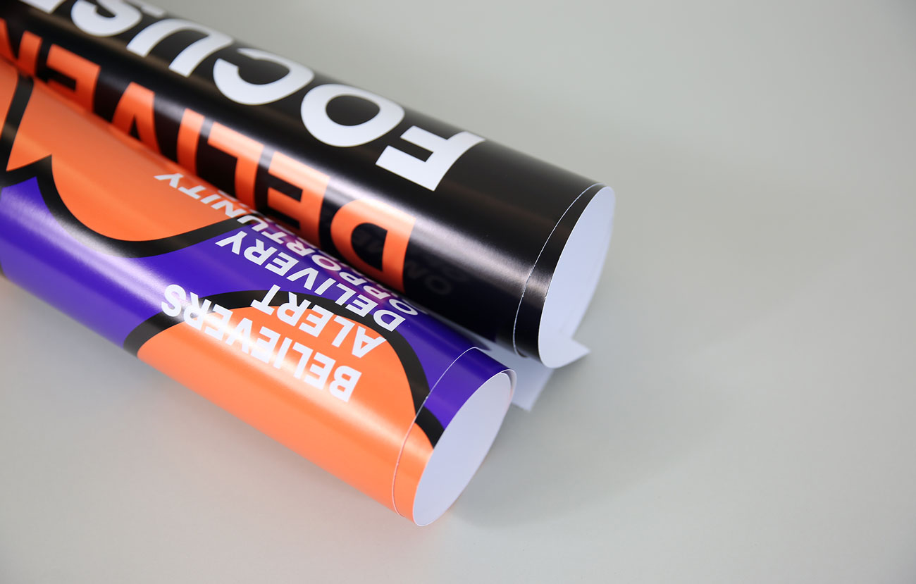
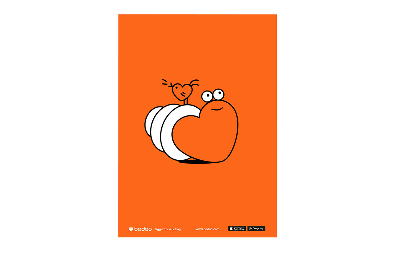
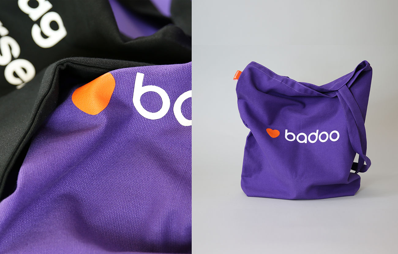
The new identity utilises large text and a vibrant yet pared-down four-tone colour palette along with playful graphics. Badoo avoided the typical colour palette of red and blue commonly used by other dating apps and opted for a bold purple which holds a neutral space between the two.
Badoo’s new branding establishes itself as a contemporary, forward-thinking contender in the world of dating apps, and cemented its identity by creating a strong brand bible, including their mission statement, brand values, tone of voice and personality.


Credits: Badoo Design


