Sam George
March 05, 2021
Mindsparkle Mag


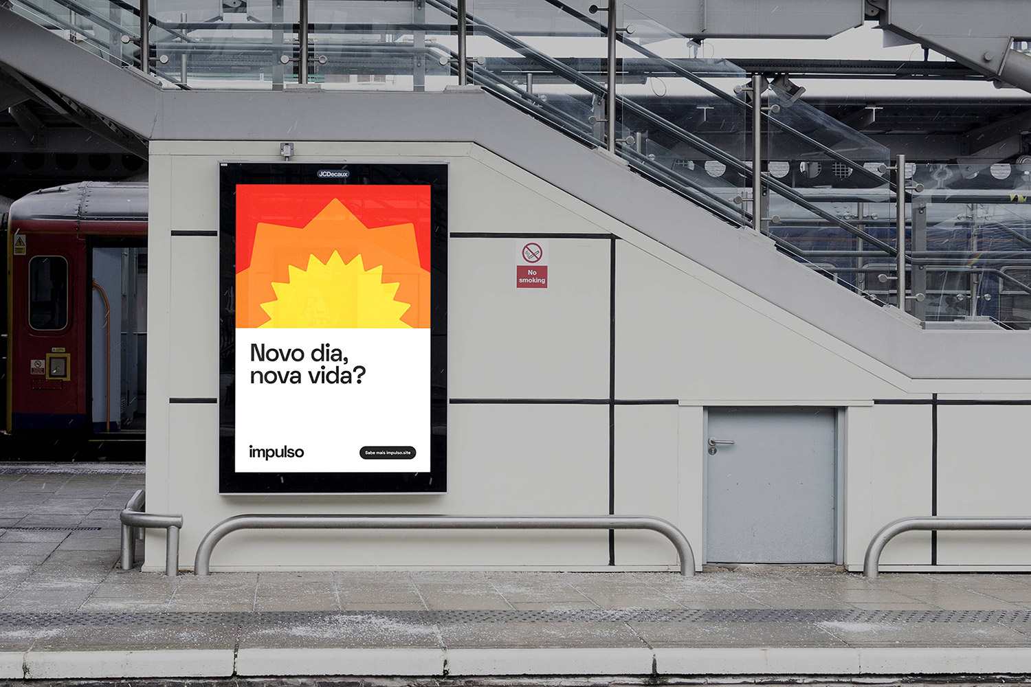
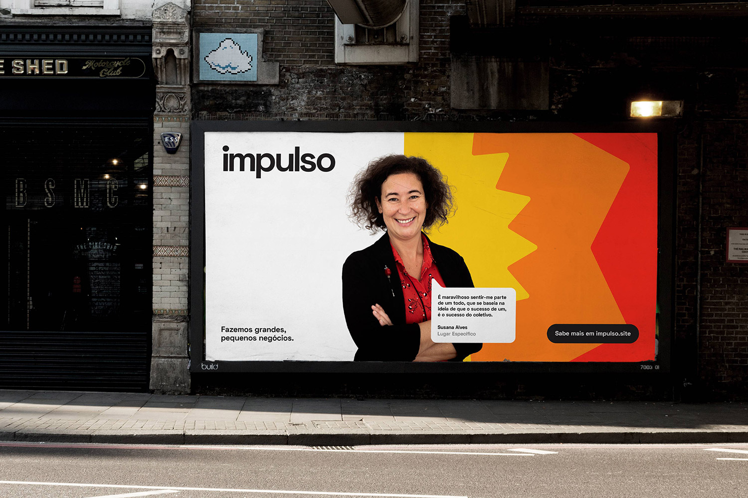
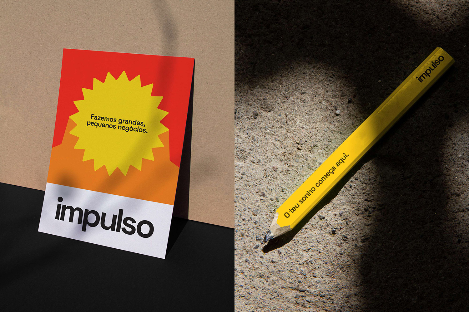
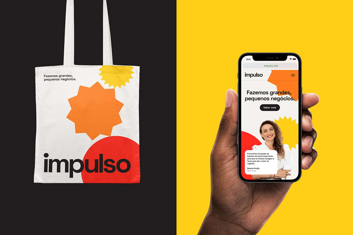
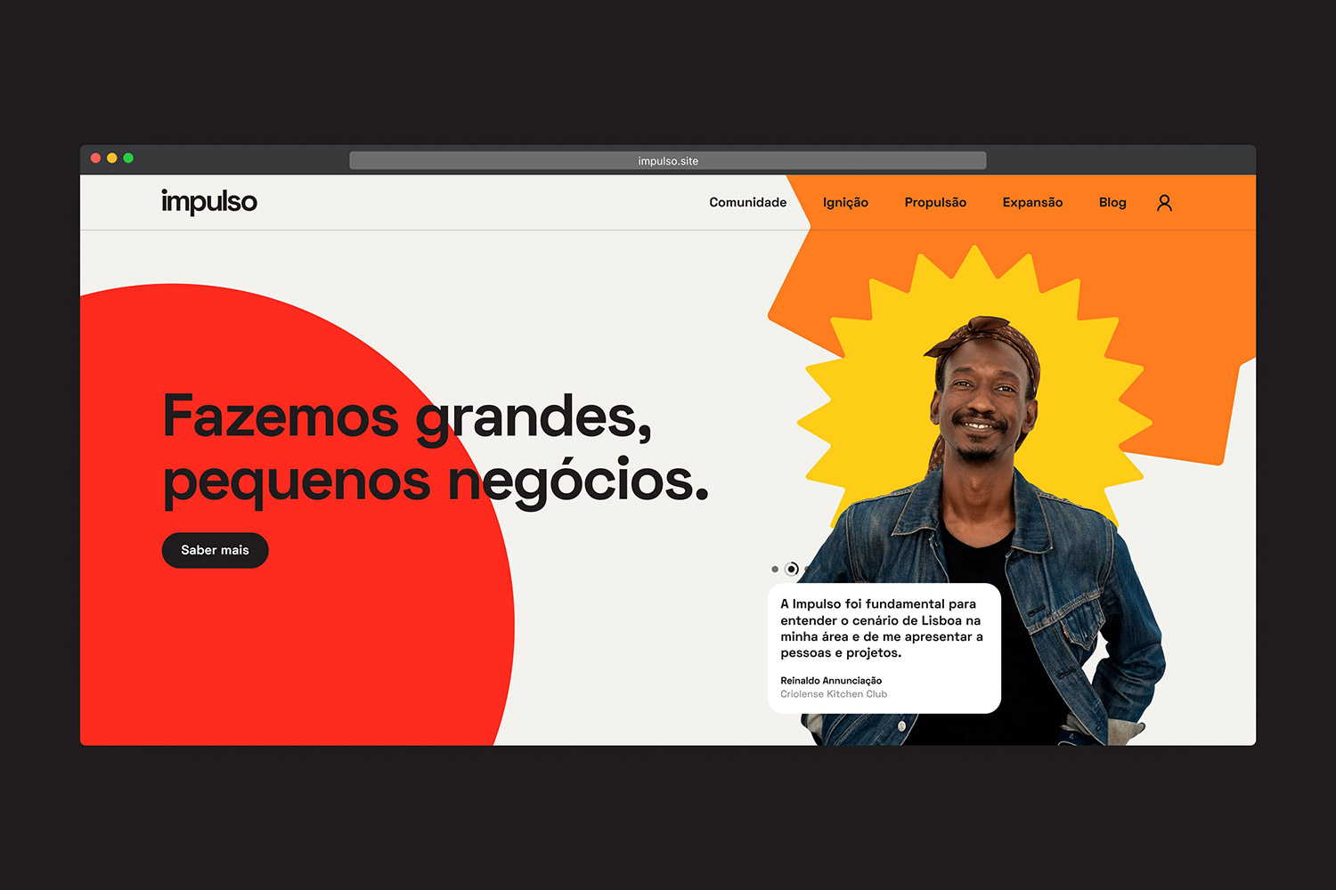
Sam George designed the rebranding for Impulso. This was the story: Menos, an organisation based in Portugal, reached out last August with a challenge. They wanted to radically change their identity, including their name, to better reflect what they do and who they do it for. Menos, now known as Impulso, is an organisation that fosters entrepreneurship through different programs aimed at supporting entrepreneurs and small businesses. João and Frederica, the organisation leads, felt their identity needed to showcase the energy their programs unlock in their entrepreneurs, playfully and humanly. These became the core concepts of their new brand: Energy, Playfulness, and Humanity.
The new identity needed to achieve three core objectives:
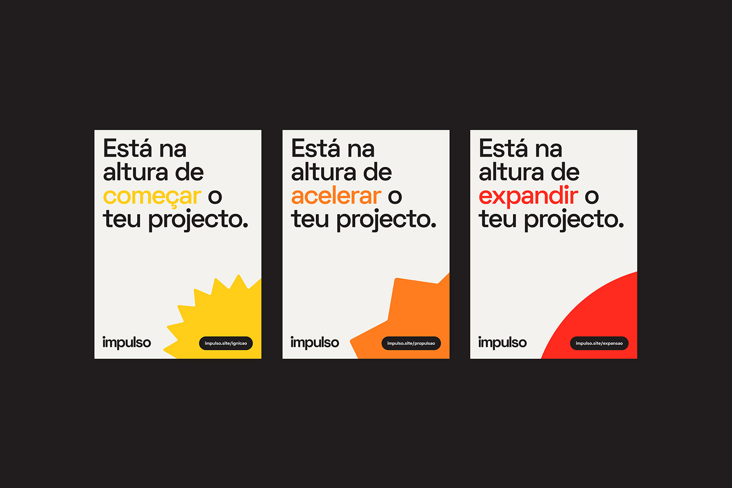
1-It needed to be human, energetic and playful. 2-It needed to showcase the program participants as the 'heros'. The entrepreneurs are the reason Impulso exists, they are key brand ambassadors. 3-It needed to be flexible enough to communicate the organisation as a whole but also their three core programs: Ignição (Ignition), Propulsão (Propulsion) and Expansão (Expansion). Each programme is aimed at entrepreneurs at different stages of development (Ignition for early stage businesses, Propulsion for businesses ripe for acceleration and Expansion for businesses ready for expansion)
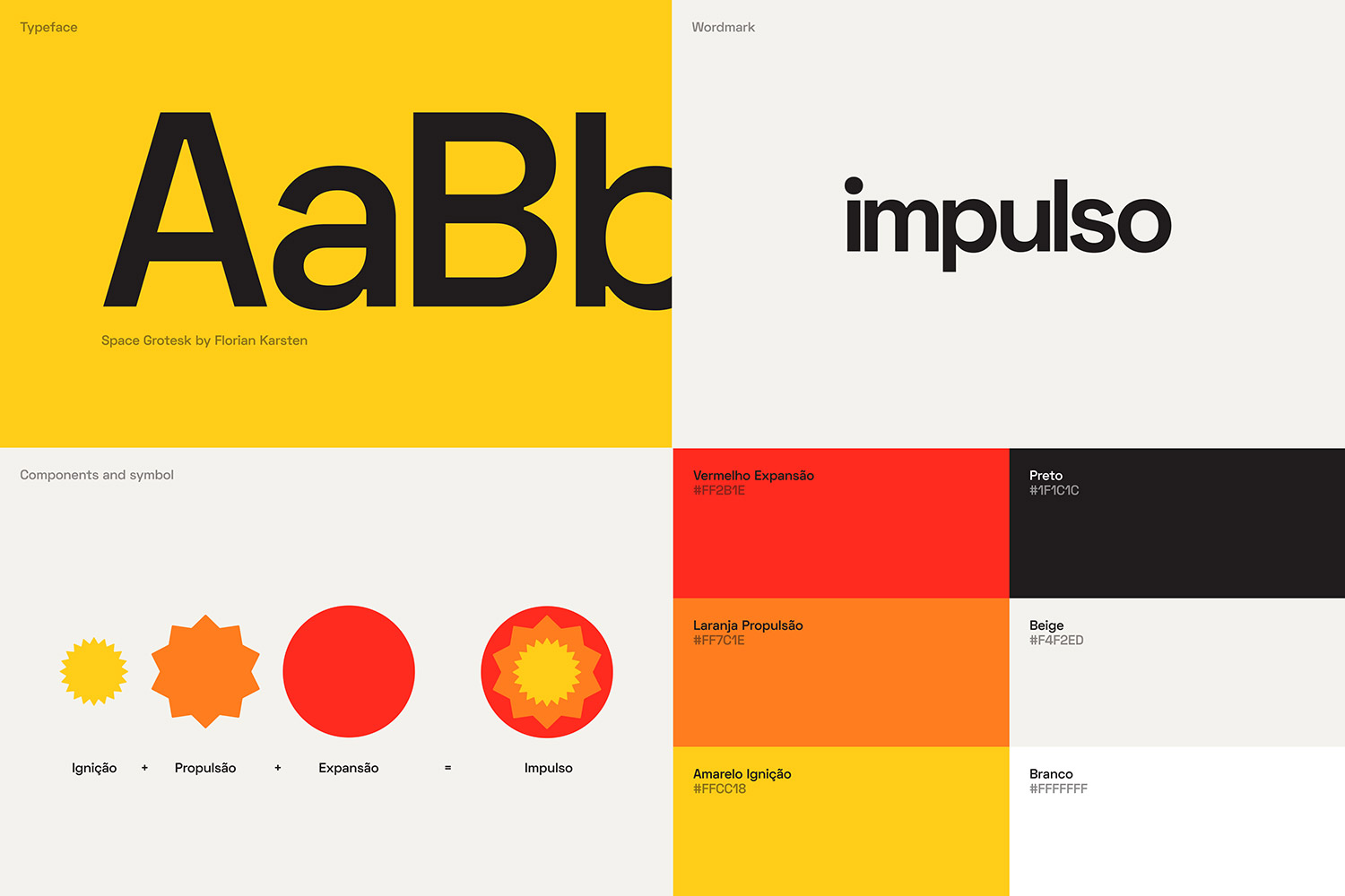
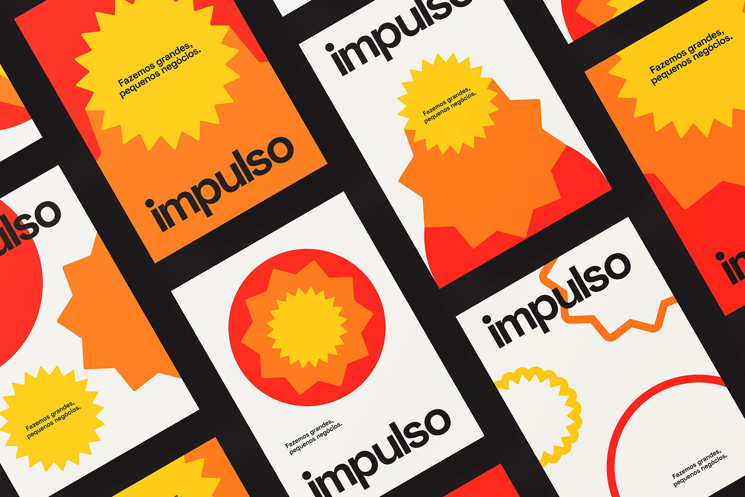
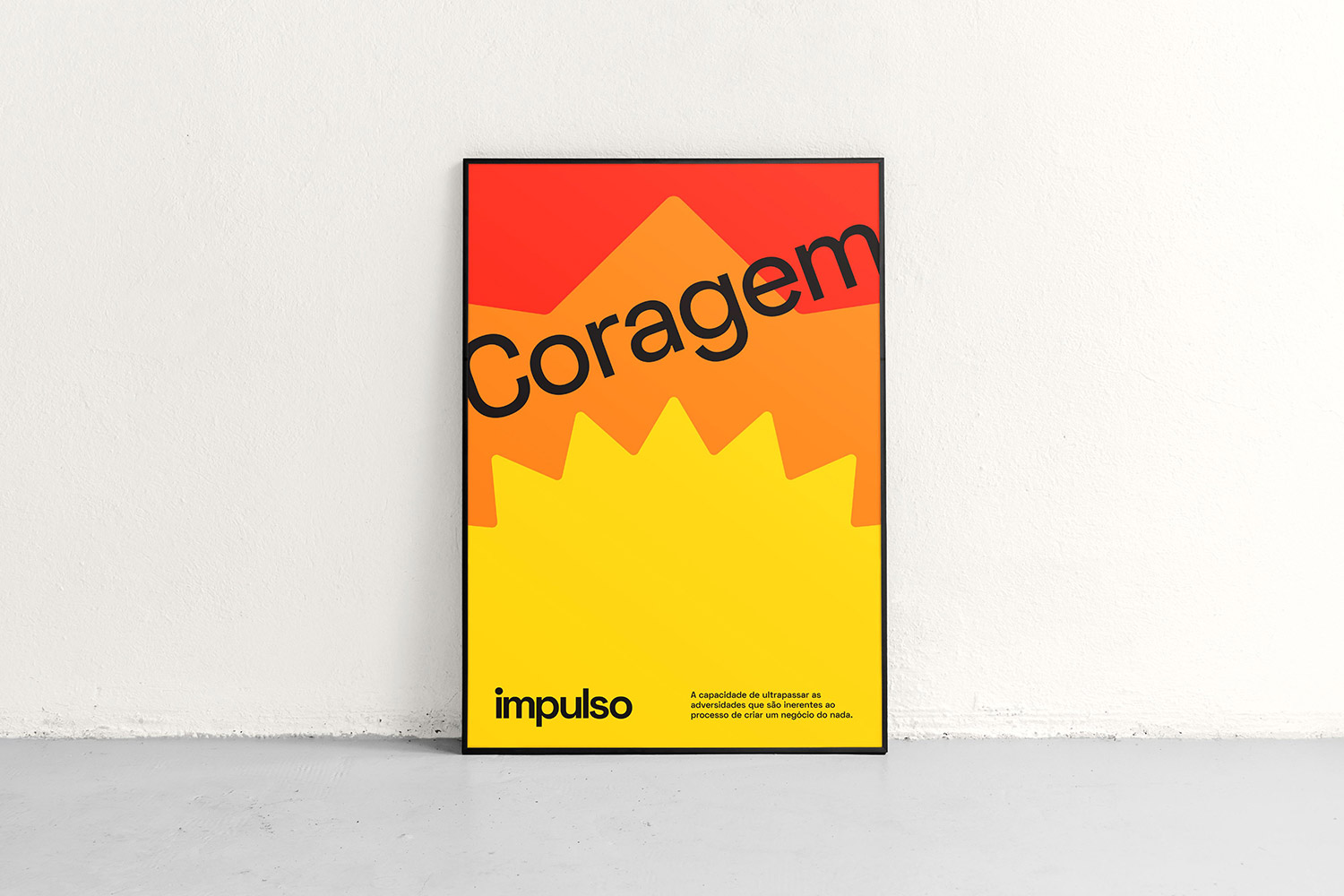
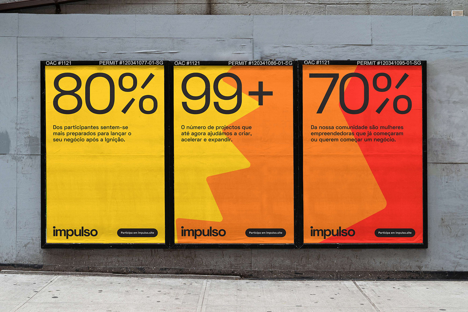
The proposed solution consists of a symbol made up of three shapes and three colours. Each shape and colour is used to communicate one of the three core programs:
1-Yellow Star for Ignição 2-Orange star for Propulsão and 3-Red circle for Expansão
The three shapes have different sizes which symbolise the journey of growth of an entrepreneur and, when together, convey a pulsating sense of energy.
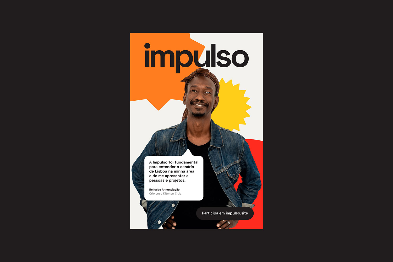
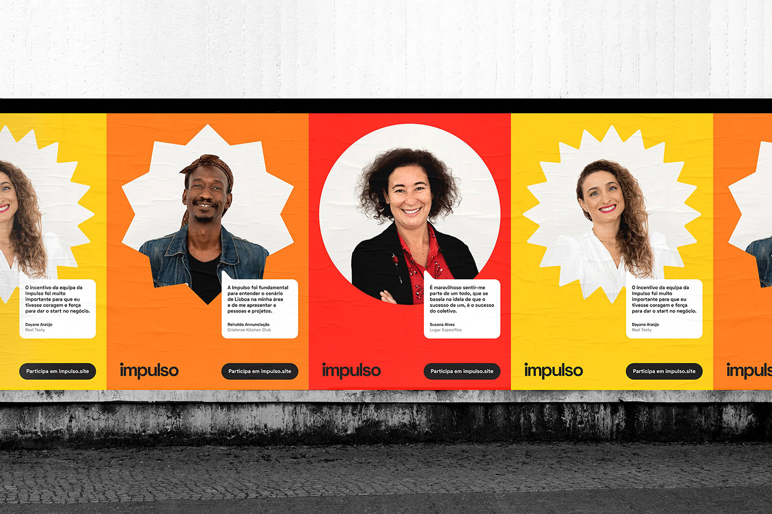
Heroing their diverse group of participants and the brand's experiences was a key aspect of the identity. Tessy Morelli shot the program entrepreneurs in a simple and honest manner which allowed for the usage of their portraits throughout the identity. This is especially important in Portugal as unfortunately there's still the misconception that entrepreneurship is not for everyone.
Additional information Typeface: Space Grotesk by Florian Karsten Clients: João Pedro Duarte & Frederica Cerqueira Photography: Tessy Morelli
Credits: Sam George