 Plus
Plus

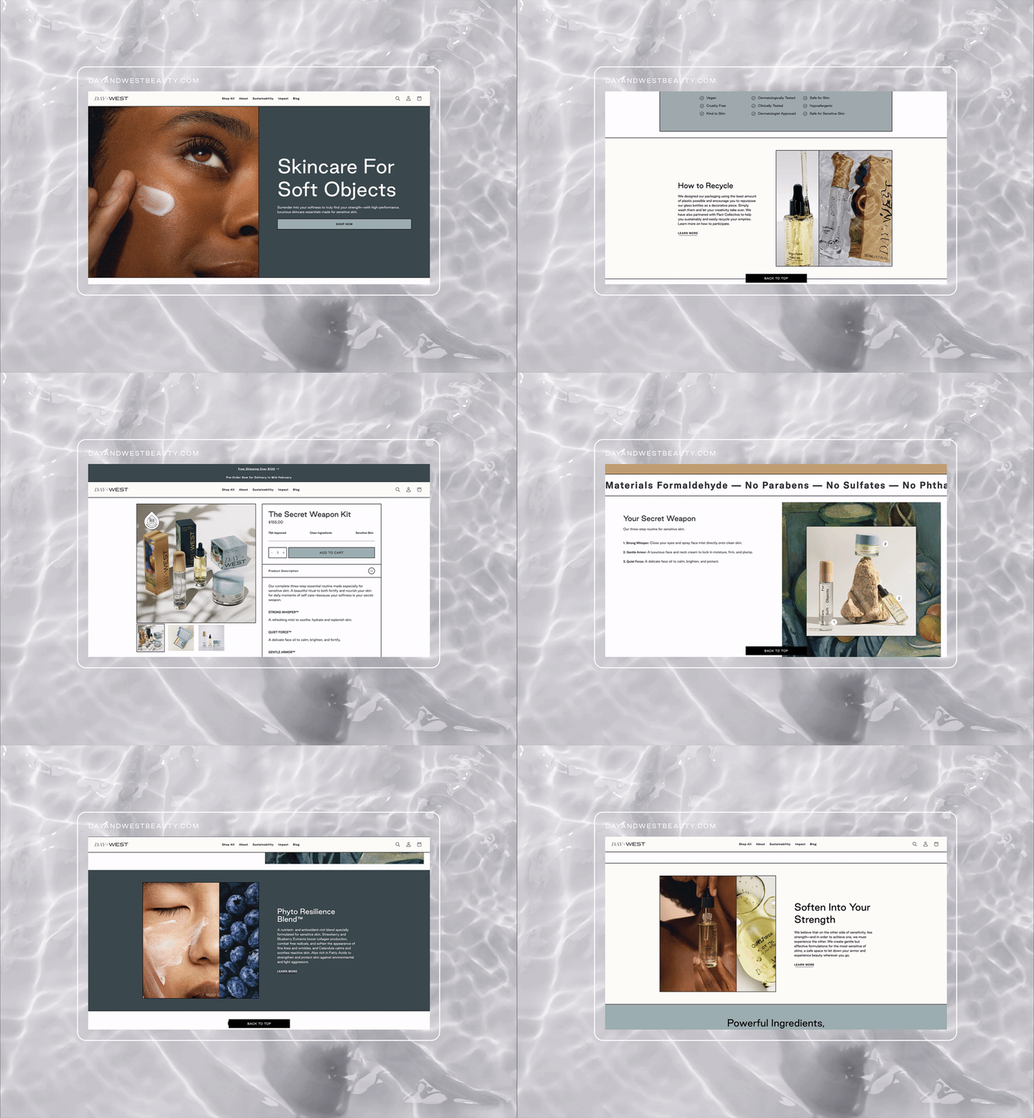
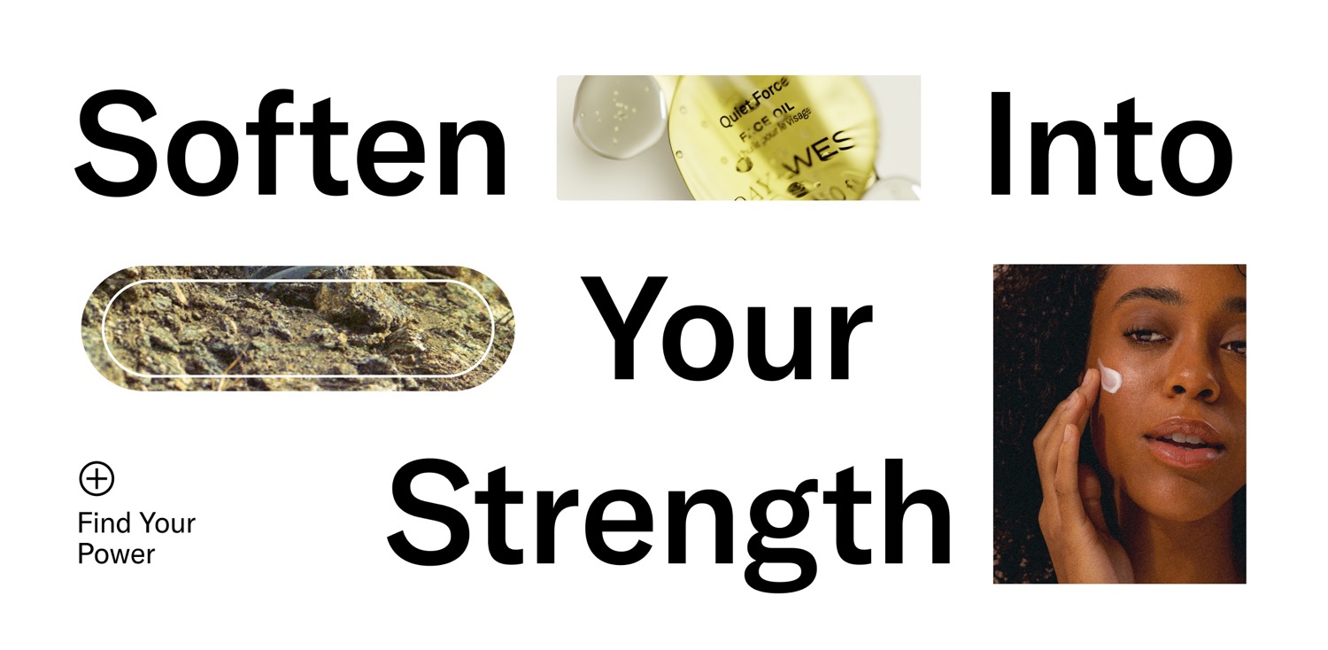
As anyone who has dealt with sensitive skin knows, skincare is an exhaustive daily battle against irritation. In too many cases, customers find solace in sterile, clinical formulations that feel anything but indulgent and continually remind them of their vulnerability in the world. Looking to shift perceptions of sensitive skin, turning softness into strength, Founder Gabrielle Braden partnered with branding and marketing agency SMAKK to create branding, website and more for new skincare brand Day+West.
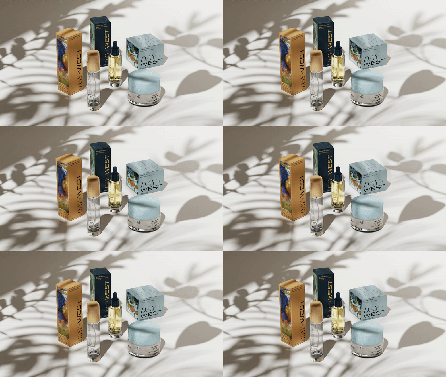
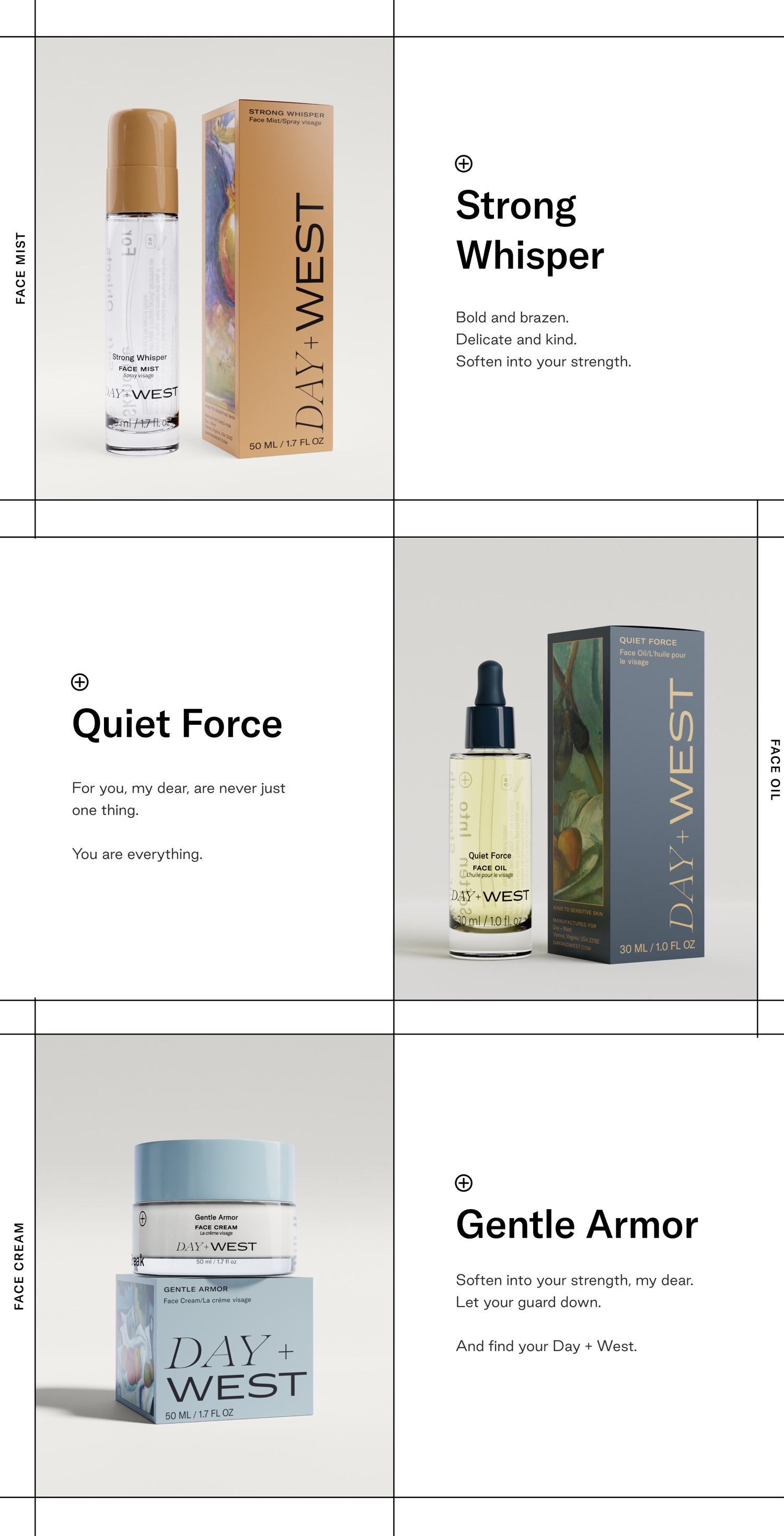
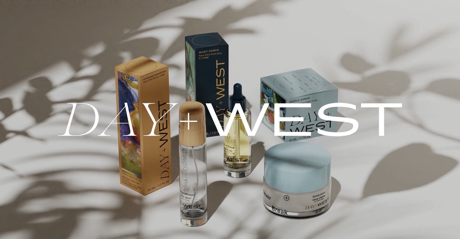
Conceptualized by a former federal agency vet, Day+West was inspired by Bradens personal experiences weathering long-haul flights to austere locales, dealing with stress and the toll it can take on skin. Born with remarkably reactive and highly sensitive skin, she spent her life in pursuit of solutions to soothe her easily-irritated, rosacea-prone cheeks, and indulge her passion for luxurious self-care. Working with chemists at a lab for over a year to formulate three clean, foundational skincare solutions, Braden then turned to SMAKK to build the Day+West brand everything from brand and DTC strategy, the creation of the new visual identity and packaging to messaging and copywriting as well as ecommerce design and development. The result is a pleasurable, empowering brand experience and products as beautiful on a bedroom (or hotel room) dresser as they are kind to skin. Day+West needed to feel premium and indulgent while also earning credibility with customers that have sensitive skin, explains SMAKK Founder Katie Klencheski. More of a poetic experience than a straightforward brand, it needed to avoid the mass market feel of most sensitive skin solutions and invite consumers to have a moment of beauty, surrender and self-care wherever they are in the day and in the world.
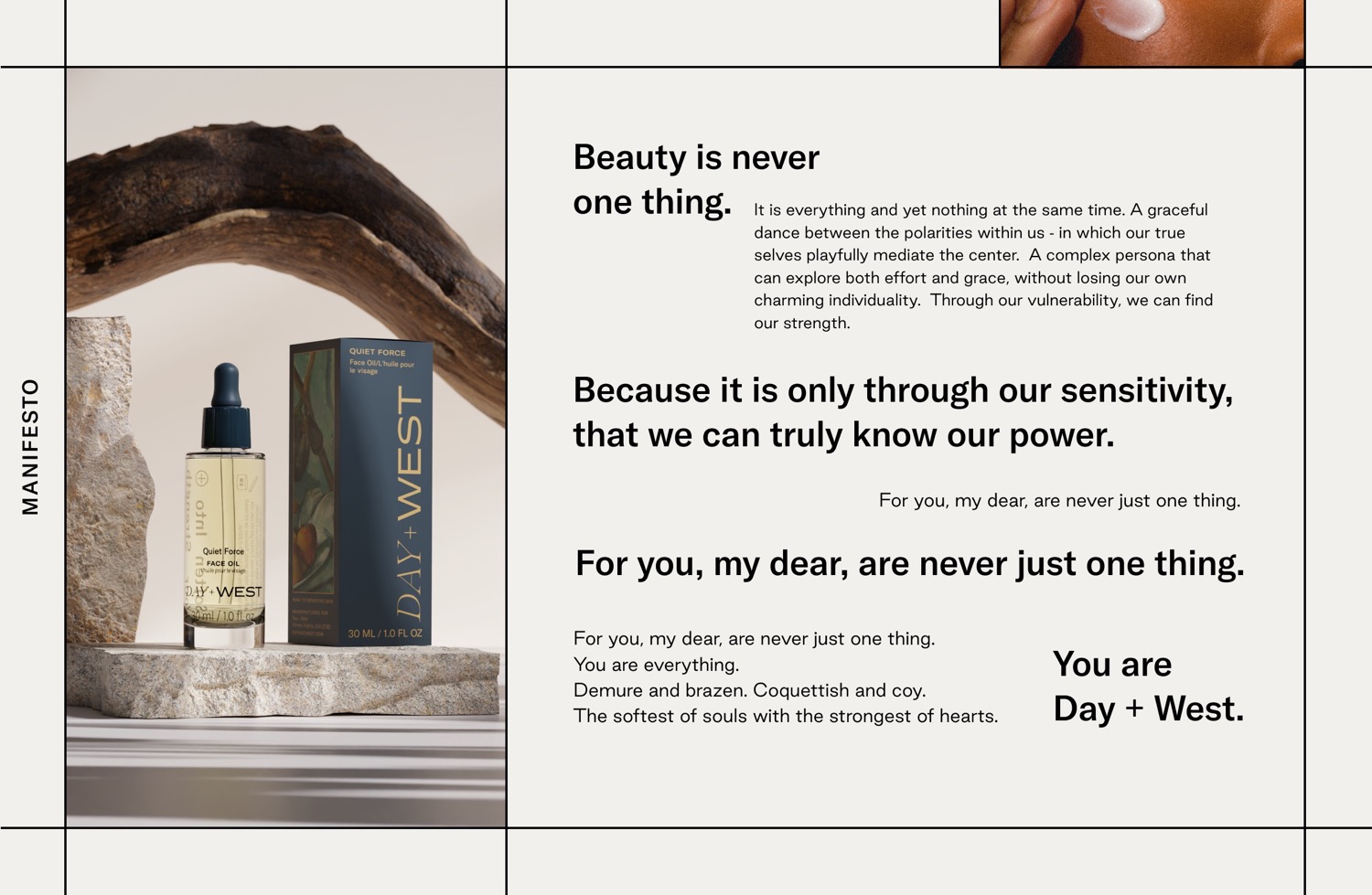
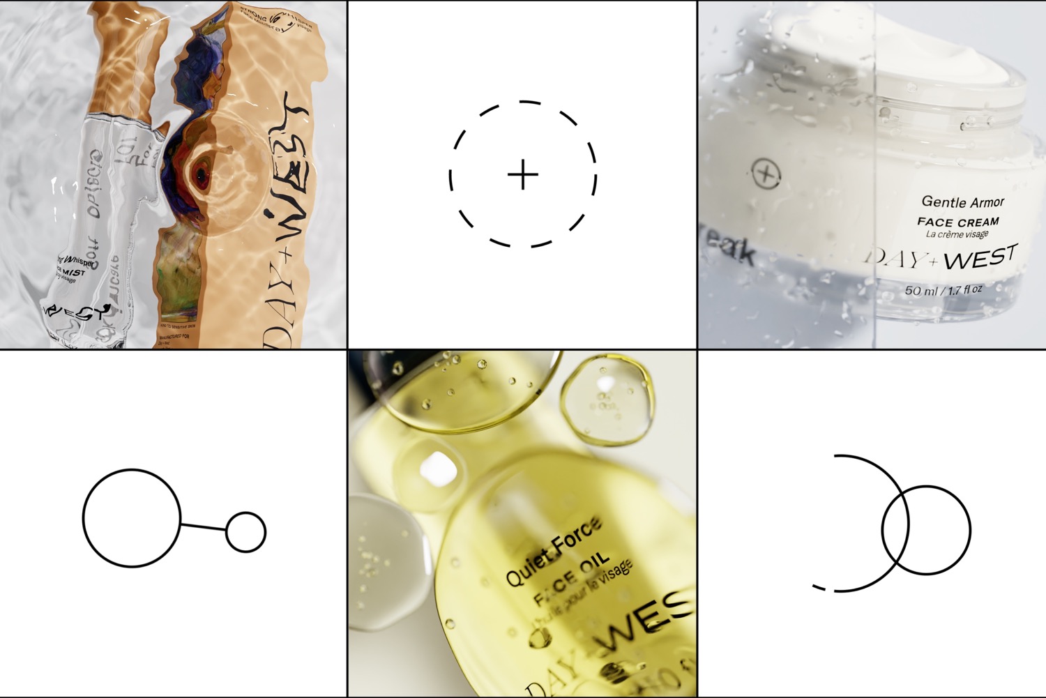
This meant rethinking each brand touchpoint with a similarly empathetic respect for sensitivity and the wellbeing of its customers. Beginning with the name Day+West (a reference to legendary actresses Doris Day and Mae West), SMAKK embraced these very different embodiments of beauty - suggesting that customers can be both demure and brazen, coquettish and coy. This became a thematic cornerstone, reflected in the serif and san-serif logo, visual juxtapositions, messaging like Gentle formulas for powerful souls, and elsewhere throughout the brand. We really leaned into the idea of polarities for the brand, adds SMAKK CMO Anna Kavaliunas. This meant reinforcing how our weaknesses are actually our biggest strengths and how balance is never a fixed point, but rather a graceful dance between the polarities that live within us. We are never just one thing, but we are actually everything, mediating between them.
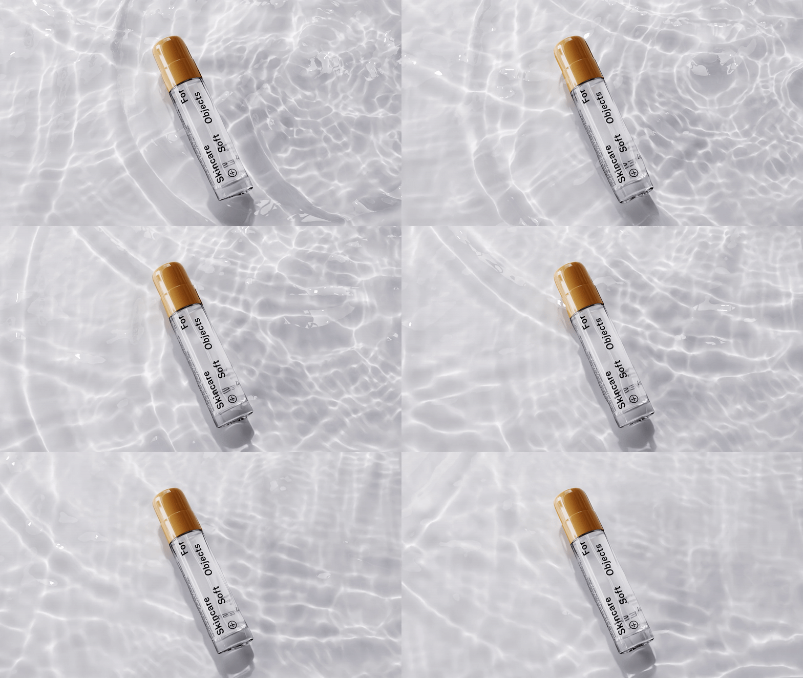
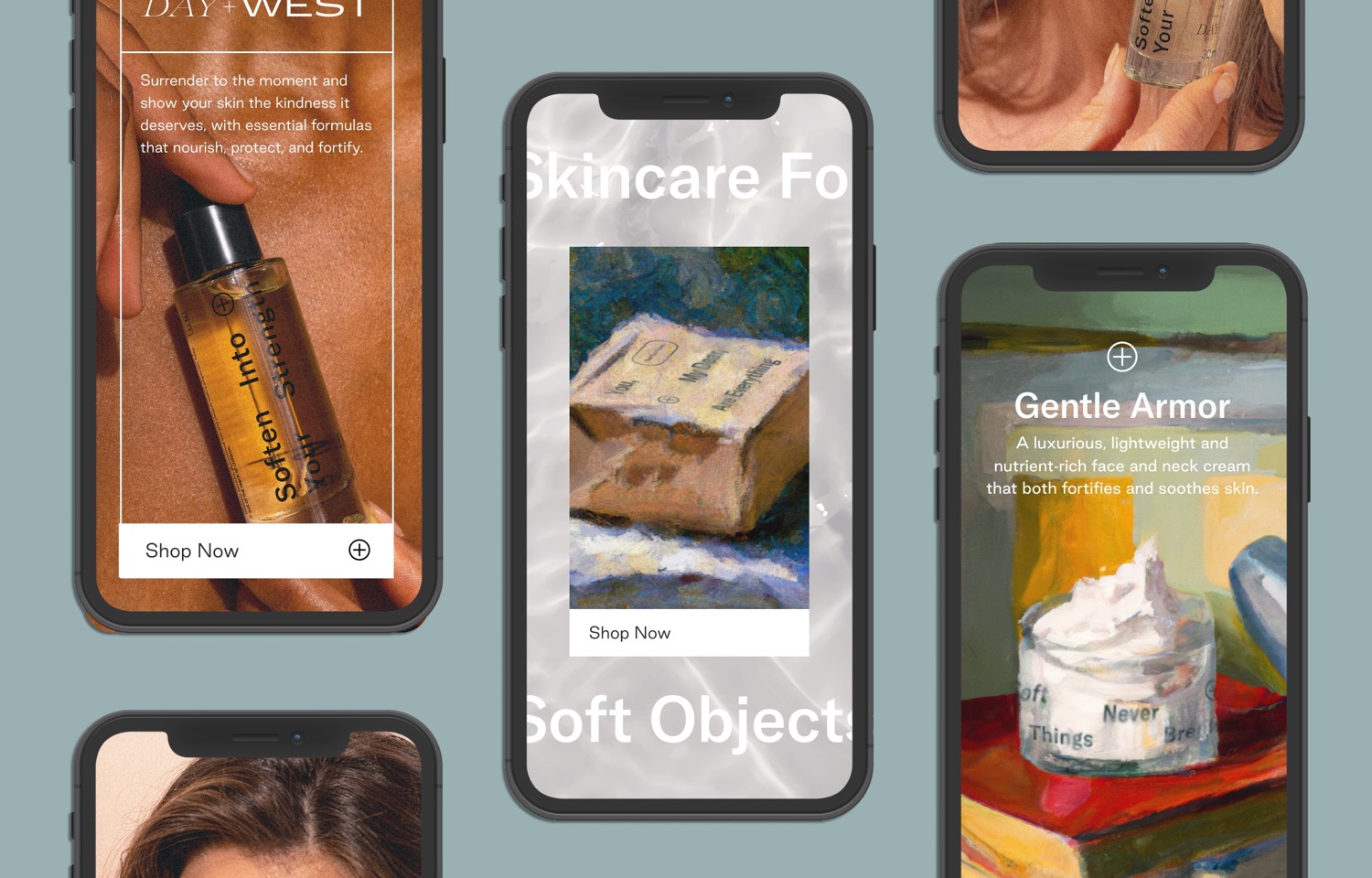
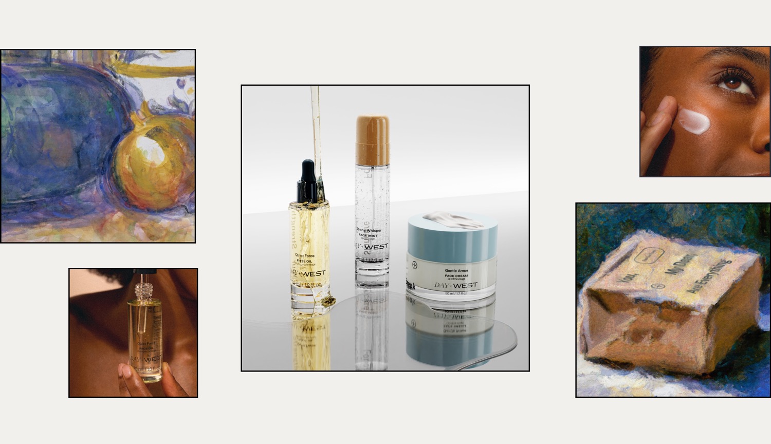
SMAKK also worked to surface the artistry and beauty at Day+Wests core using a series of oil paintings as the backdrop for many of its visuals. The colors and textures in the paintings created sensorial, tactile moments that made the world of the brand feel richer and more ethereal. Sustainability was also a primary concern, leading SMAKK to leverage their expertise to not only ensure that shipping containers and glass packaging were both made of recycled materials and easily recyclable, but also took into account proximity of materials to cut down on carbon emissions. Even the plastic applicators and caps were made of recycled plastic and meant to be reused with future purchases.
Credits: SMAKK
