Plus
Plus

 Menu
Menu


Yuri Narvin
November 05, 2018
Mindsparkle Mag


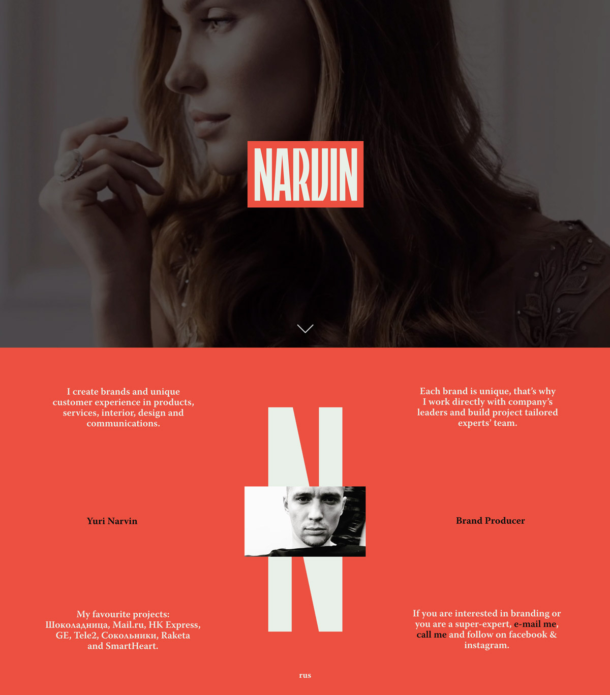
Yuri Narvin casts his brand-producer portfolio in a single, arresting shade of coral red, and that commitment to one colour is what makes it sing. A cinematic hero portrait dissolves into a bold NARVIN wordmark, then hands over to elegant high-contrast serif type that lays out his approach in two neat columns. A giant ghosted “N” holds the centre, with a cropped black-and-white self-portrait tucked into its crossbar — a clever, understated bit of self-branding. The tone is personal and direct: “I create brands and unique customer experience,” it says, nodding to work for the likes of Mail.ru and Tele2. It is a striking, editorial-feeling study in restraint and confident typography put to the service of branding.
Credits: Yuri Narvin
More in Design Agency
Includes freebie bundle, unseen BTS insights and more.