Plus
Plus

 Menu
Menu


Waste Not
October 10, 2020
Mindsparkle Mag


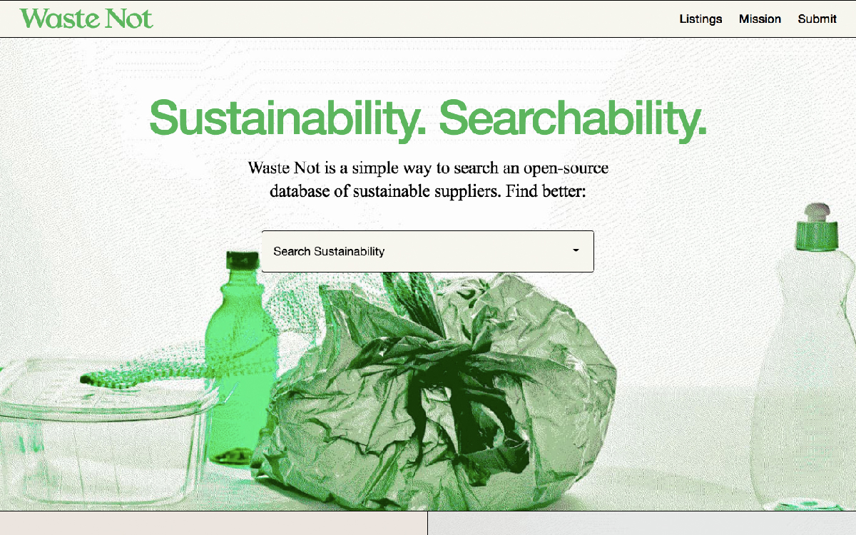
Waste Not pairs purpose with polish, opening on a cream canvas and a green duotone still life of plastic packaging that quietly states its theme. A crisp green serif wordmark and the punchy line “Sustainability. Searchability.” introduce an open-source database of sustainable suppliers, complete with a prominent search field. The tight two-colour palette and clean editorial layout keep the tool feeling approachable and trustworthy. It is a considered, mission-led example of web design that leans on confident typography.
Credits: Waste Not
More in Design Agency
Includes freebie bundle, unseen BTS insights and more.