Plus
Plus

 Menu
Menu


Frans Hulet
April 08, 2021
Mindsparkle Mag


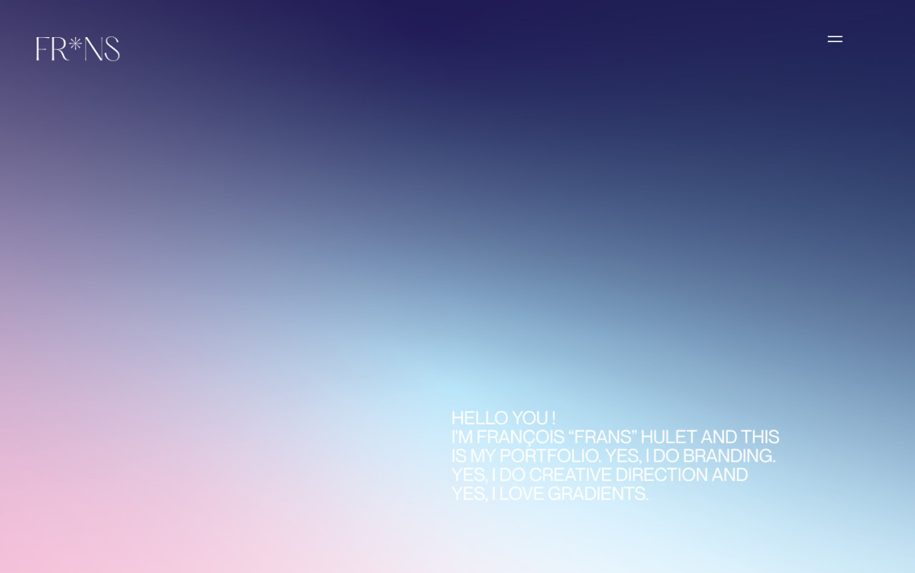
Belgian creative Frans Hulet opens his portfolio with exactly what he promises to love: a soft, luminous gradient that melts from deep midnight blue into blush pink and pale cyan. The minimal ‘FR*NS’ wordmark sits quietly in the corner while a friendly, all-caps introduction welcomes visitors with disarming warmth. There is a lovely restraint here, letting colour and light do the talking against generous negative space. The dreamy palette and clean typography set an elegant, contemporary tone for the branding and creative direction work that follows. It is a beautifully understated exercise in web design and art direction.
Credits: Frans Hulet
More in Portfolio
Includes freebie bundle, unseen BTS insights and more.