Plus
Plus

 Menu
Menu


Toby Grubb
April 18, 2017
Mindsparkle Mag


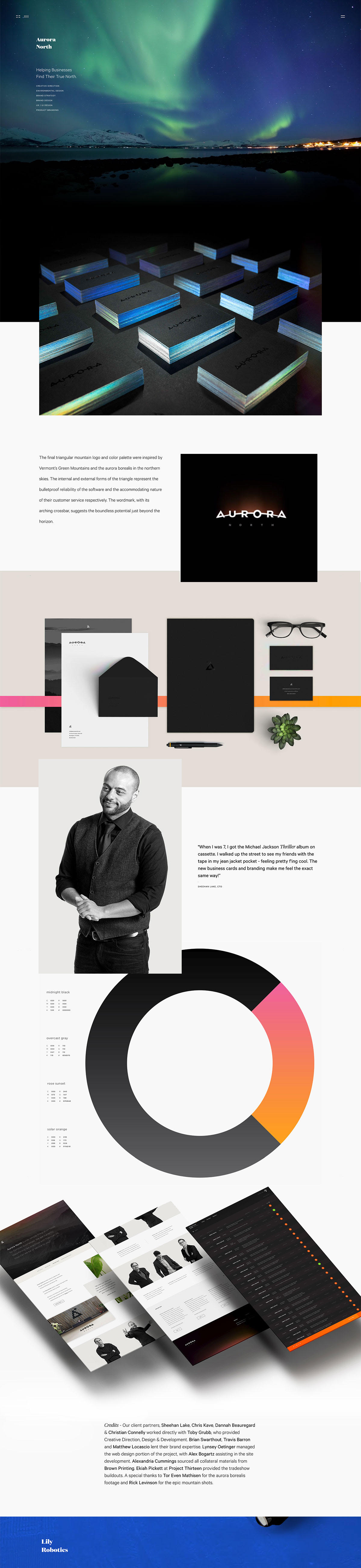
Toby Grubb crafted this striking portfolio piece under his studio This. design, presenting the Aurora North identity as a cinematic scroll. The project opens on a dark, star-flecked aurora borealis photograph before revealing a crisp triangular wordmark inspired by the northern skies. Holographic-edged business cards, muted stationery threaded with pink and orange accent lines, and a smooth gradient donut chart of the colour palette give the case study a polished, considered rhythm. It is a confident example of branding and web design presented with real care for detail.
Credits: Toby Grubb
More in Minimal Branding
Stay on top of this week's design. Insights, top picks & more.