Plus

 Menu


Studio DOT
October 05, 2016
Mindsparkle Mag


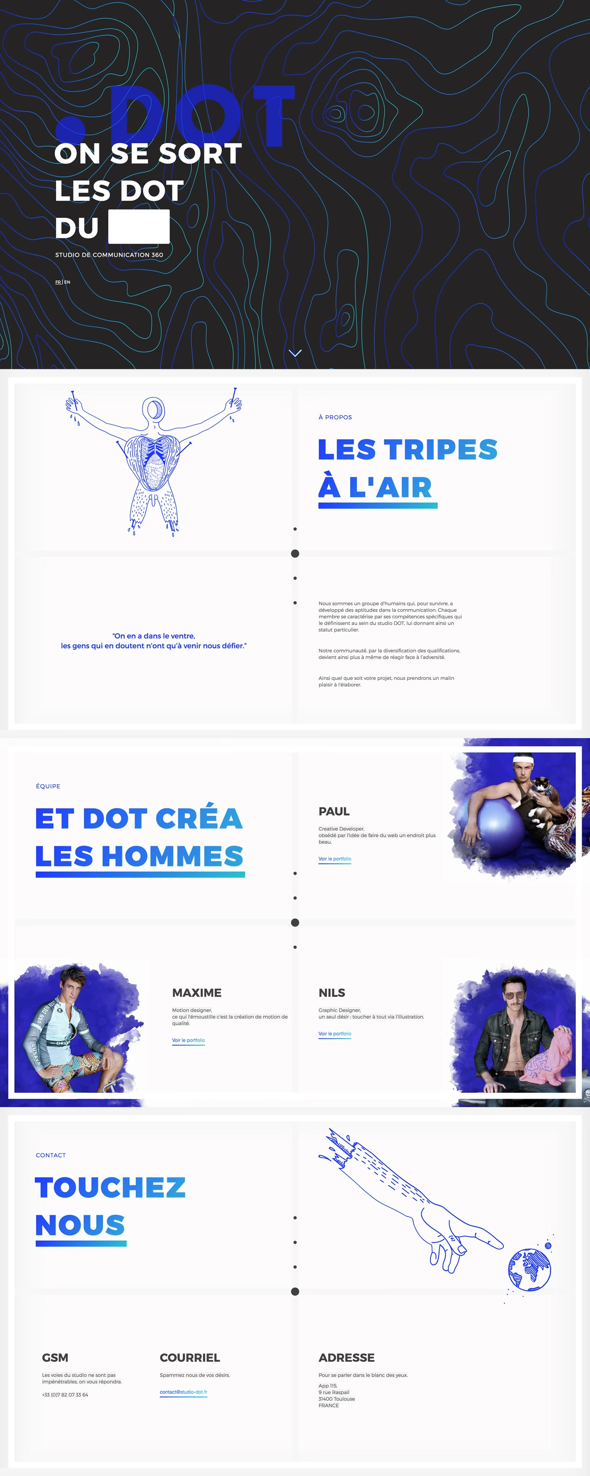
Studio DOT is a French communication studio out of Toulouse, and their website leans all the way into cheeky personality. A dark hero patterned with electric-blue topographic contour lines carries a bold “.DOT” logo and a playful French wordplay headline, with a FR/EN toggle tucked underneath. Scrolling reveals crisp white sections punctuated by irreverent blue line illustration and watercolour-cutout team portraits that give each member a mischievous edge. The electric-blue-on-white palette stays consistent throughout, tying the humour to a confident visual system. It is a bold, characterful slice of web design that clearly enjoys itself.
Credits: Studio DOT
More in Beauty Branding
Includes freebie bundle, unseen BTS insights and more.