Plus

 Menu


Sourcy
June 02, 2017
Mindsparkle Mag


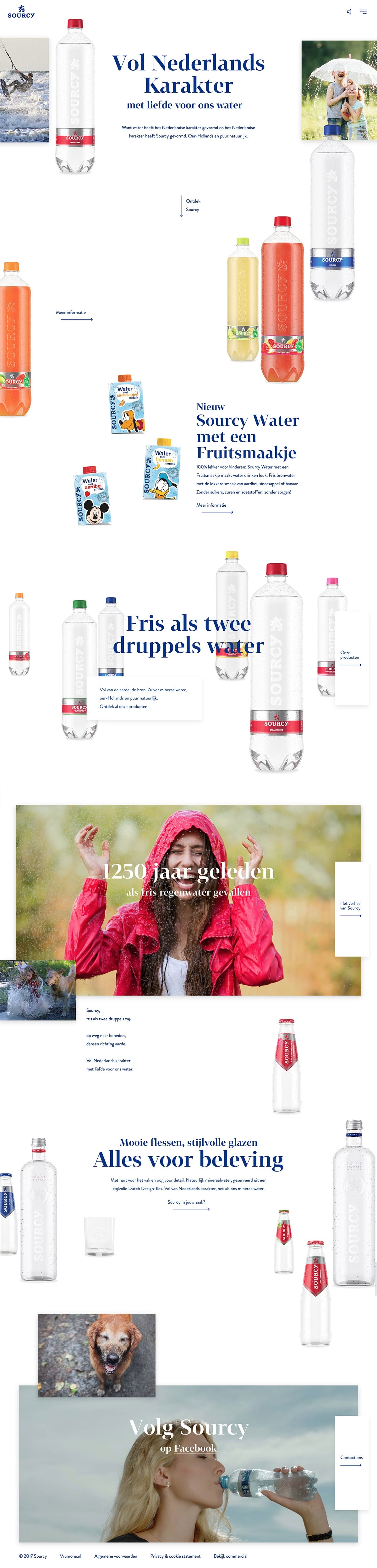
Sourcy presents its Dutch mineral-water brand through a bright, playful site where bottles seem to float freely across a crisp white canvas. Elegant blue serif headlines like “Vol Nederlands Karakter” anchor an airy, scattered layout that feels light and refreshing, echoing the product itself. Cheerful lifestyle photography — a girl laughing in the rain, a dog mid-splash — mixes with colourful fruit-water variants and character-branded packs to keep the scroll lively. The generous white space and staggered product shots invite an interactive sense of discovery as you explore sourcy.nl. It is clean, upbeat web design that makes a simple bottle of water feel genuinely joyful.
Stay on top of this week's design. Insights, top picks & more.