Plus
Plus

 Menu
Menu


Sea Change Studio
April 12, 2017
Mindsparkle Mag


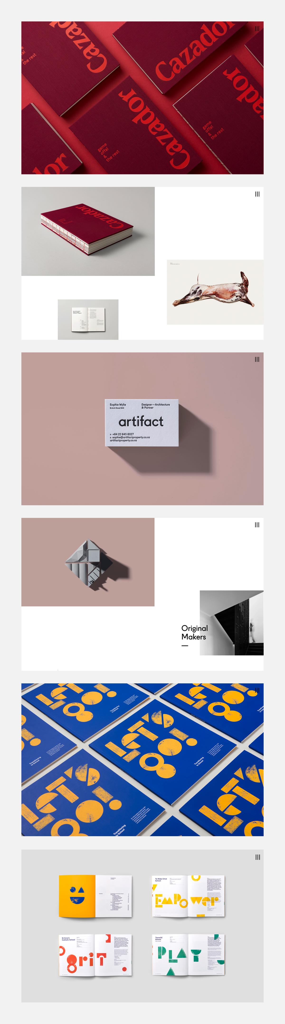
Sea Change Studio fills its portfolio with bold, print-led work that practically leaps off the screen. Deep red Cazador booklets play with reversed and rotated lettering, crisp “artifact” business cards cast long shadows, and electric blue posters break the alphabet into chunky geometric shapes. School brochures in sunny yellow and cobalt spell out words like Empower, Spirit and Play, all tracked with tidy roman-numeral markers. The studio’s command of typography and confident branding comes through on every frame. See the full body of work at seachange.studio.
Credits: Sea Change Studio
More in Minimal Branding
Includes freebie bundle, unseen BTS insights and more.