Plus
Plus

 Menu
Menu


Schoener + Semplice
July 09, 2018
Mindsparkle Mag


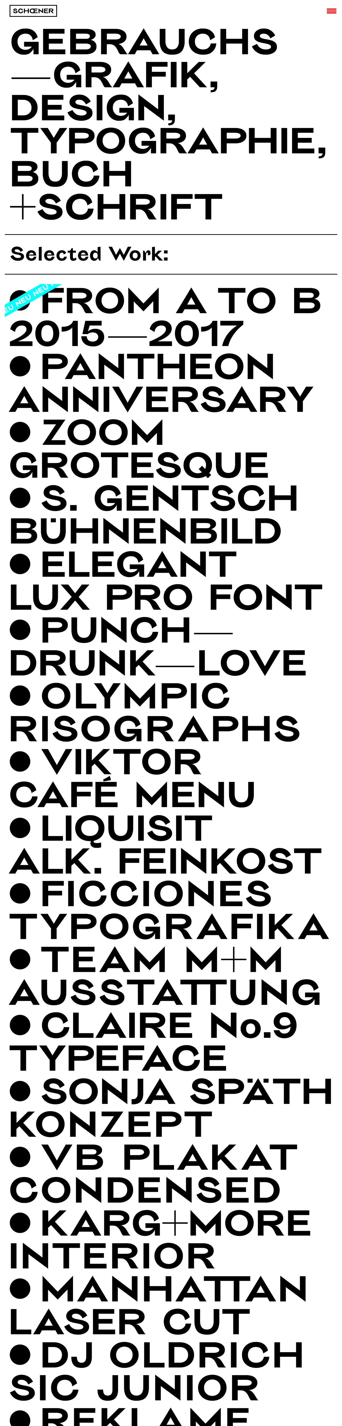
Schoener makes its case through pure typographic force in this stark, Swiss-flavoured portfolio. The page is almost entirely black-and-white: a compact 'SCHŒNER' wordmark and a single red menu bar sit above a wall of enormous display capitals reading 'Gebrauchsgrafik, Design, Typographie, Buch + Schrift'. Beneath a simple 'Selected Work:' heading, projects scroll as a bulleted list — From A to B, Zoom Grotesque, Elegant Lux Pro Font, Olympic Risographs — each set in the same commanding grotesque. There is no imagery competing for attention; the letters themselves are the design. It is a bold, uncompromising study in typography and type design.
Credits: Schoener + Semplice
More in Design Agency
Includes freebie bundle, unseen BTS insights and more.