Plus

 Menu


Postevand
February 04, 2017
Mindsparkle Mag


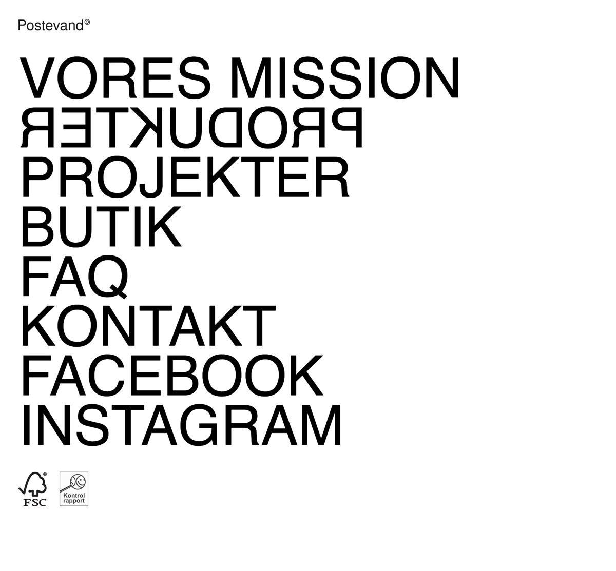
Postevand makes a bold statement with a homepage stripped back to almost nothing but words. Oversized black sans-serif navigation — Vores Mission, Produkter, Projekter, Butik — stacks down a bright white page, with one line playfully mirrored to keep the eye moving. The restraint is total: no imagery beyond the small FSC and Kontrolrapport marks in the corner, which quietly signal the brand's sustainable ethos. It is a confident exercise in typography and minimalist web design where the type carries the entire experience. You can explore the full project at Postevand.
Credits: Postevand
More in Web Design
Stay on top of this week's design. Insights, top picks & more.