

Black Friday 50% off Plus
Unlock InsightsBlack Friday 50% off Plus
Unlock Insights Menu


William Lyall
August 23, 2018
Mindsparkle Mag


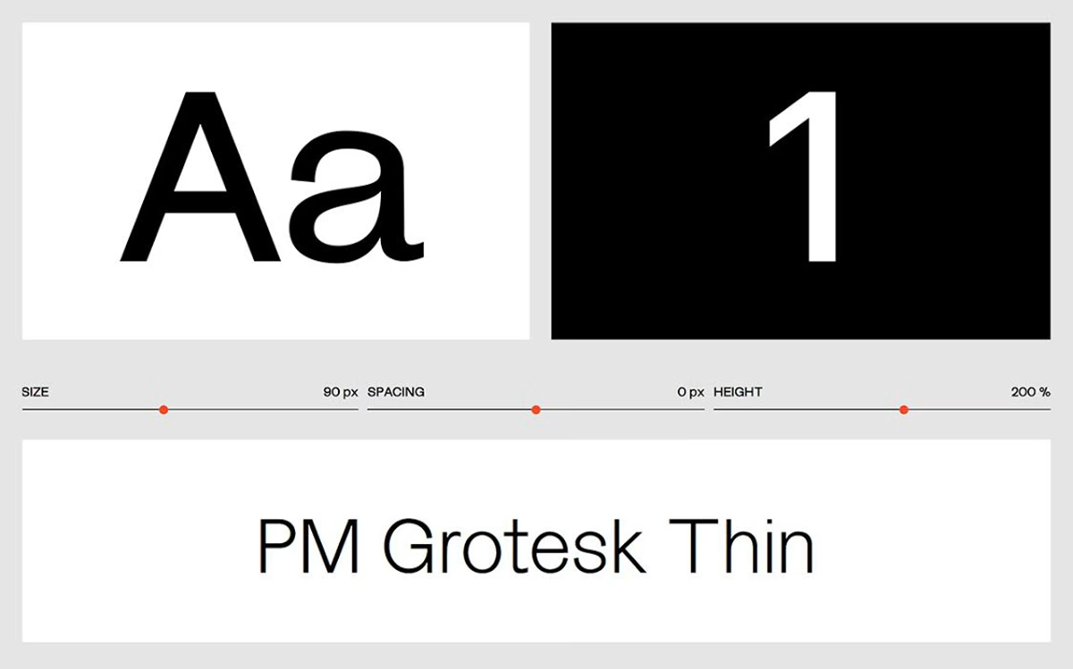
William Lyall showcases his typeface PM Grotesk through a clean, interactive specimen site built entirely around the letterforms. Large Aa and numeral glyphs sit in crisp black-and-white panels, inviting visitors to test the type at a glance. A neat row of sliders for size, spacing and line-height turns the page into a live playground, letting the grotesk be pushed and pulled in real time. Set on a calm neutral-grey background, the minimal interface steps back so the typeface — here shown in an elegant thin weight — can speak for itself. It is a focused, well-judged piece of type design and interactive typography.
Credits: William Lyall
More in Fonts
Stay on top of this week's design. Insights, top picks & more.
 Plus