Plus
Plus

 Menu
Menu


PINE
July 24, 2021
Mindsparkle Mag


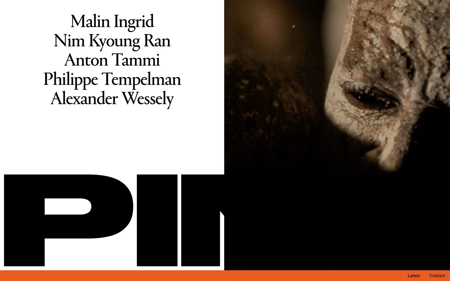
PINE presents its roster of directors through bold, uncompromising typography and a striking split layout. On the left, names like Malin Ingrid, Anton Tammi and Alexander Wessely are set in a graceful serif, while a colossal black “PINE” wordmark anchors the lower half in heavy sans-serif. The right side holds a dark, cinematic film still — a weathered, dust-caked face — hinting at the calibre of the work within, all underlined by a single bright orange bar. The contrast between refined serif detail and brute display type gives the page real editorial tension. Visit PINE for a directors’ showcase whose sharp art direction makes a strong first impression.
Credits: PINE
More in Playful Branding
Includes freebie bundle, unseen BTS insights and more.