Plus

 Menu


Bureau Collective
July 18, 2016
Mindsparkle Mag


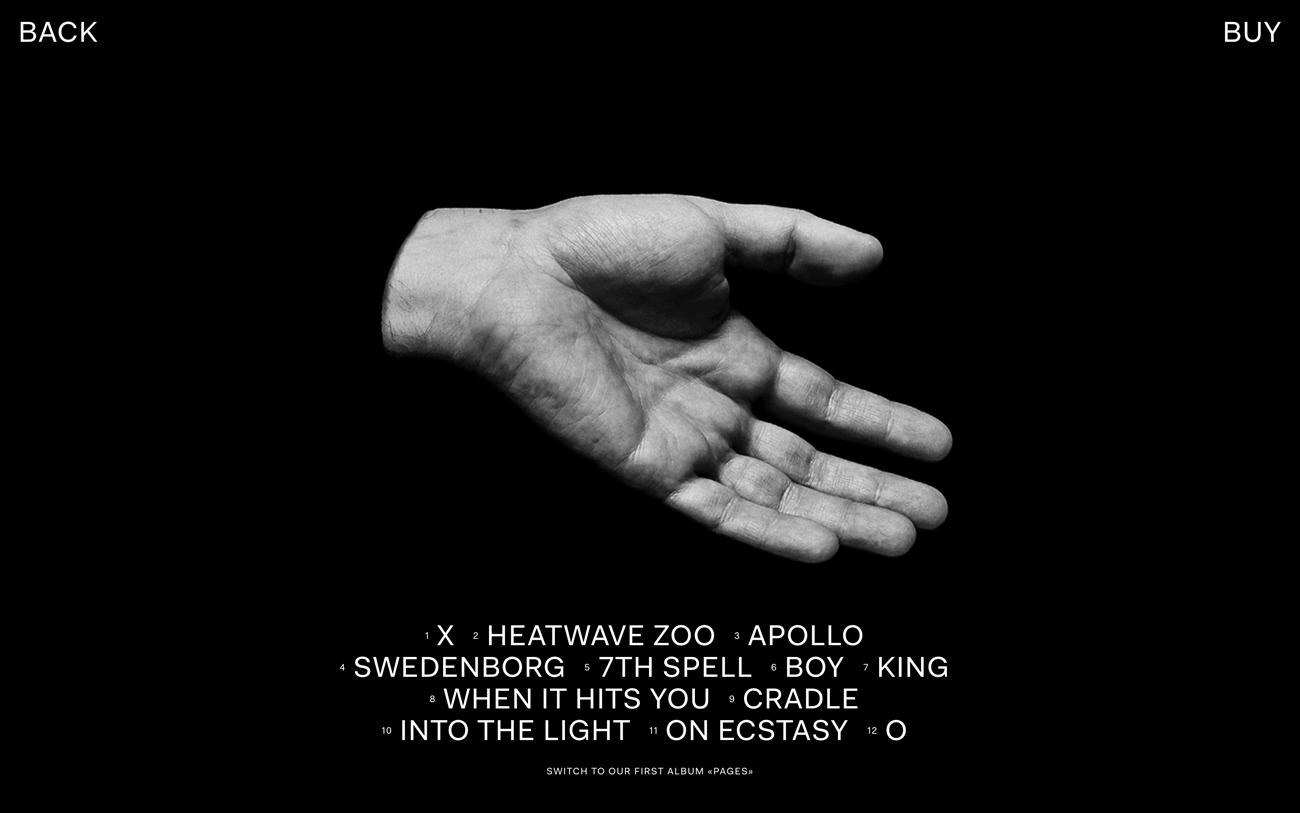
Swiss studio Bureau Collective brings a stark, gallery-like calm to this album site for Kalte Hand's "Natasha Waters". Against a deep black backdrop, a single black-and-white photograph of an open, outstretched hand anchors the screen, framed only by minimal "BACK" and "BUY" labels in the top corners. The full tracklist sits beneath in a clean, numbered sans-serif grid, turning song titles like "Heatwave Zoo" and "Into the Light" into their own quiet typographic composition. Everything is reduced to image and text, giving the record a serious, almost editorial presence. It's a beautifully spare piece of web design that lets confident typography set the entire mood.
Credits: Bureau Collective
More in Music Branding
Stay on top of this week's design. Insights, top picks & more.