Plus
Plus

 Menu
Menu


JuLee
August 26, 2020
Mindsparkle Mag


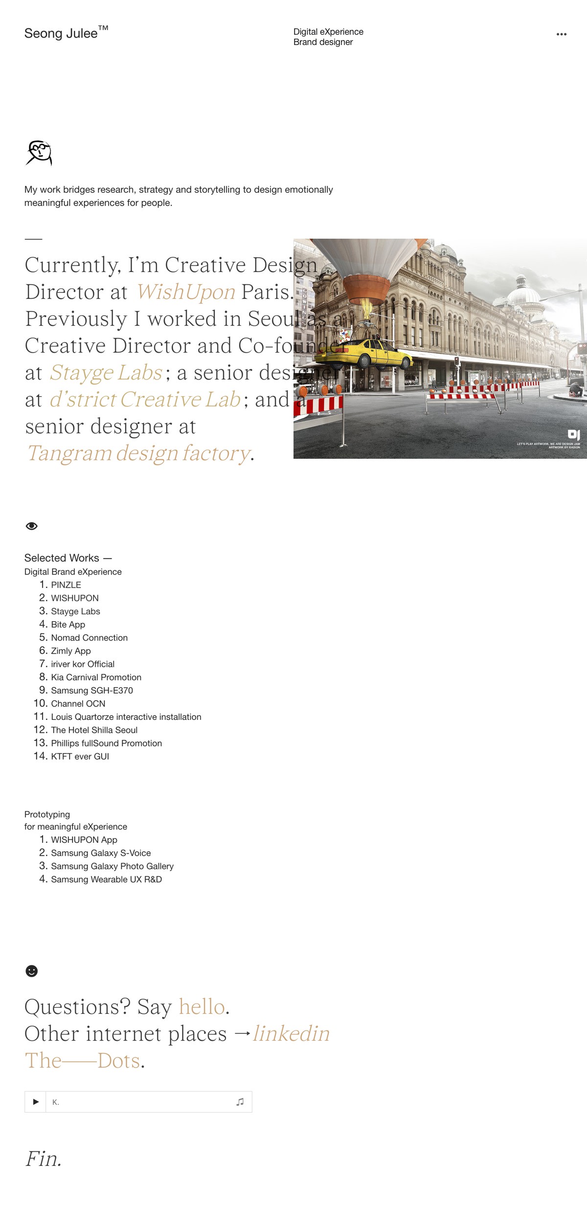
JuLee, the portfolio of Seong Julee, opts for a stripped-back, typographic layout that reads like a personal essay. The single-column page sets an elegant serif against generous white space, threading a career narrative through mentions of Paris, Seoul and studios like Stayge Labs and Tangram, punctuated by a single surreal image of a balloon-lifted taxi. Numbered Selected Works lists and a quiet closing Fin give the composition a literary, unhurried rhythm that puts words and hierarchy first. It is refreshingly restrained, trusting type and structure to carry the story. The result is a thoughtful study in typography and web design.
Credits: JuLee
Includes freebie bundle, unseen BTS insights and more.