Plus
Plus

 Menu
Menu


Gláuber Sampaio
August 13, 2018
Mindsparkle Mag


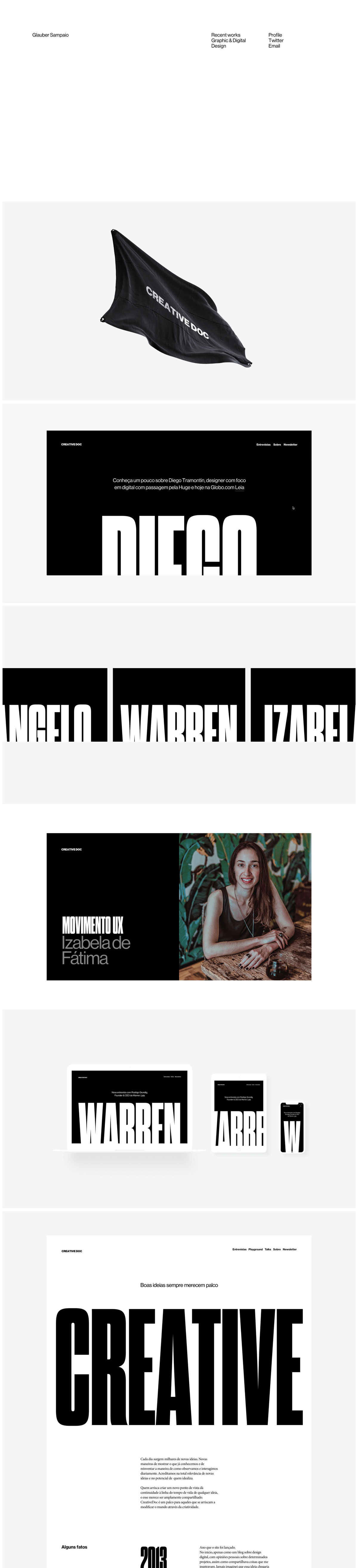
The portfolio of Gláuber Sampaio is a confident, typography-led affair that lets heavyweight lettering carry the whole show. On glaubersampaio.com, crisp white pages are punctuated by enormous condensed black display type, spelling out names like Diego, Warren and Izabela at full bleed. His “Creative Doc” case study runs from a black flag emblazoned with the wordmark through responsive device mockups to a bold “Movimento UX” portrait section, giving a clear sense of a digital designer at ease with both interface and identity. The pacing is generous and the contrast striking. It is a punchy study in typography and UI/UX web design.
Credits: Gláuber Sampaio
More in Design Agency
Stay on top of this week's design. Insights, top picks & more.