Plus
Plus

 Menu
Menu


V-A Studio
August 06, 2021
Mindsparkle Mag


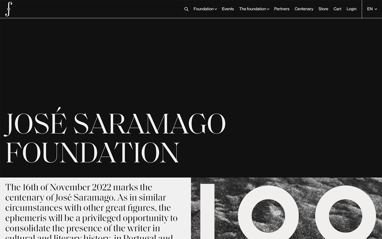
V-A Studio gives the José Saramago Foundation a refined, literary presence rooted in beautiful typography. A deep black canvas lets an elegant white serif spell out the foundation’s name at generous scale, with a graceful “f” monogram and a tidy horizontal navigation completing the masthead. A pale text panel introduces the centenary of the Nobel laureate’s birth, set against a grainy black-and-white “100” image that adds a tactile, editorial quality. The monochrome palette and considered type give the site the gravitas its subject deserves without ever feeling austere. It is a dignified piece of editorial typography for a cultural institution.
Credits: V-A Studio
More in Business & Corporate
Stay on top of this week's design. Insights, top picks & more.