Plus
Plus

 Menu
Menu


Elliot Midson
January 22, 2019
Mindsparkle Mag


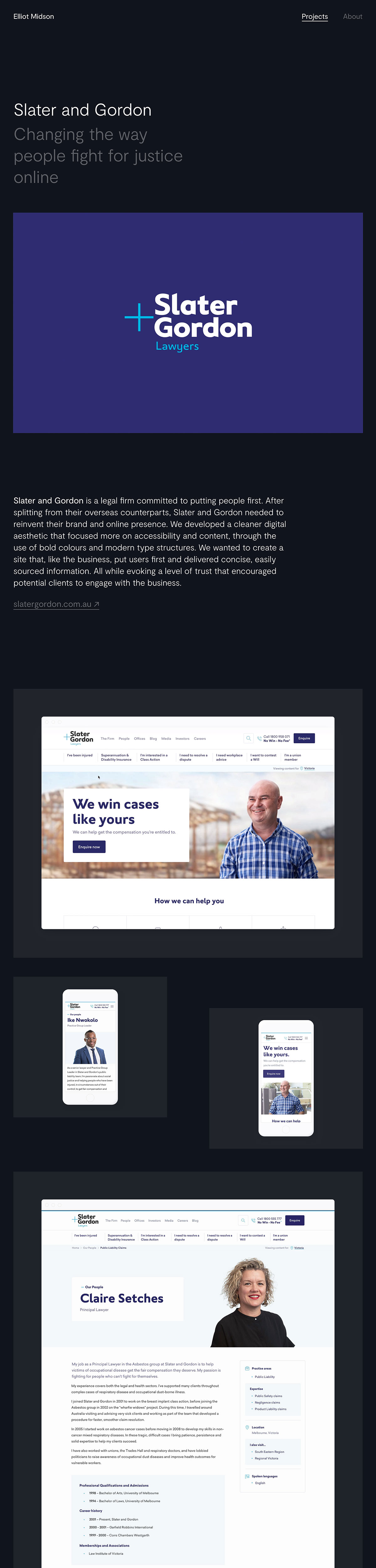
Elliot Midson sets a calm, confident tone across this portfolio, framing each project on a deep near-black canvas with generous space and quietly elegant typography. The featured Slater and Gordon case study opens with a bold violet brand panel before unfolding into crisp desktop and mobile mockups that celebrate a cleaner, more accessible digital presence. Everything feels considered and unhurried, with restrained navigation and soft grey captions that keep attention squarely on the work. It is a polished, trustworthy showcase that mirrors the very qualities the projects set out to convey. Explore more of this refined portfolio web design and considered branding at elliotmidson.com.
Credits: Elliot Midson
More in Minimal Branding
Includes freebie bundle, unseen BTS insights and more.