Plus
Plus

 Menu
Menu


Garden Eight
July 02, 2021
Mindsparkle Mag


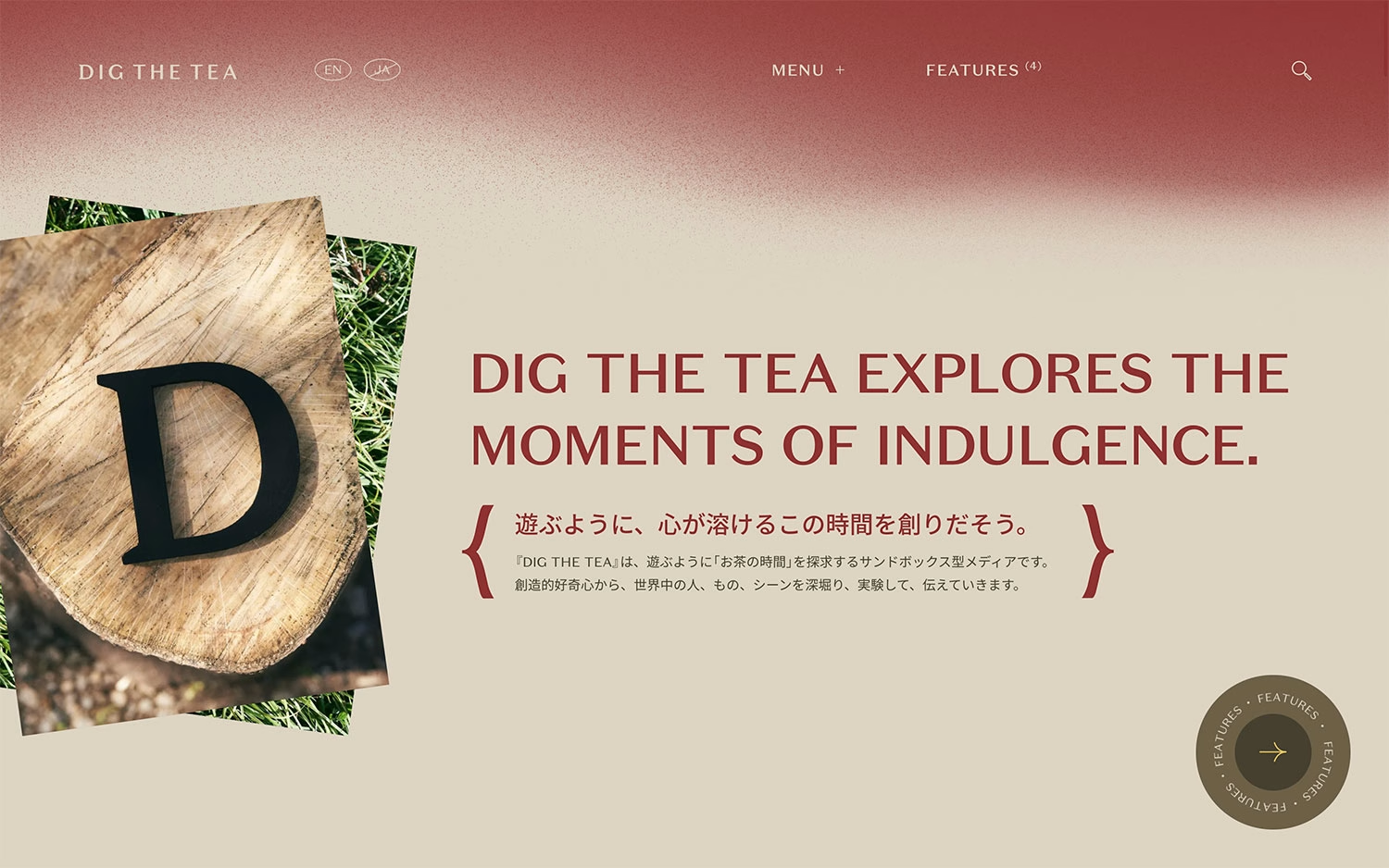
Garden Eight brings a refined editorial sensibility to DIG THE TEA, a bilingual media project exploring the culture and quiet pleasure of tea. A soft gradient shifts from deep red to warm beige as a stately serif headline declares “Dig the Tea explores the moments of indulgence,” balanced by elegant Japanese type set within decorative brackets. A tilted, layered photograph of a wooden letter D resting on grass adds a tactile, handmade warmth, while a rotating “Features” badge invites deeper reading. Thoughtful EN/JA language toggles and a calm menu keep the experience unhurried and premium. It is a graceful piece of editorial web design that treats its subject with genuine care.
Credits: Garden Eight
More in Food & Beverage Branding
Includes freebie bundle, unseen BTS insights and more.