Plus
Plus

 Menu
Menu


Gláuber Sampaio
December 11, 2018
Mindsparkle Mag


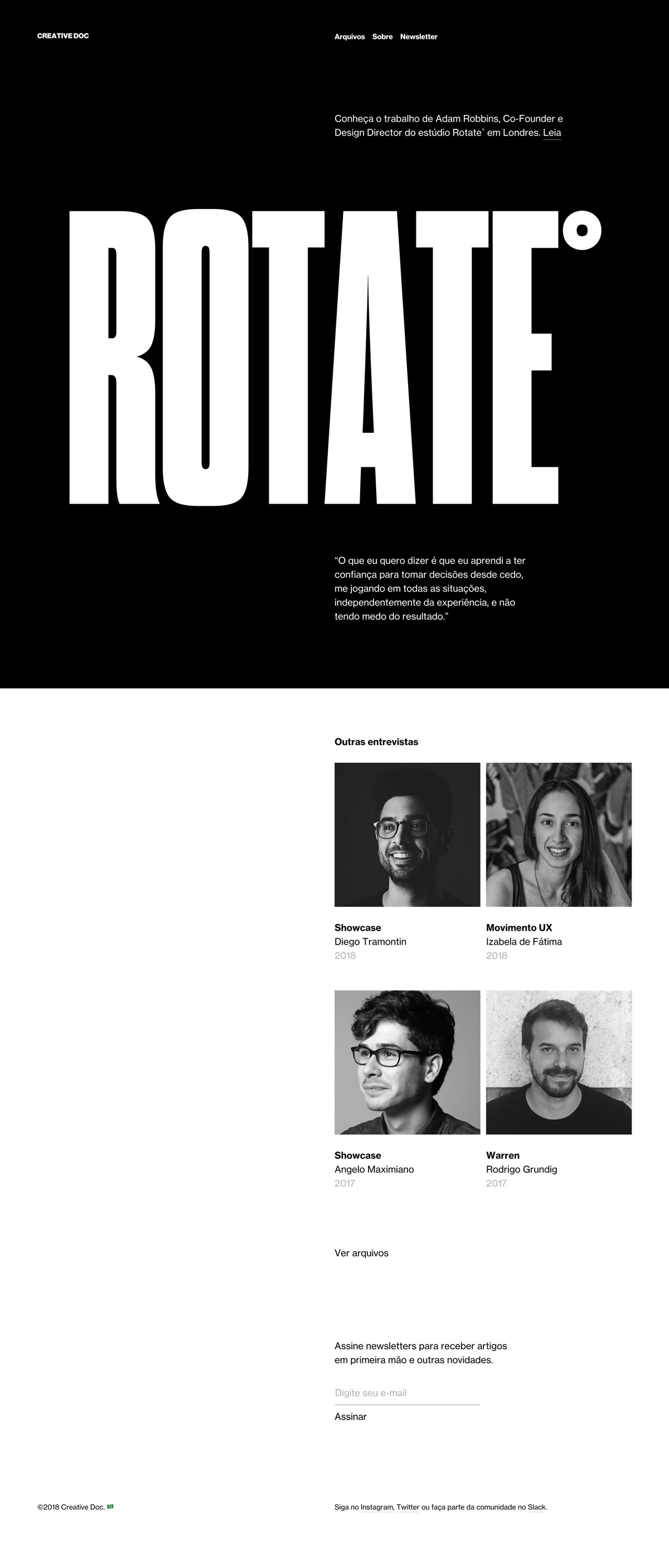
Gláuber Sampaio gives the Brazilian design-interview project Creative Doc a wonderfully bold typographic identity. The hero fills the black screen with an enormous condensed 'ROTATE°' wordmark, framing a conversation with a London studio's design director in crisp Portuguese copy. Below, a grid of black-and-white portrait interviews and a tidy newsletter sign-up keep the reading experience calm and focused. The contrast of monumental display type and quiet editorial structure feels effortlessly assured. A striking piece of editorial typography.
Credits: Gláuber Sampaio
More in Web Design
Stay on top of this week's design. Insights, top picks & more.