Plus
Plus

 Menu
Menu


Coraline Colasse and Fabio Carretti
August 09, 2017
Mindsparkle Mag


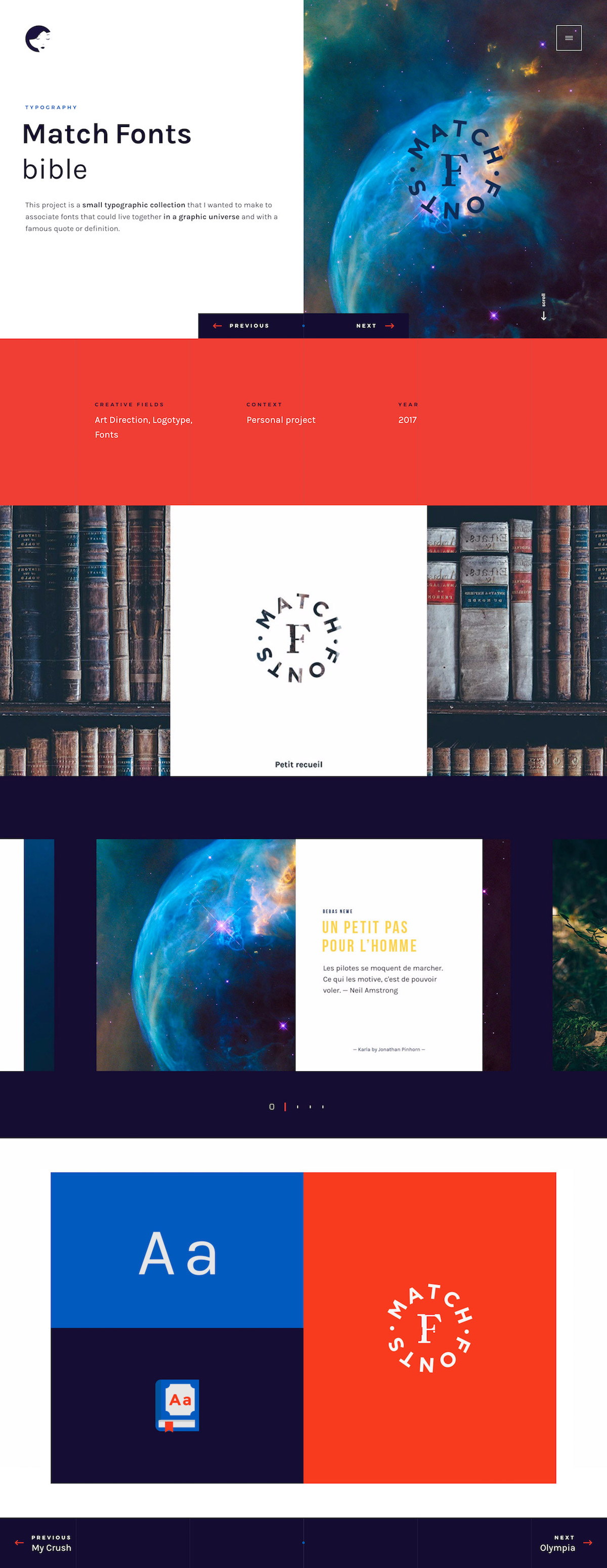
This portfolio piece from Coraline Colasse and Fabio Carretti centres on Match Fonts, a small typographic collection that pairs typefaces with famous quotes. The layout moves through bold blocks of navy and vivid red-orange, punctuated by a circular MATCH FONTS logotype and atmospheric imagery of nebulae and weathered library spines. Clean specimen pages and a tidy grid keep the focus on the lettering, while the confident colour contrast gives the whole case study real energy through considered typography. Labelled as art direction, logotype and font work, it is a measured study in how type can carry a mood. It is an elegant showcase of thoughtful art direction.
Credits: Coraline Colasse and Fabio Carretti
More in Design Agency
Includes freebie bundle, unseen BTS insights and more.