Plus
Plus

 Menu
Menu


Graphic Design Festival Scotland
June 14, 2017
Mindsparkle Mag


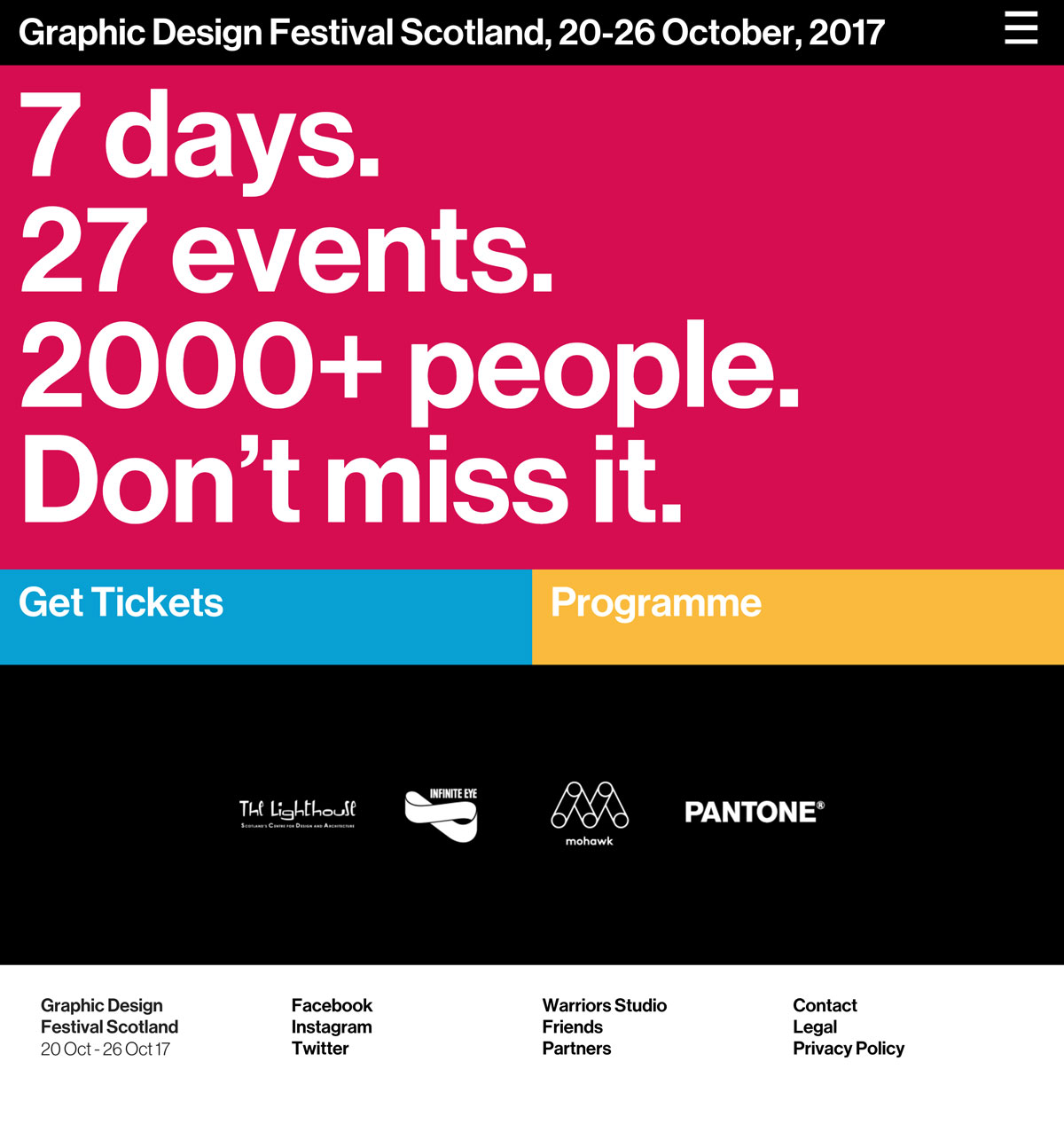
Graphic Design Festival Scotland takes its annual celebration of the discipline online with a website as confident and vocal as the event itself. The layout is built almost entirely from oversized grotesque type, stacking bold white statements — ‘7 days. 27 events. 2000+ people.’ — across a hot magenta field that grabs attention the instant the page loads. Blocks of cyan and marigold split the calls to action into clean, tappable panels, while a black partner section keeps the supporting logos calm and legible. It is a punchy, poster-like piece of web design in which confident typography does nearly all the heavy lifting. Visit the festival site to feel the energy of the Scottish design week captured in a single scroll.
Credits: Graphic Design Festival Scotland
More in Music Branding
Stay on top of this week's design. Insights, top picks & more.