Plus

 Menu


CO OP Brand
January 09, 2017
Mindsparkle Mag


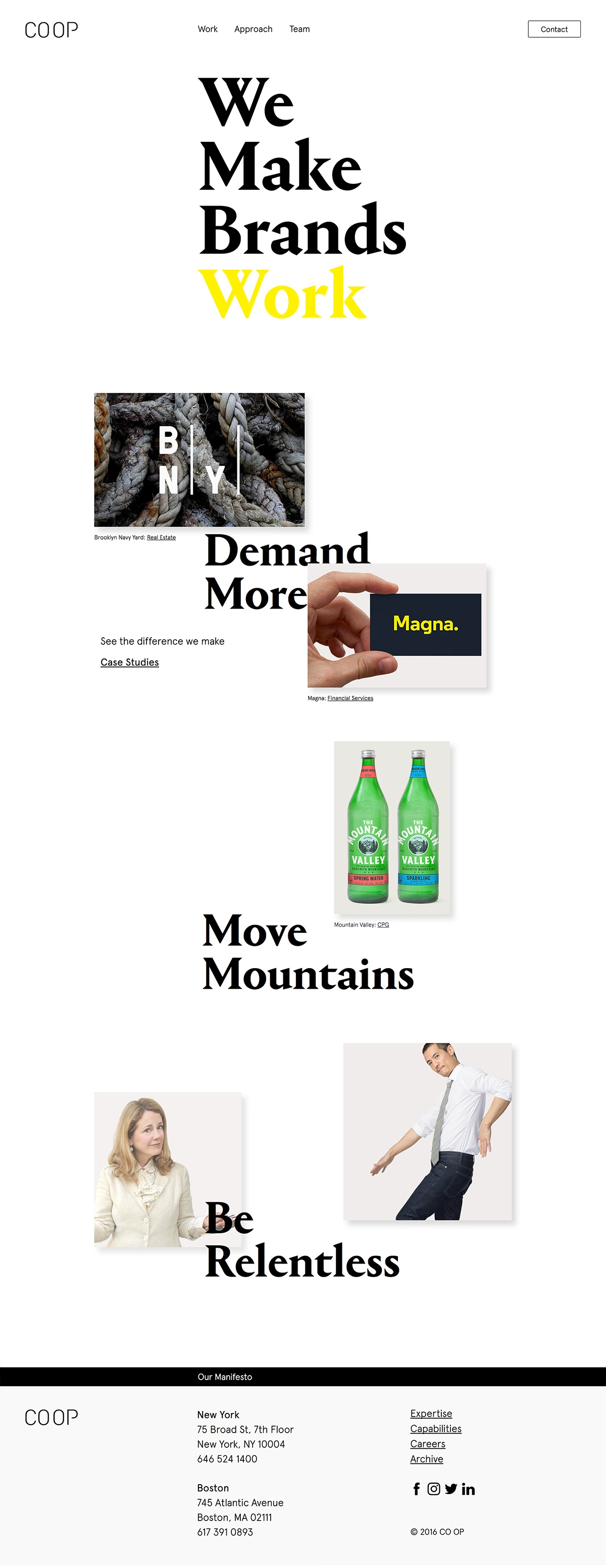
CO OP Brand makes a bold statement of intent with this crisp, typographic site built around the line “We Make Brands Work.” Set on a clean white canvas, oversized black serif headlines with a single punch of yellow give the layout gravity and confidence. Case-study imagery — from Brooklyn Navy Yard to Mountain Valley spring water — is scattered in an asymmetric rhythm that keeps the eye moving between statements like “Demand More” and “Be Relentless.” The New York and Boston agency lets its typography carry the whole personality of the page, spare yet emphatic. It is a smart, self-assured piece of branding that practises the brand thinking it preaches.
Credits: CO OP Brand
More in Minimal Branding
Includes freebie bundle, unseen BTS insights and more.