Plus
Plus

 Menu
Menu


British Standard Type
June 18, 2021
Mindsparkle Mag


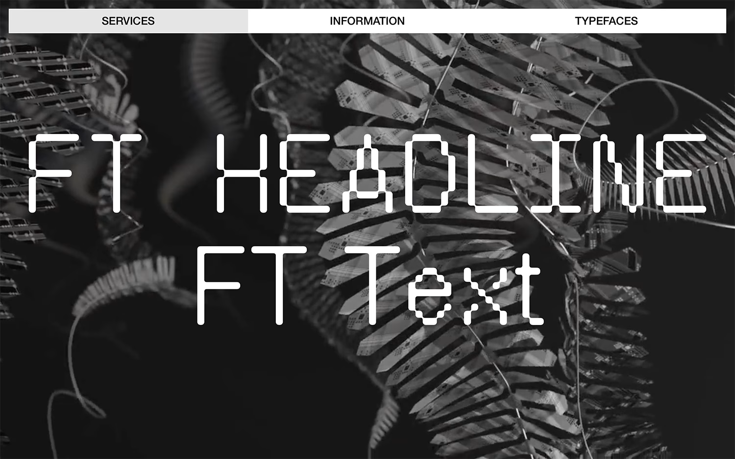
British Standard Type presents its foundry with all the confidence you would hope for from people who draw letters for a living. A moody, greyscale macro image — something between circuitry and organic growth — fills the background, while a clean tabbed bar splits the site into Services, Information and Typefaces. Front and centre, the faces themselves take the spotlight: “FT Headline” and “FT Text” rendered in a distinctive rounded, almost pixelised design that shows the character of the library. The high-contrast, near-monochrome treatment keeps every ounce of attention on the letterforms. It is focused, editorial web design in service of genuinely characterful type design.
Credits: British Standard Type
More in Portfolio
Includes freebie bundle, unseen BTS insights and more.