Plus
Plus

 Menu
Menu


Ben Longden
June 19, 2021
Mindsparkle Mag


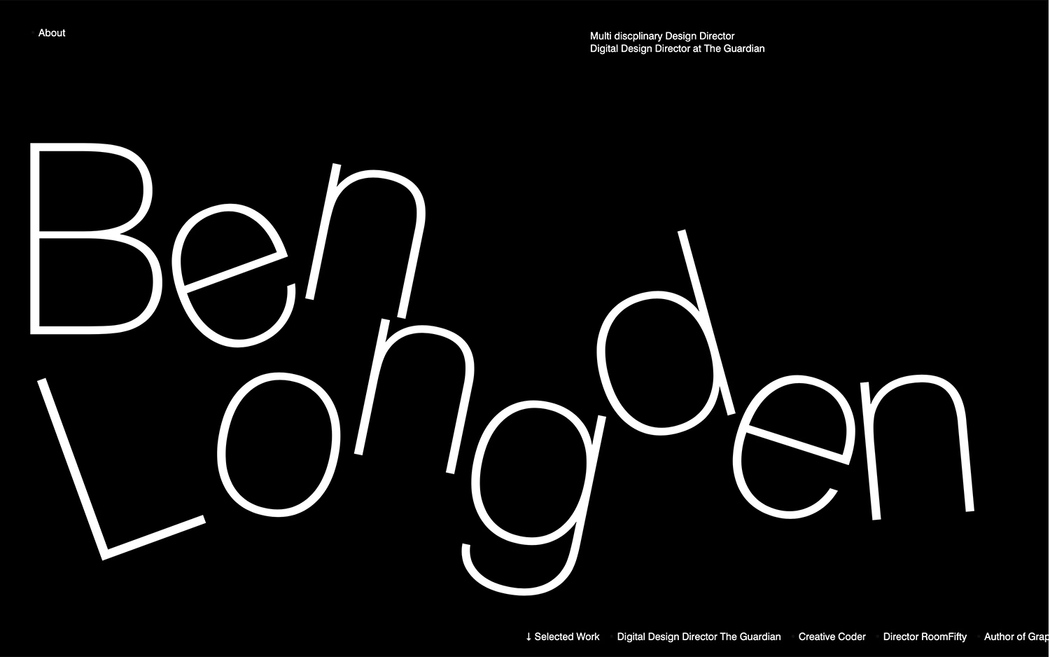
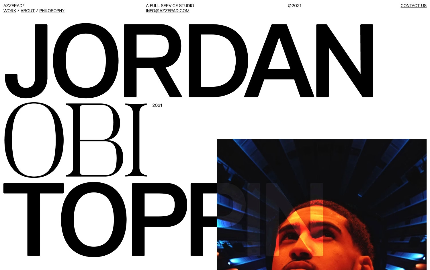
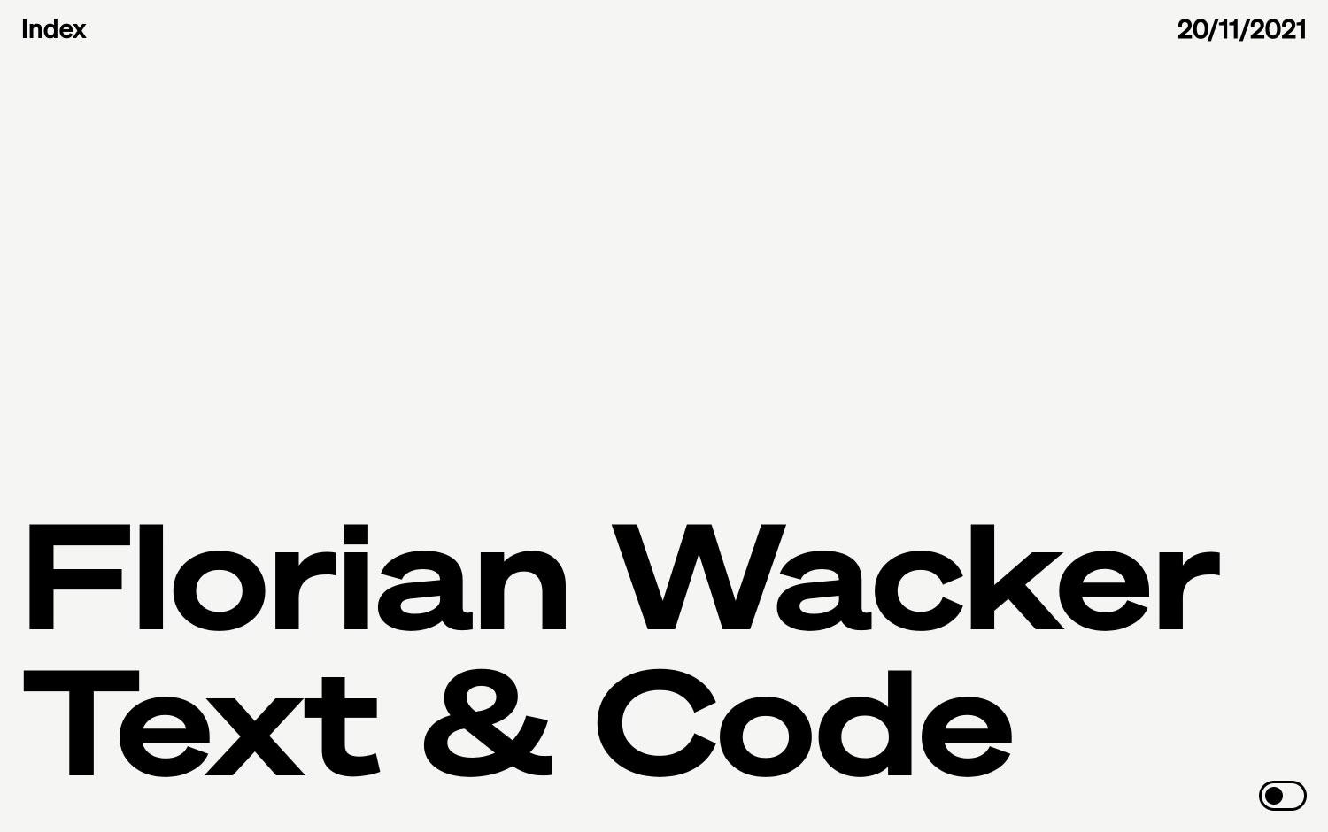
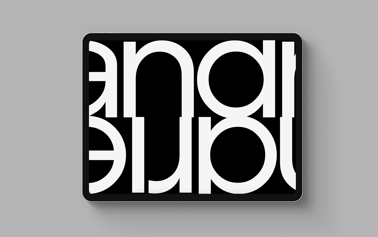
Ben Longden, a multidisciplinary design director whose credits include Digital Design Director at The Guardian, lets typography do all the talking on his portfolio. Against a pure black backdrop, his name sprawls across the screen in a thin white sans-serif whose letters stretch, tilt and warp as though caught mid-motion. The effect is confident and a little irreverent, exactly the register you want from a self-described creative coder. Sparse labels — About, Selected Work, Director of RoomFifty — sit quietly at the edges, leaving the distorted lettering centre stage. It is a bold, minimal piece of web design that proves how far expressive typography alone can carry a page.
Credits: Ben Longden
More in Playful Branding
Includes freebie bundle, unseen BTS insights and more.