Plus
Plus

 Menu
Menu


Obys agency
March 24, 2021
Mindsparkle Mag


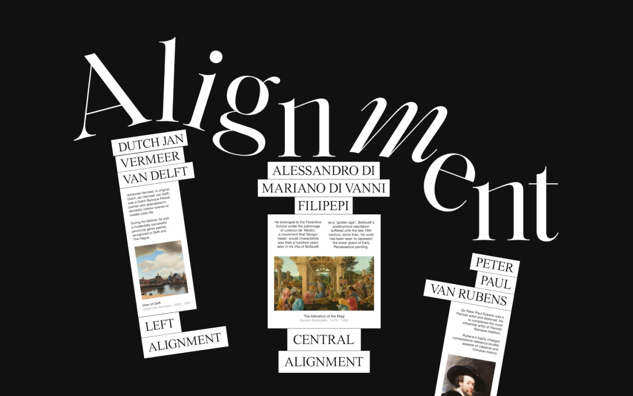
Obys agency brings its signature flair to Typography Principles, an elegant interactive lesson dressed entirely in black and white. Enormous display letters spelling "Alignment" mix upright serifs with sweeping italics, sprawling across the screen like a gallery wall, while tilted cards pin fragments of art history — Vermeer's View of Delft, Botticelli's Adoration of the Magi, a Rubens portrait — beside crisp captions on left and central alignment. The result feels part museum, part masterclass, teaching the fundamentals of setting type through sheer compositional confidence. It is a beautiful celebration of typography and editorial craft.
Credits: Obys agency
More in Design Agency
Stay on top of this week's design. Insights, top picks & more.