Plus
Plus

 Menu
Menu


Verde
October 10, 2016
Mindsparkle Mag


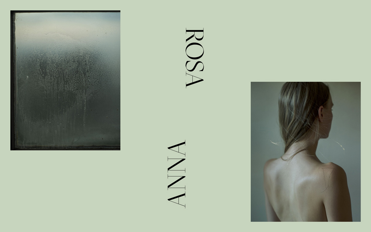
Verde crafted this hushed, editorial identity for Anna Rosa, and calm is clearly the point. A soft sage-green field holds two muted photographs — a fogged, weathered pane of glass and a bare-shouldered figure bathed in cool light — spaced with generous breathing room. The name itself becomes the layout: “ROSA” runs upright while “ANNA” is set mirrored beneath it in a refined serif, an understated bit of typography that rewards a second look. The desaturated palette and painterly imagery give the whole thing a poised, gallery-like mood. It is a beautifully restrained piece of editorial art direction and web design.
Credits: Verde
More in Photography Websites
Stay on top of this week's design. Insights, top picks & more.