Plus
Plus

 Menu
Menu


Aer Design
July 26, 2017
Mindsparkle Mag


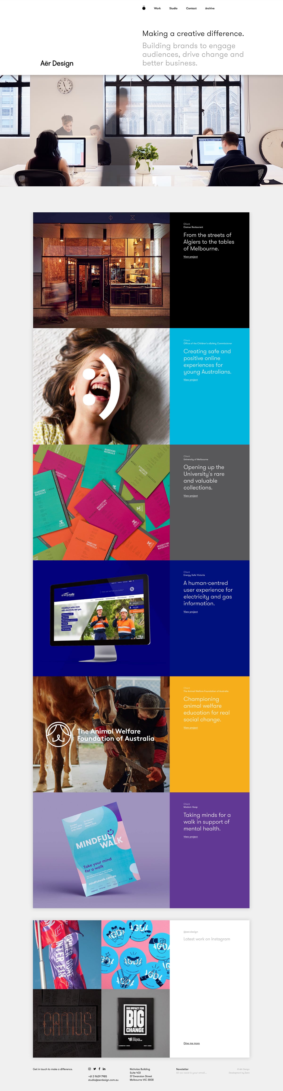
Aer Design want to make “a creative difference,” and their studio site lays out that mission with warmth and clarity. Beneath a friendly office photo, case studies stack up as bold colour blocks — black for a restaurant, cyan for a children’s safety body, sunny yellow for an animal-welfare foundation — each paired with a crisp line of white text. The grid is rhythmic and easy to scan, letting projects for the University of Melbourne and Energy Safe Victoria shine through their identity rather than lengthy copy. It is a confident, socially minded showcase that balances colour and restraint nicely. Tidy web design underpinned by strong branding thinking.
Credits: Aer Design
More in Design Agency
Stay on top of this week's design. Insights, top picks & more.