


KLUN spaces + stories
September 15, 2021
Mindsparkle Mag


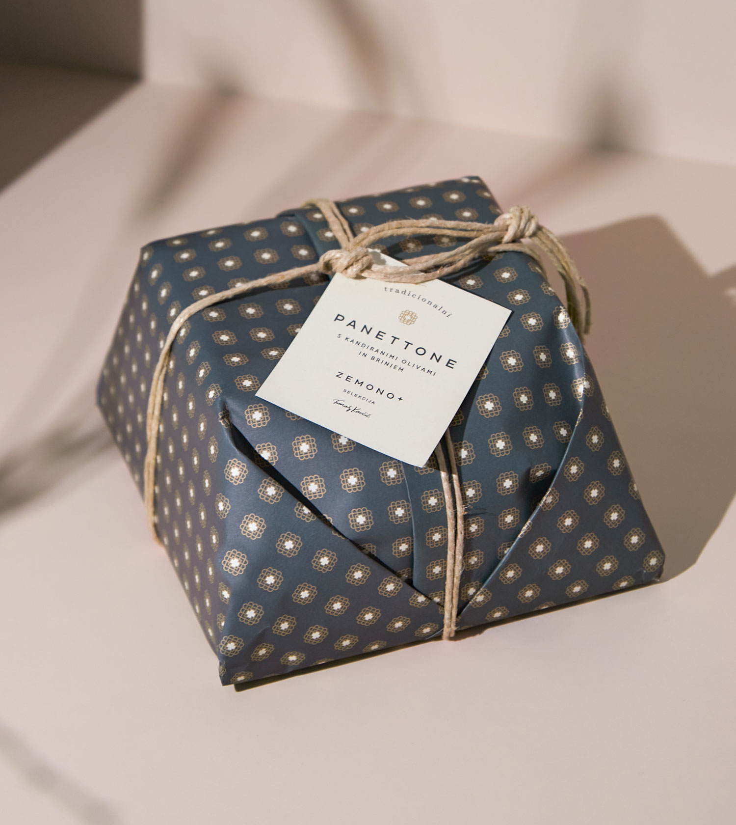
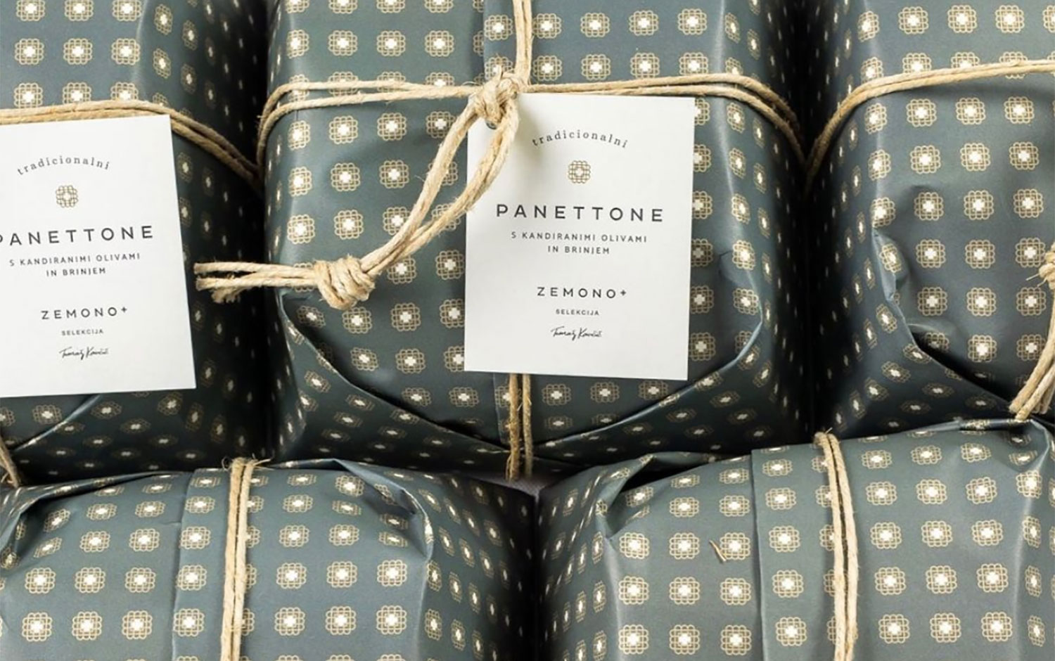
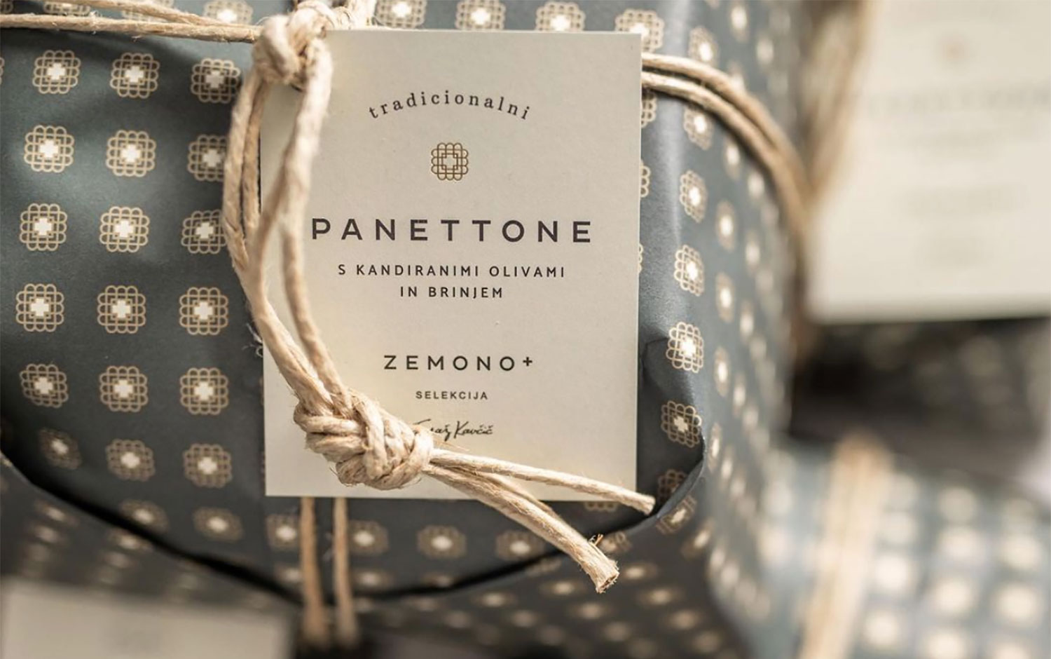
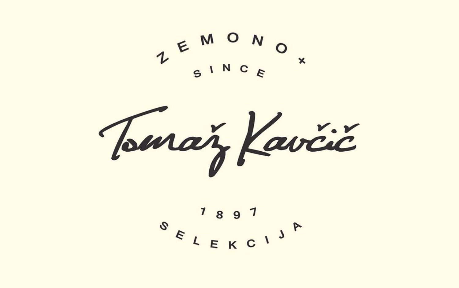
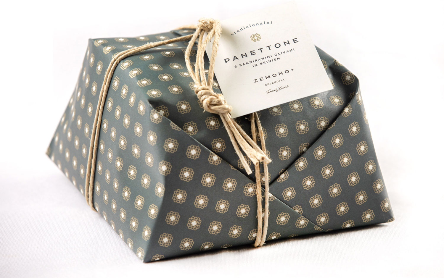
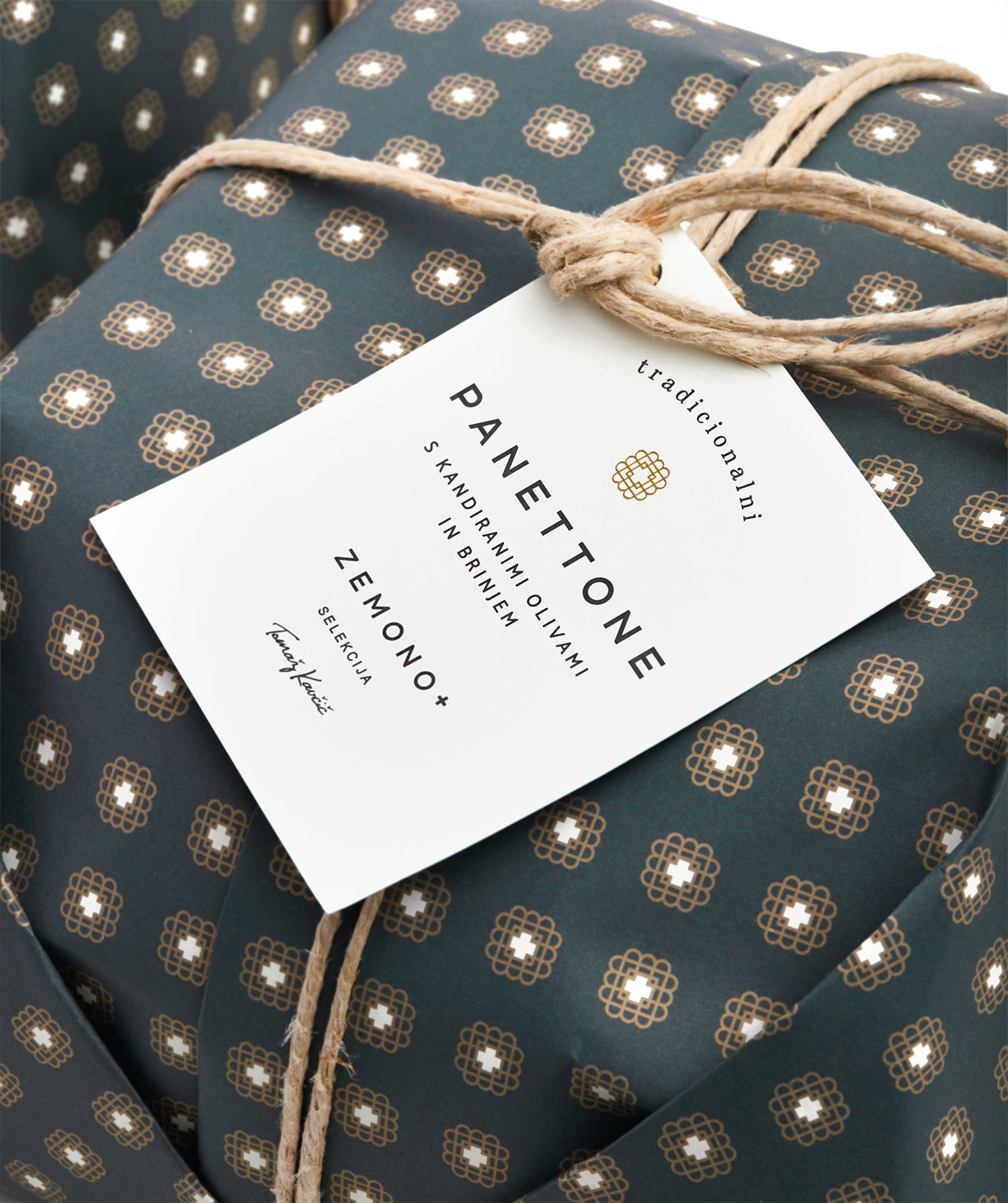
Zemono + selection Toma/u017e Kav/u010di/u010d is the brand of one of the most recognizable chefs in Slovenia, the holder of a Michelin star, and one of the 100 best chefs in the world. Toma/u017e Kav/u010di/u010d often proved to be a pioneer and initiator of revolutions in many hospitality areas, but never for a single brand. So, he asked/u00a0Klun/u00a0to create his new signature line identity./u00a0
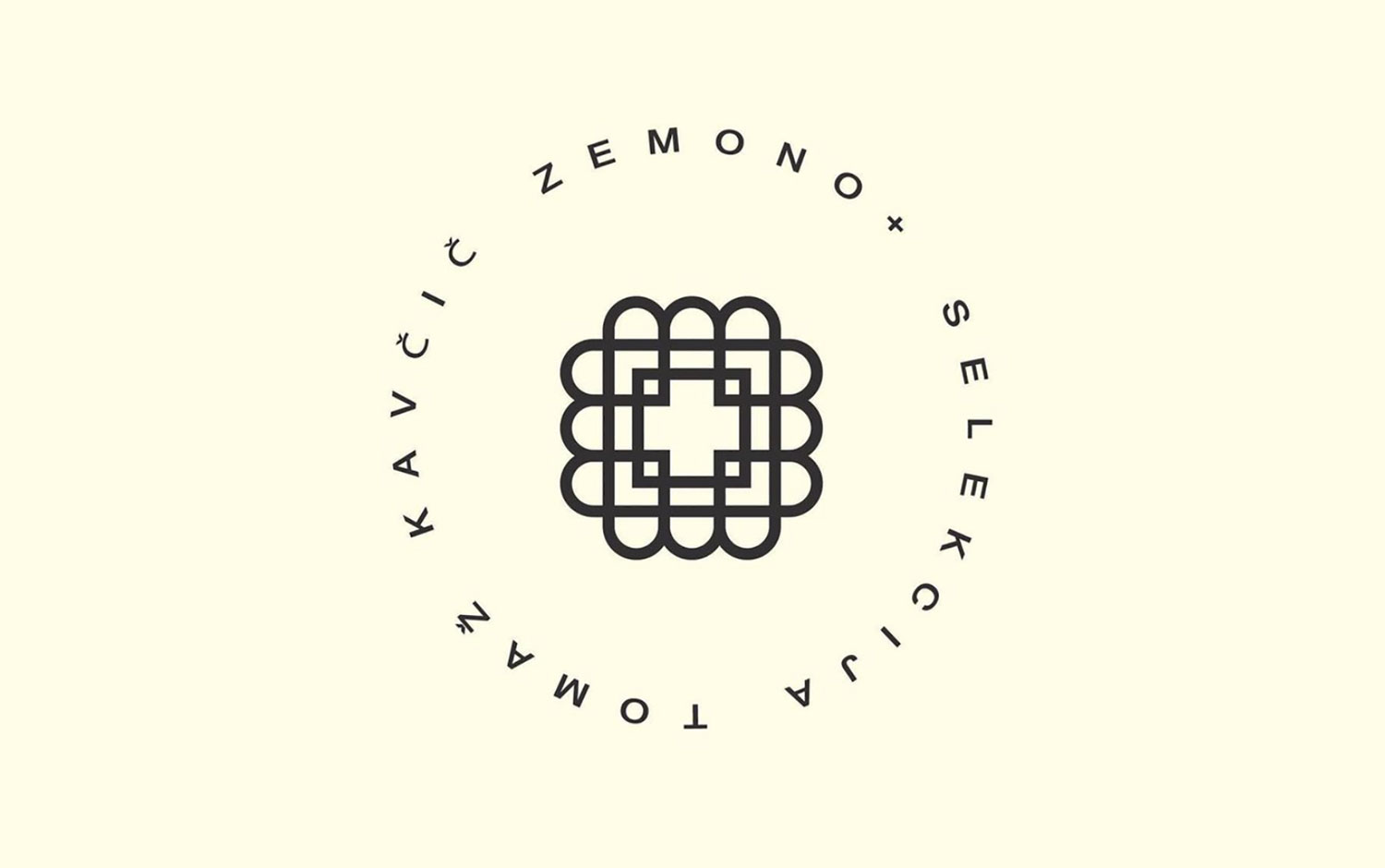
The name and image are everything the maestro wanted to say and communicate and the promise of a transparent, premium, and fair brand. The main image contains inscriptions, numbers, a signature, and an icon - especially the icon, which defines the life and work of Toma/u017e Kav/u010di/u010d with a multi-level symbolic meaning. In the icon, one can find many interpretations descending from the external ground plan of Zemono. Some of them are: two squares, a shot of the roof, to the ground floor of the mansion, drawing corner rooms and central corridors with a recognizable arched exterior. The icon is a table with 12 or 4 chairs, larger or smaller. Two squares symbolically indicate a protected space, safe from the rest of the world, and four hearts are four generations of Kav/u010di/u010d family, dedicated to hospitality.
The icon flirts with Suprematism, with Malevich's Square and the Cross, but not only in form, but above all because of the parallels between the artistic direction and Toma/u017e's culinary approach. Both approaches use simple forms and ingredients which awaken interpretations, memories and come to life in the viewer or eater. Malevich is one of the most recognizable Russians in the West. He is a kind of ambassador of Slavic art, just like the honorary consul Toma/u017e Kav/u010di/u010d./u00a0
Creator: KLUN spaces + stories


.webp)


