


Studio Arndt Benedikt
July 01, 2024
Mindsparkle Mag


Buying, renting, modifying or rebuilding containers of all shapes and sizes for any purpose, whether new or used: Unitainer designed by Studio Arndt Benedikt is truly an innovative one-stop shop that thinks outside the box /u2013 with a dedicated team that can transform containers into anything.
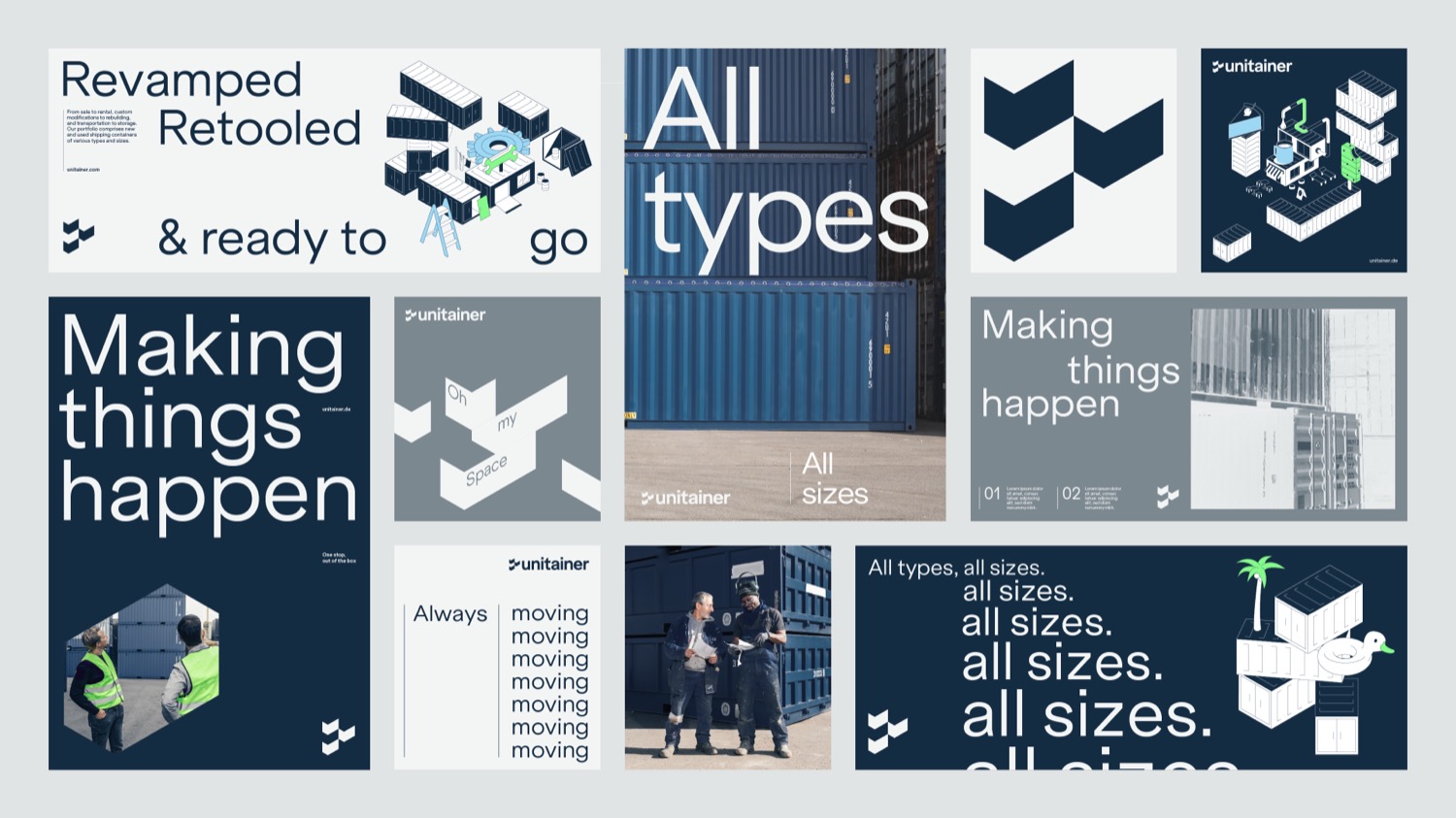
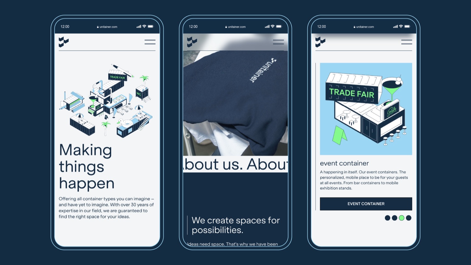
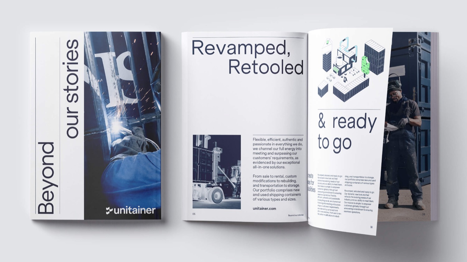
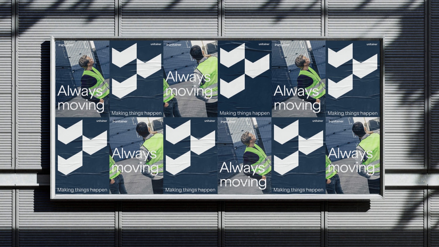
Clean, intuitive and instantly eye-catching: the new brand identity for the container specialist is designed to be rolled out with ease online and offline /u2013 leaving an impression that strikes a deft balance between serious and spirited.
For the logo, a classic container shape was initially used and abstracted. The outcome is three chevrons that look both like checkmarks /u2013 embodying the mission statement /u2013 and arrows pointing toward the future. Next up was the colour palette, which was anchored with a deep marine blue that symbolises three things: the company/u2019s home in the port city of Hamburg, Germany, the briny deep, and the classic colour of shipping containers the world over.
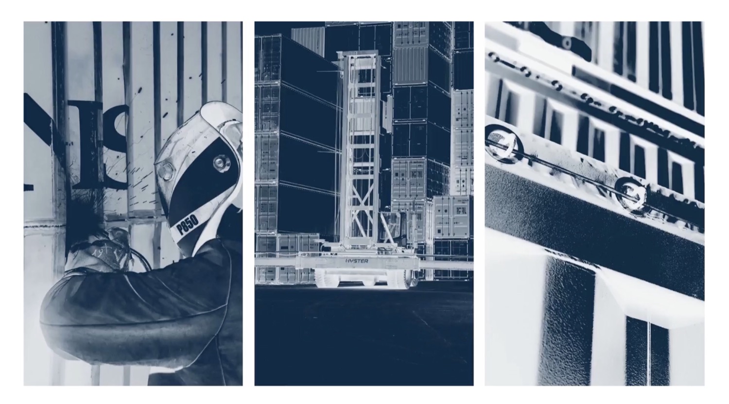
Building on this, a series of isometric container-based illustrations along with other elements /u2013 flowers, palm trees, cocktail glasses, even a duck pool float /u2013 was created to set the imagination racing and demonstrate the countless ways and settings in which these solutions can be applied. This was rounded off with photos that focus on authentic situations (featuring containers, naturally) that underline Unitainer/u2019s strong team aesthetic and can-do attitude, as well as x-ray style images as a visually arresting alternative.
Creator: Studio Arndt Benedikt


.webp)


