


OH&CO
June 02, 2017
Mindsparkle Mag


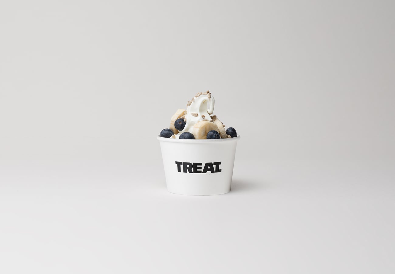
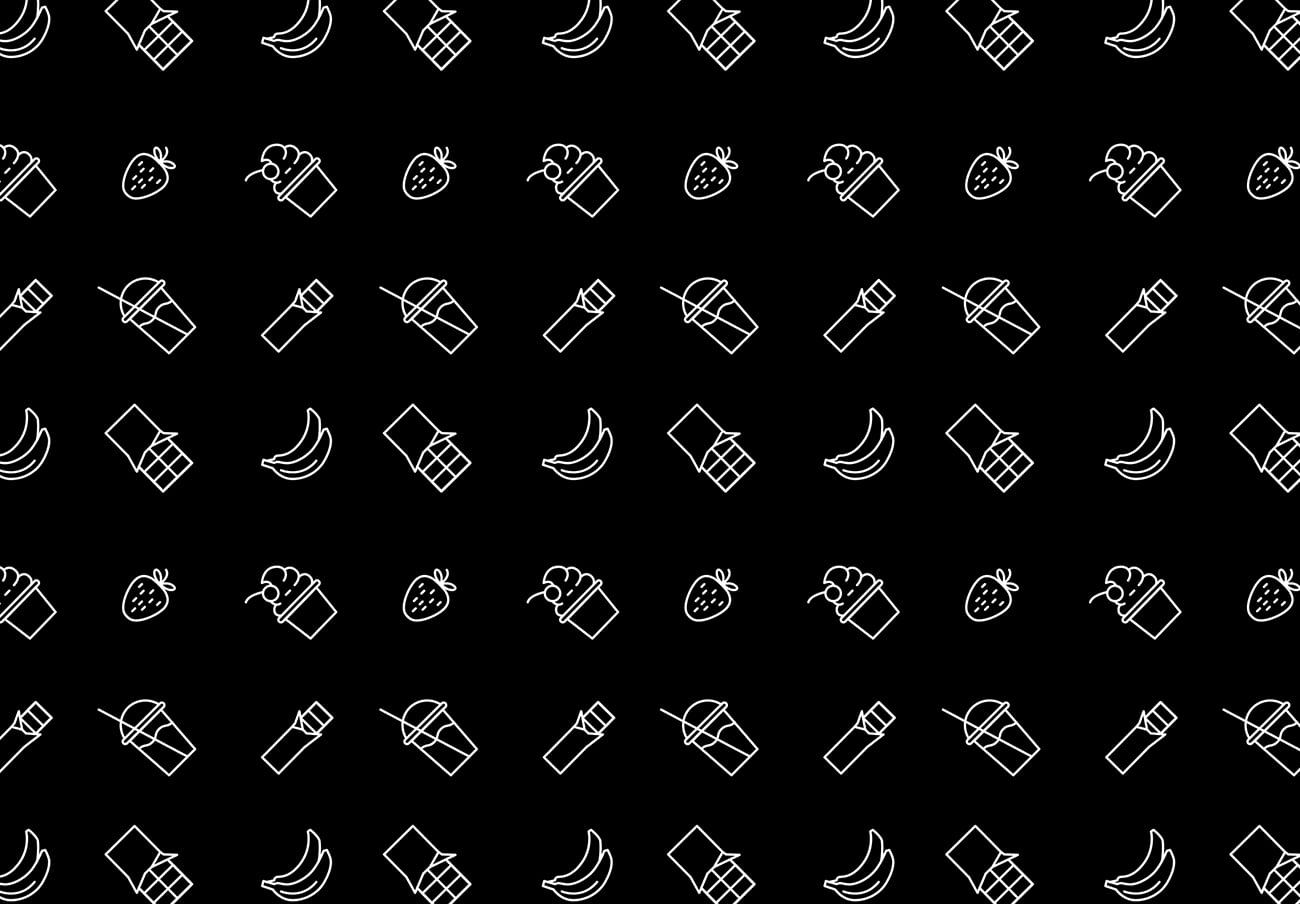
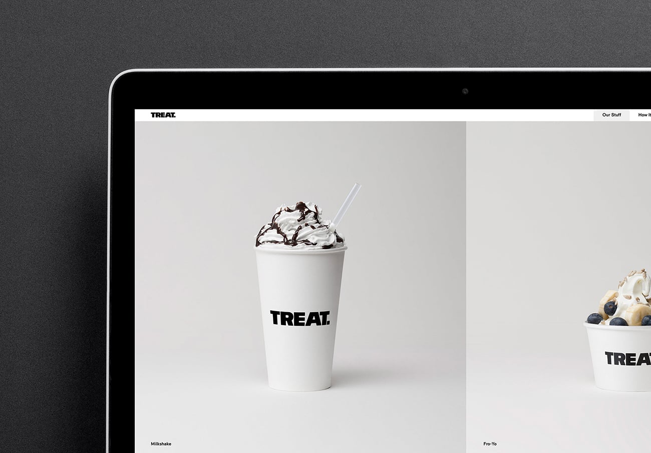
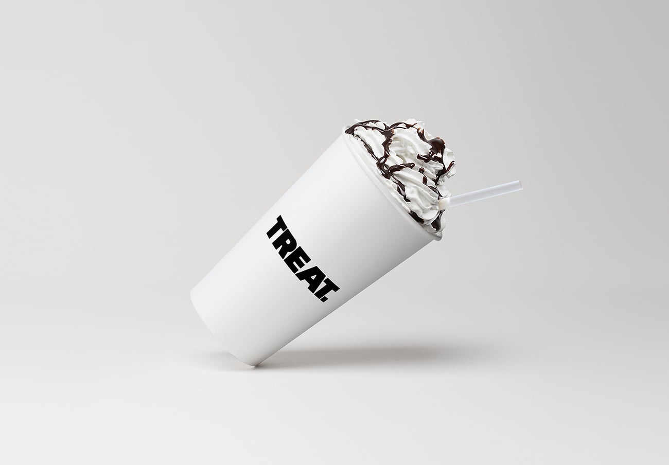
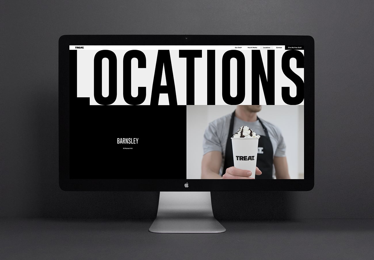
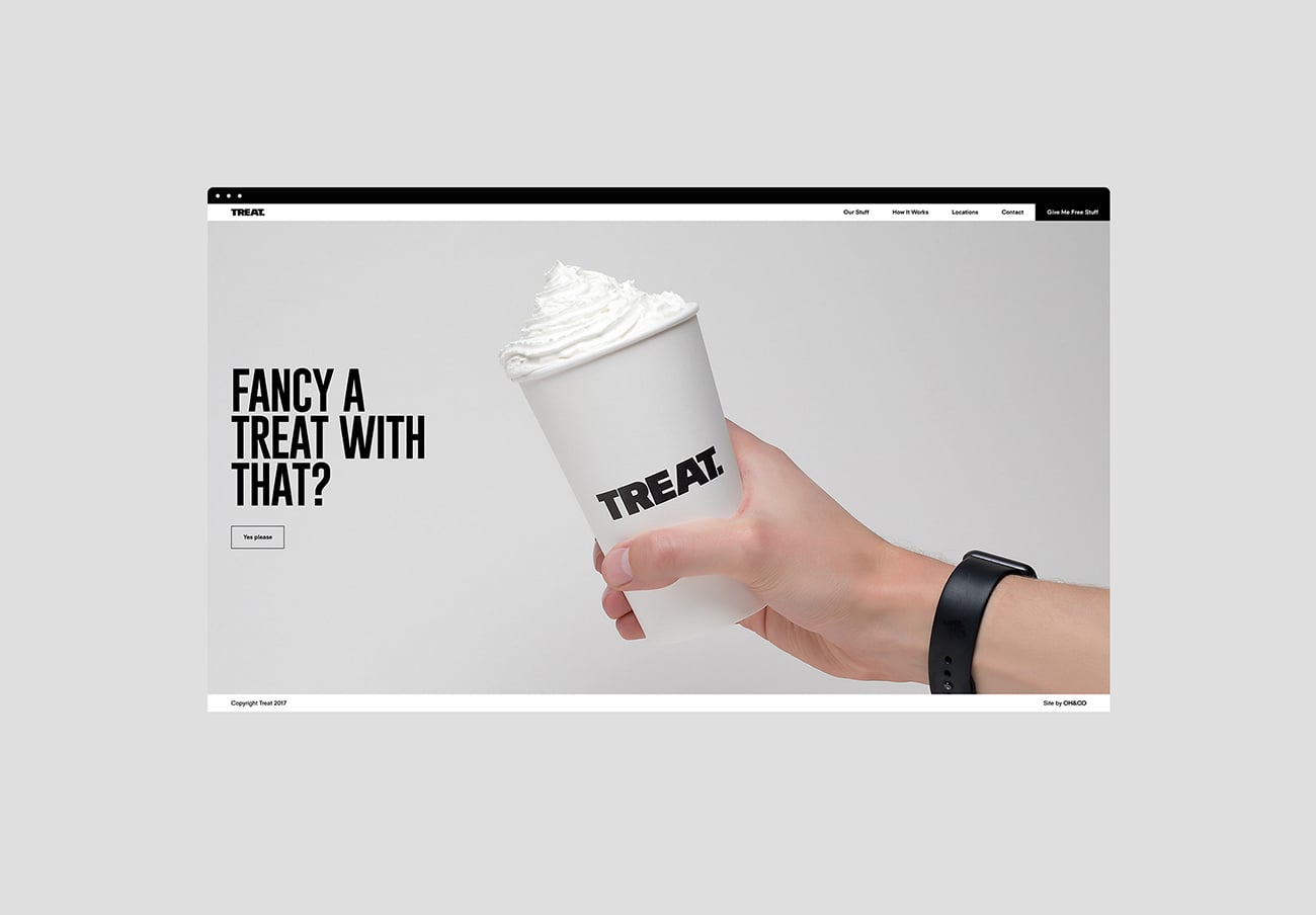
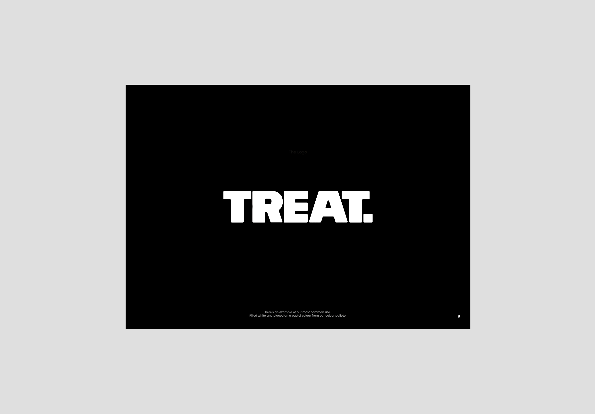
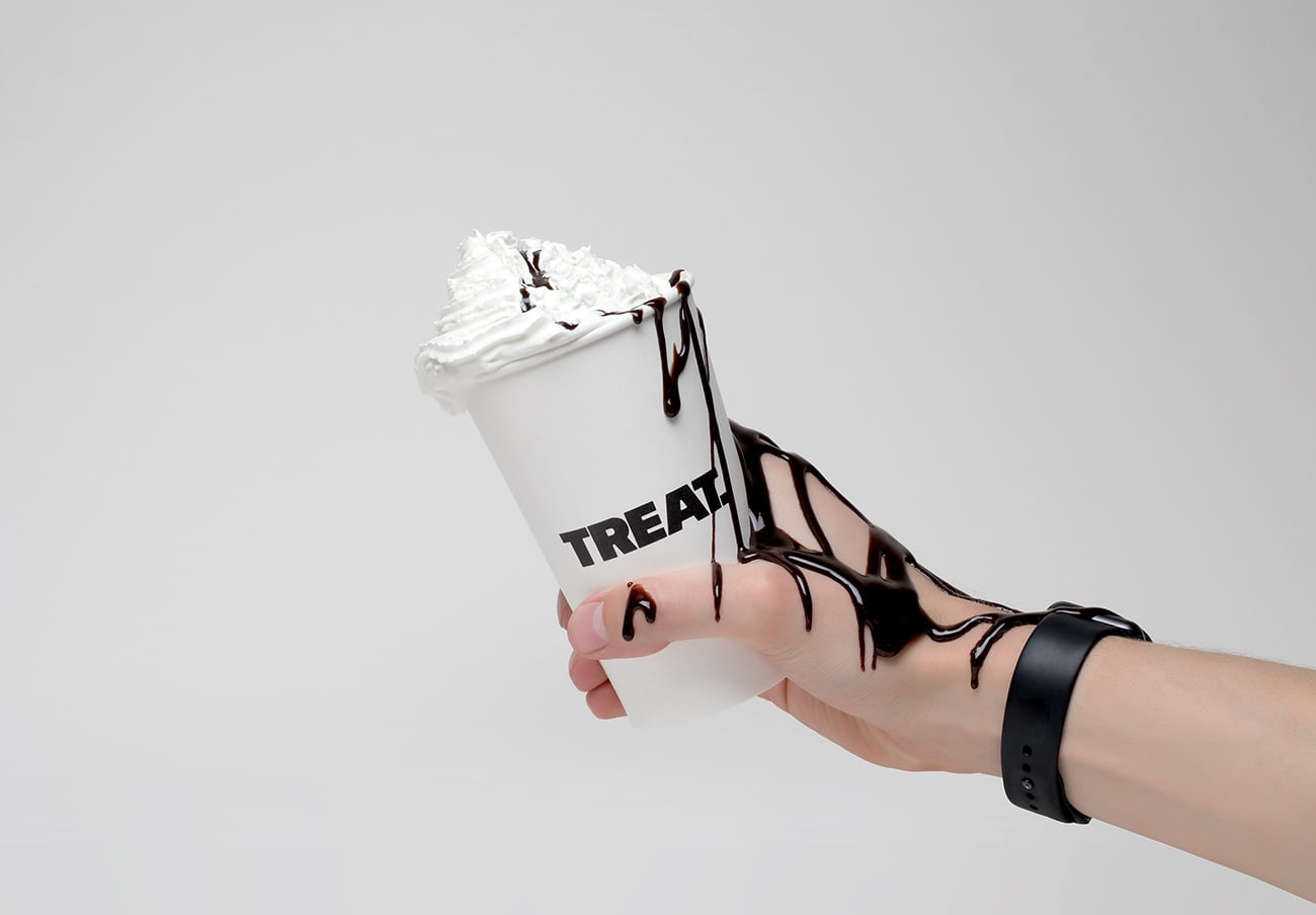
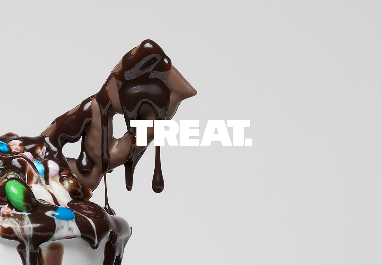
Set to open it/u2019s doors in 2017, Treat is a place to indulge your sweet tooth. From Frozen yogurts, to nostalgic classic sweets, Treat is a space to relax and create lasting memories. Treat approached OH&CO in search of a forward thinking brand identity that captured their brand essence and personality./u00a0The people at Treat are bold people but they're a friendly bunch, and that/u2019s exactly what they wanted to portray in their logo. The curved edges ofset what is a strong bold logo to give it a more inviting & playful feel./u00a0It is important that Treat is recognised as a place to enjoy yourself and have fun. A mixture of monochrome/u00a0colours/u00a0and natural wood tones are the predominant colour choice for the brand. The monochrome colour palette brings an air of modernism to the Treat brand./u00a0We had as much fun creating the brand graphics as we hope the customer will when they visit the shop. From swirl patterns to give the visualisation of frozen yogurt ripples, to coffee cups with delightful/u00a0expressions on them, all these elements add/u00a0excitement in to the brand.
Creator: OH&CO


.webp)


