


OlssønBarbieri
November 28, 2023
Mindsparkle Mag


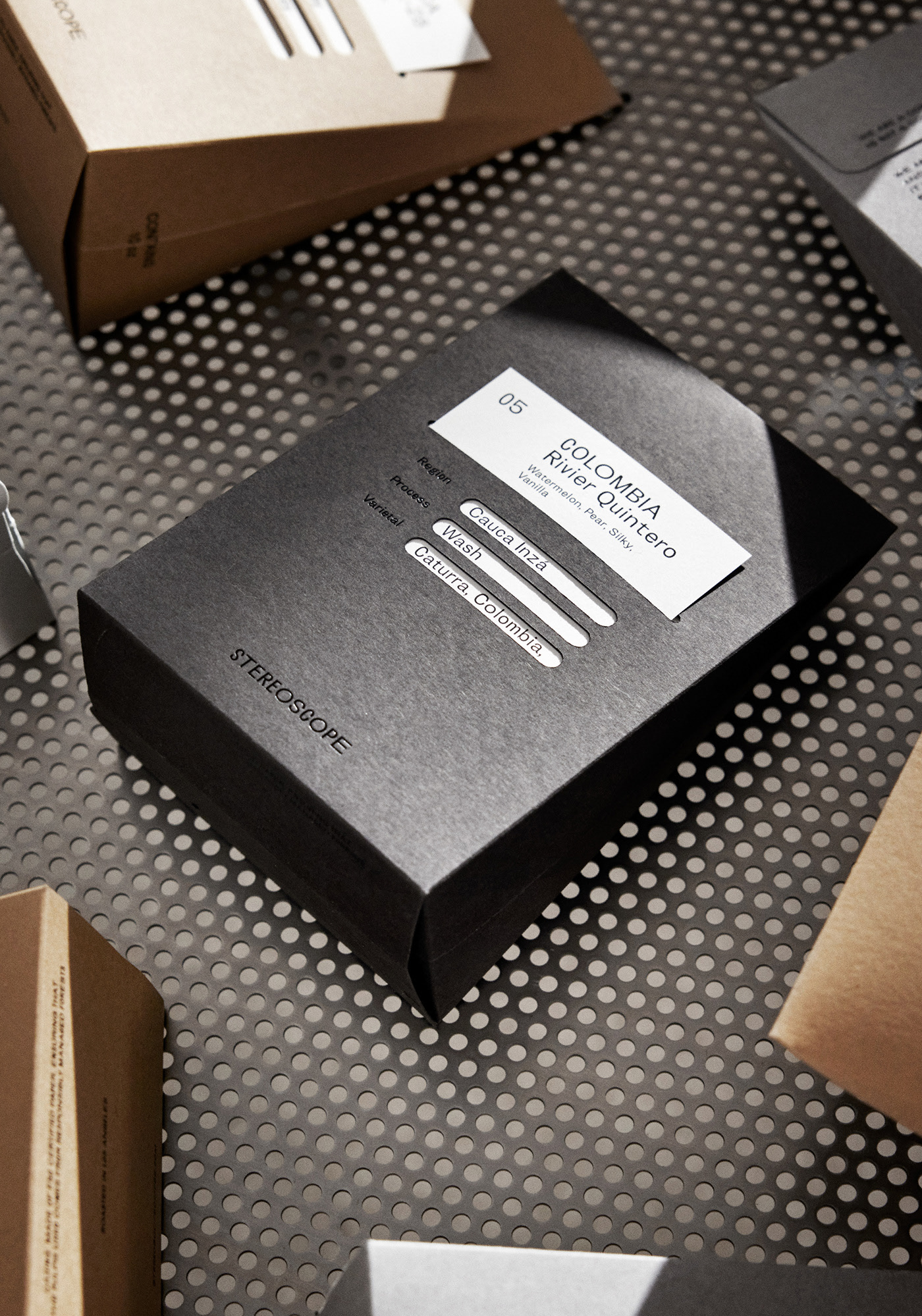
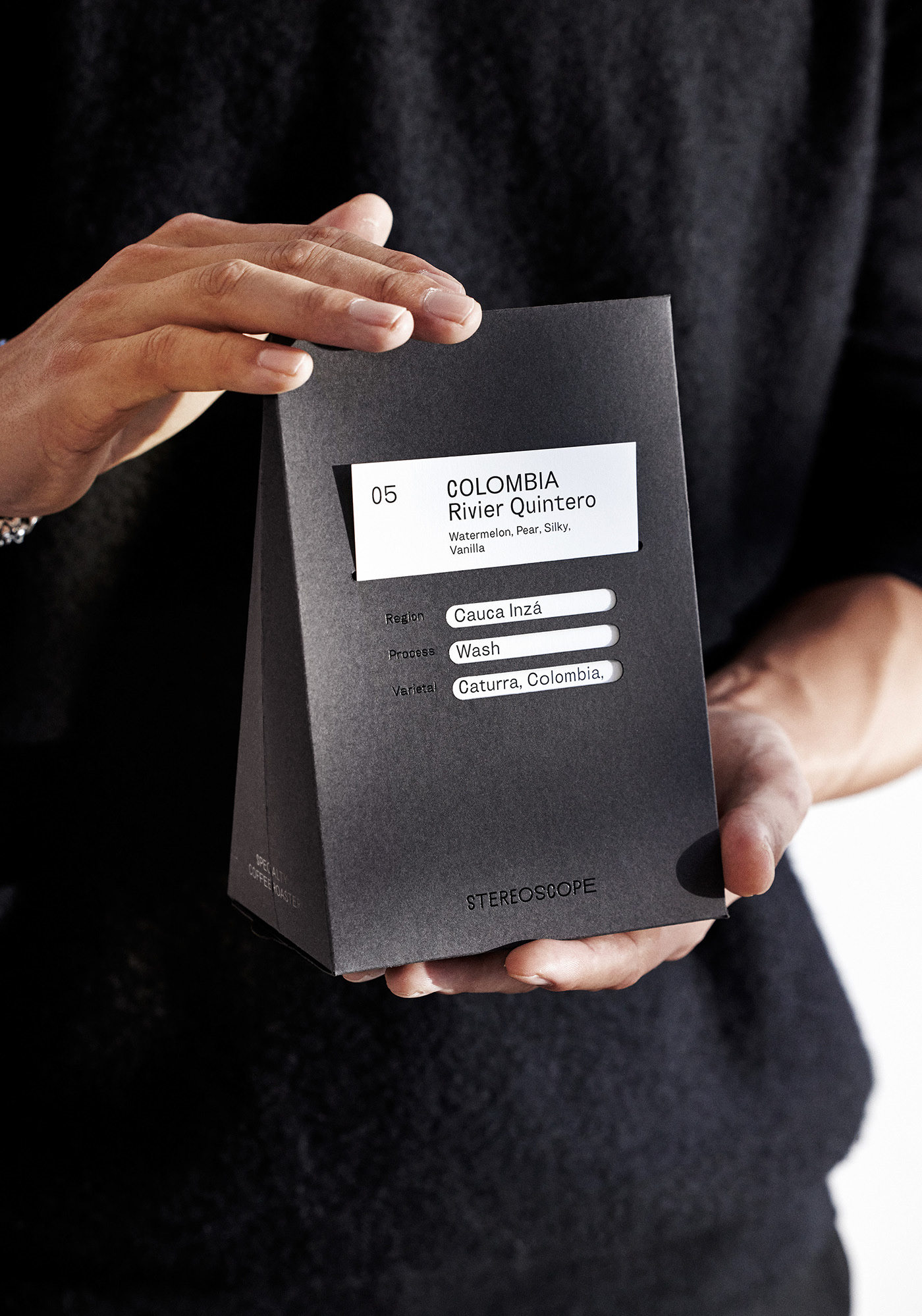
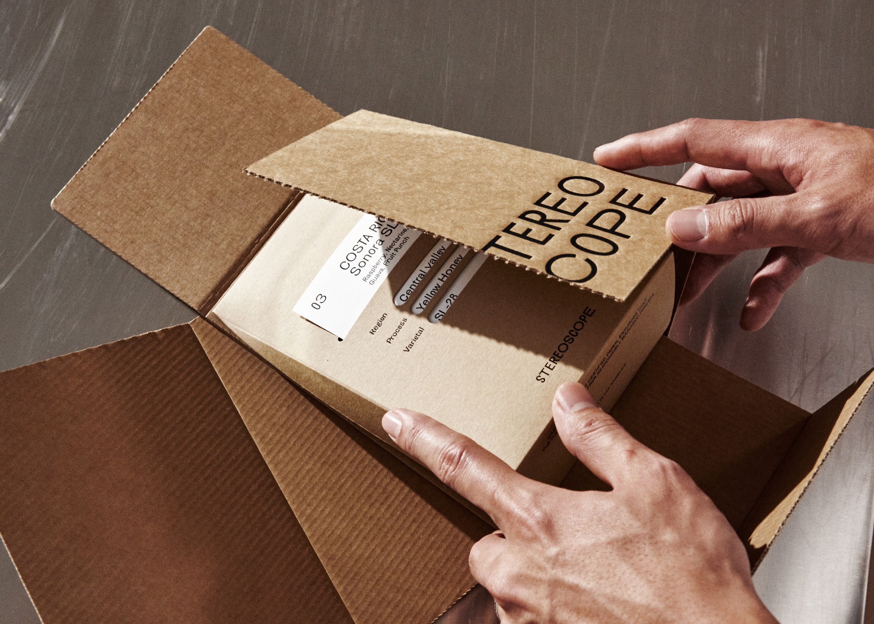
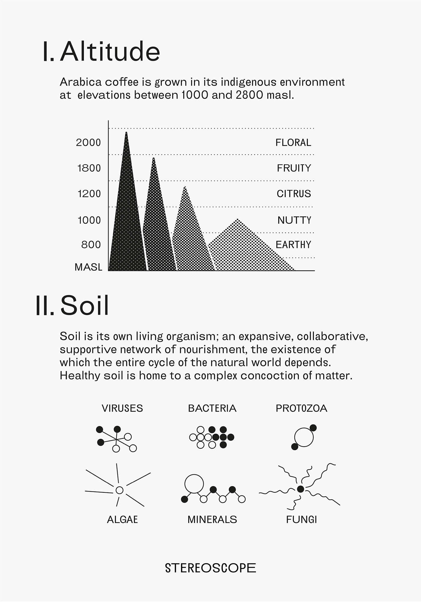
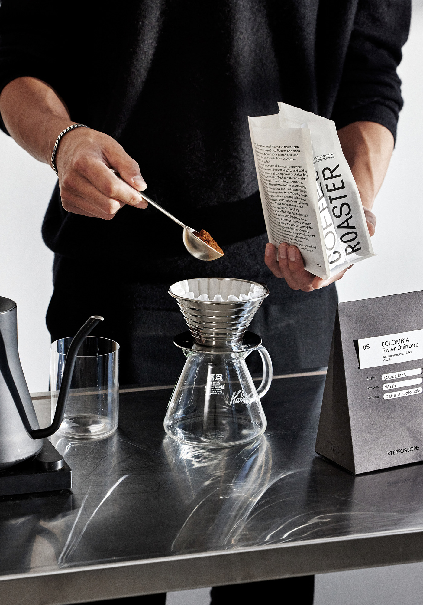
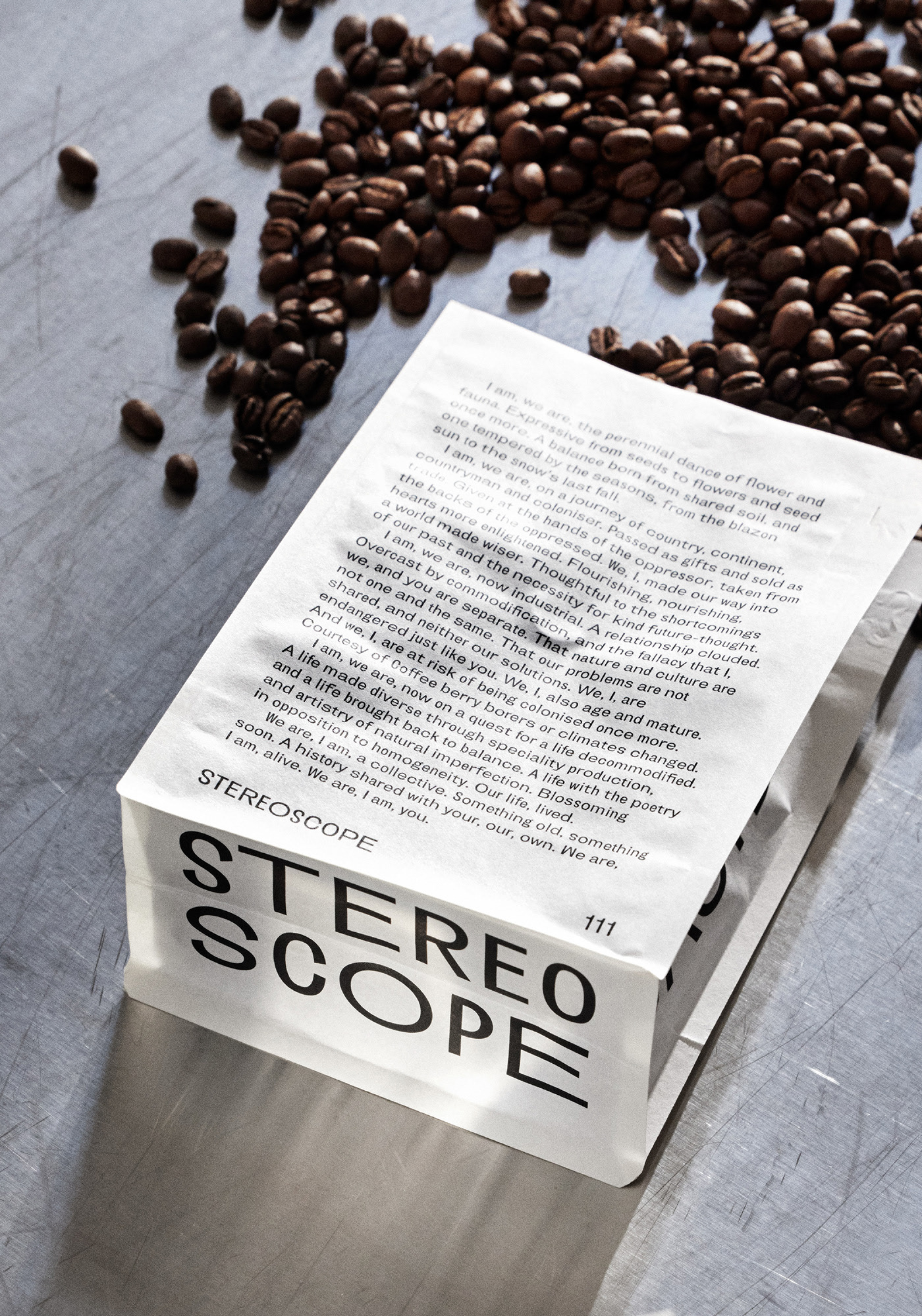
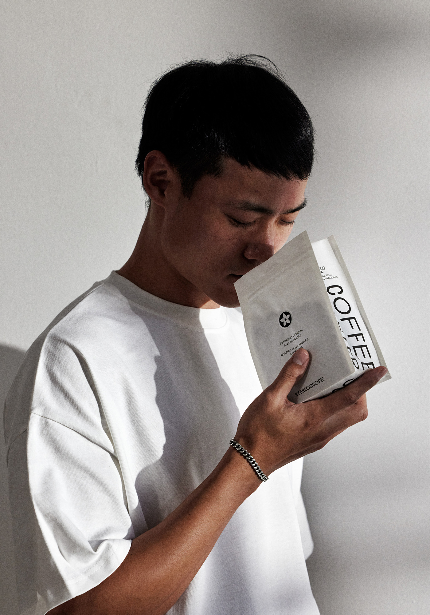
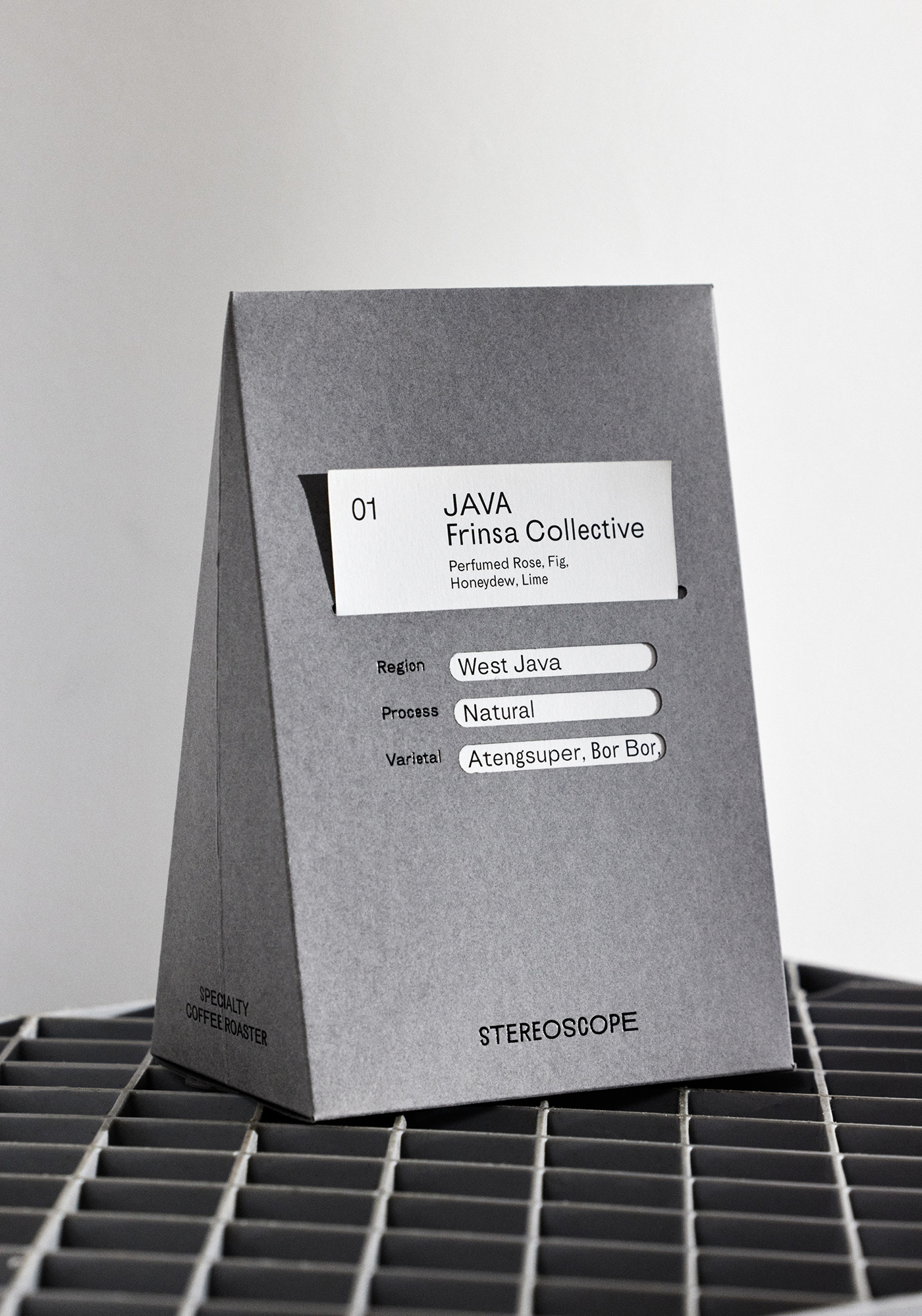
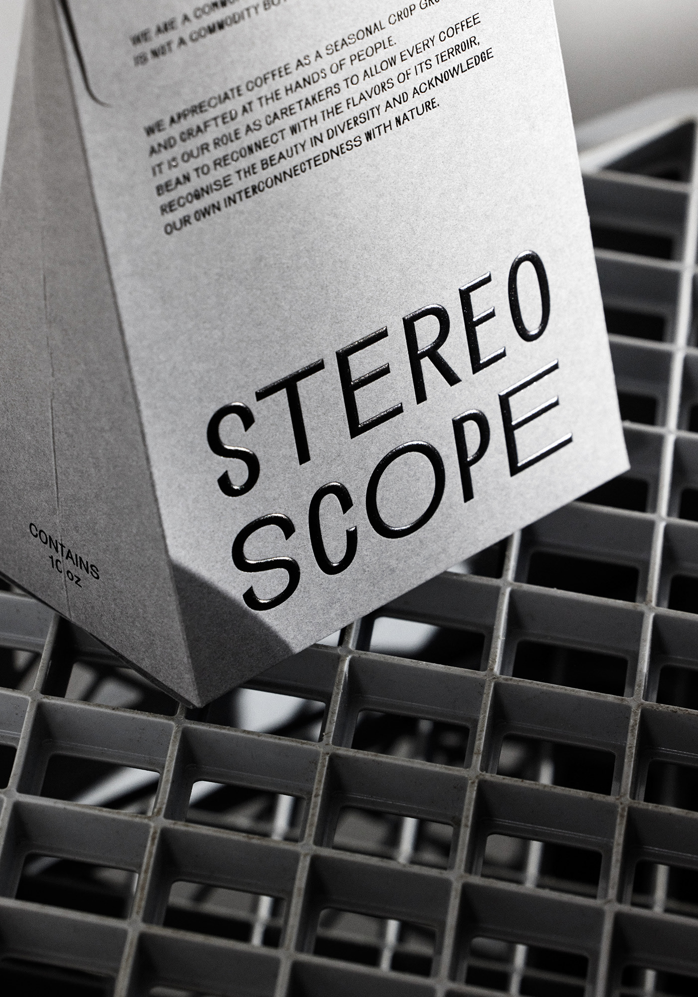
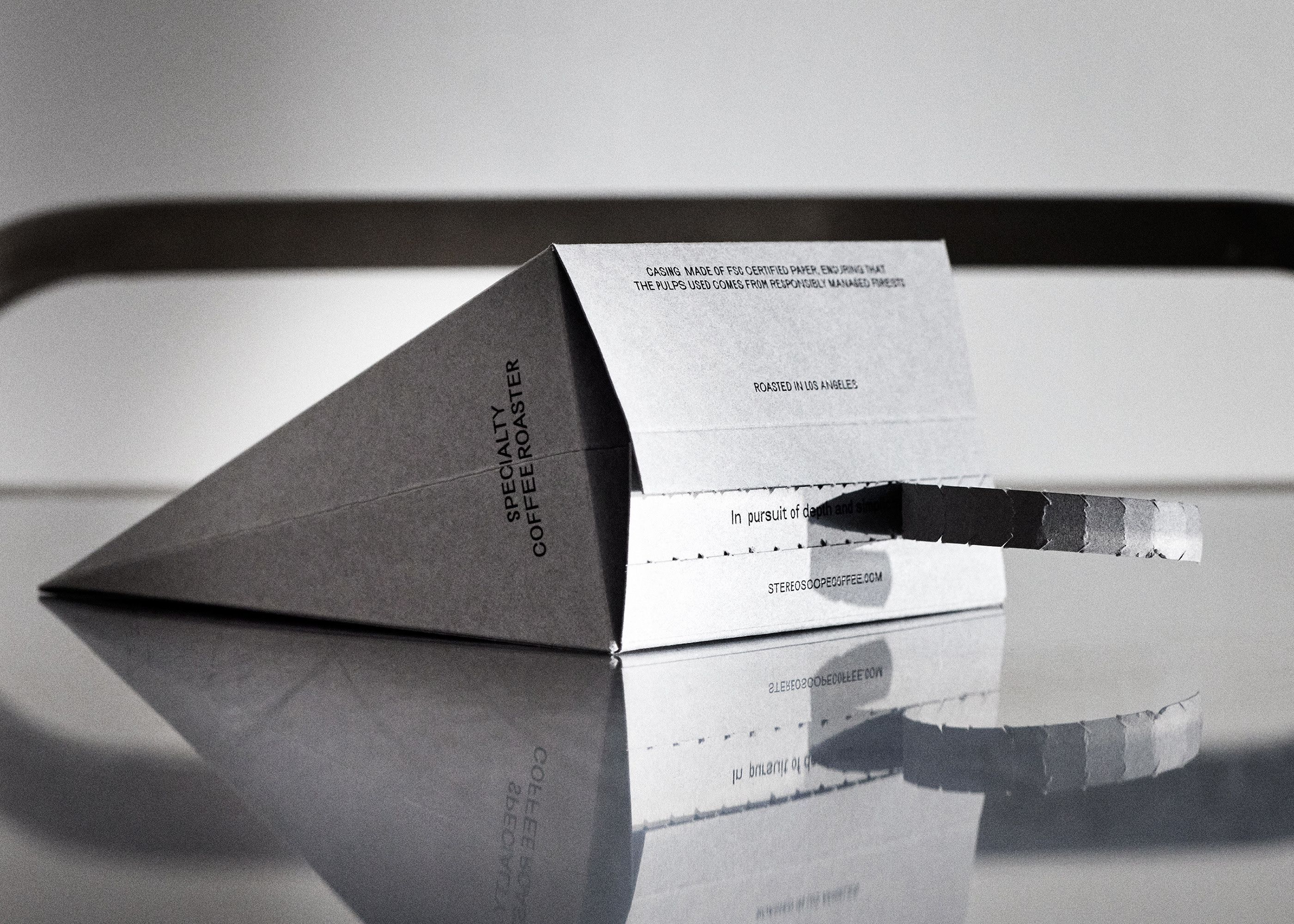
Los Angeles-based speciality coffee roastery Stereoscope, renowned for the remarkable quality of its roasts, was launched with the forward-thinking foundational belief that there is more to coffee than its tasting profiles and processing methods, using their platform to create unique experiences and fair relationships over low prices and standardisation in flavour. Moreover, it is Stereoscope/u2019s belief that we, in fact, share an indisputable responsibility to coffee /u2013 towards both the workers farming it and the beans themselves /u2013 led by the notion that coffee is a living organism and not a commodity. Across their sites, Stereoscope has sought to forge a space where coffee/u2019s positive impact on local communities and farms is something you aspire to, and the plant/u2019s larger cultural and ecological context is recognised. Working closely with the team, Olss/u00f8nBarbieri set out to reflect the roastery/u2019s progressive philosophy across their brand identity, packaging design and printed matter, embodying their unique perspective through thoughtful tactility and meticulous typographic detail. Olss/u00f8nBarbieri began with not only recognising the etymology of Stereoscope and their practice but, crucially, the brutal realities coffee faces /u2013 from the declaration of Coffee Arabica as an endangered plant to the acknowledgement of coffee/u2019s legacy in colonialism. Whether it/u2019s climate change or the colonial and capitalist structures, there/u2019s a global architecture set to commodify nature whilst ever widening the gap betOlss/u00f8nBarbierien us and the wild world /u2013 transforming their role as stewards of the natural world to beings elevated above it. In recognising coffee as a living organism with Stereoscope, Olss/u00f8nBarbieri hope to help decolonise speciality coffee and raise awareness of the Arabica plant/u2019s history, reality and potential futures. Alongside Stereoscope/u2019s progressive endeavtheirs, the coffee roastery buries itself deep in the philosophy of clarity, as championed by its namesake /u2013 an instrument that offers the user multiple perspectives, deepening their perception. As such, Stereoscope/u2019s maxim, /u2018In pursuit of depth and simplicity/u2019, introduced by founder Leif An, explains how seemingly opposite forces are complementary and interdependent in the natural world /u2013 a feat Stereoscope sought to live up to. Stereoscopes/u2019 dualistic vision of depth and simplicity sits alongside the Chinese cosmology notion of yin yang, whereby the circle represents harmony, balance, and duality, whilst the /u2018void/u2019 denotes the space before anything existed. Out of this void emerged the yin and yang, rotating together to begin the formation of their universe across the five elements /u2013 directly tied to nature and the Earth/u2019s seasons. To personify this philosophy, Olss/u00f8nBarbieri opted for a typeface that wasn/u2019t tied to any strong historical legacy to not impose any cultural and historical heritage on the brand. Instead, Olss/u00f8nBarbieri wanted the typography to feel alive, open and in constant flux, capturing the interconnectedness of things. The grotesque sans serif comprises five distinct widths, combined randomly when set. The result has an air of charming, contemplative irreverence, emblematic of the five elements theory, the five petals of the coffee flor, the ever-changing nature and the five principles considered to make each coffee unique. This integral dedication to duality manifests across the material, production and typographic choices behind the brand, creating the roastery/u2019s own /u2018Stereoscope Cosmology/u2019, including a card-based labelling system across the brand/u2019s packaging. The highlighted details of the coffee on the cards, such as the fermentation process, are revealed through a /u2018trigram/u2019 shaped cut-out inspired by the Bagua iconography, sitting alongside a printed narrative emblazoned on the box/u2019s side. Moreover, to underscore the integral notion that coffee is a living organism, Olss/u00f8nBarbieri gave it its own voice, introducing a text where the seeds of Coffee Arabica talk in first person on the coffee bags, made of 99.6% plant-based material. In addition, the bean/u2019s bespoke box design, inspired by the mountain shape associated with the high-altitude cultivation of the latter, reflects season and practice in its design. Produced in ftheir coltheirs, printed on FSC-certified paper embellished by a rounded foil blocking, the box/u2019s tear-off opening introduces a sense of ritual to ytheir day-to-day coffee routine.
Creator: OlssønBarbieri


.webp)


