 Plus
Plus

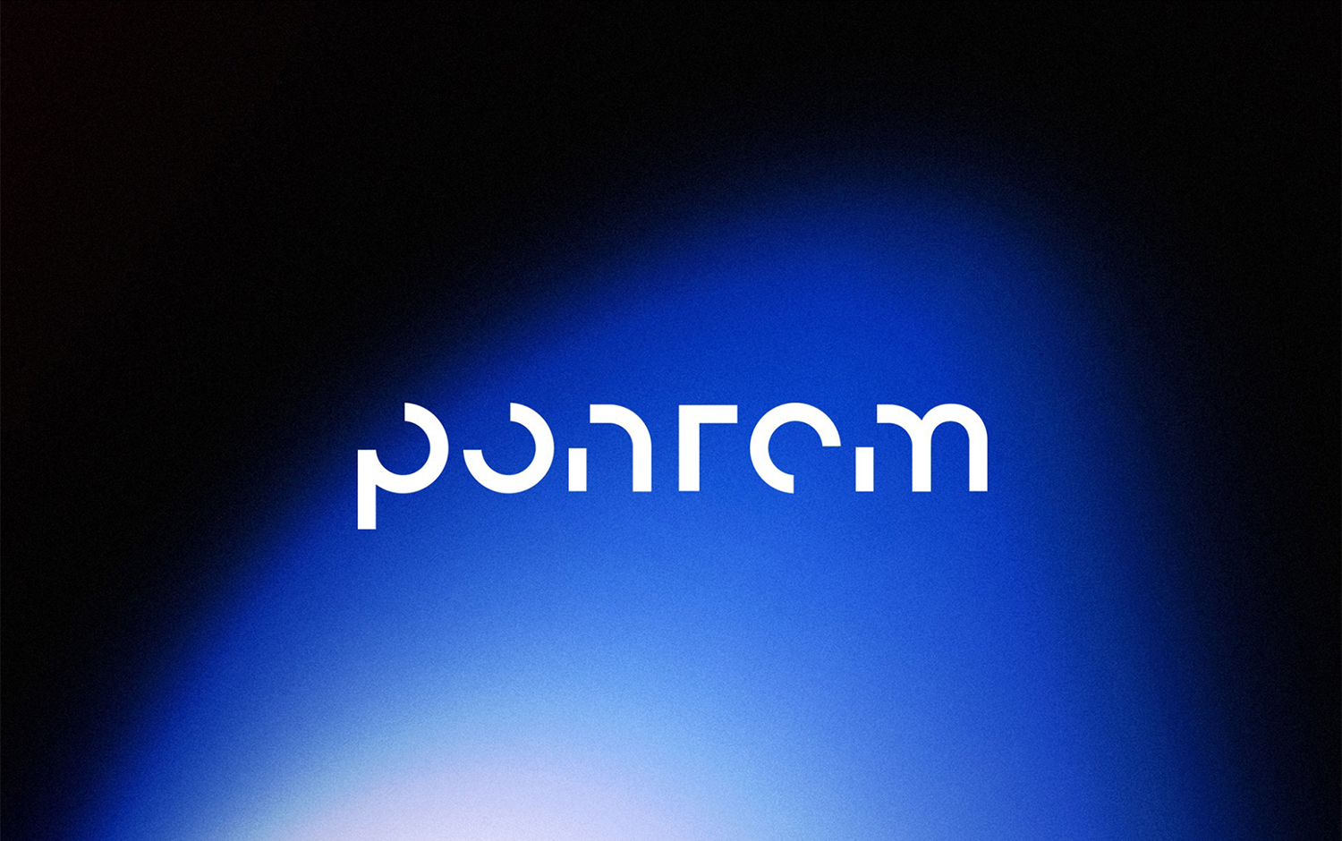
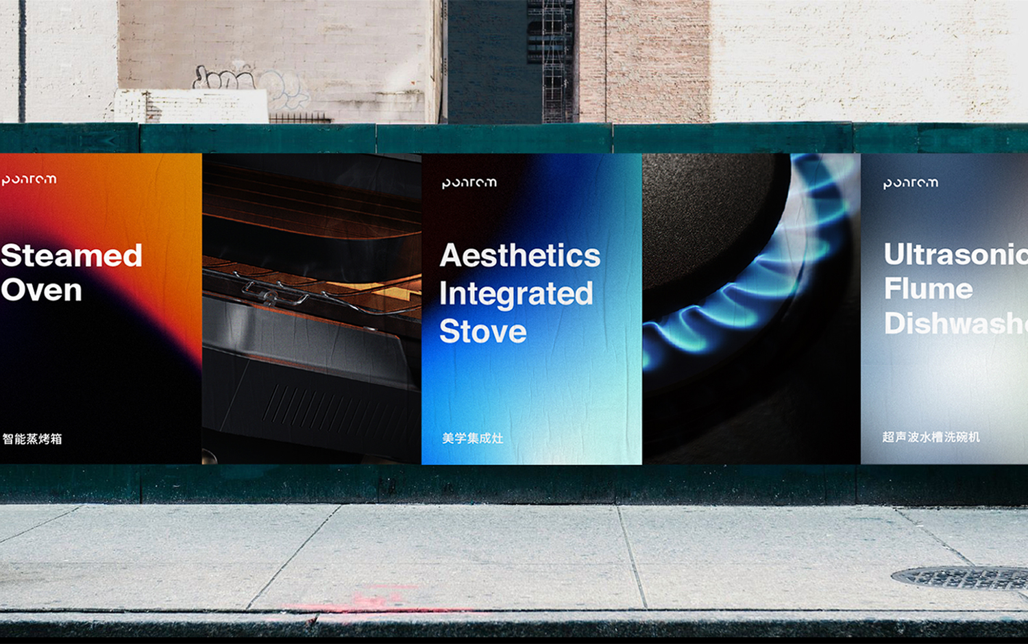
Today, we're taking you to China to showcase the brand identity of Ponrom, a company in charge of the production and sales of kitchen appliances founded by Hangzhou. He asked/u00a0Pan Chuxiong/u00a0and his team to create Ponrom's visual identity and graphic system. The goal was to position the company as an intelligent kitchen appliance brand that is more life-quality and advocates aesthetics of life.
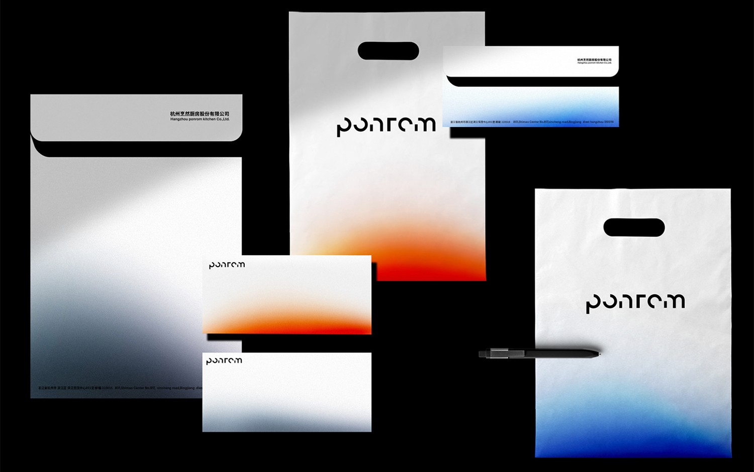
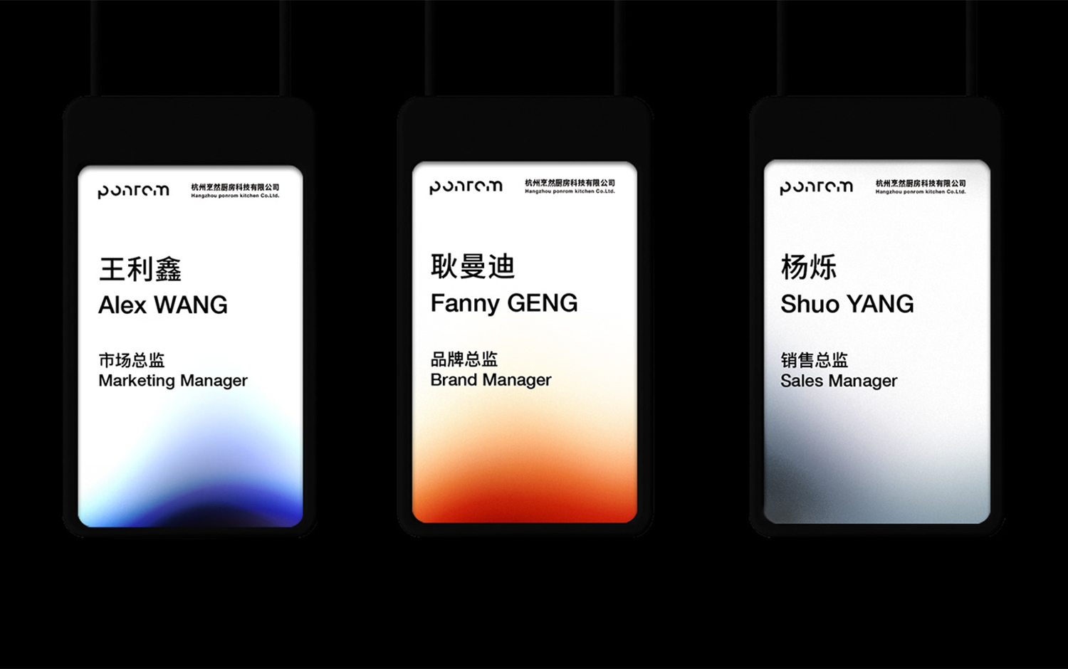
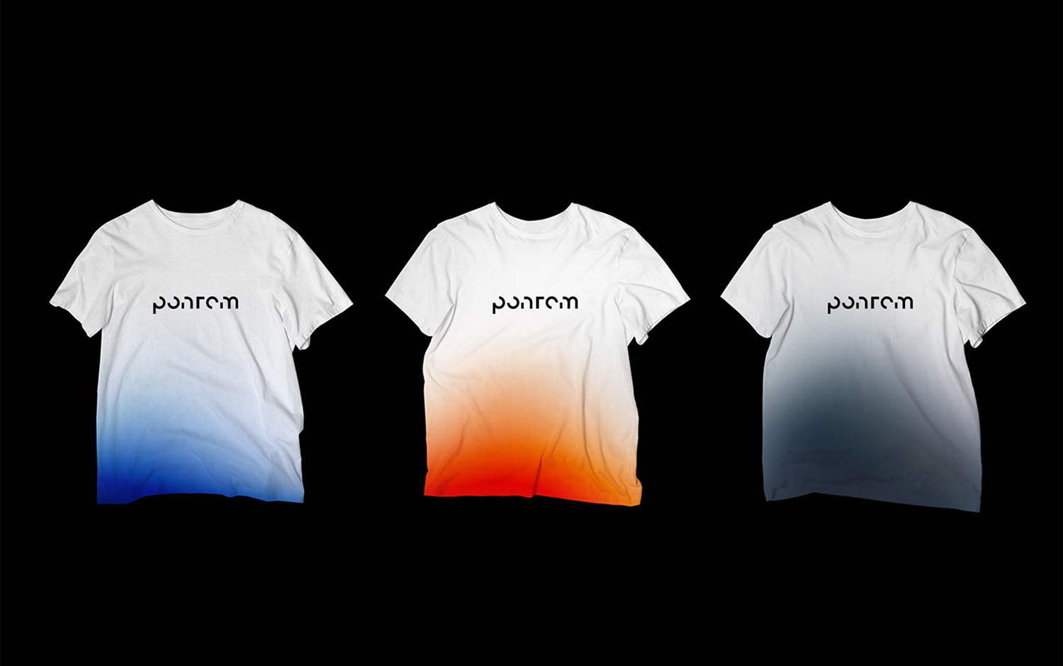
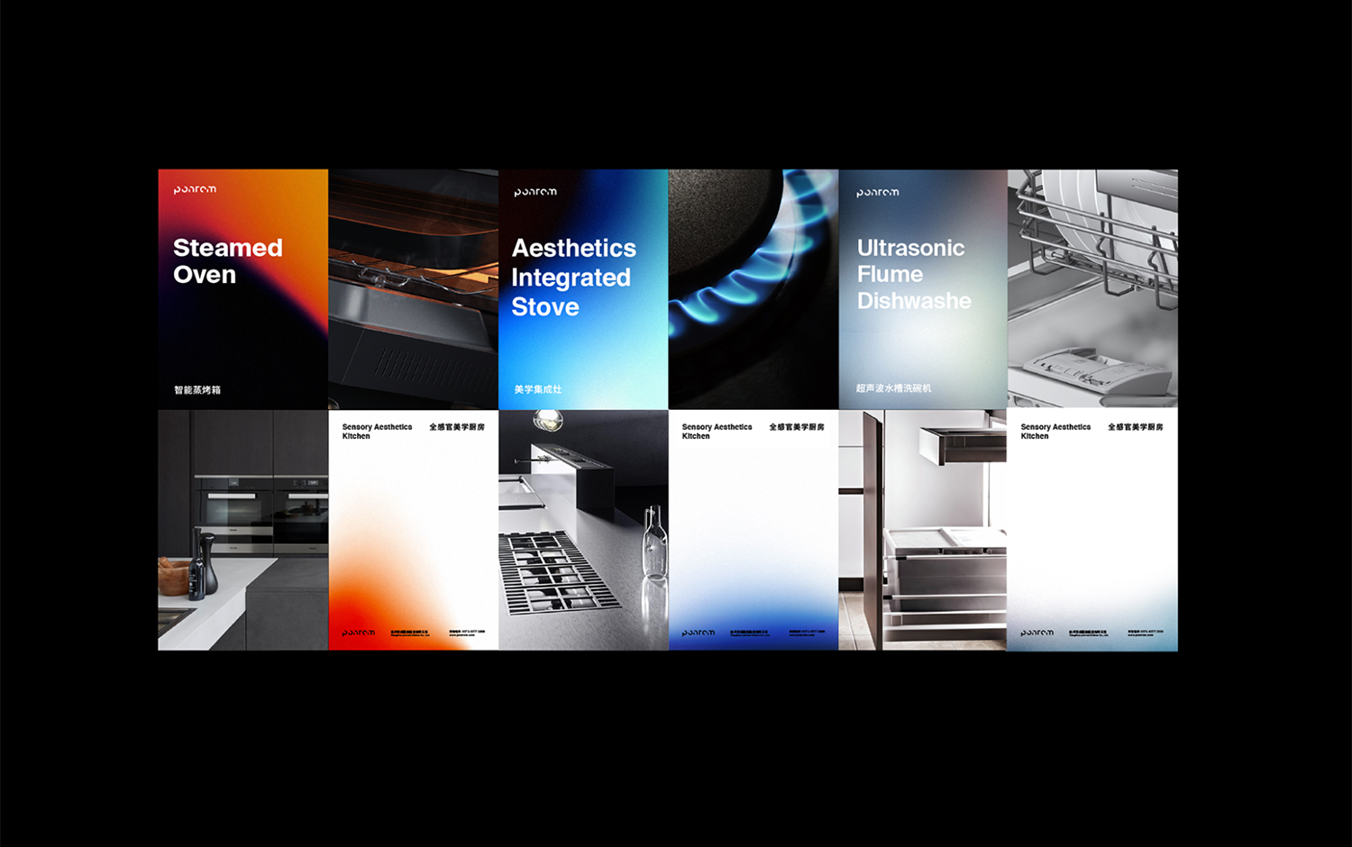
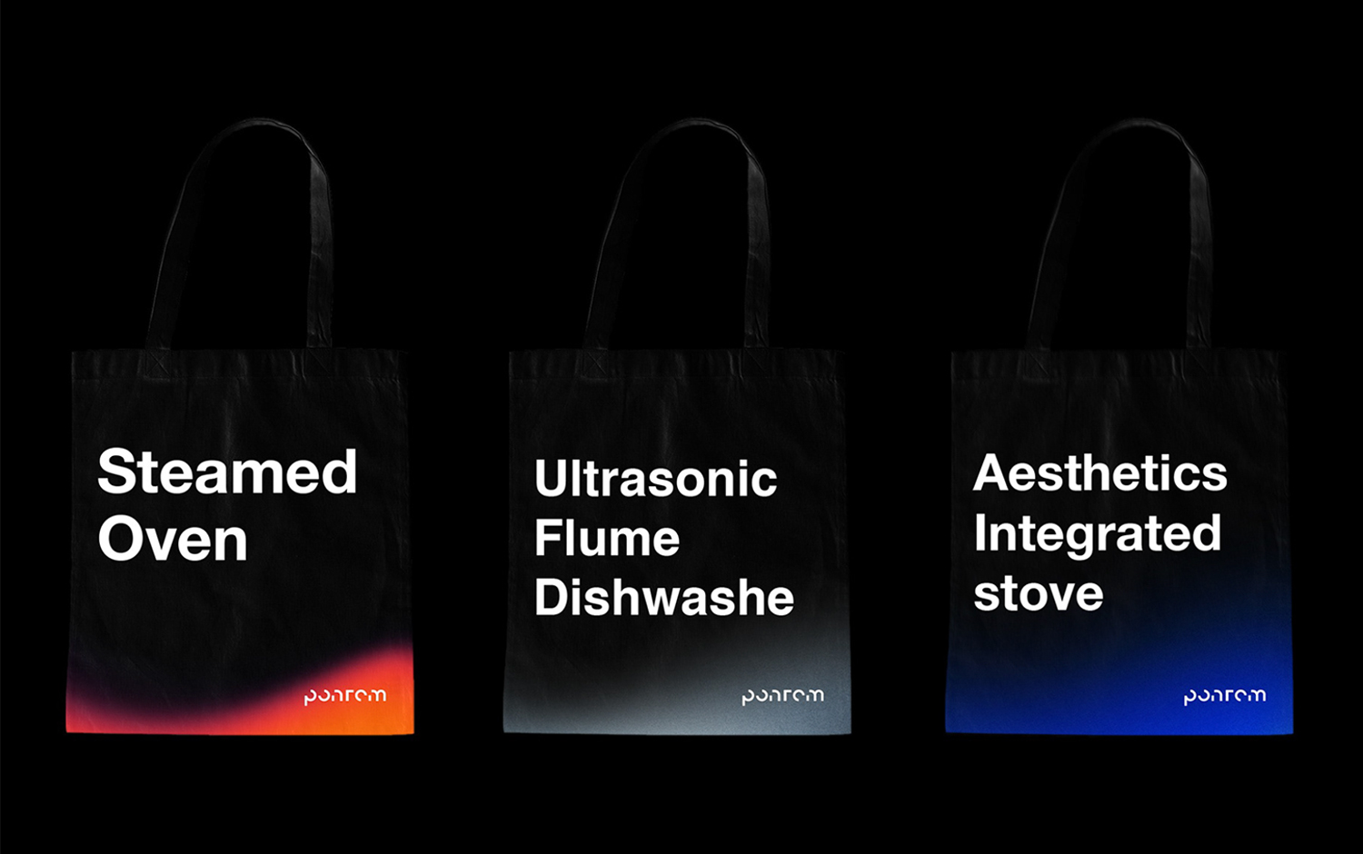
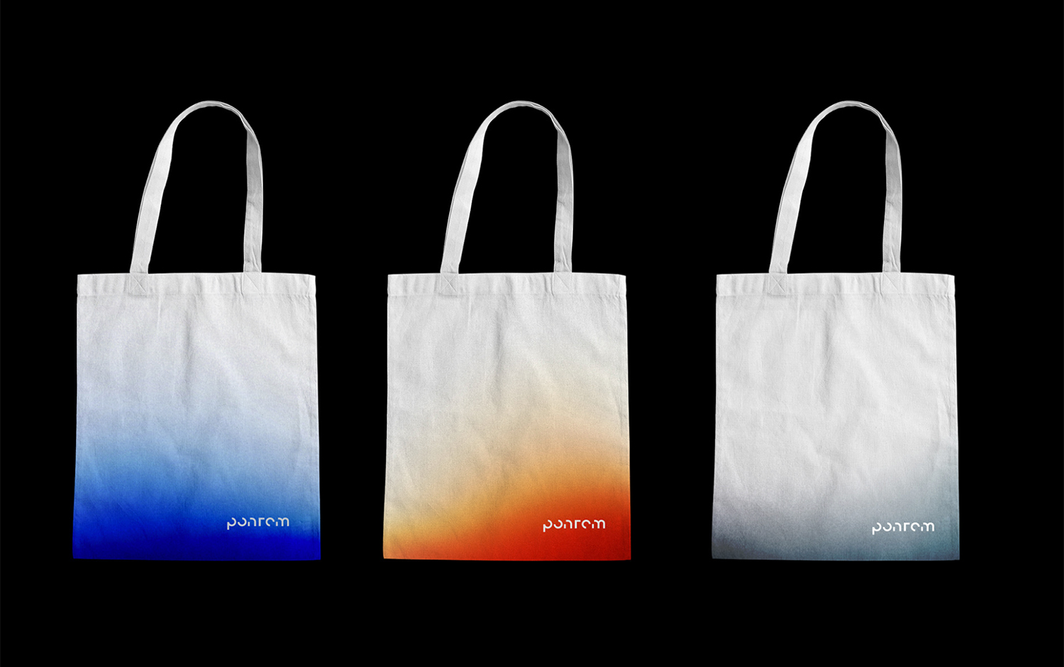
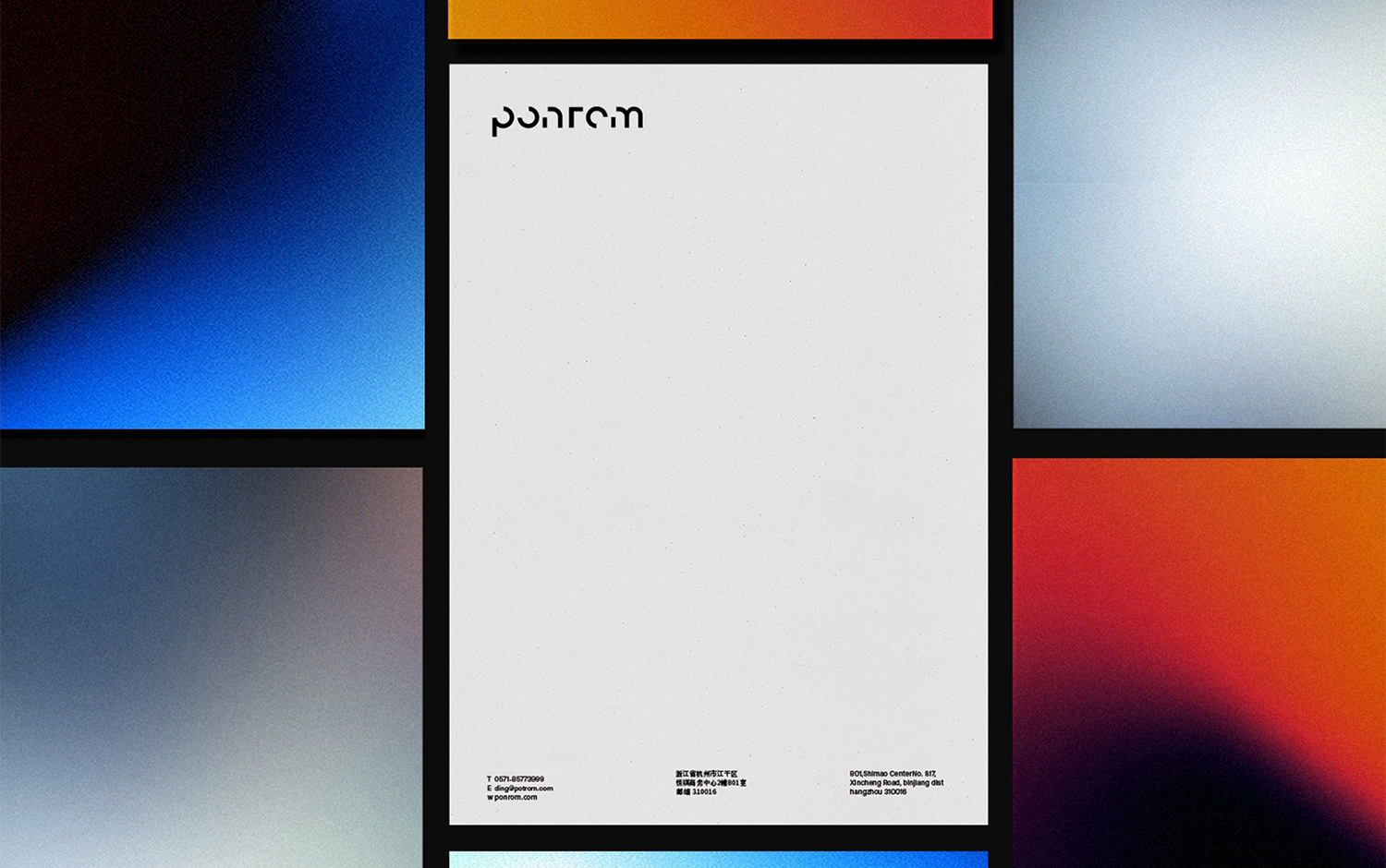
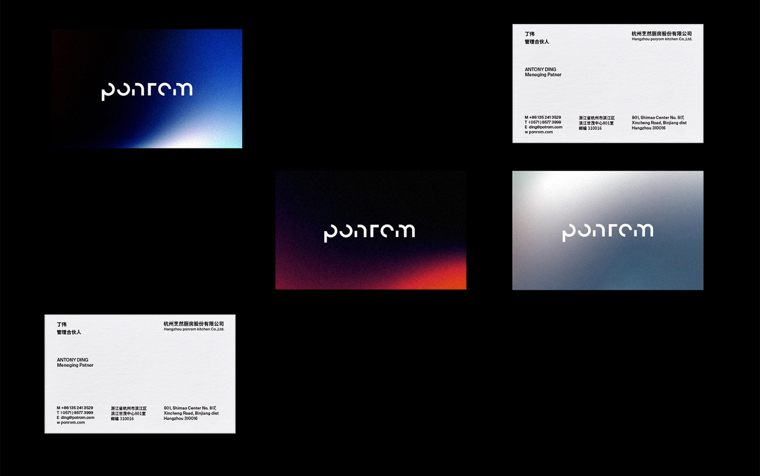
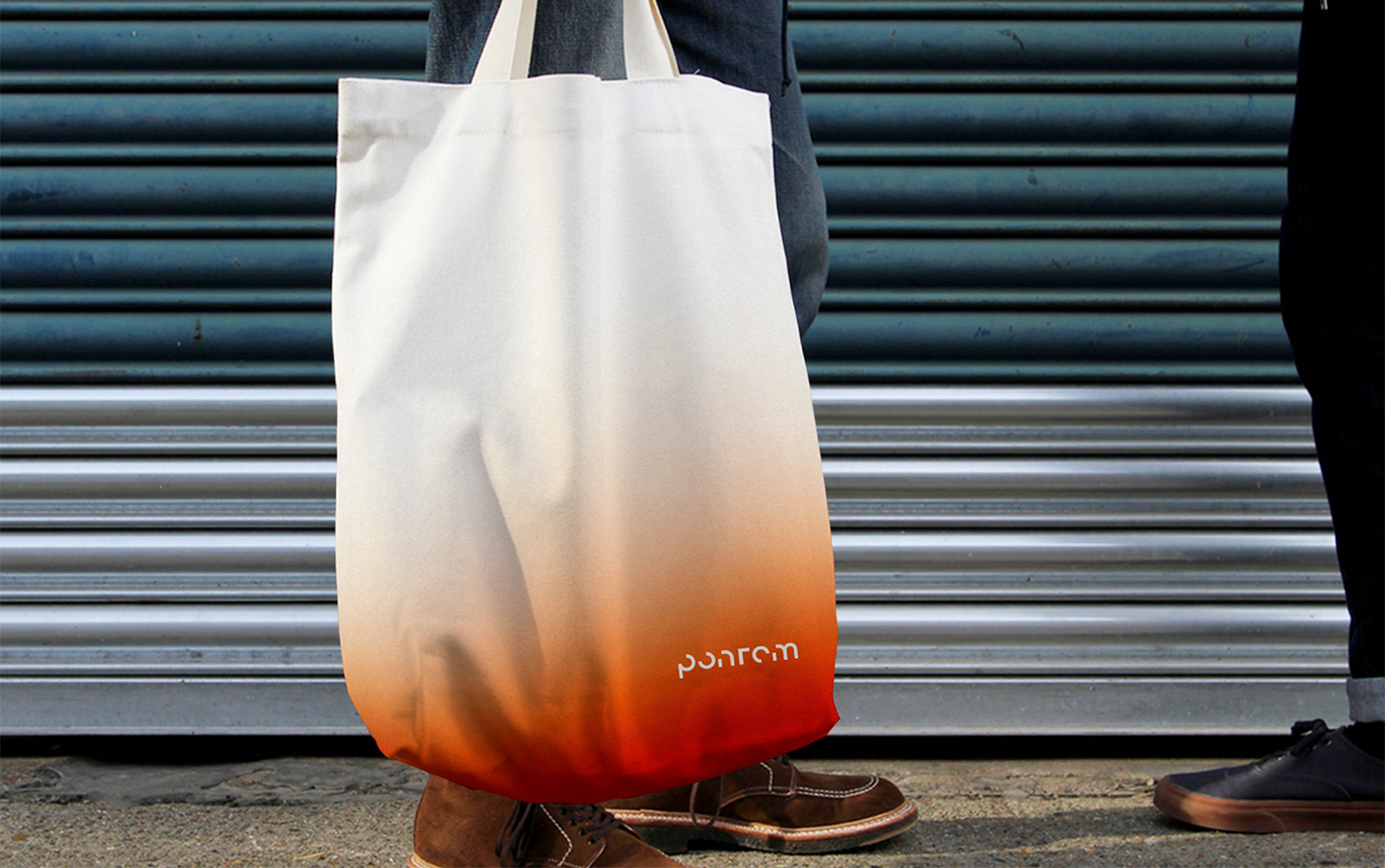
Creatives hoped that the brand communication didn't blind the potential clients, leaving the product's functionality in a second place. In addition to the high quality, designers focused on improving life's quality and whether they can meet their aesthetic needs. The solution comes from three main types of products of Ponrom sells an integrated stove, two steamed ovens, and an ultrasonic flume dishwasher./u00a0From these three products, the team extracted three gradient color forms. Following 2021's most popular palette trend, the brand's visual language adopts the blue from the stove, the red after the oven, and the silver from the sink. So, the chosen hues, of course, bring a modern and technological imprint, which is super eye-catchy./u00a0
All in all, creatives hope that through the beauty of the texture of kitchen appliances from another perspective to show the aesthetic feeling of kitchen appliances./u00a0
Creator: Pan Chuxiong
