


Kati Forner
May 25, 2022
Mindsparkle Mag


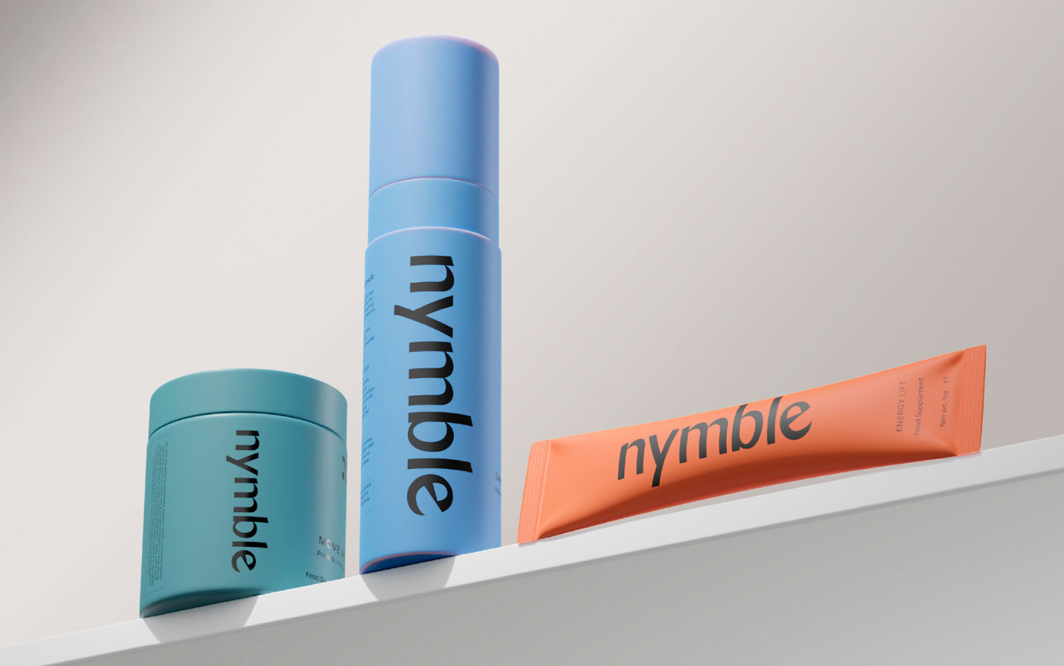
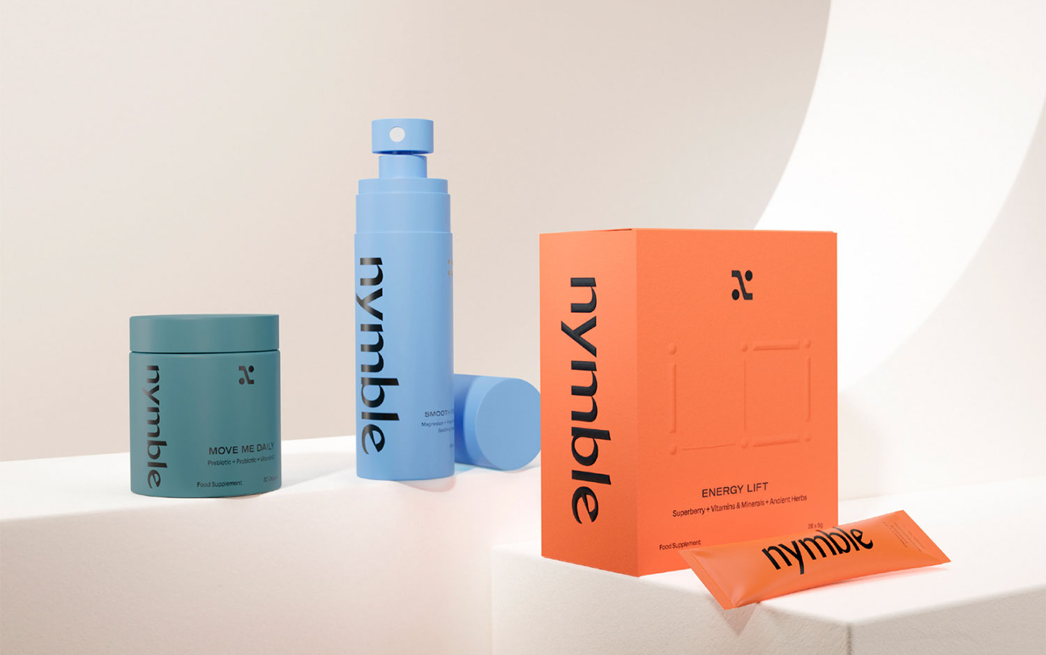
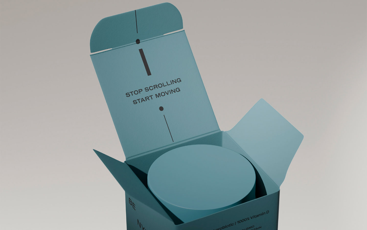
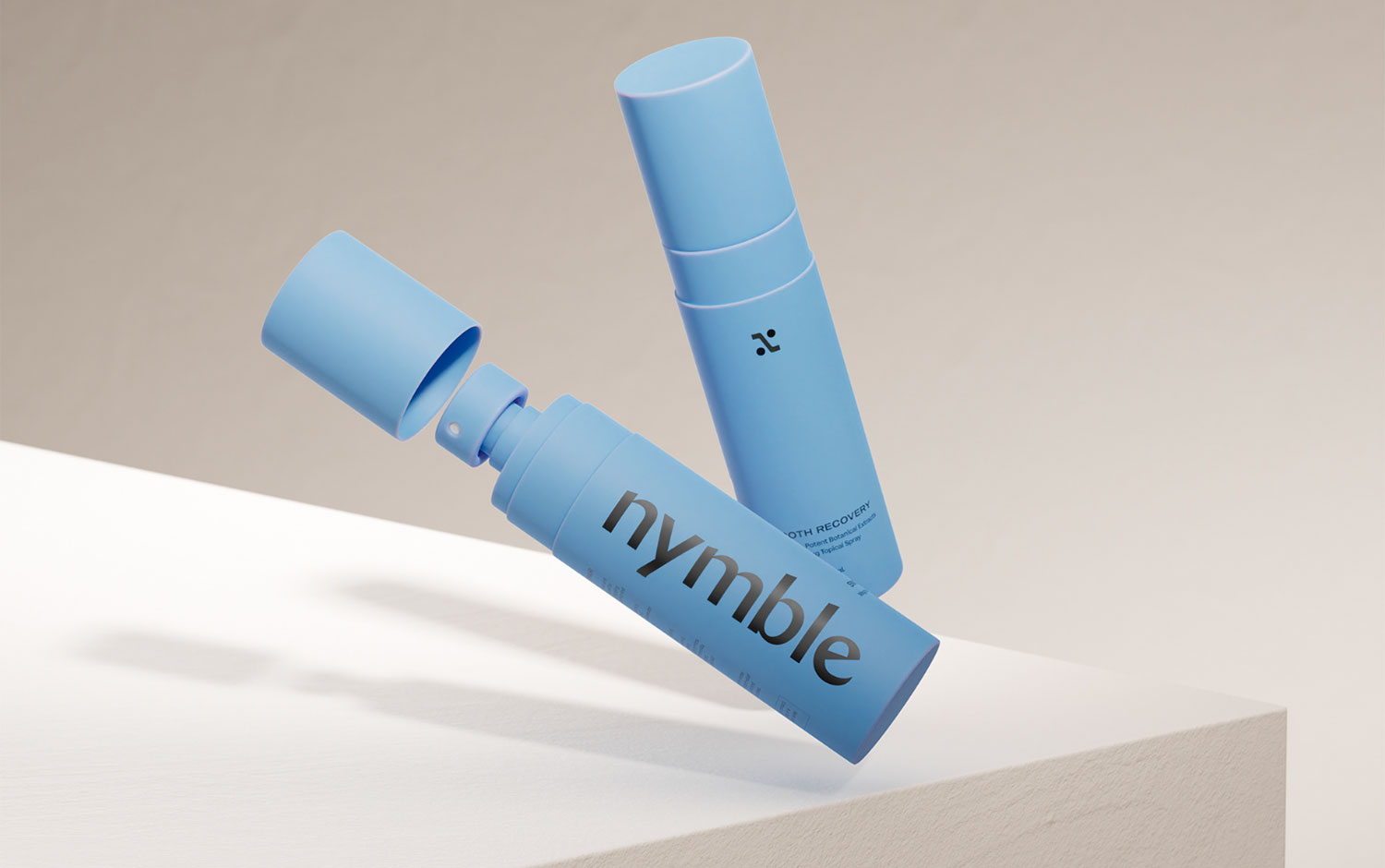
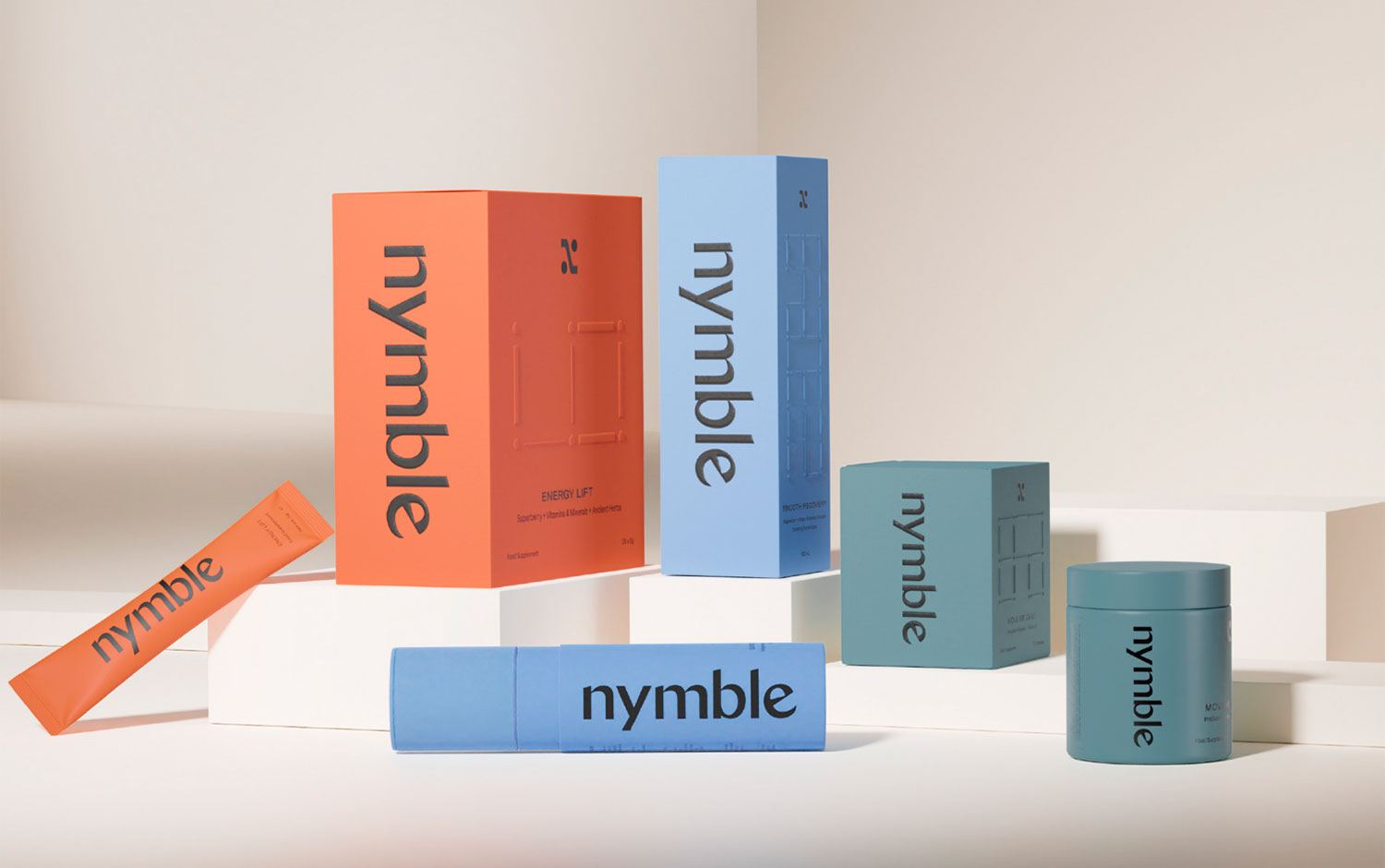
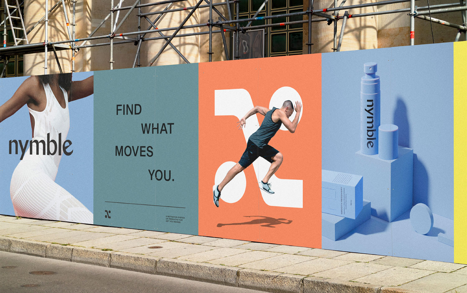
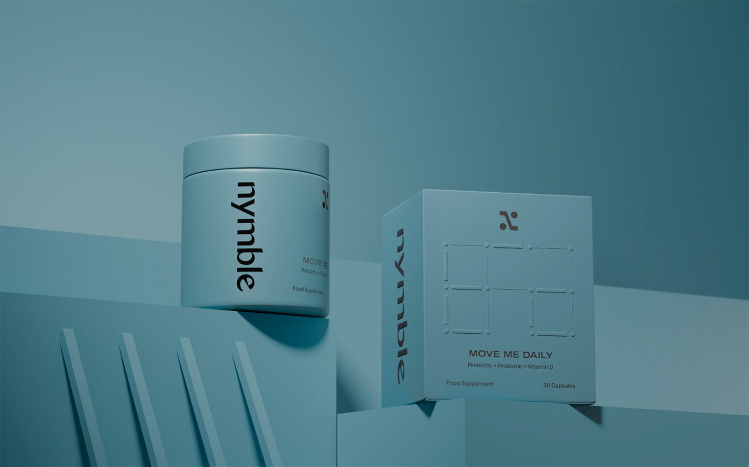
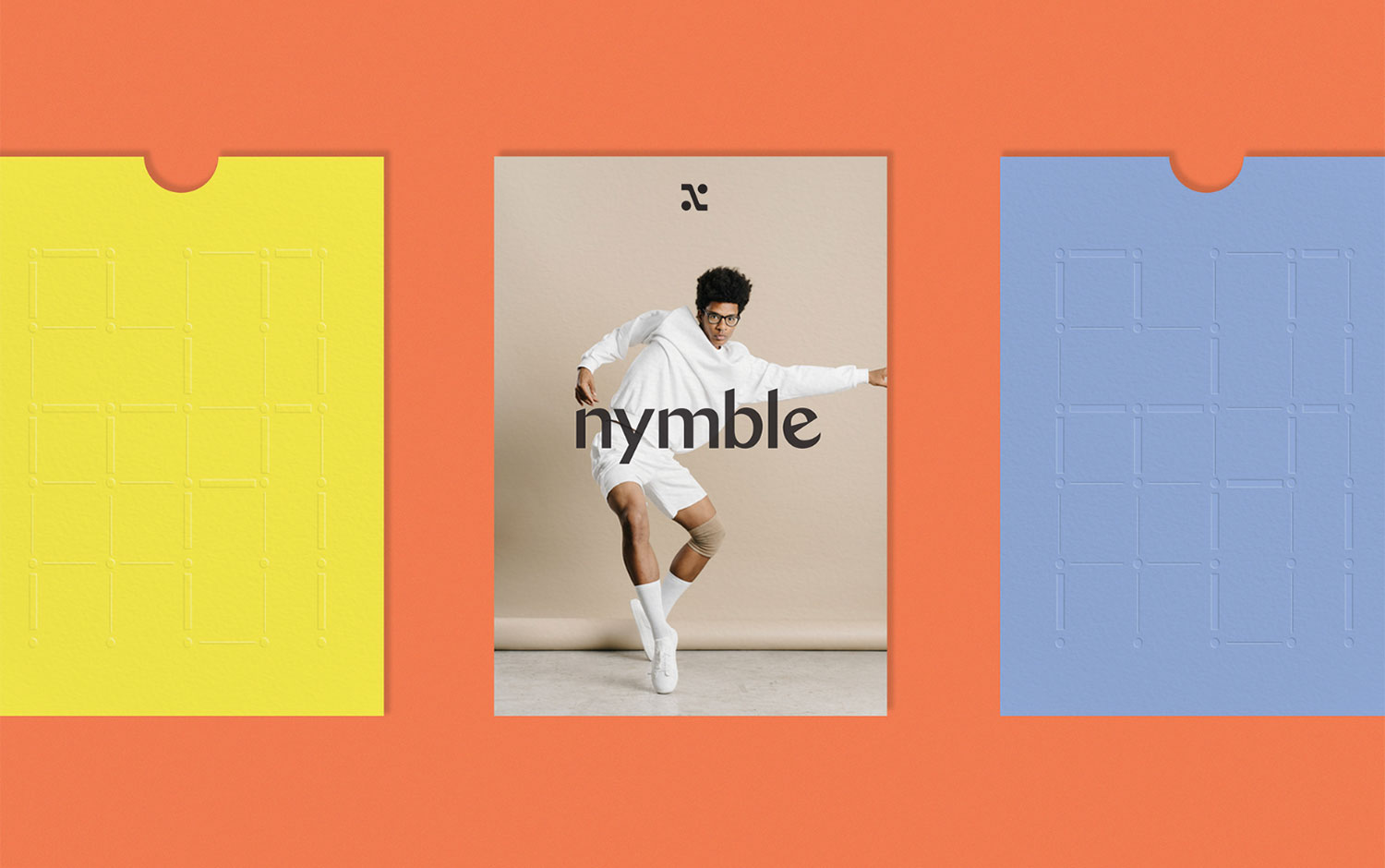
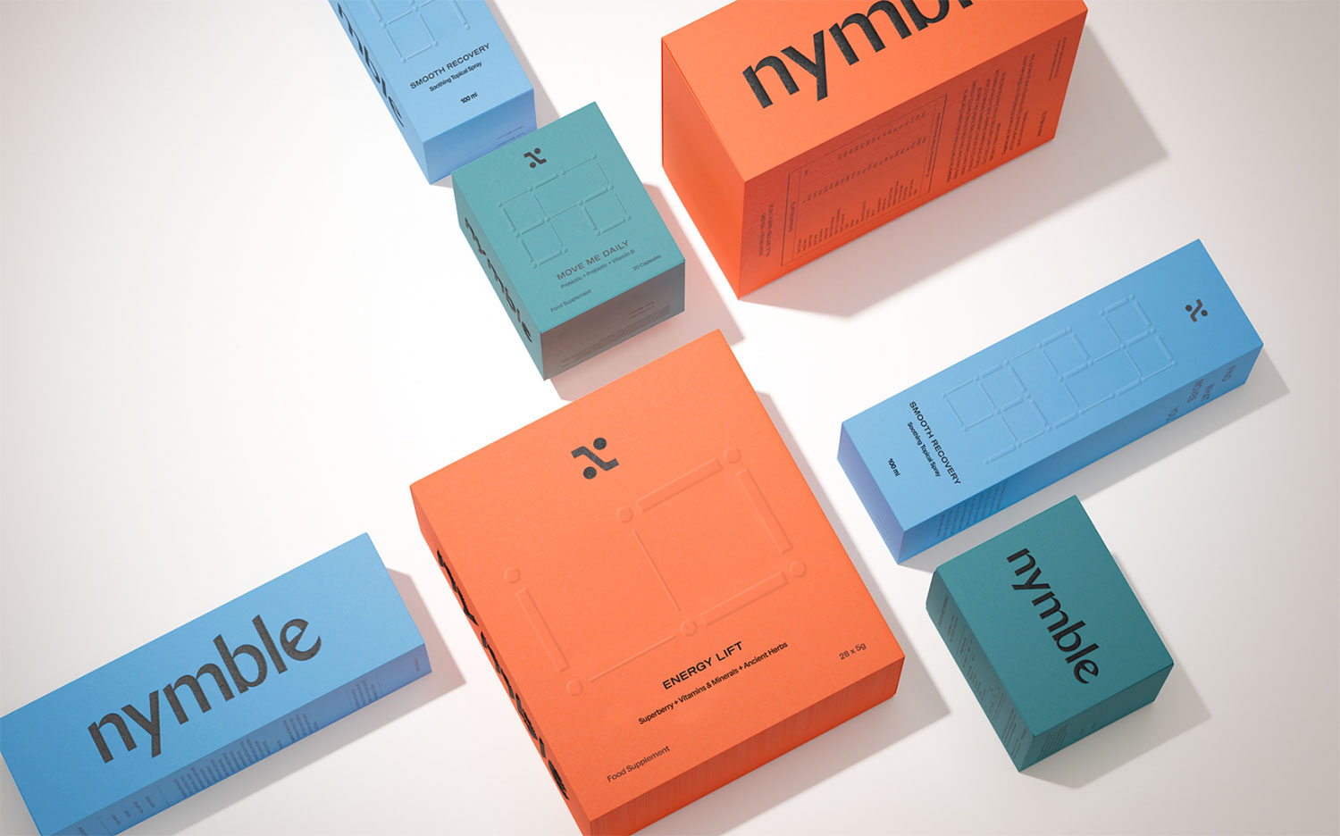
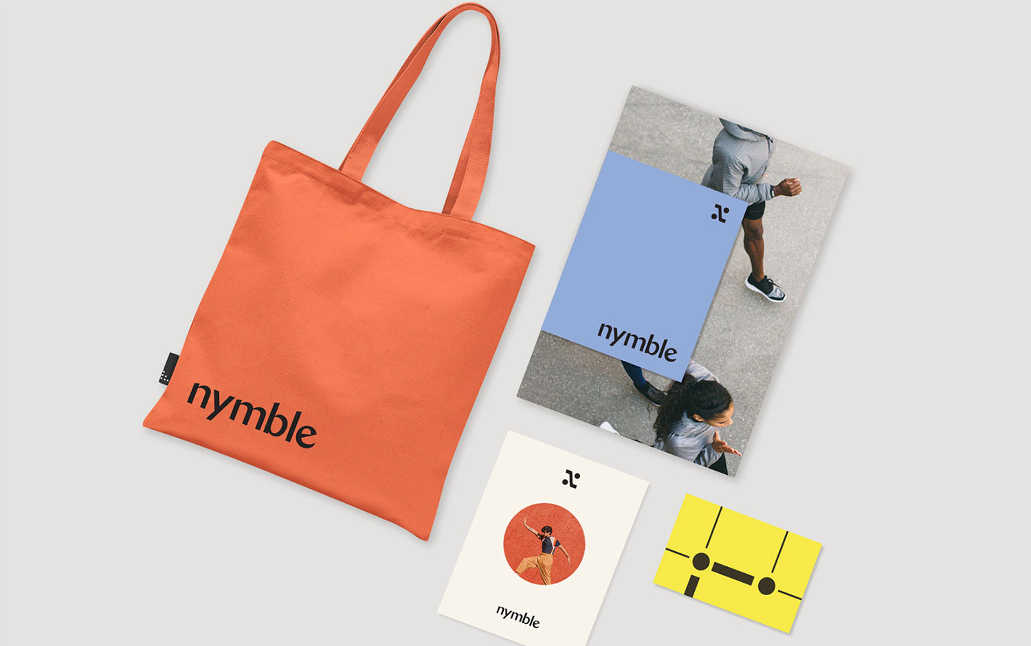
Nymble came to/u00a0Kati Forner's design studio with a wellness suite focused on getting more people moving. From naming and strategy to messaging and identity, they helped them create a brand culture that changes the fitness conversation from how we look to how we feel. And empowers people to move for the right reason/u2014their health/u2014while removing barriers like sluggishness, fog, and fatigue./u00a0
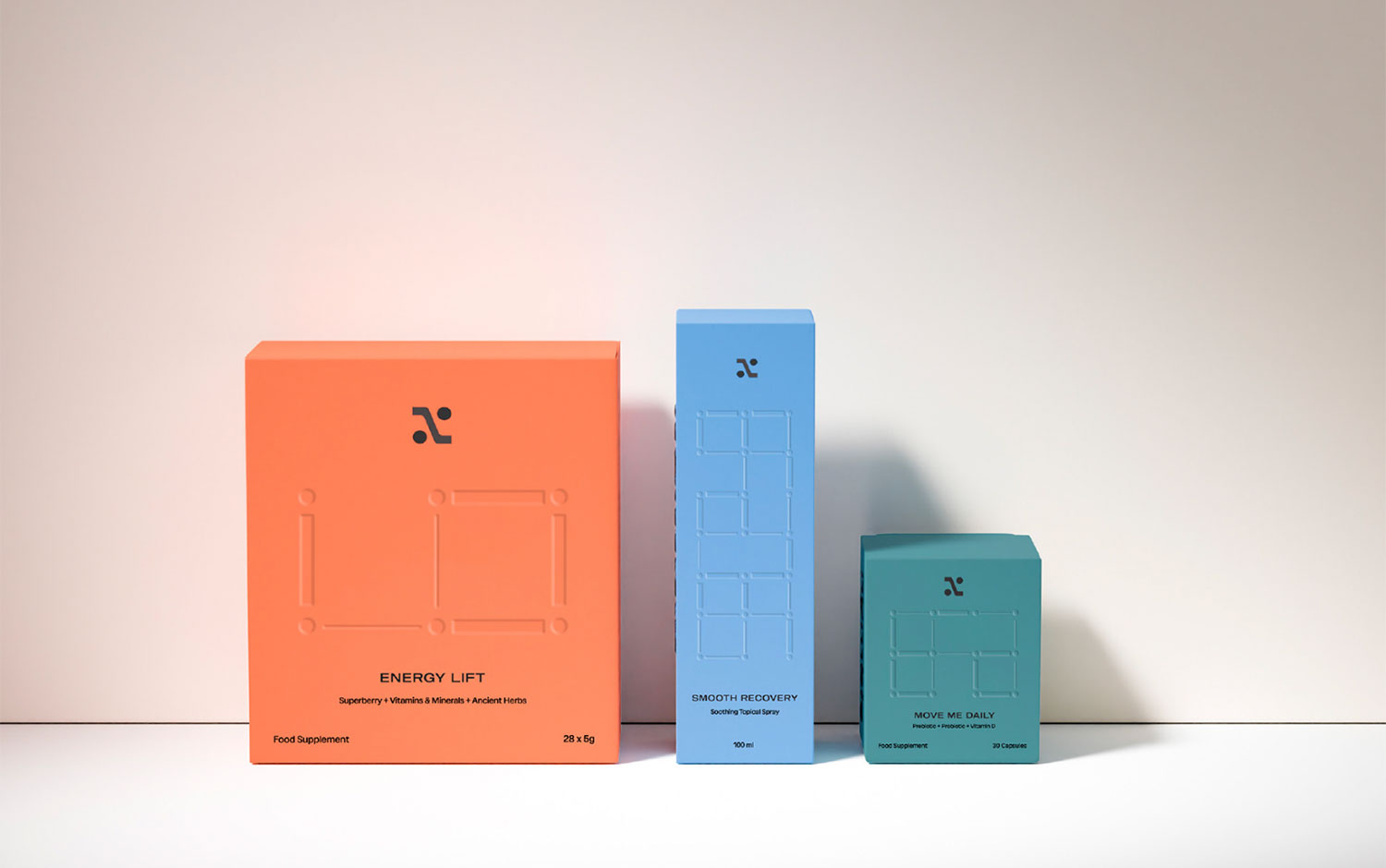
The logomark is built upon a stylish sans serif that is both clean and sophisticated. Each letterform has beautiful transitions that give the mark as a whole a sense of movement. Inspired by body movement, the Nymble 'N' submark embodies the spirit of the brand in a clean and elevated way. The Nymble grid pattern represents health journeys and individual pathways to greater health and wellness.
Creator: Kati Forner


.webp)


