


Erretres
March 18, 2017
Mindsparkle Mag


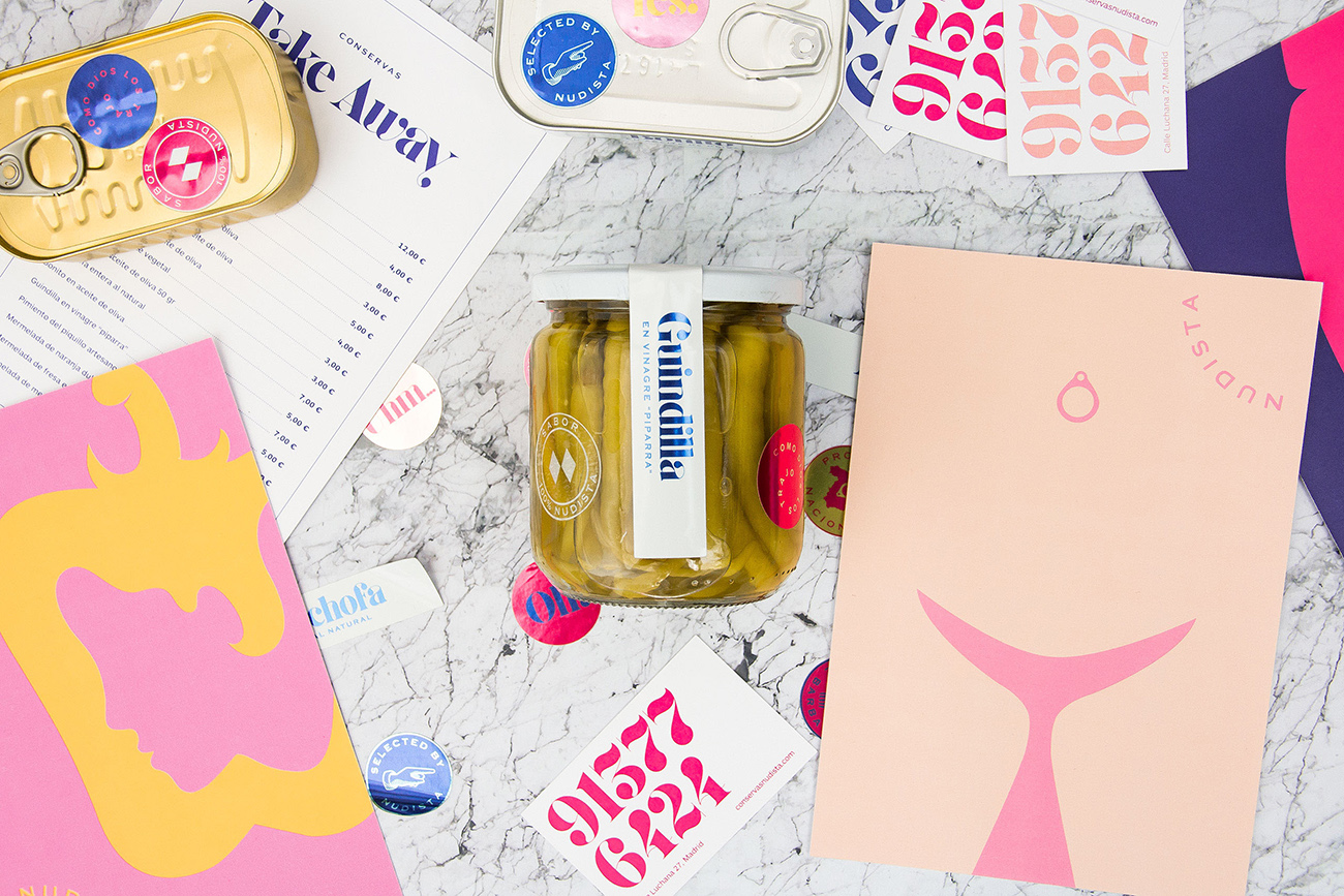
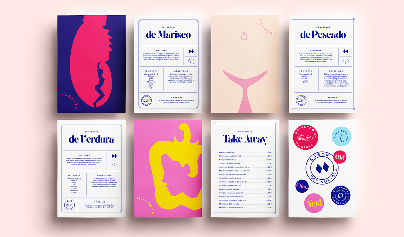
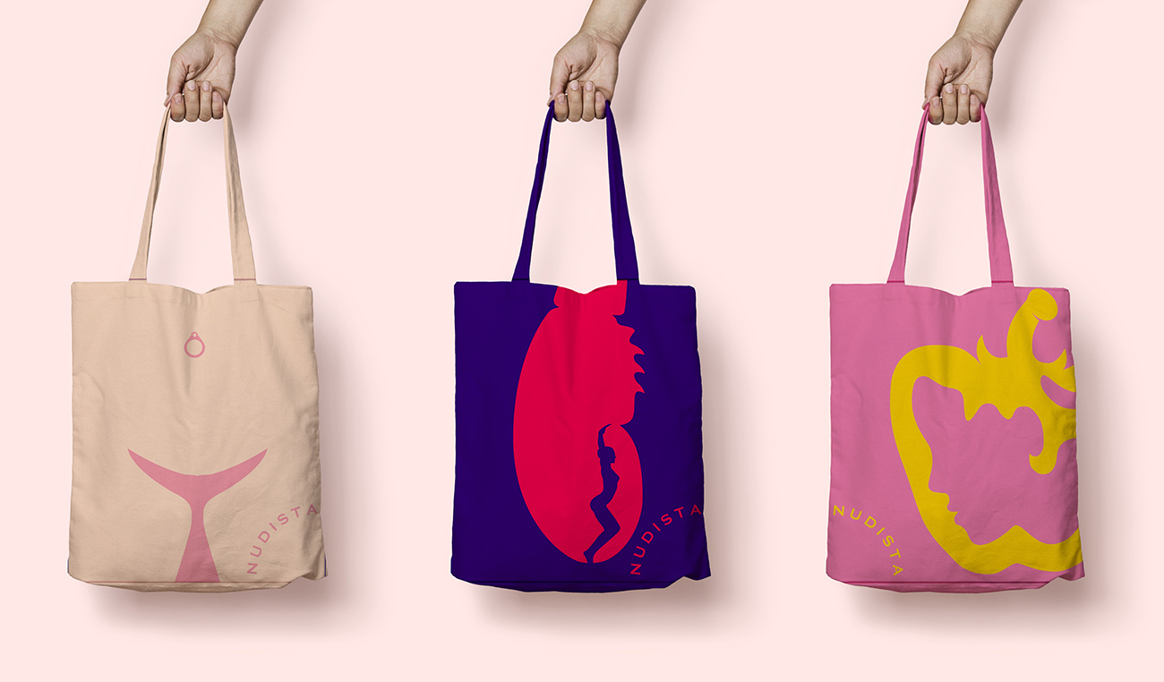
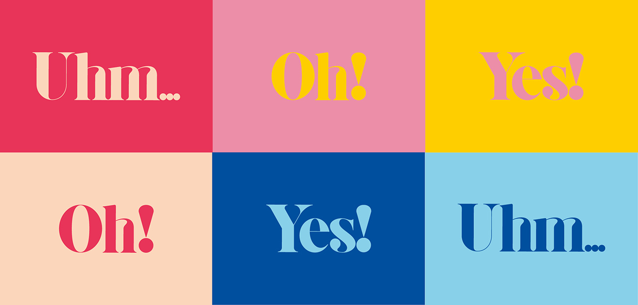
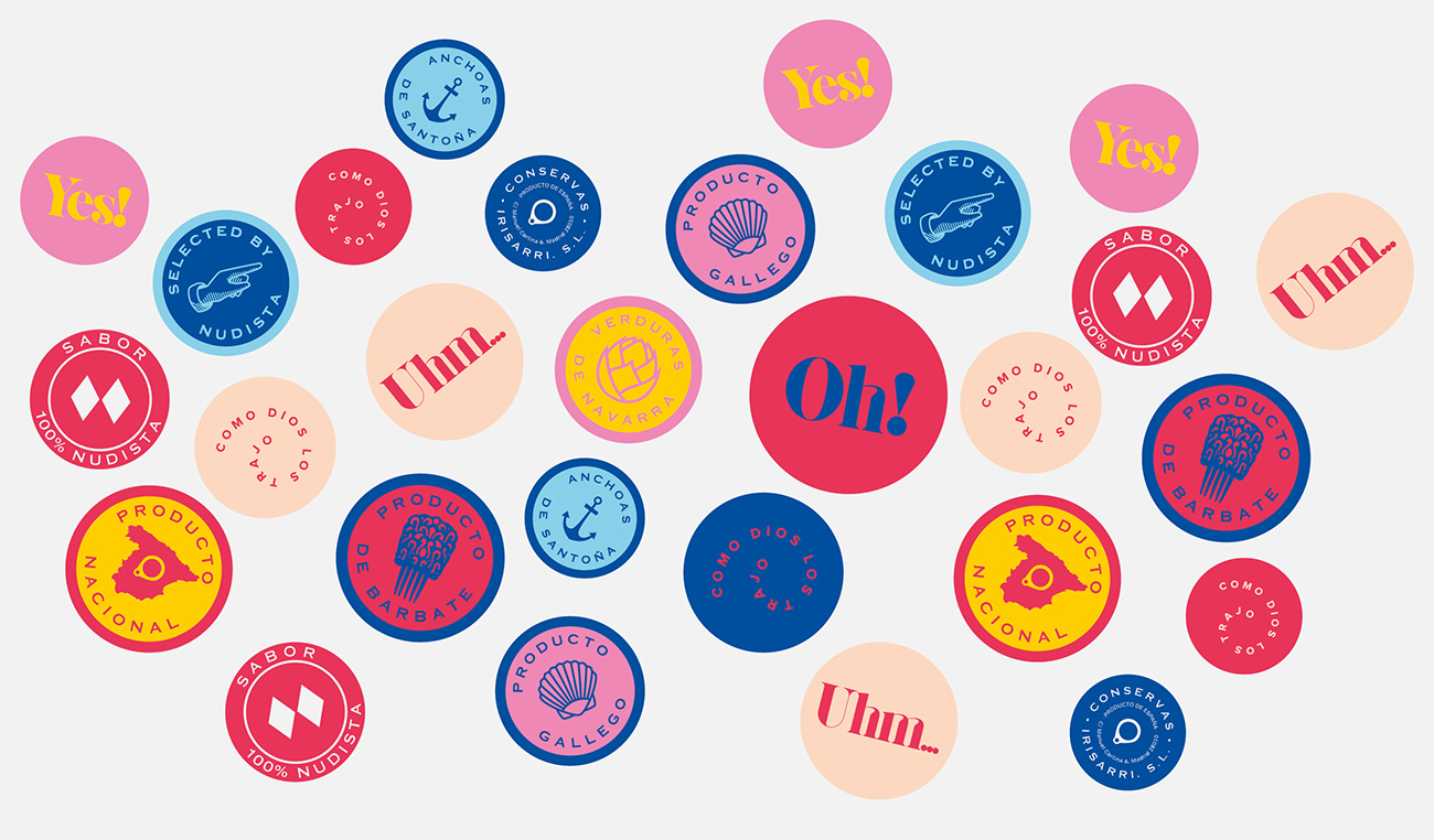
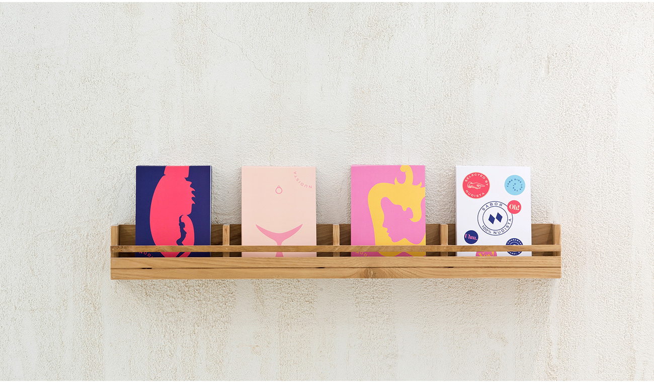
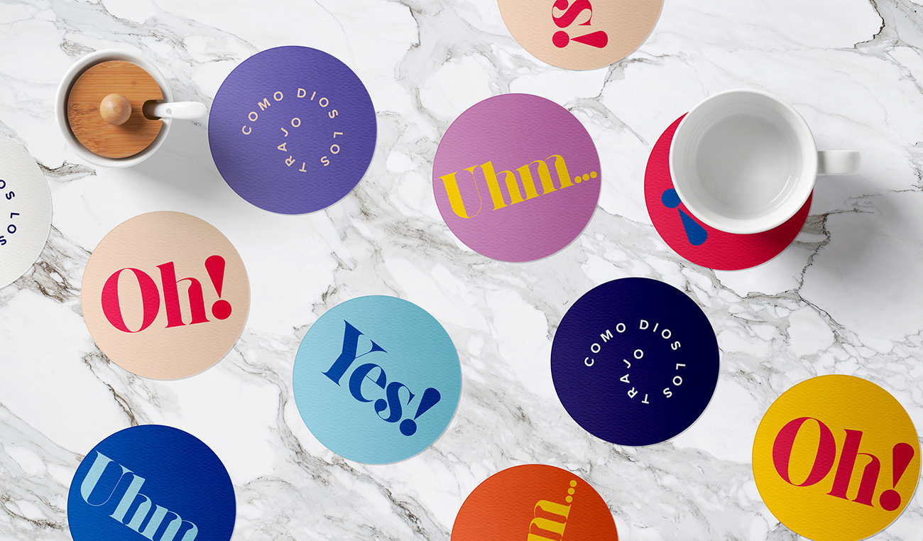
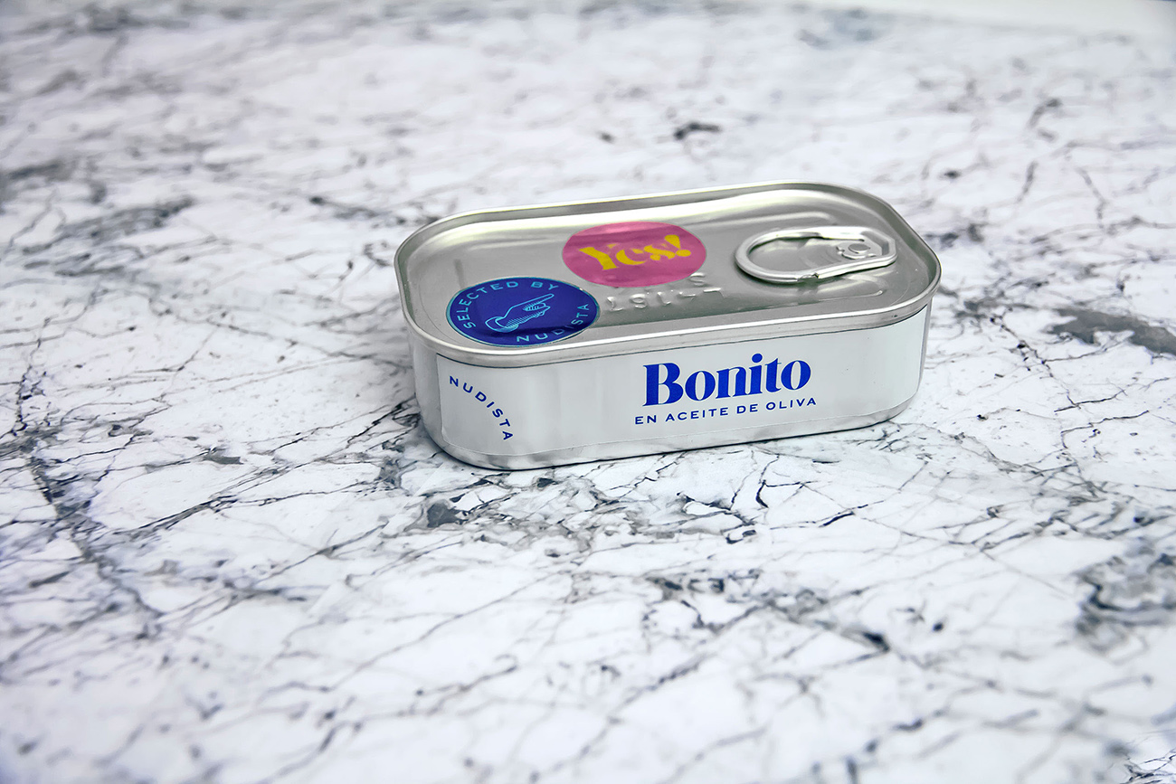
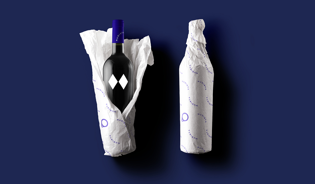
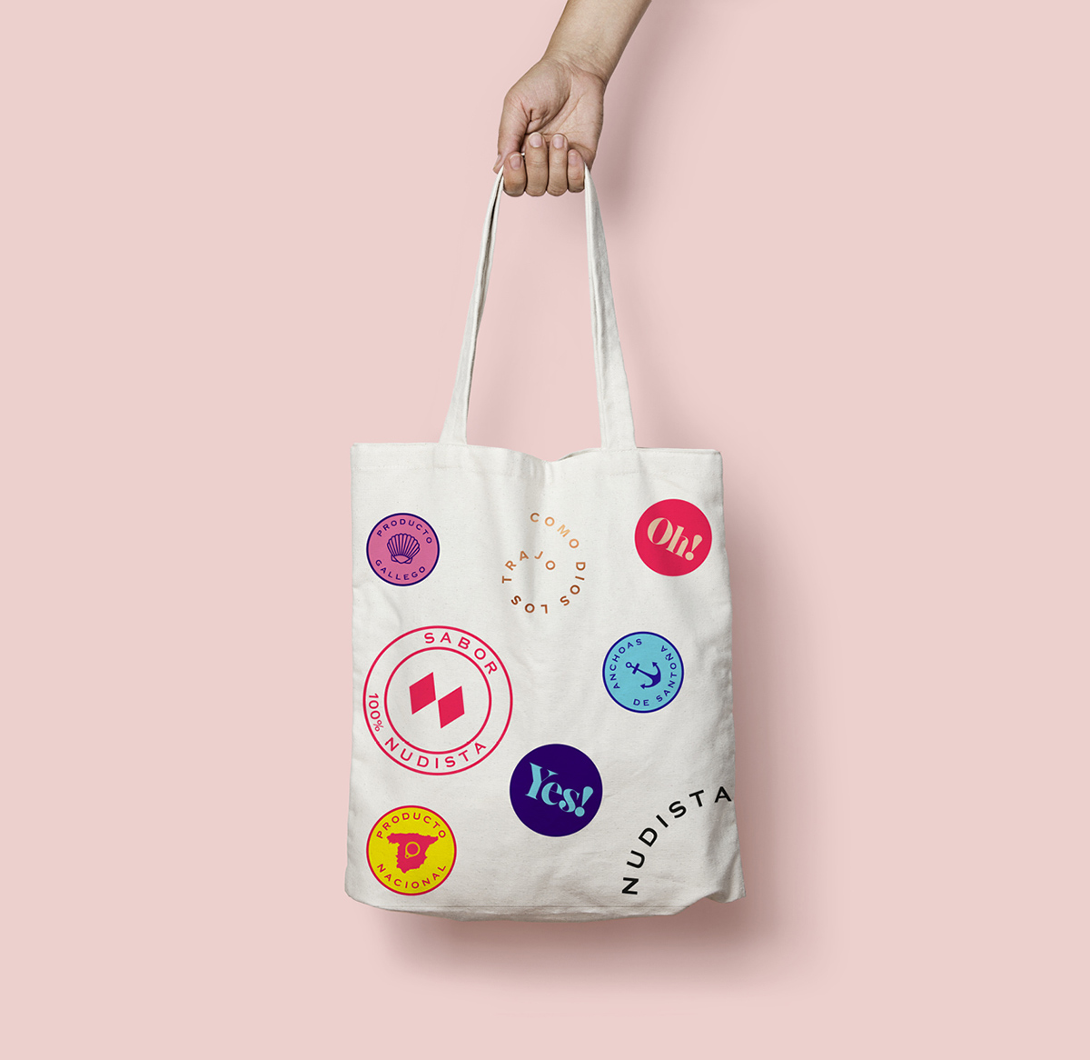
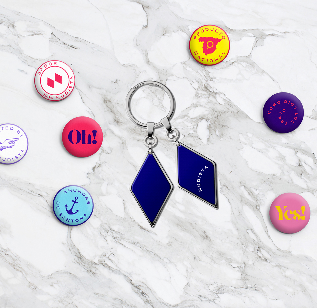
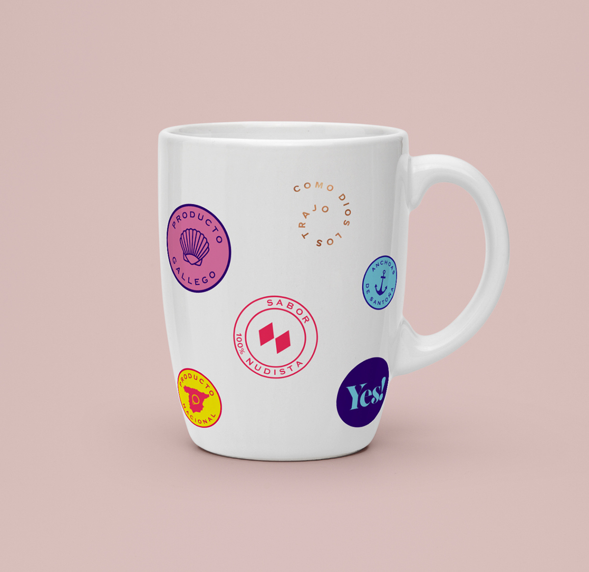
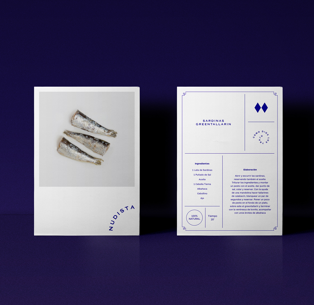
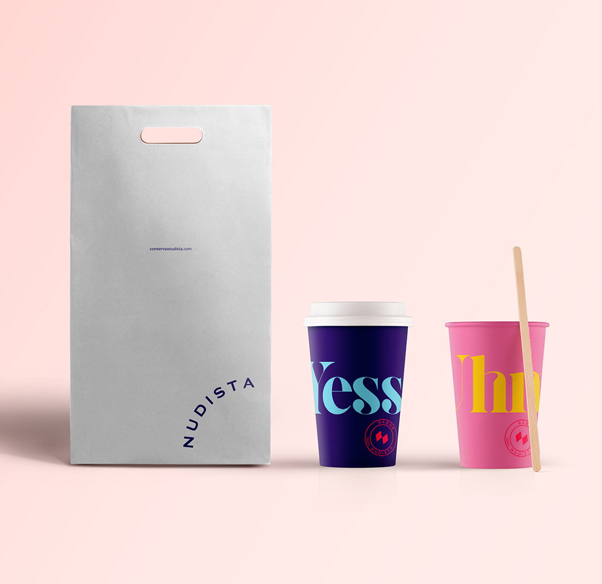
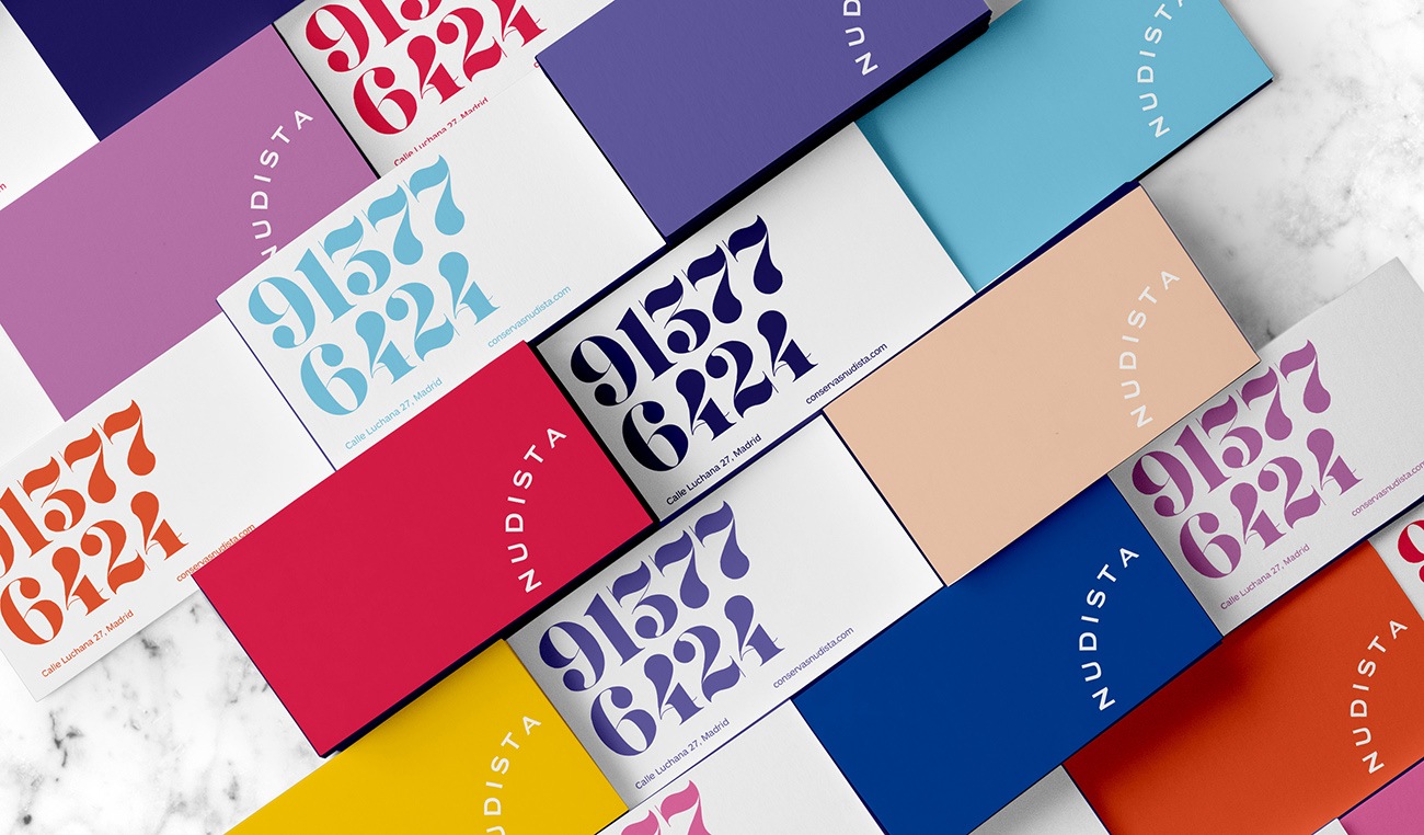
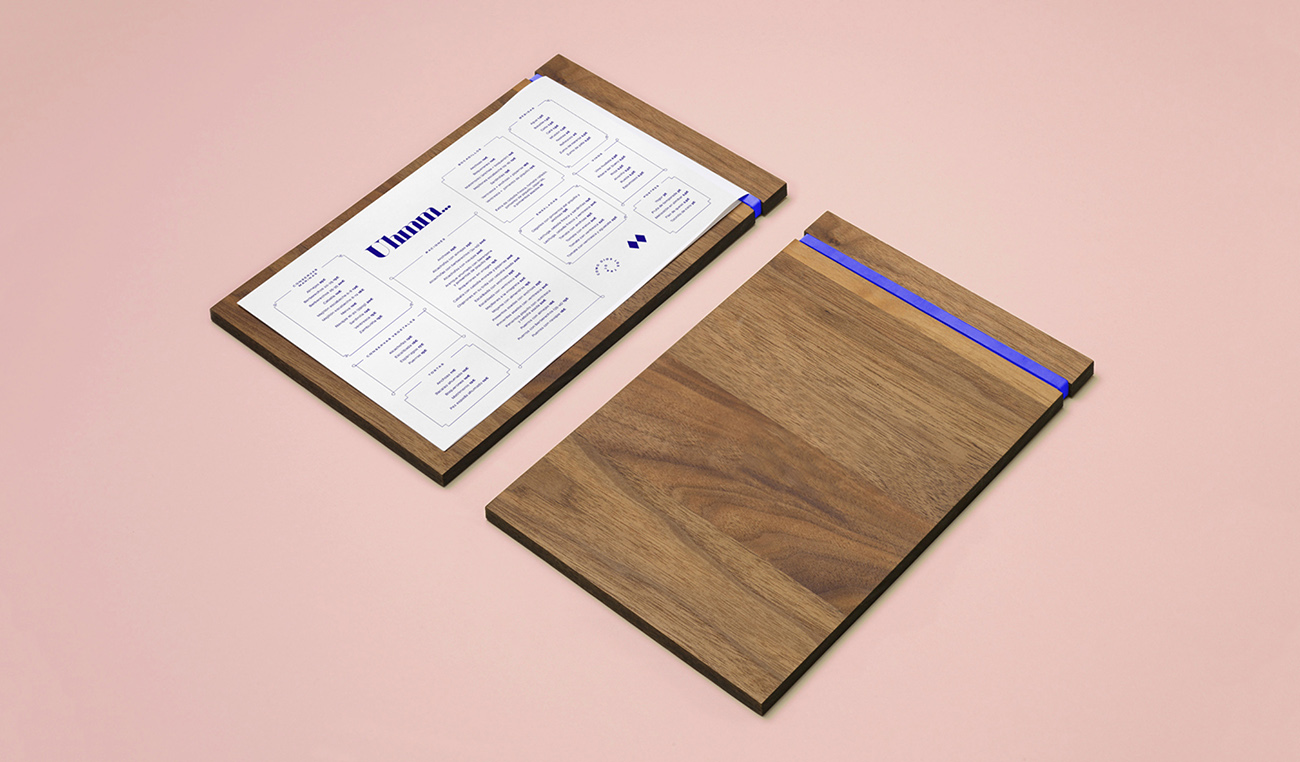
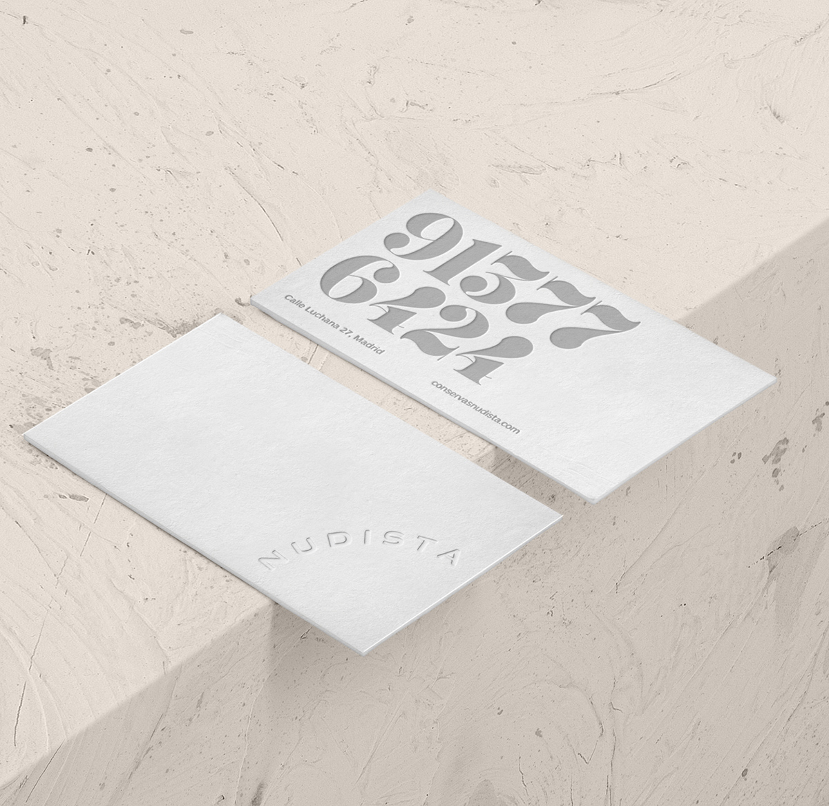
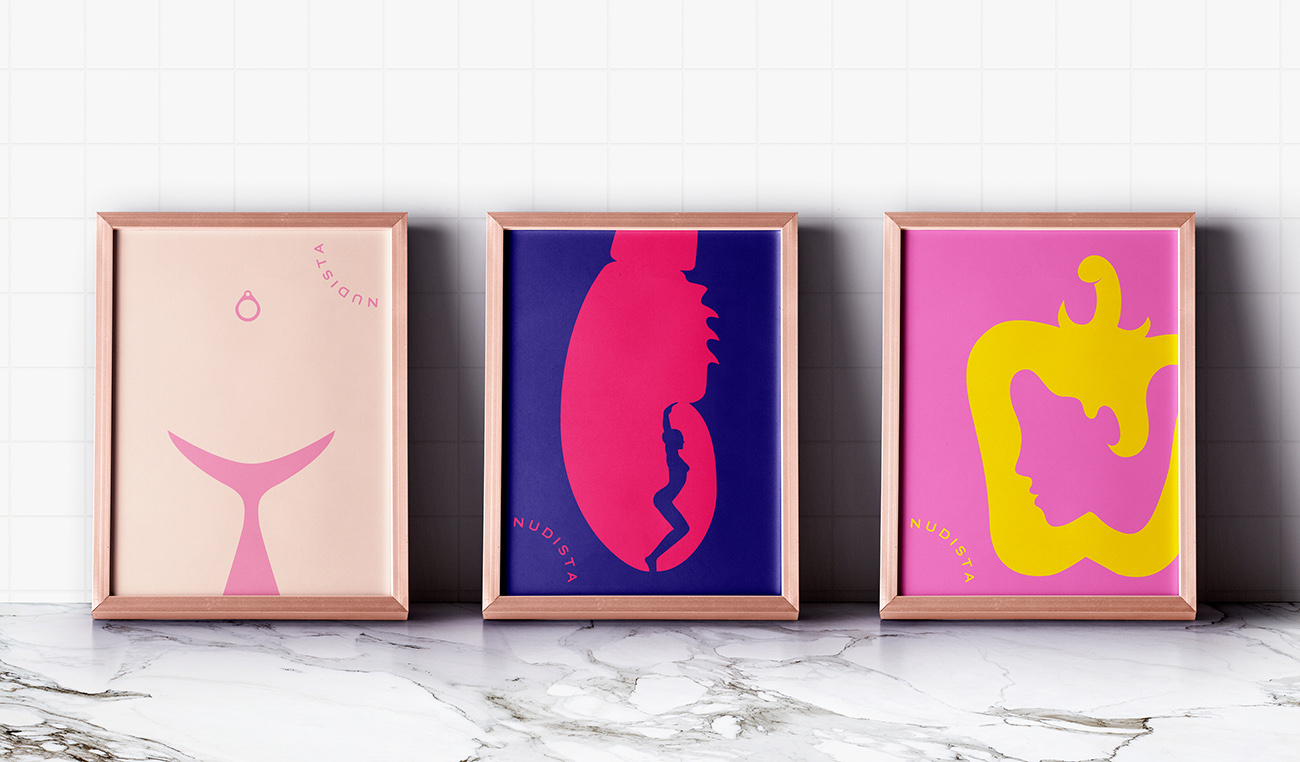
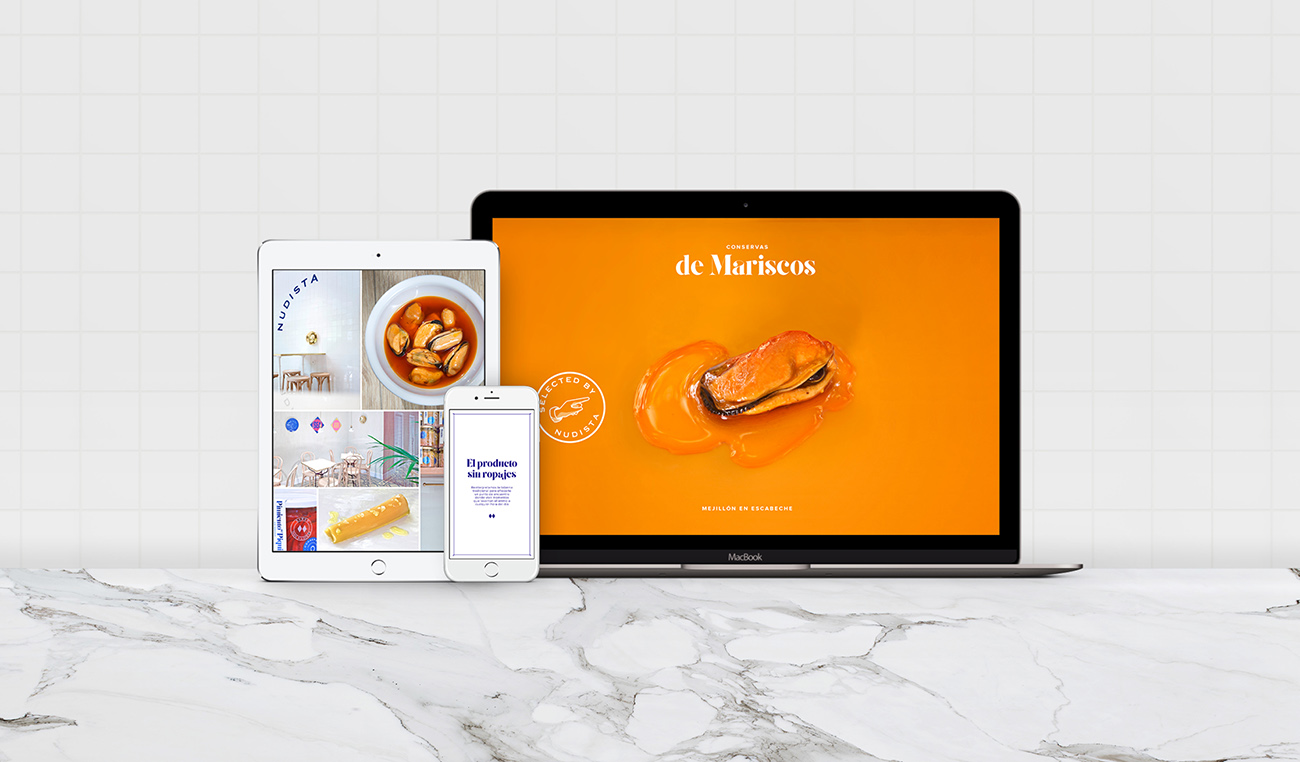
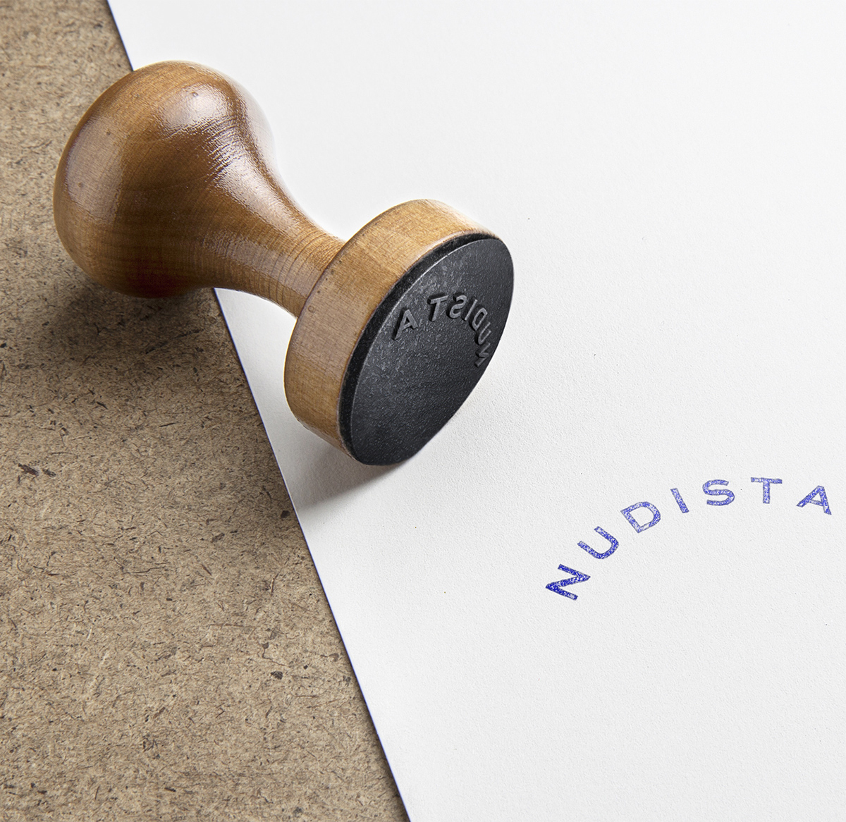
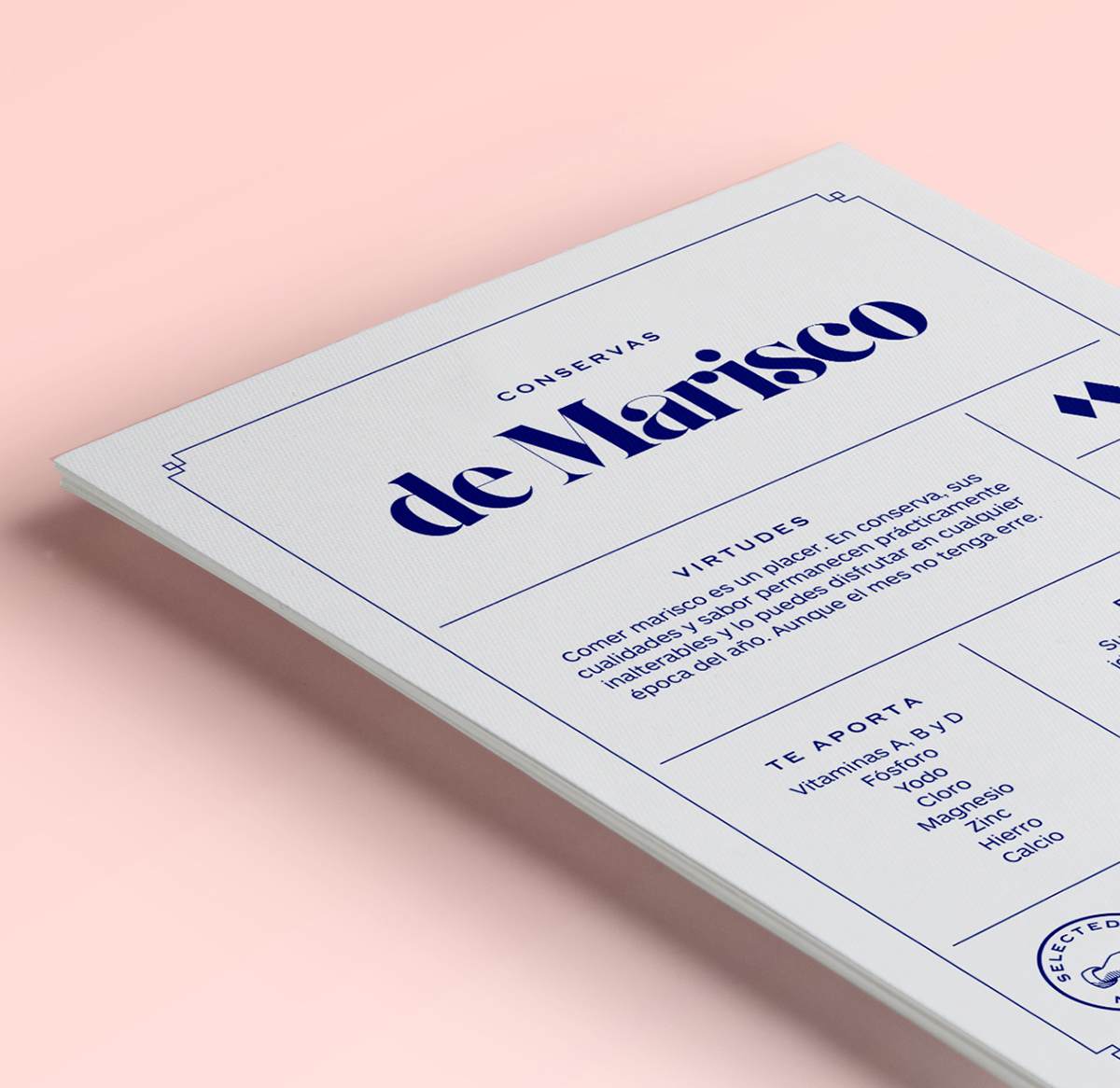
The client, Micky Irisarri, came to/u00a0Erretres/u00a0with a strong conviction that would lend the project a clear vision and a weakness for canned and bottled foods that is contagious./u00a0His project consists of a gastronomic proposal in the form of a tapas bar that seeks to position canned food products as a healthy, simple and, above all, extremely appetizing option. After long sessions, /u201cNudista/u201d was chosen as the name that would carry out the project/u2019s objectives and inspire new horizons for the brand. The brand concept was developed by researching the nude in the history of art and classical mythology. Once the brand/u2019s energy had been focused, the concept was adorned with distinct graphic elements that comprise a single visual language./u00a0For the identity, a pure typographic family was chosen, one that is typically linked to the luxury sector, but which, in this case, is associated with the values of this novel product, giving it a slightly renaissance and popular touch through the use of an oval shape that is equally reminiscent of the corners of a can or the beginning of the golden spiral./u00a0The typography is accompanied by a very POPular symbol in Spain: that of two diamonds, which, decades ago, was used on television to indicate that the program to follow was not recommended for minors or the fainthearted.
Creator: Erretres


.webp)


