


Darling Visual Communications
November 17, 2016
Mindsparkle Mag


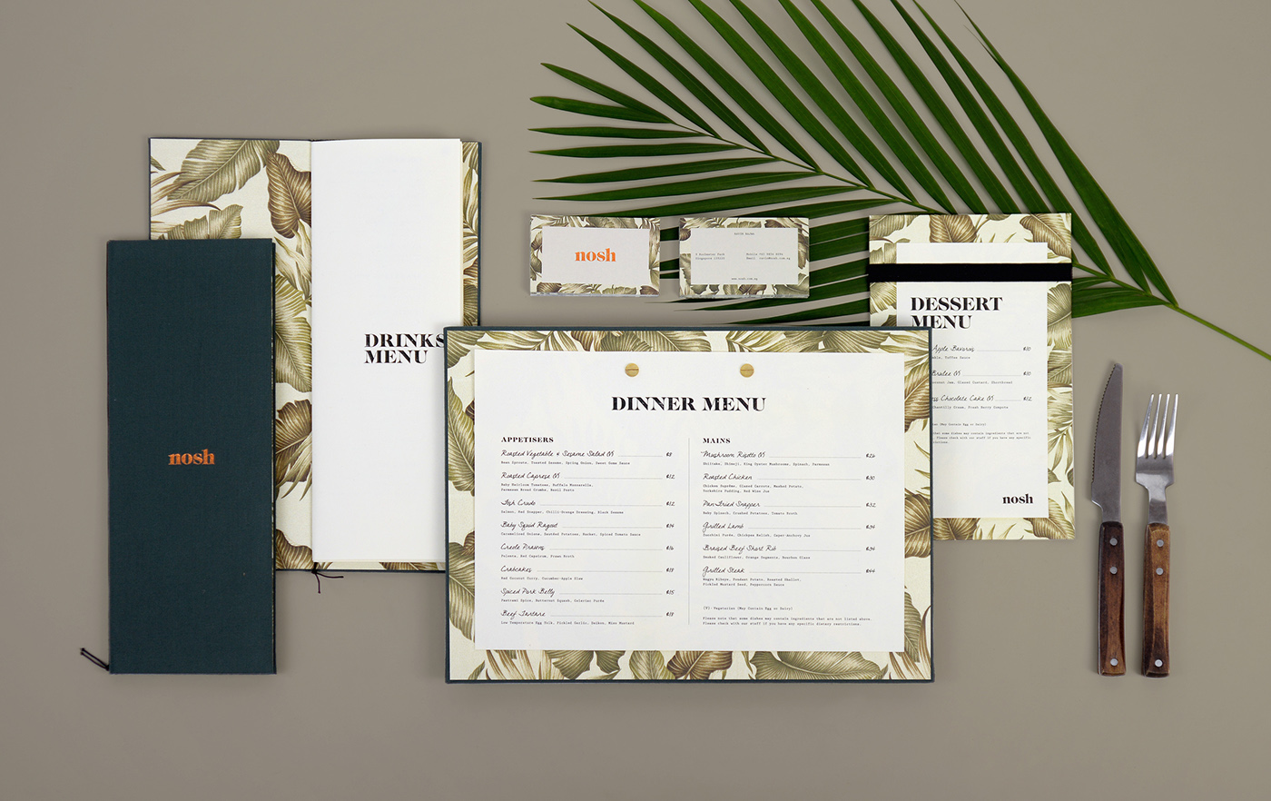
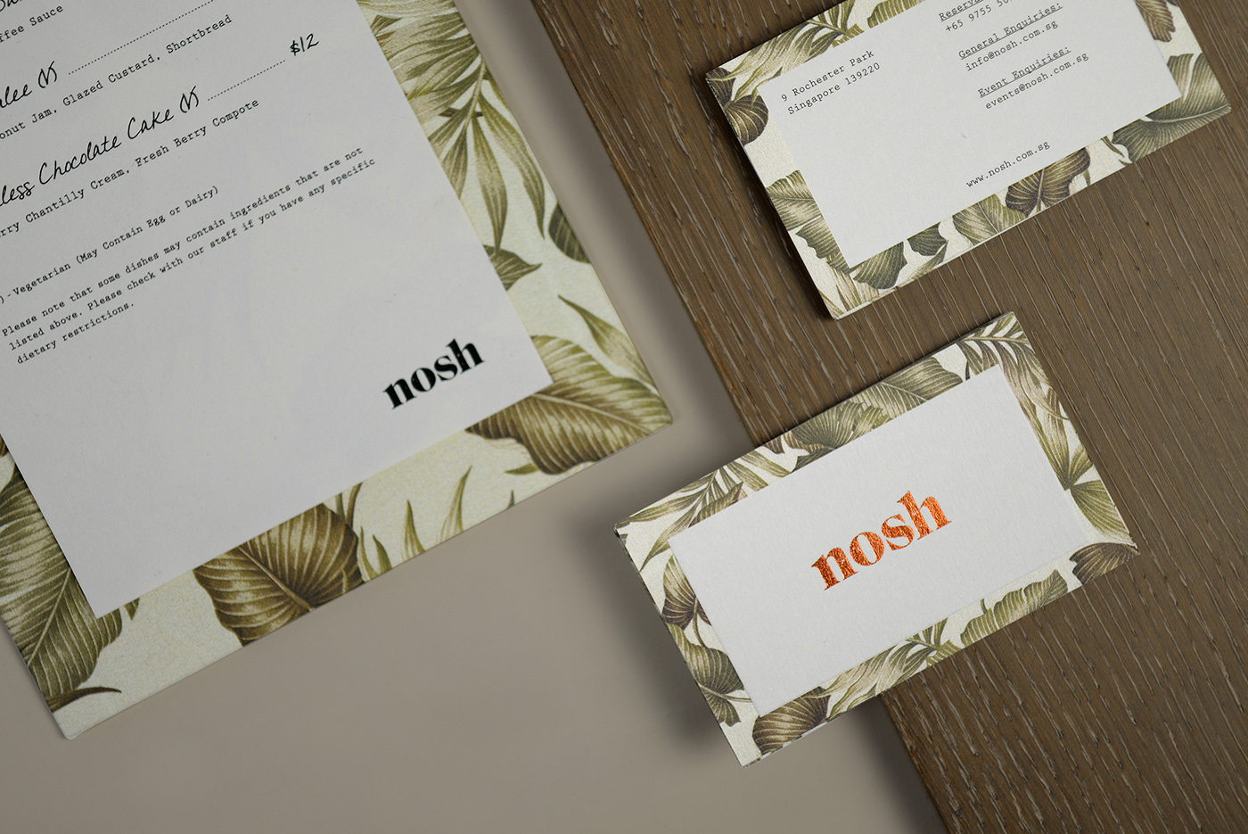
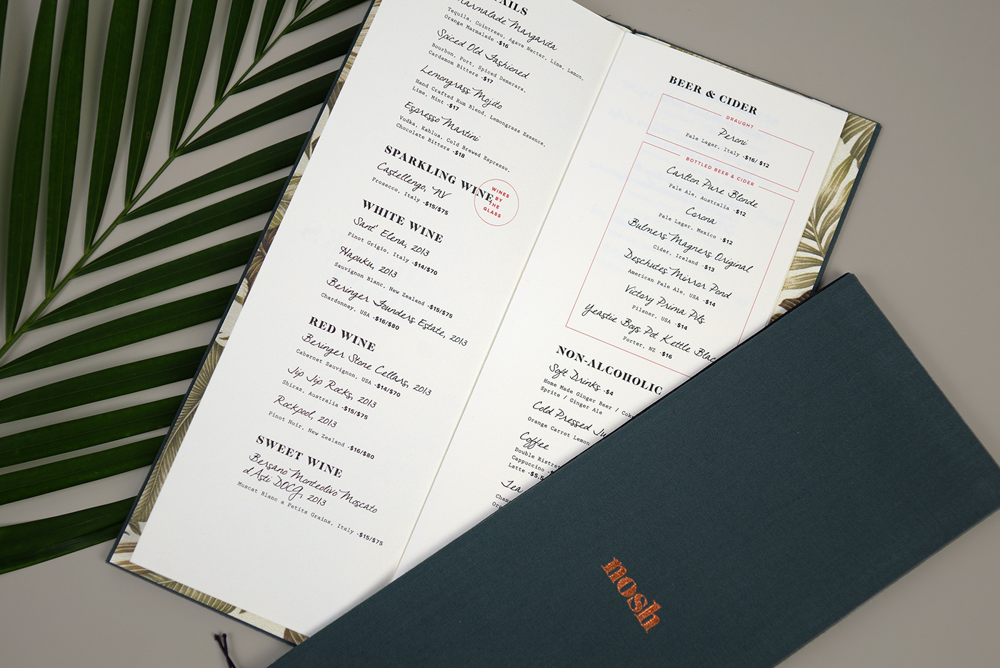
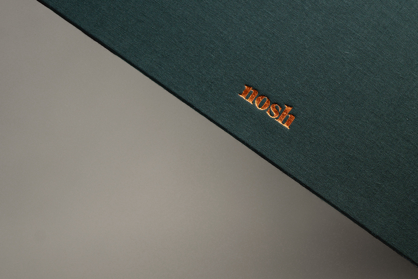
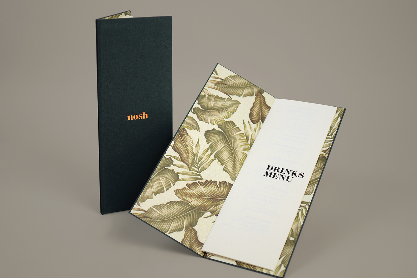
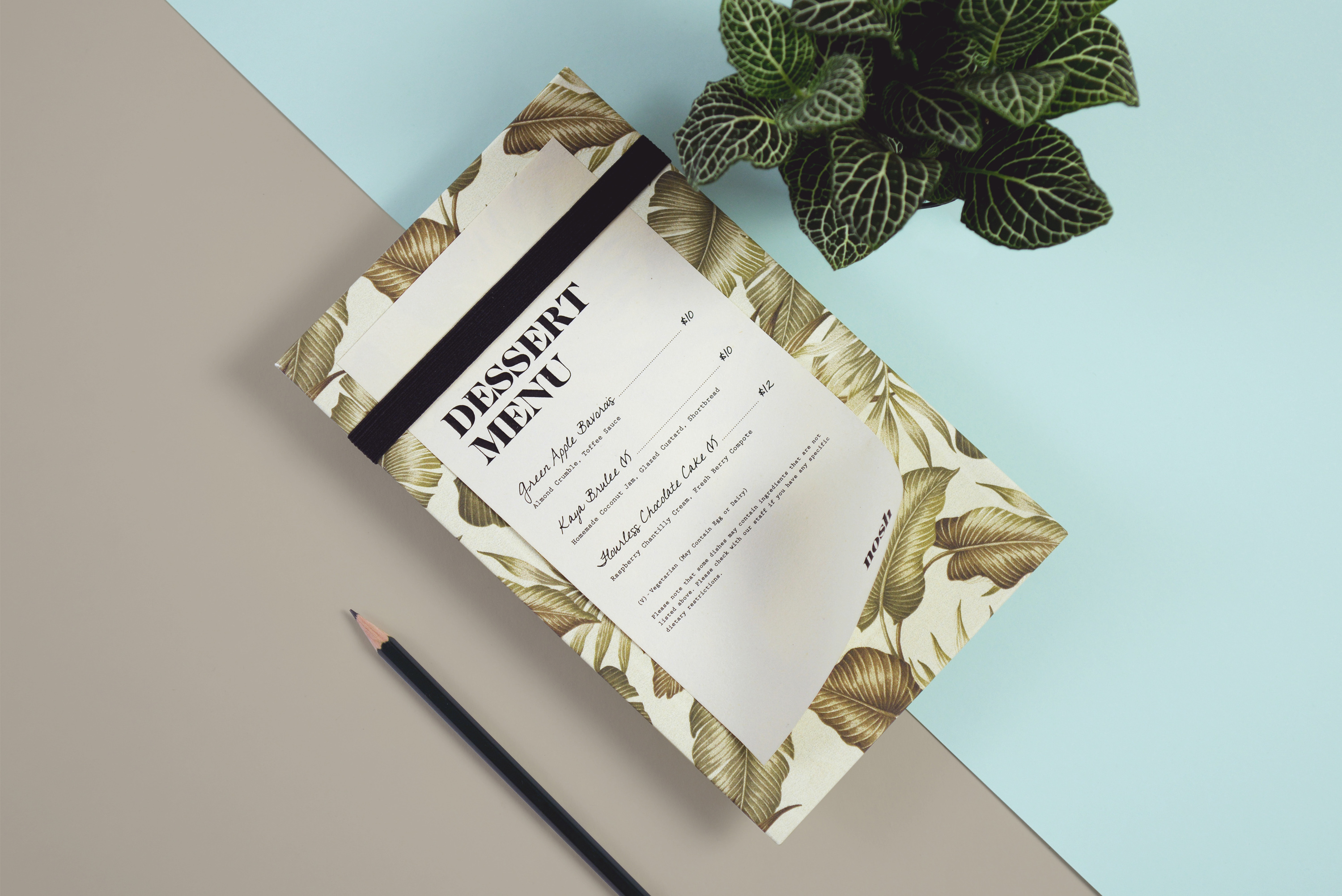
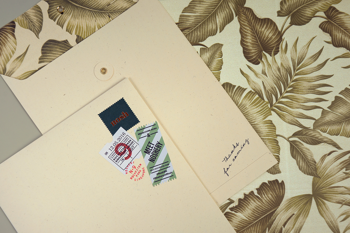
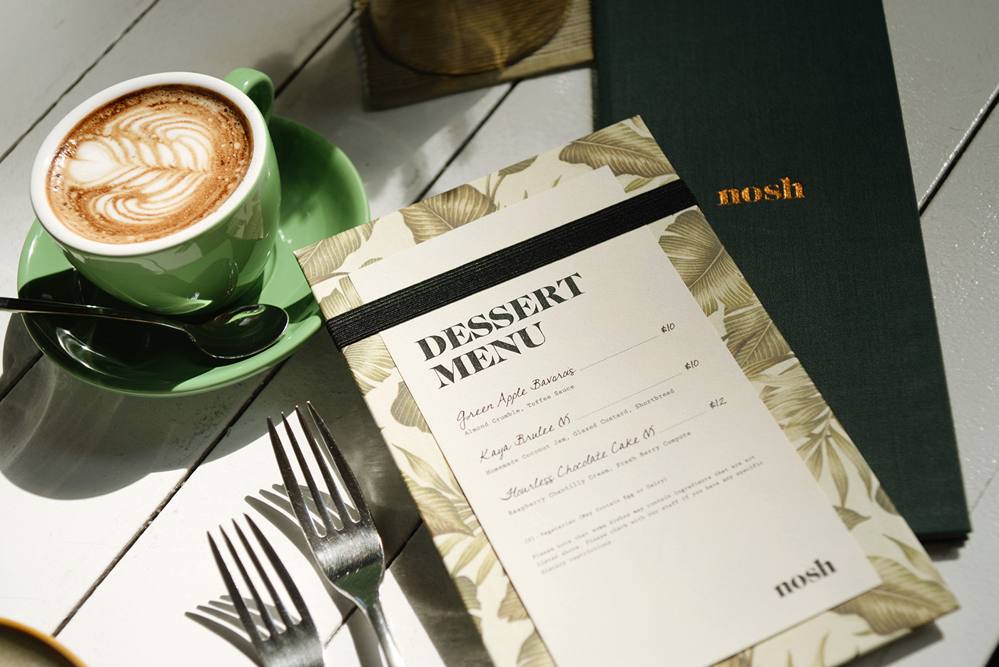
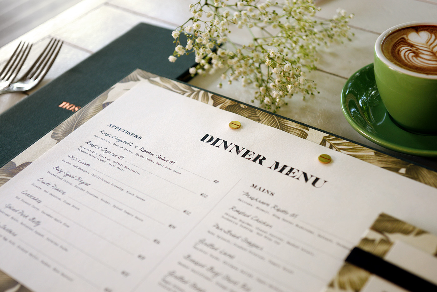
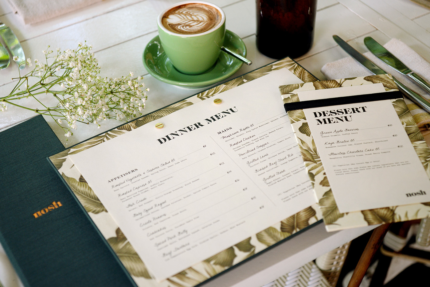
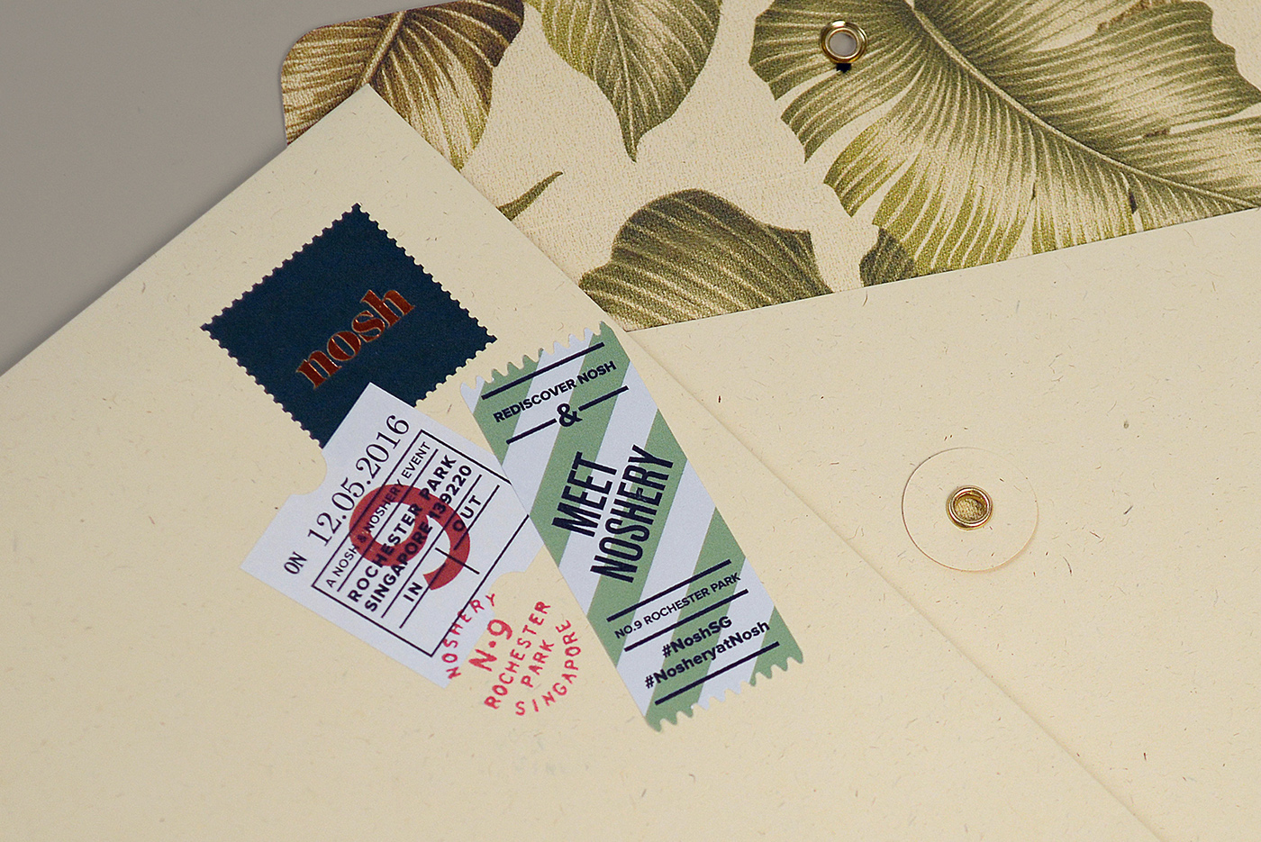
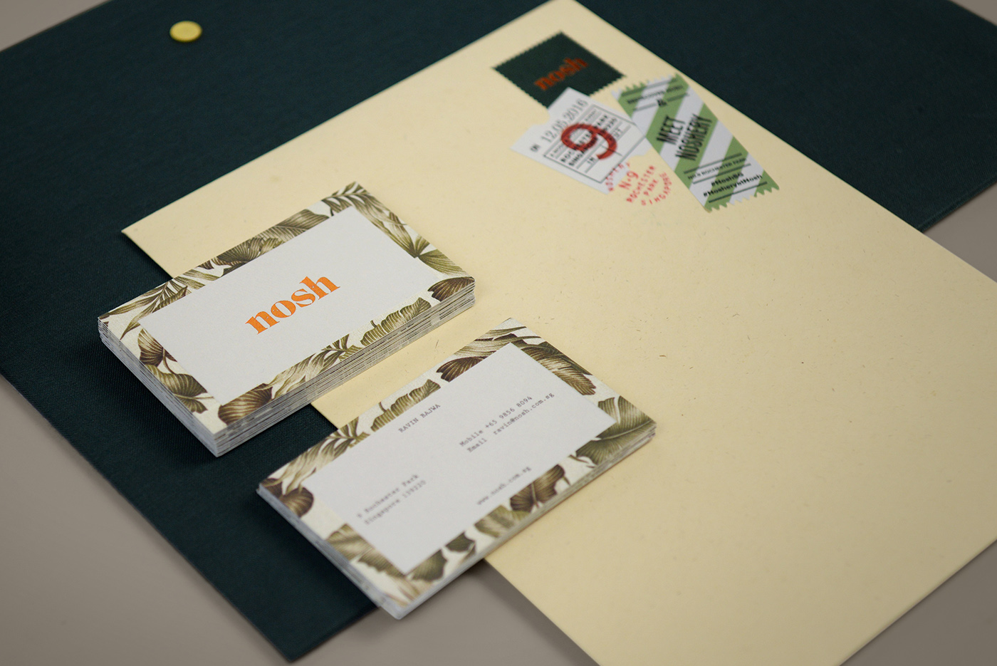
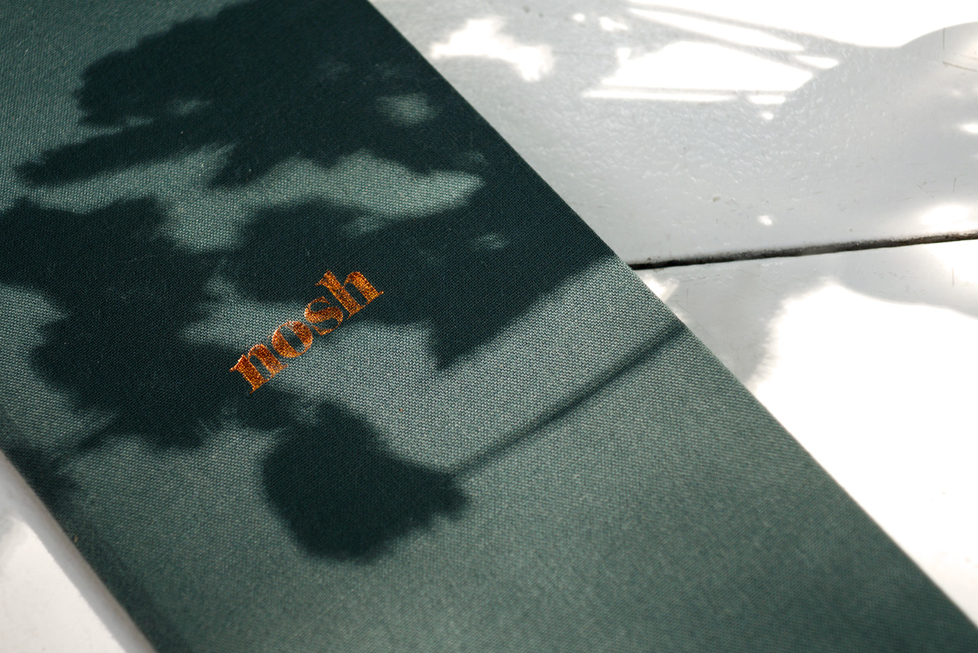
In an age where cutting-edge is growing dull, contemporary comfort take us back to a simpler time. Located on the leafy slopes of Rochester Park, Nosh brings to mind the rustic, specialising in contemporary comfort food that brings a modern perspective to a romantic, pastoral setting. A time when the hustle was slow; the hustle was a rustle; the rustle was of leaves in the breeze. Rural yet urbane, it/u2019s the perfect young gentleman from a bygone time, the dapper farmer/u2019s son two barns down the footpath. /u00a0Hand-pressed type is practical, like heavy equipment that somehow made our efforts lighter. Yet handwritten text is sincere, expressing feelings we/u00a0saved up for this special moment /u2013 will you meet me for a meal? The logotype is impactful, with considerable visual weight, like a beam that hangs above us, or the curve of a sturdy branch. Cursive handwriting brings an artisanal touch, a practised hand. Rustic stamps have been added as the address marker, continuing a constant visual line. Dark green is the colour of leaves, of foliage, even a lush rich quilted fabric, like a comfortable suit made for a Sunday picnic. Applications of fabric and craft paper unifies this entire concept, like a textured scrapbook you might make afterwards, fragments of the day we/u00a0spent together. The application of leaves and foliage as the main pattern is delicate, yet bold. It/u2019s like the time when we sat beneath the trees and ate. Our suits and dresses felt heavy, yet light; our conversations were sincere. The memory of that simple meal, like words etched into the trunk of a tree, will stay with us. Those moments are golden.
Creator: Darling Visual Communications


.webp)


