


H OUT H
October 28, 2021
Mindsparkle Mag


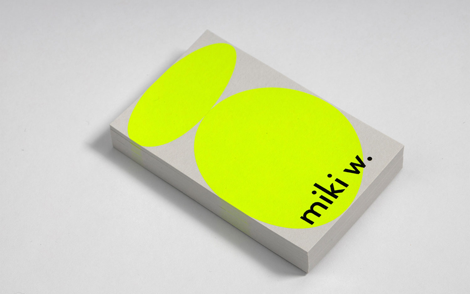
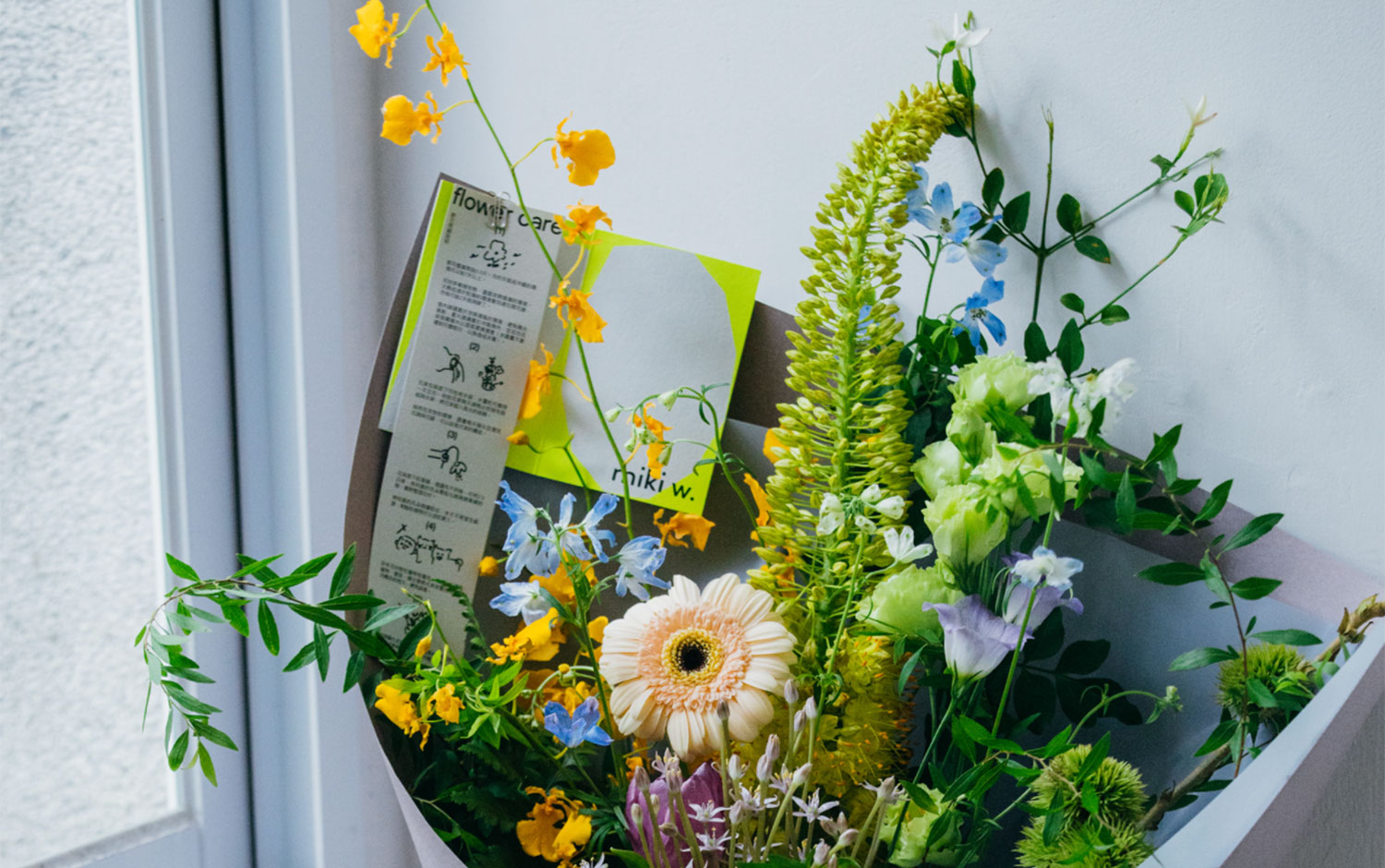
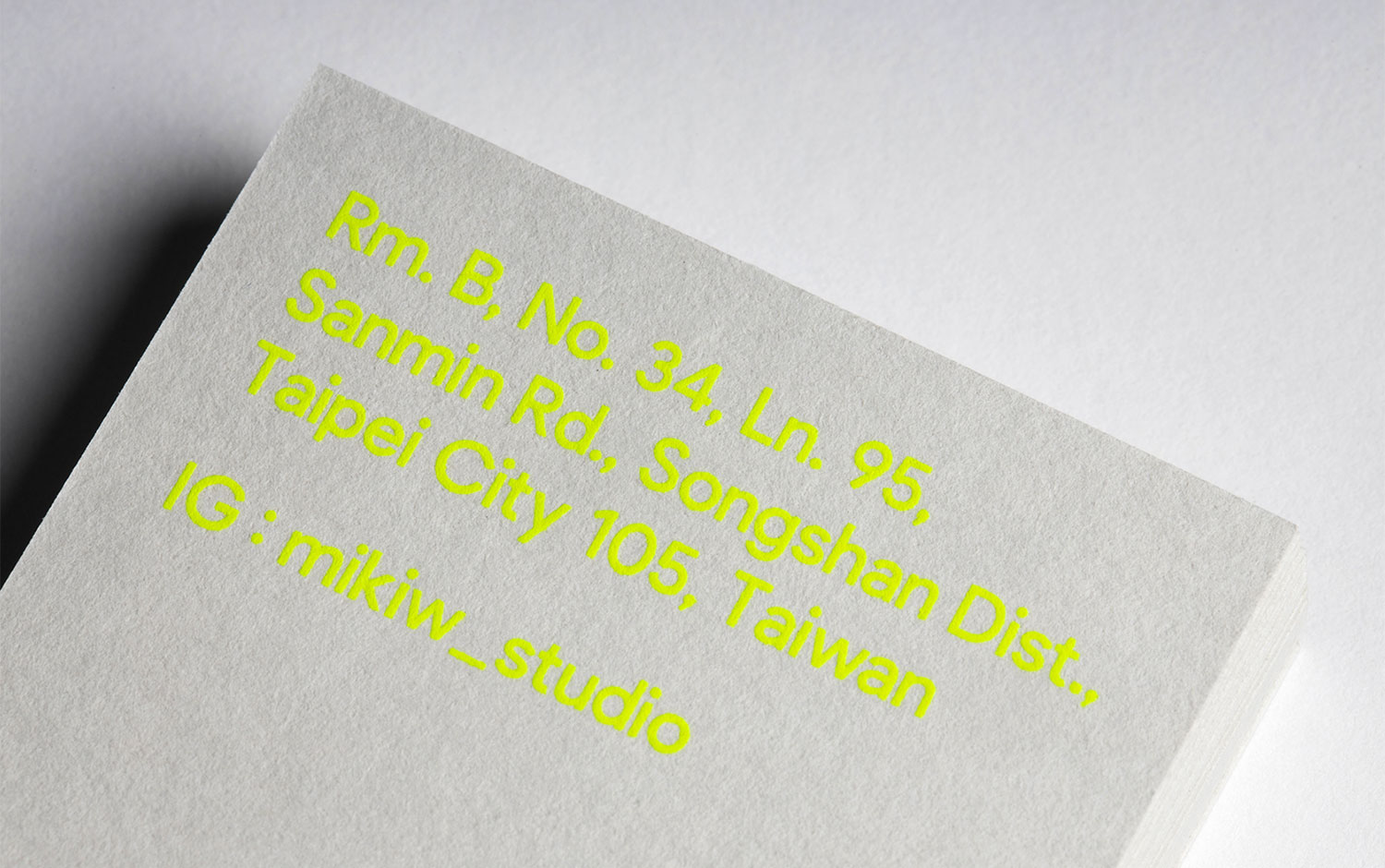
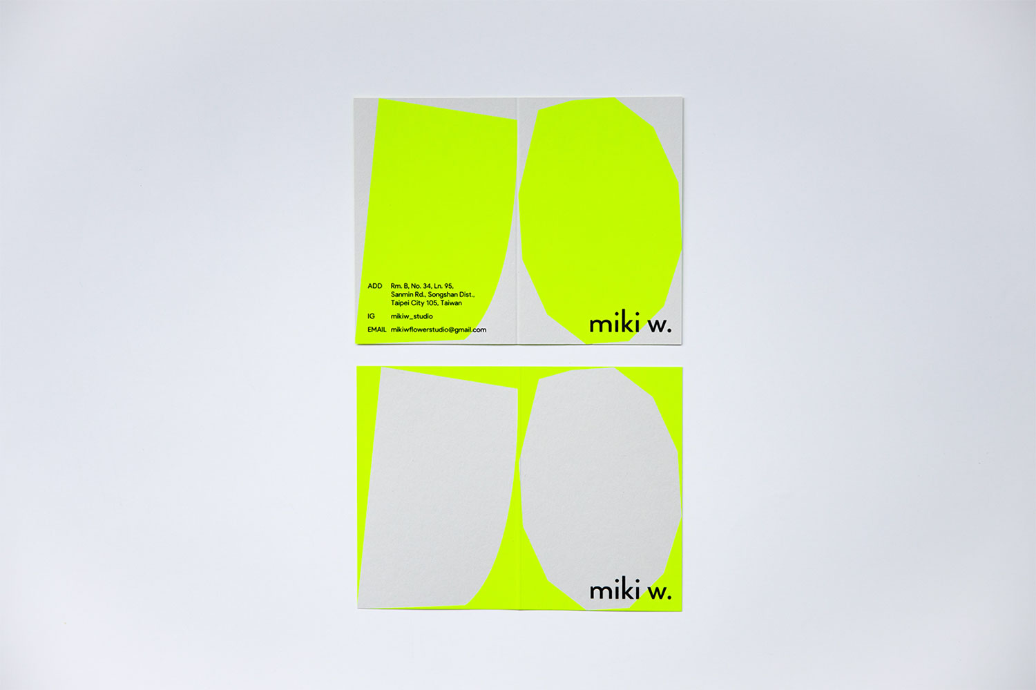
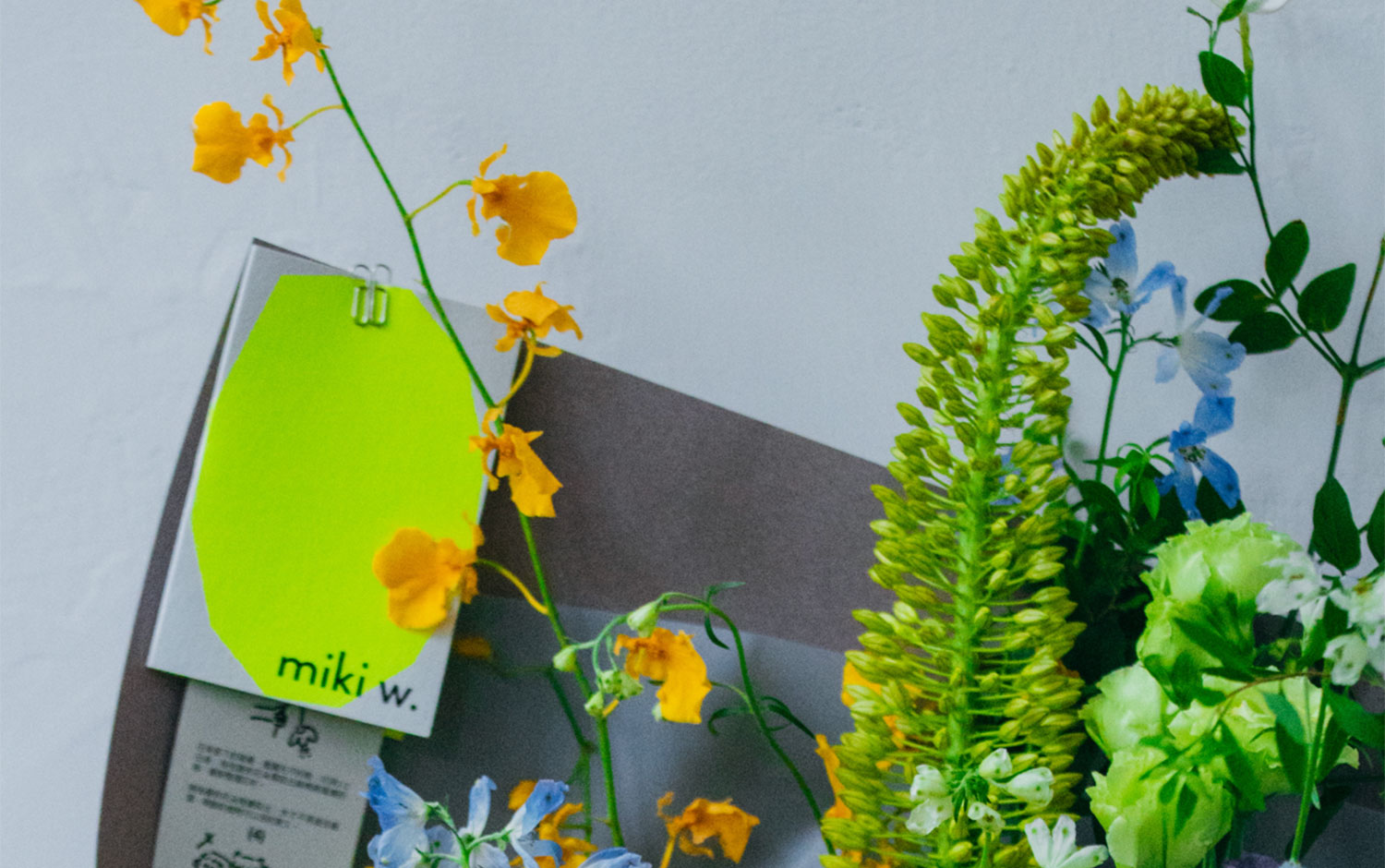
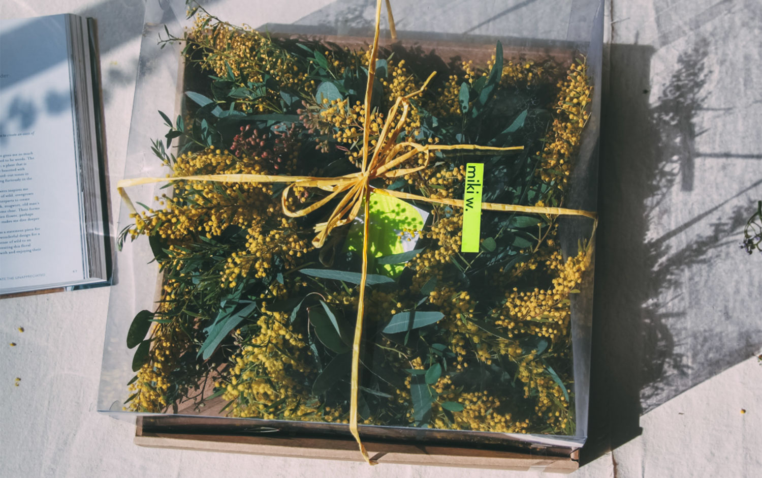
We're enjoying the beginning of fall and all its warm beauty. However, we shall not forget that the southern hemisphere is enjoying spring's blossom. Even though some people are allergic to flowers, most of us go a bundle on their incredible scents and bright colors. We're taking you today to Miki. W flower design studio based in Taipei./u00a0H OUT H/u00a0studio, also based in Taiwan, was in charge of its branding strategy and identity./u00a0
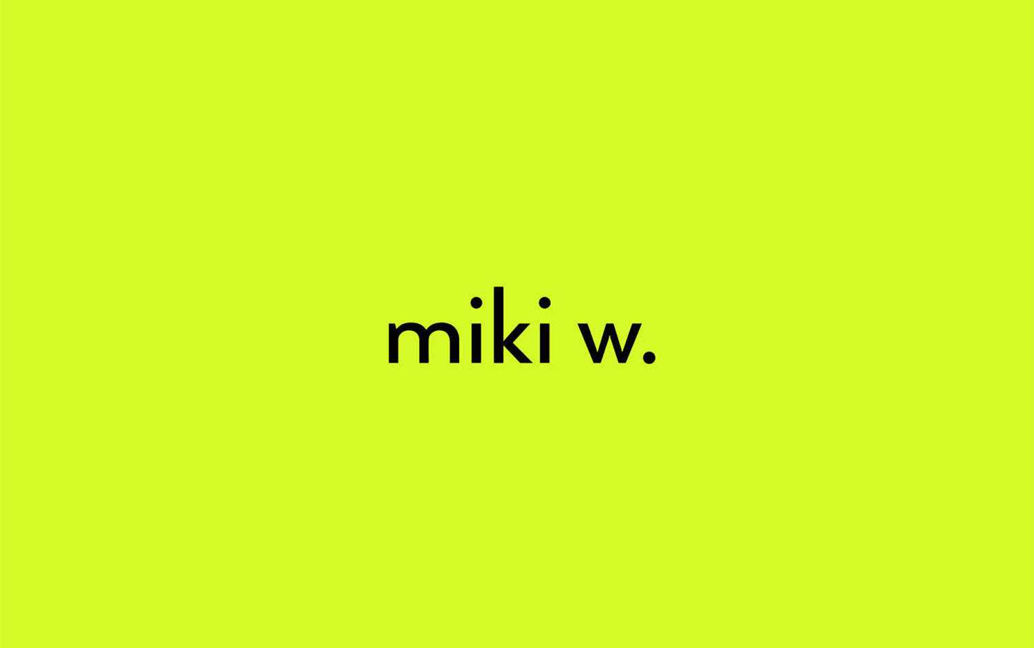
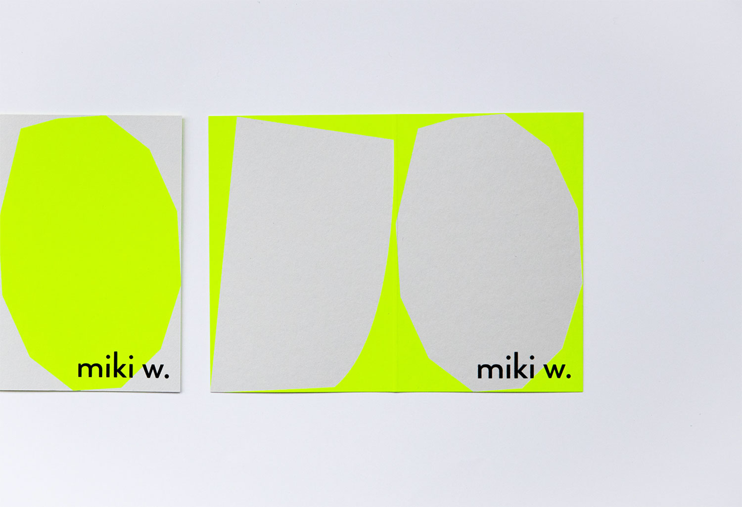
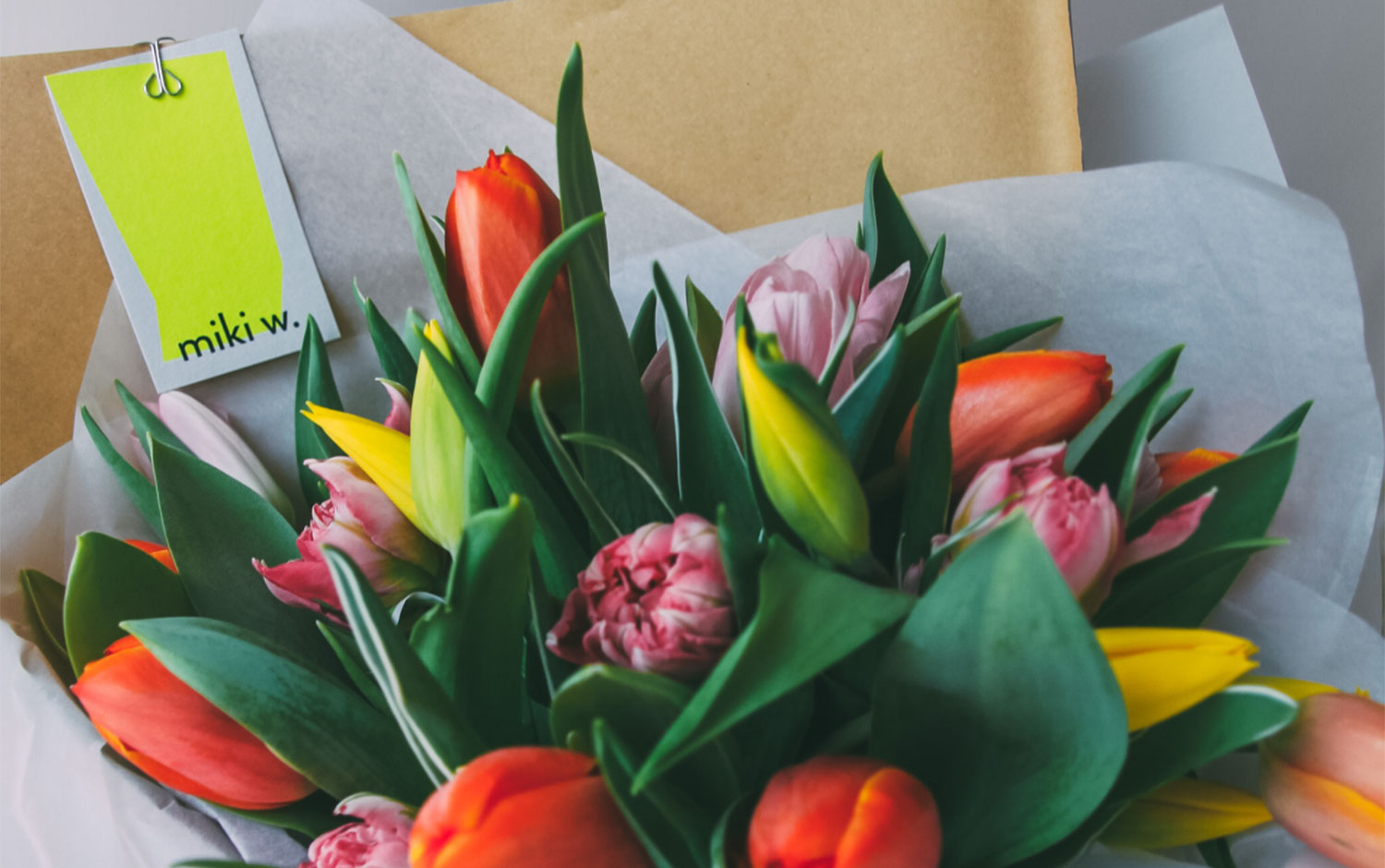
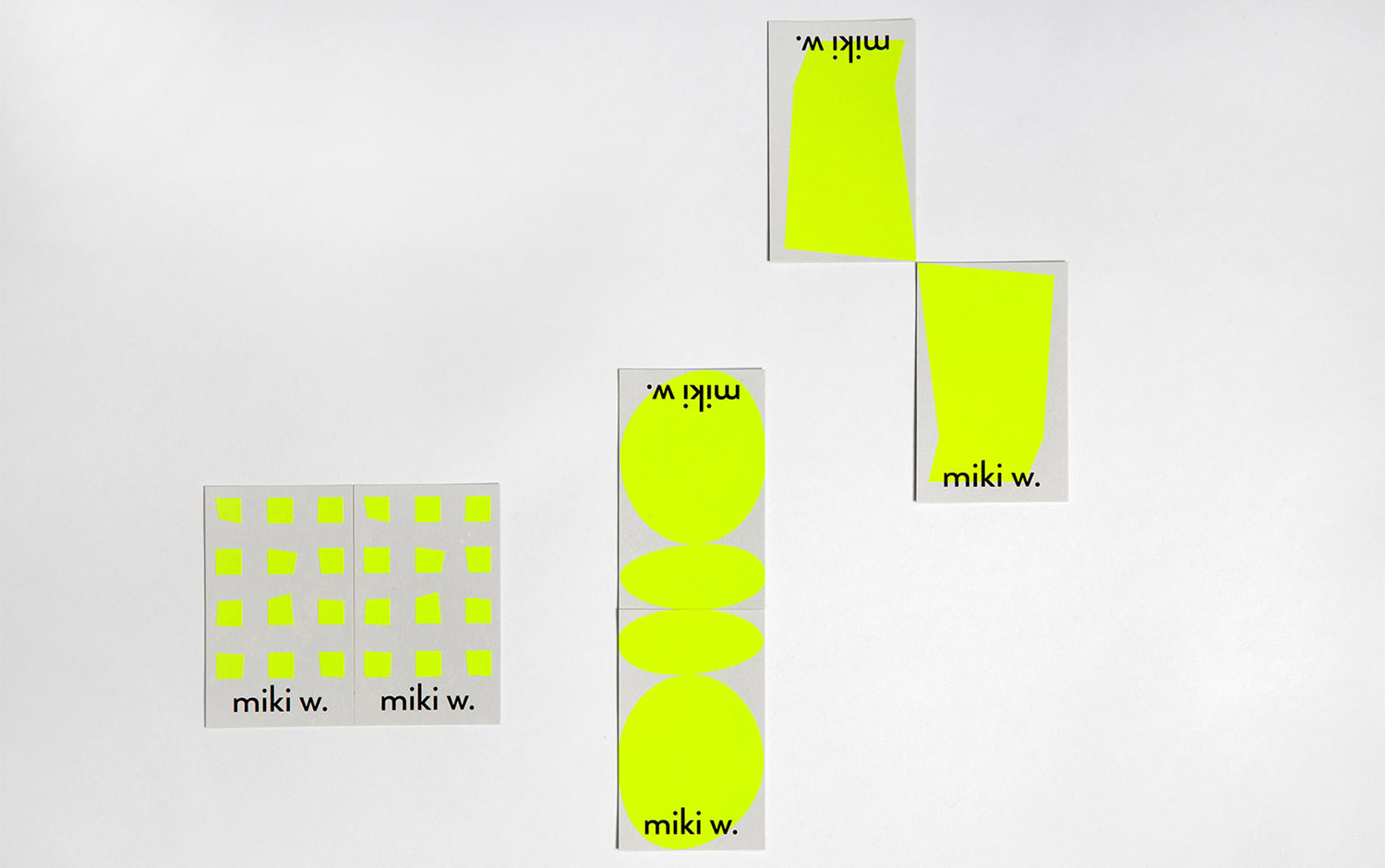
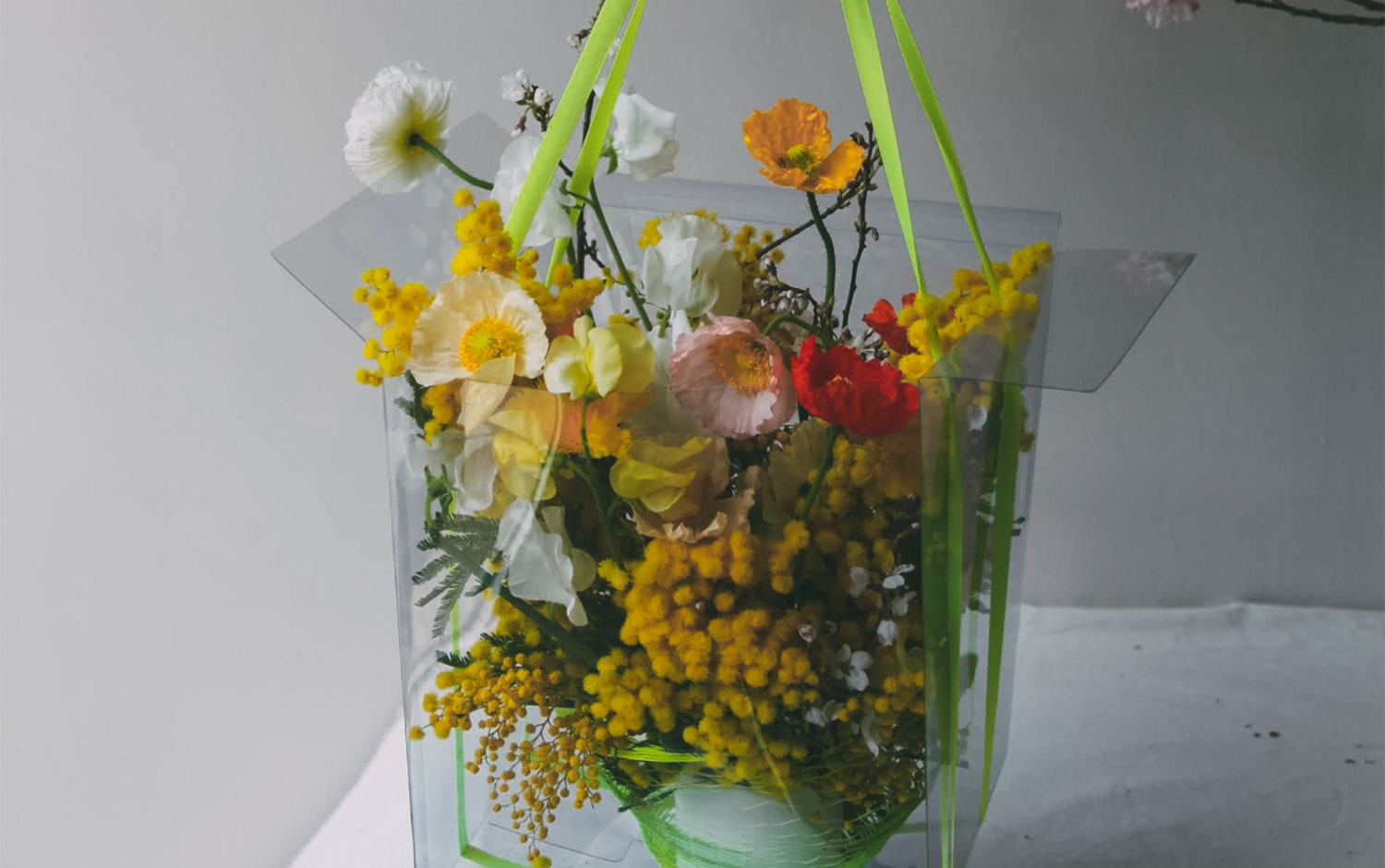
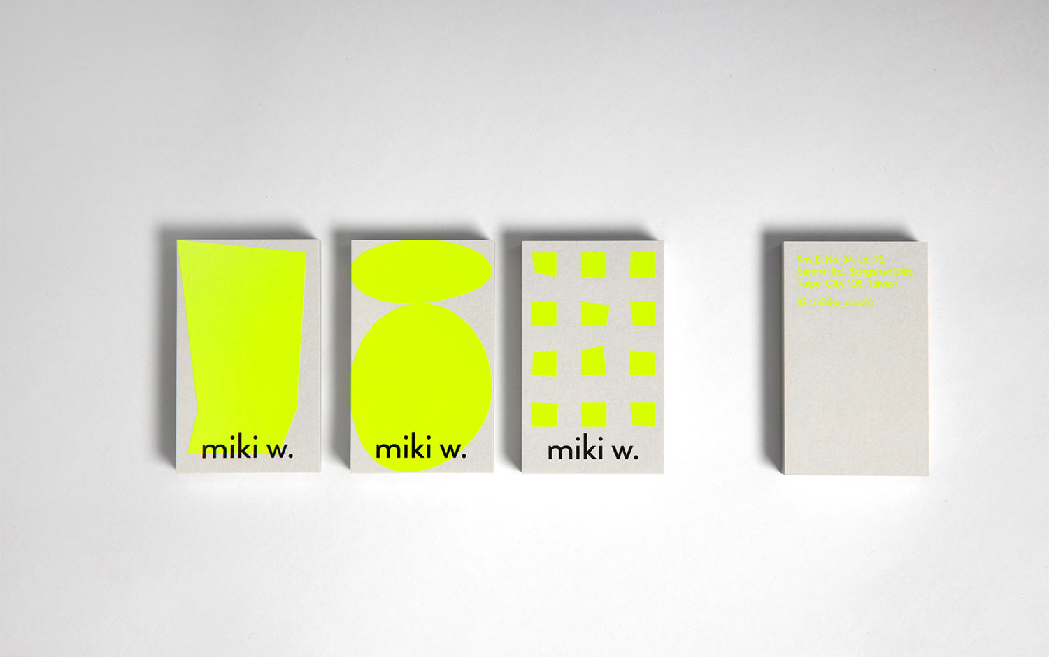
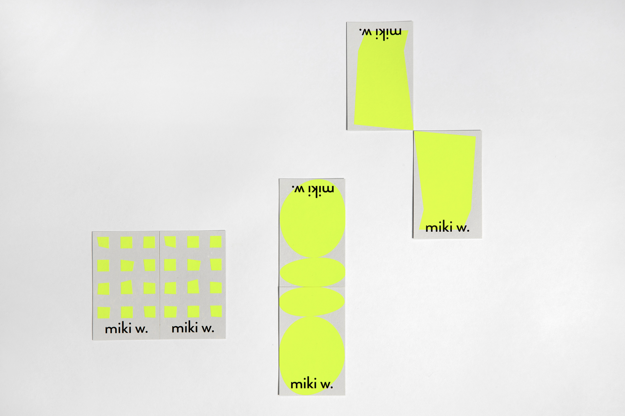
The brand's owner, Miki Wei, specializes in floral design for weddings, events, exhibitions, and installations. To create its new identity, designers chose a strident neon color palette and a cool style. Its striking colors perfectly contrast with the flower's warm and natural tones. Plus, creatives came up with some irregular shapes filled in neon green to occupy most of the stationary format. The brand includes the typical bouquet with the traditional and white and kraft paper wrapping paper. To continue with the modern and clean aesthetic, for flowerpots, they thought of clear plastic bags. Could you picture yourself next spring with all your new blooms? Because we'll be waiting for your spring sprouts on Mindsparkle's gram./u00a0
All in all, we are super excited about Miki.W's visual identity, which brings a super avant-garde look. And we're looking forward to next spring's season :)
Creator: H OUT H


.webp)


