


Masquespacio
May 04, 2017
Mindsparkle Mag


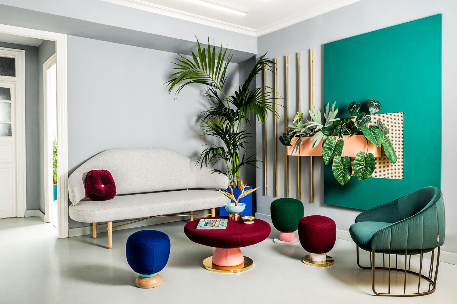
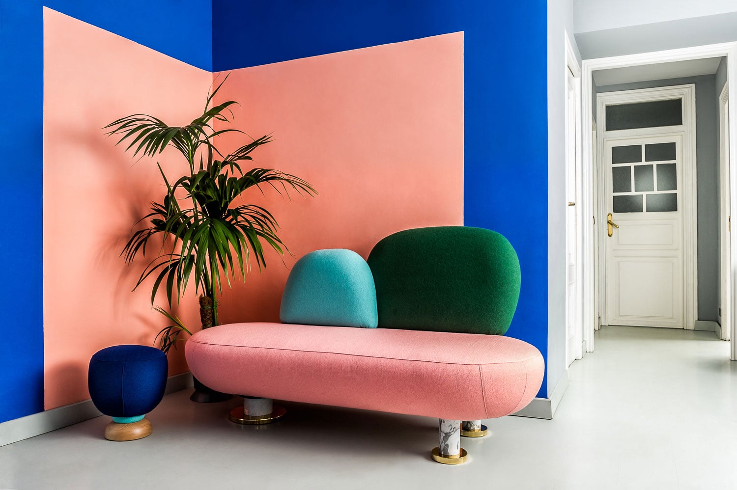
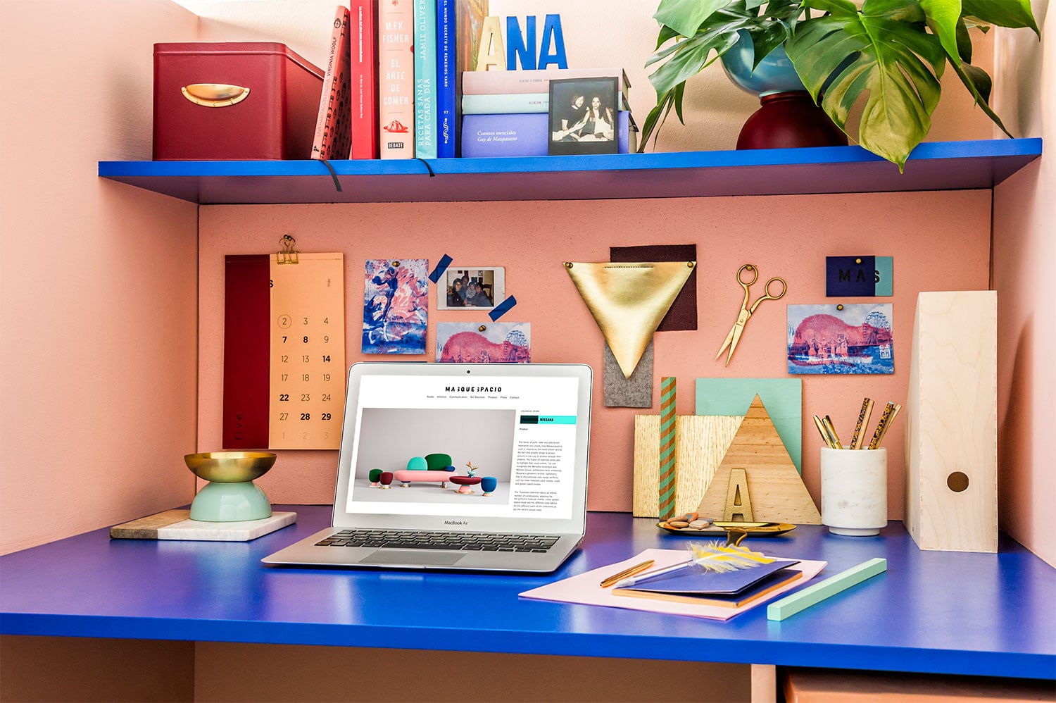
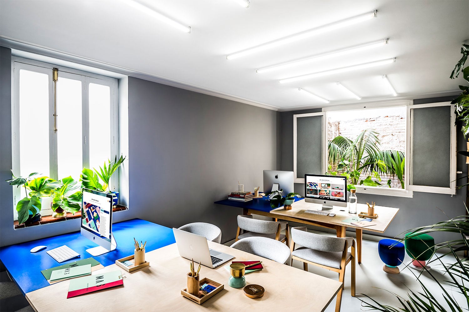
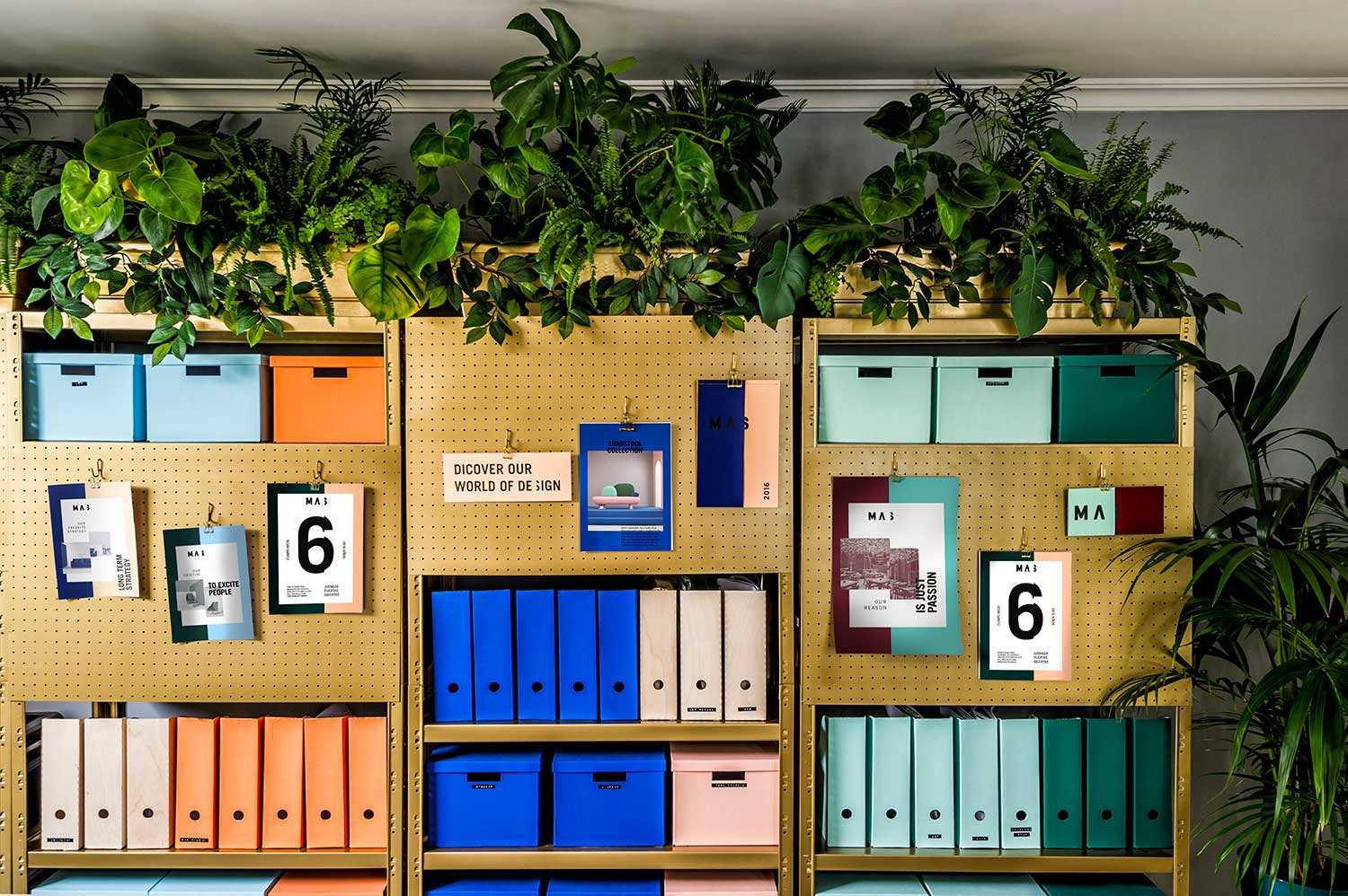
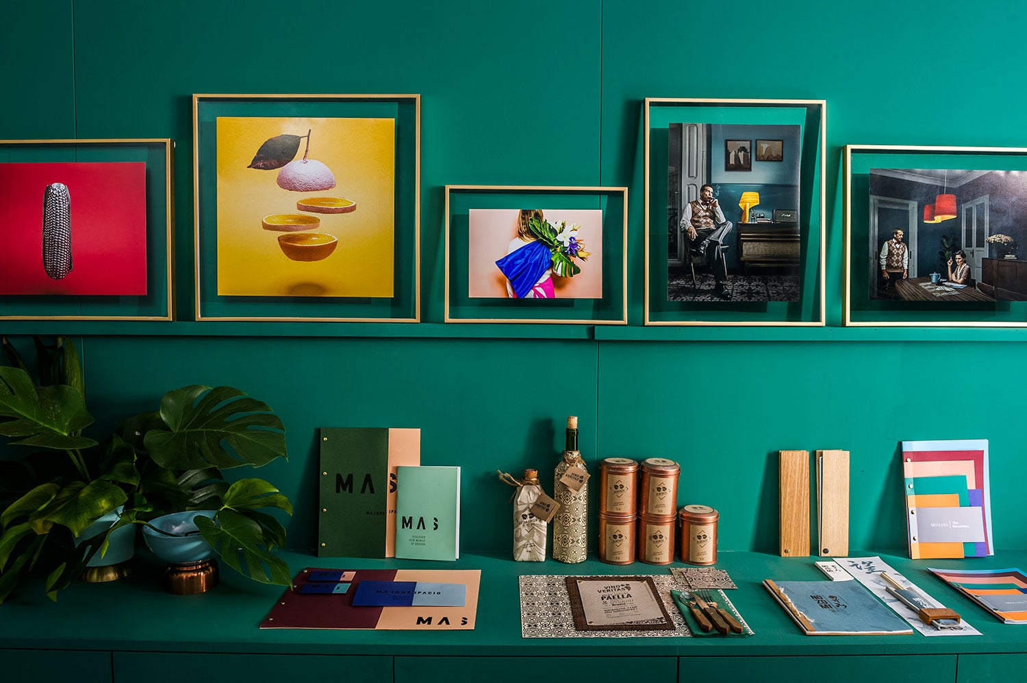
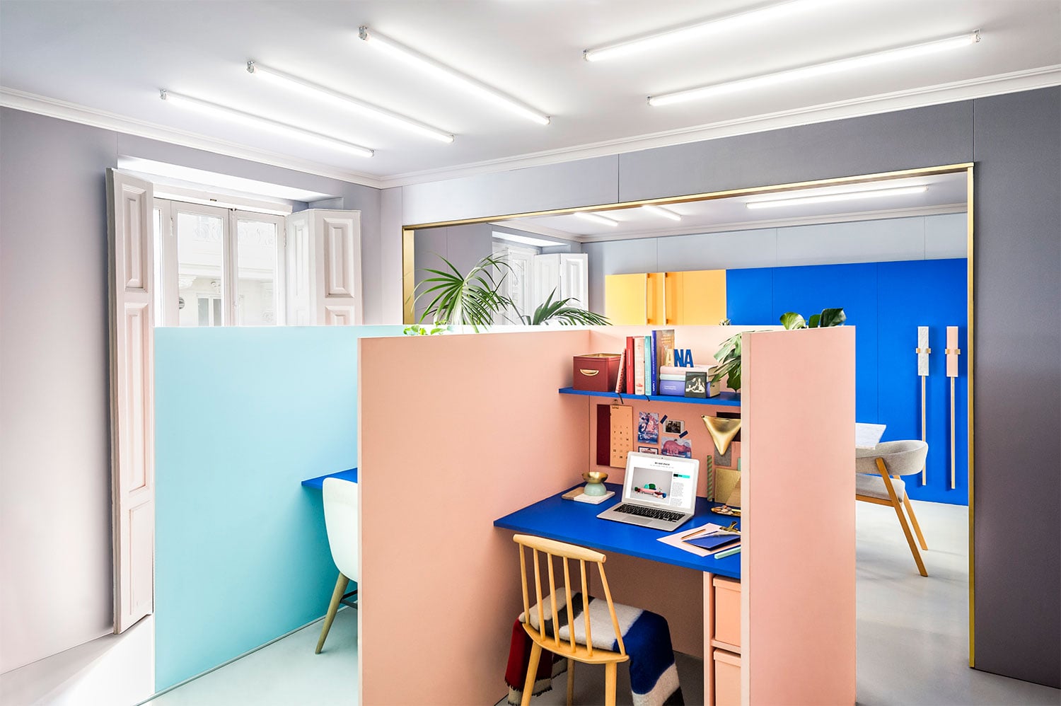
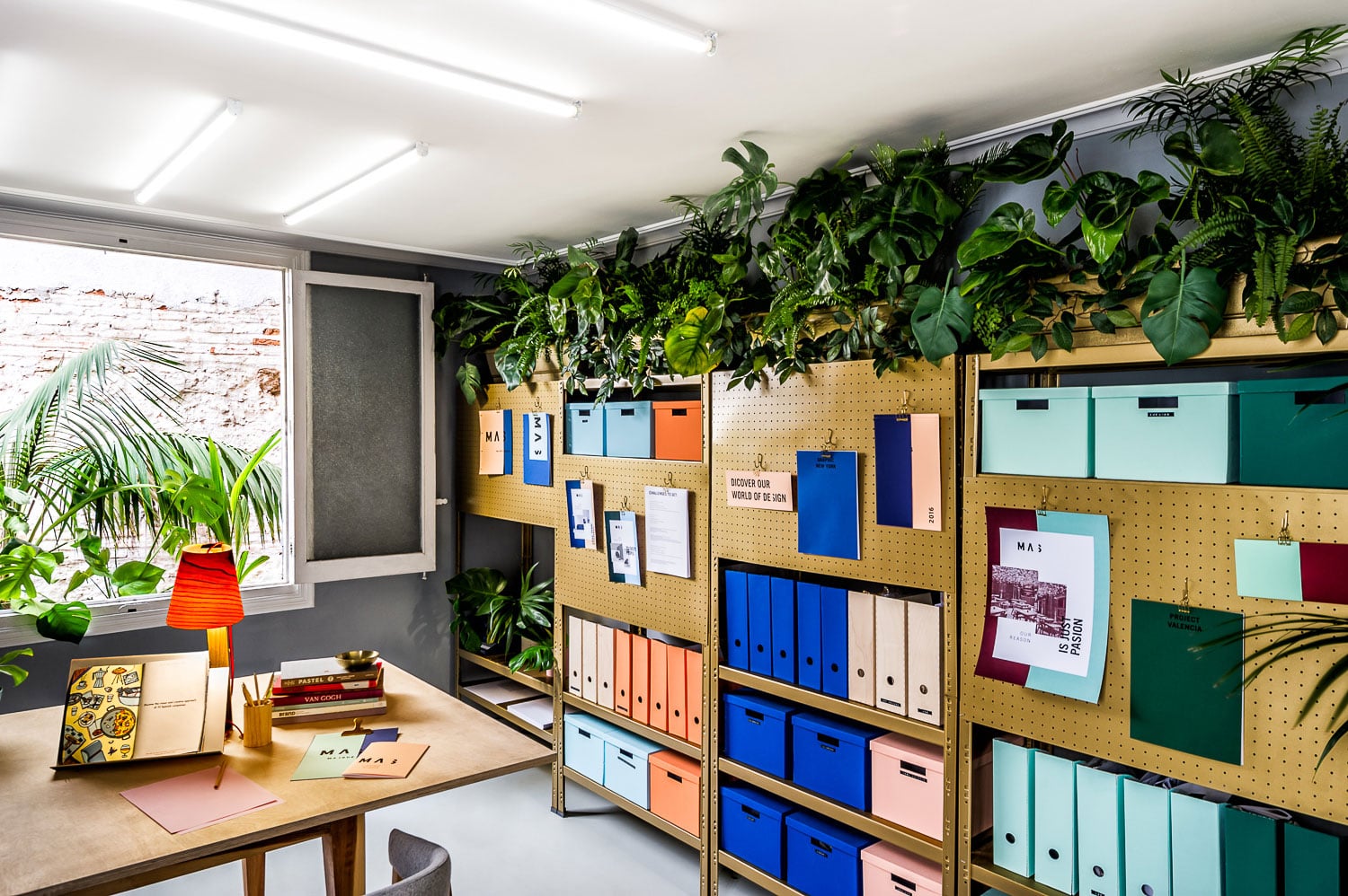
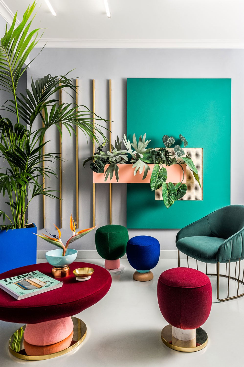
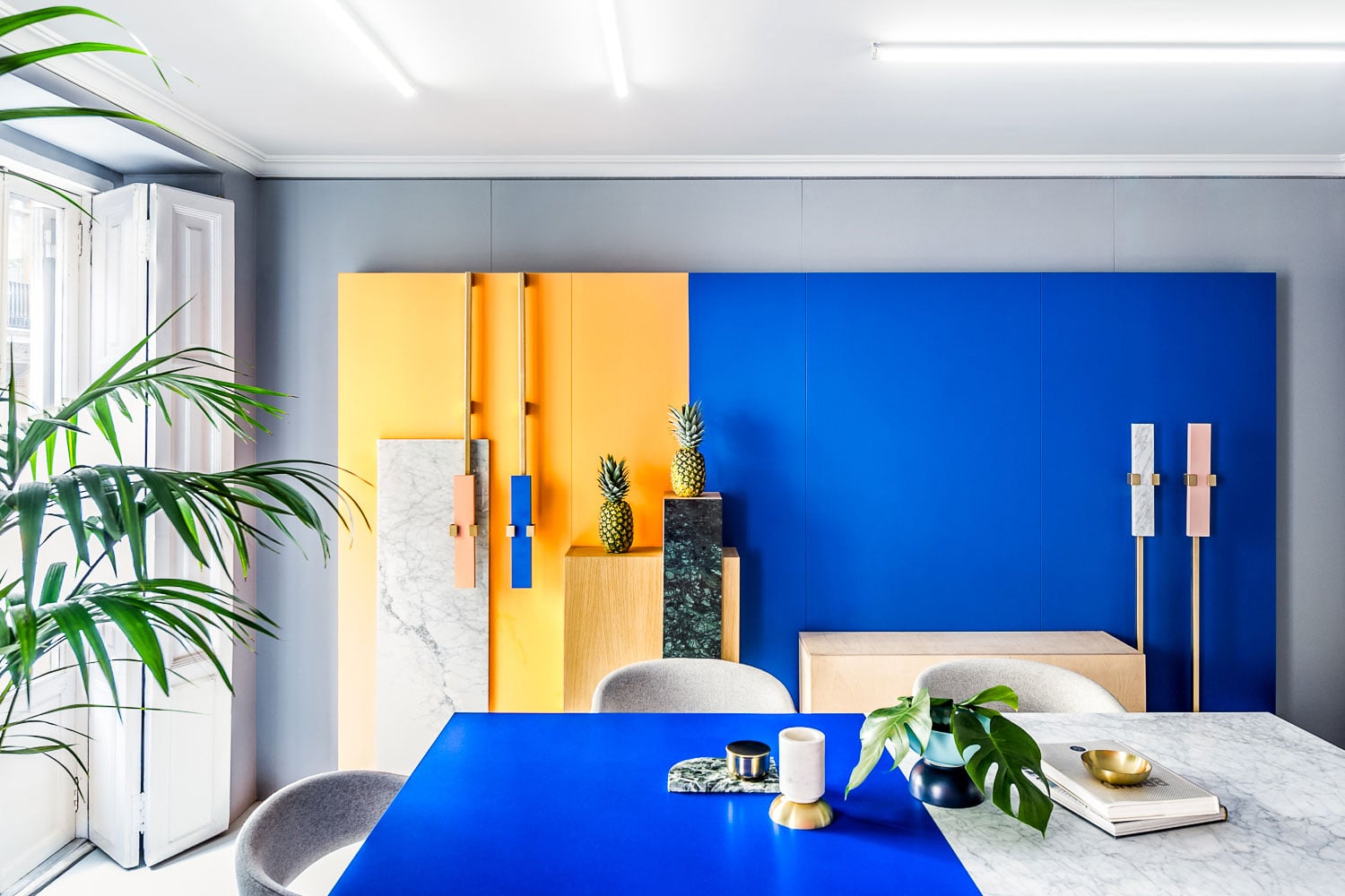
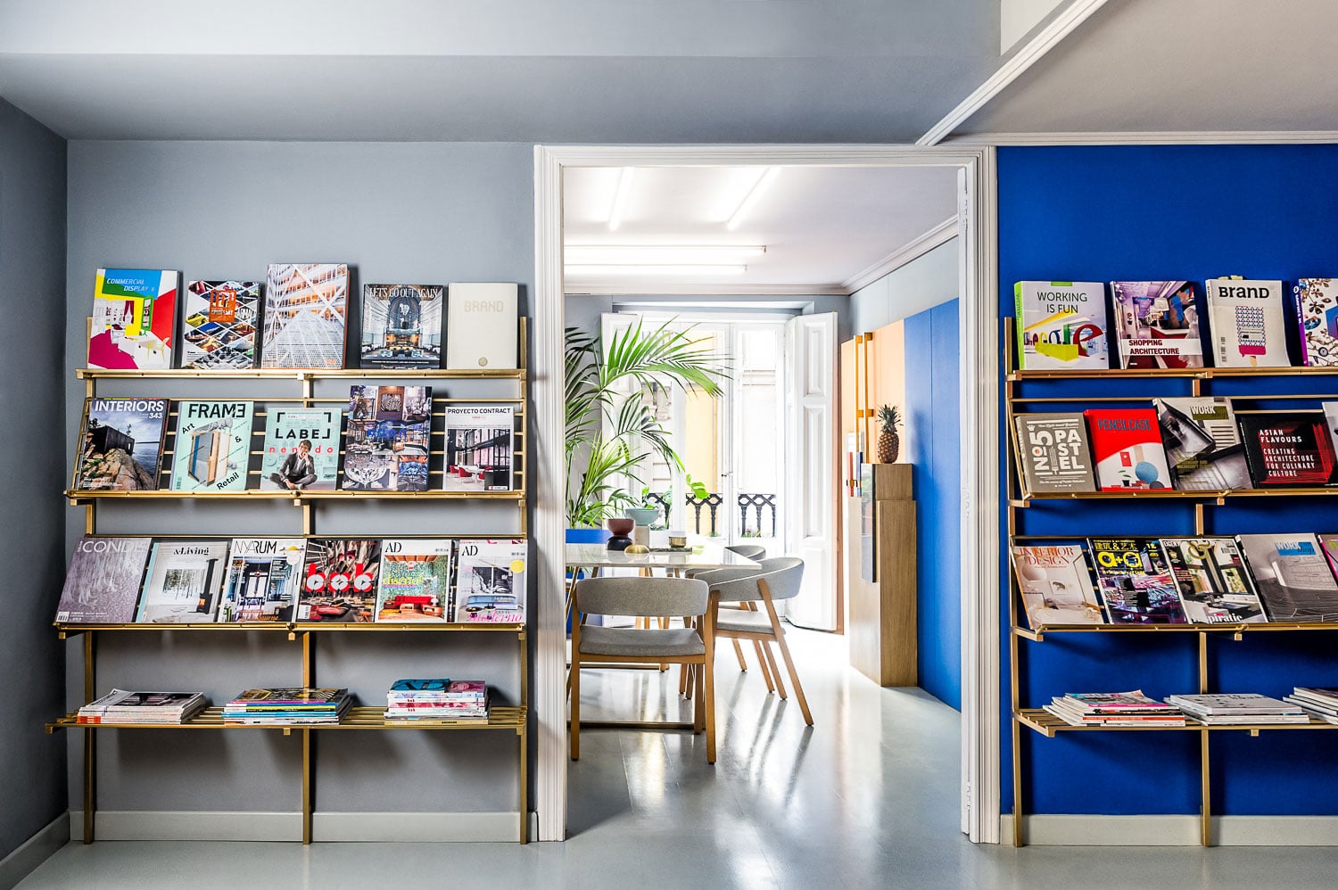
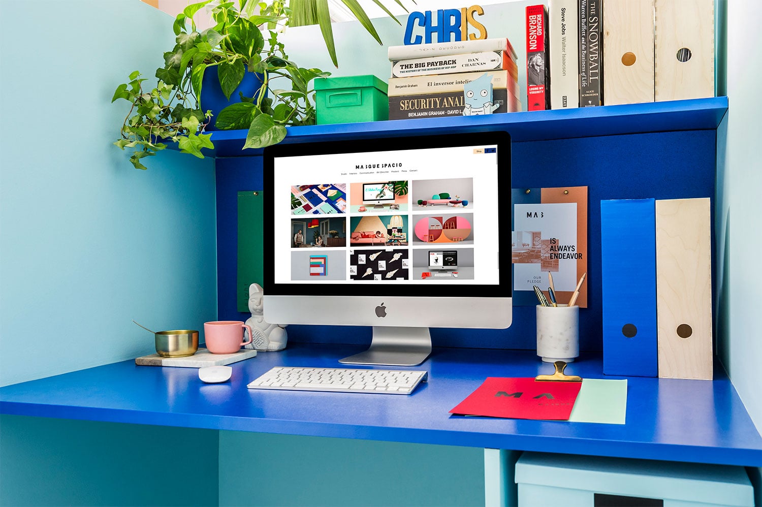
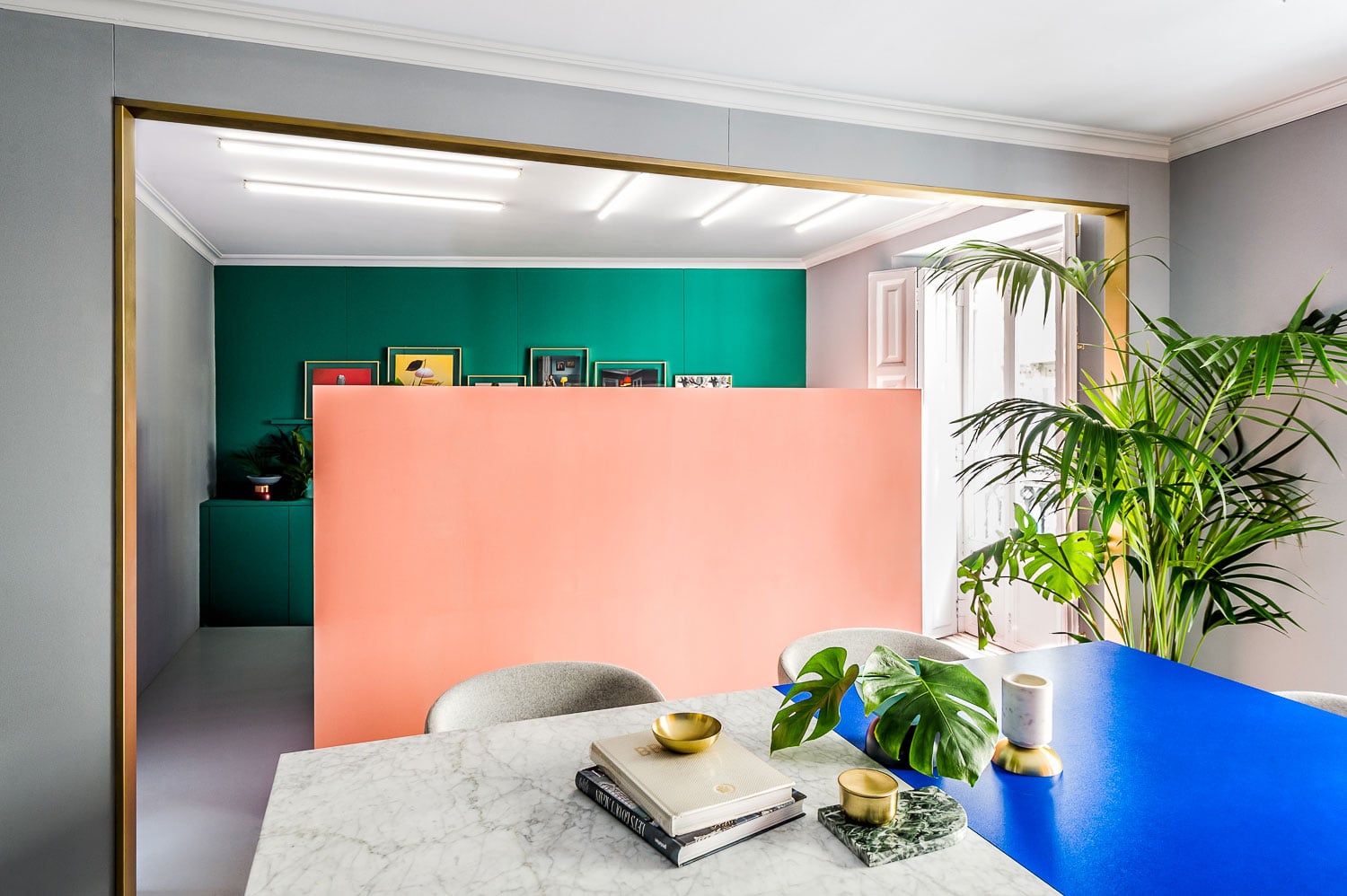
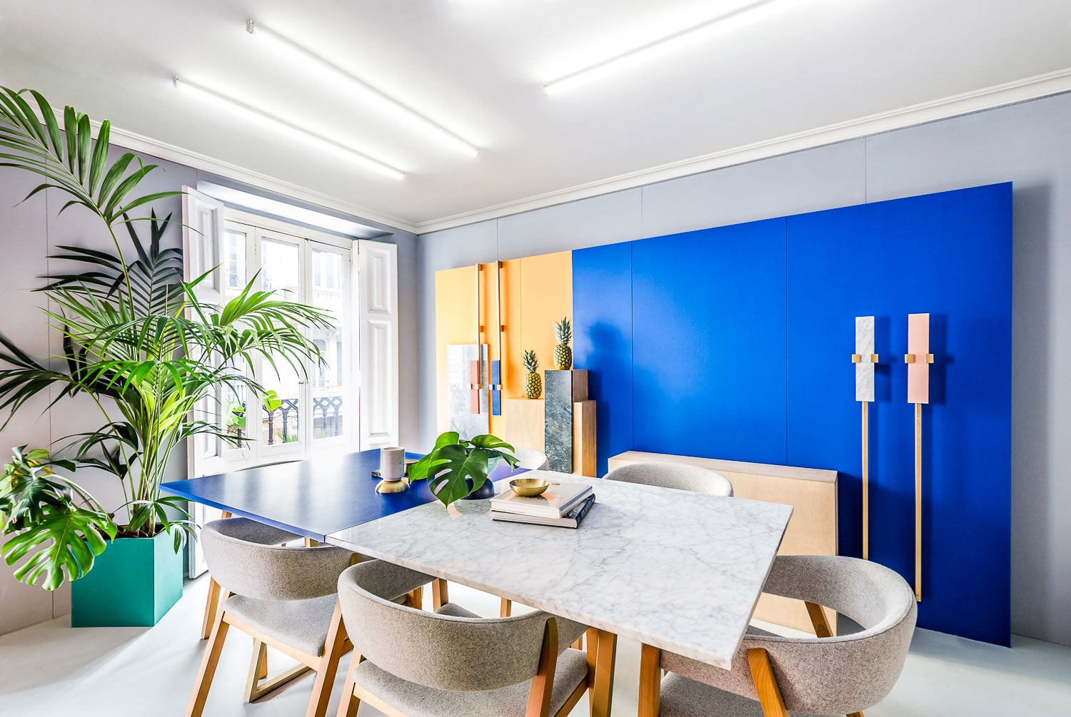
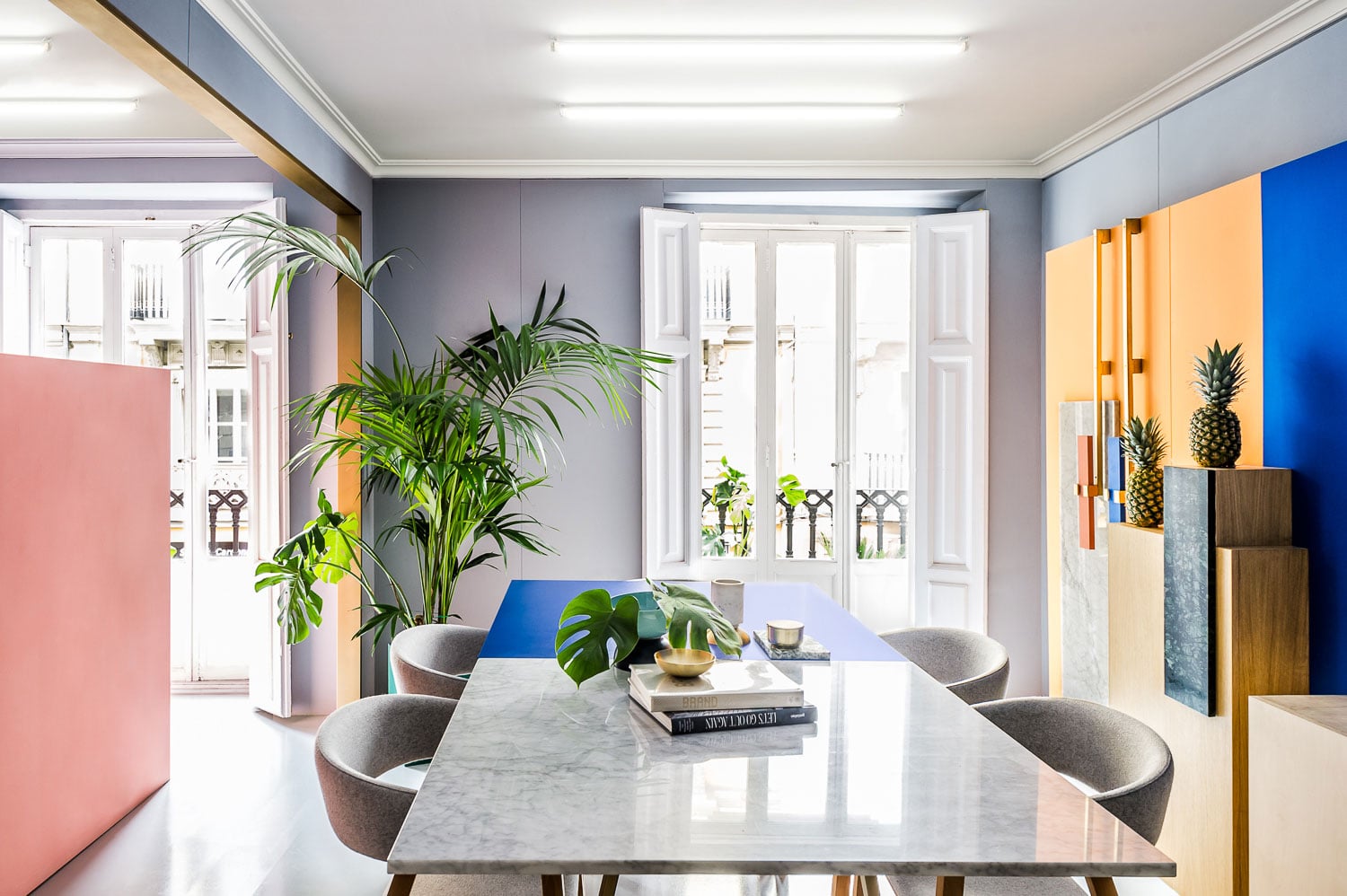
The design from Masquespacio/u2019s workspace starts with the redesign of the design studio/u2019s brand image set up on one hand by its logotype and on the other by its icon /u2018Mas/u2019, better known as /u2018More/u2019 in English. The letter /u2018S/u2019 in this case divides each of the graphic applications in two dif-ferent parts; a division that symbolizes the added value offered by the creative consultancy in each of its projects. Regarding to the colour election of the brand, it allows to play continuously with the various brand/u2019s colours and choose the most /u201ctrendy/u201d colour for each moment and project. This fact shows clearly the versatile nature from Masquespacio as a multidisciplinary design studio that works both on commercial as well as exclusive projects. The same concept is used for the interior design that plays with the different colours and partitions from the brand/u2019s identity./u00a0Entering the space, they/u00a0meet a waiting room that at the same time does its job for more casual meetings and includes Masquespacio/u2019s recently designed Toadstool collection. The right space on the other hand is di-vided in 2 different areas. Here they/u00a0can encounter a meeting room, as well as the senior designer workplaces, separated as 2 individual cubes. The upper room at the same time follows Masquespacio/u2019s identity palette of colours and finishes./u00a0Last but not least some plants add a green touch to the working space from the Spanish design studio. Photography:/u00a0Bruno Almela
Creator: Masquespacio


.webp)


