


Porto Rocha
December 29, 2023
Mindsparkle Mag


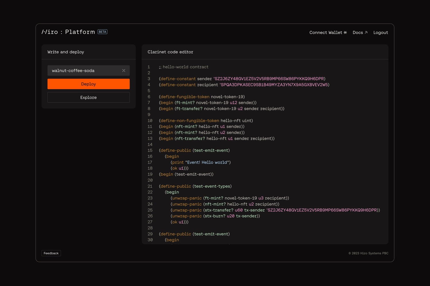
Just a few years ago, building Web3 apps on Bitcoin was almost unthinkable. It/u2019s the original blockchain, but its reputation was stuck in the /u2018coin/u2019. Enter Hiro, a suite of open-source developer tools that empowers developers to put Bitcoin to use.
As the #1 tooling company in the Stacks ecosystem, Hiro needed a brand that would align with their mission and reflect their growth as a company, all while staying true to their developer roots. Departing from the clich/u00e9s of their crowded crypto landscape, we developed an identity that brings a new visual language to Web3, balancing technical precision and a subversive sensibility.
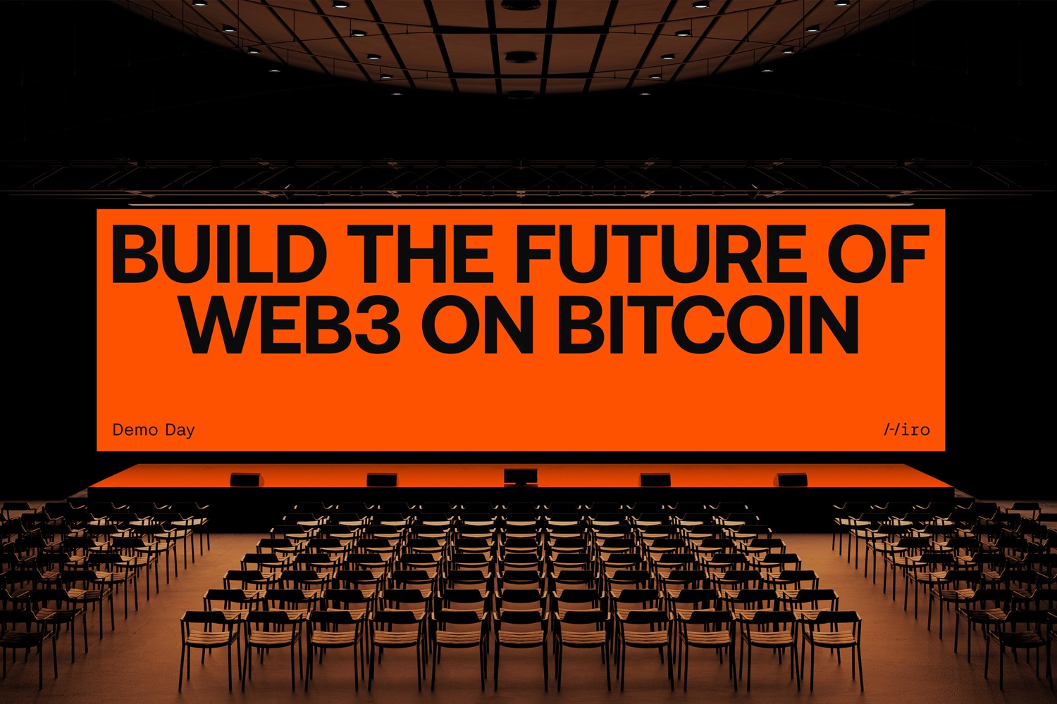
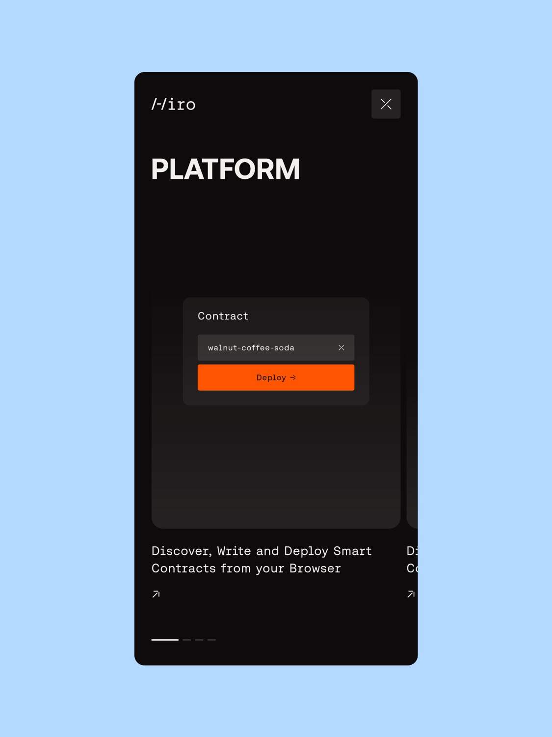
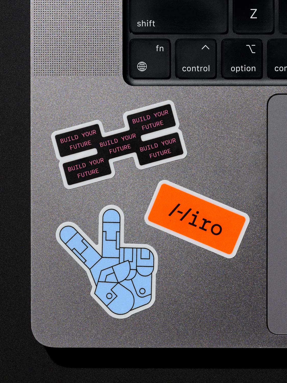
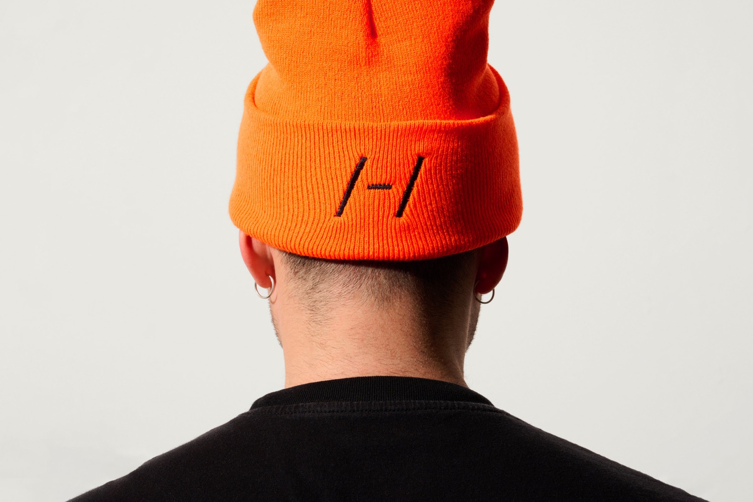
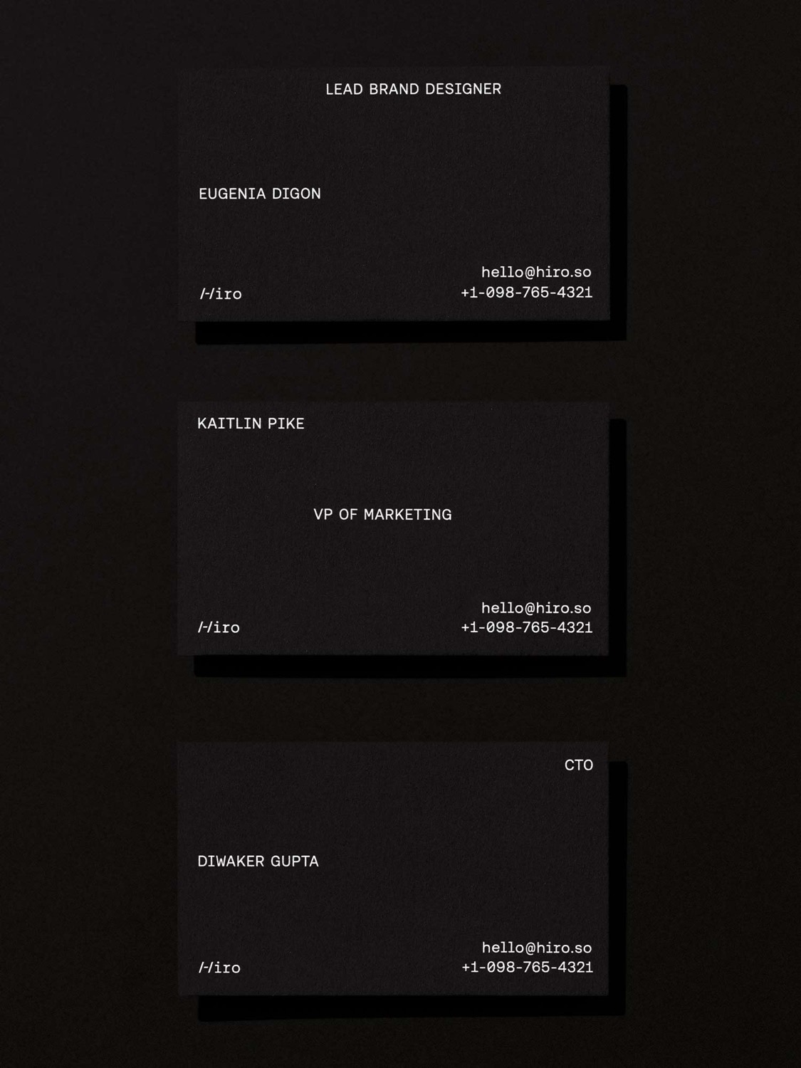
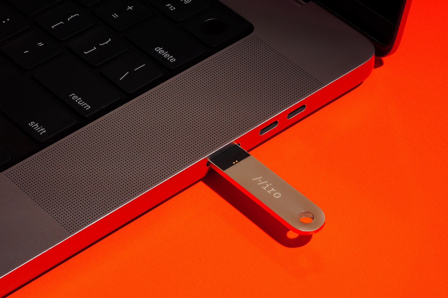
At its core is a logo inspired by the humble command-line: a technical mono wordmark with a unique /-/ that serves as an ownable icon for Hiro. Constructed from two forward-slashes and a dash, this sharp yet simple gesture signifies forward momentum. And because anyone can type it out, the mark is fundamentally open-source /u2014 just like Hiro/u2019s tools.
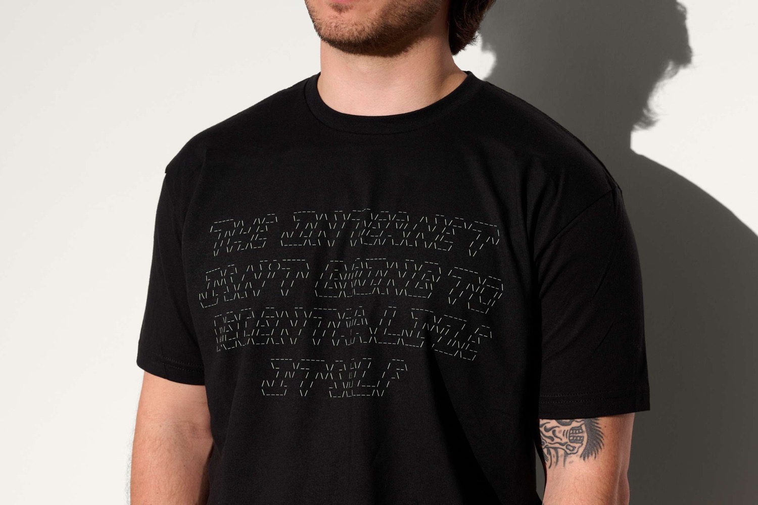
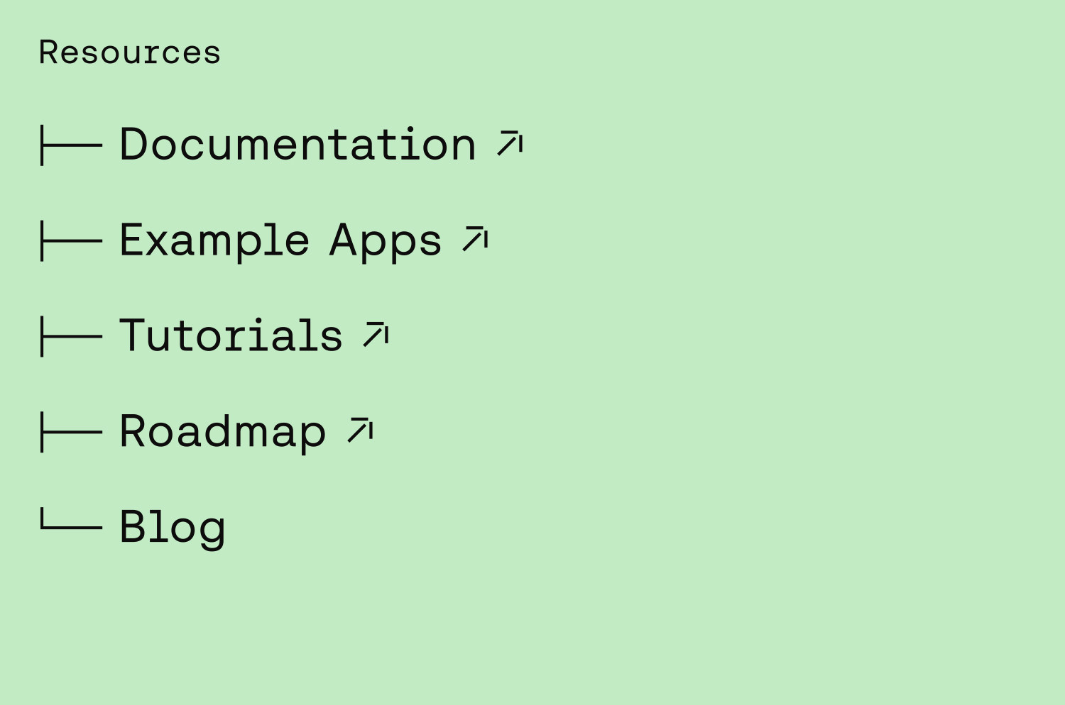
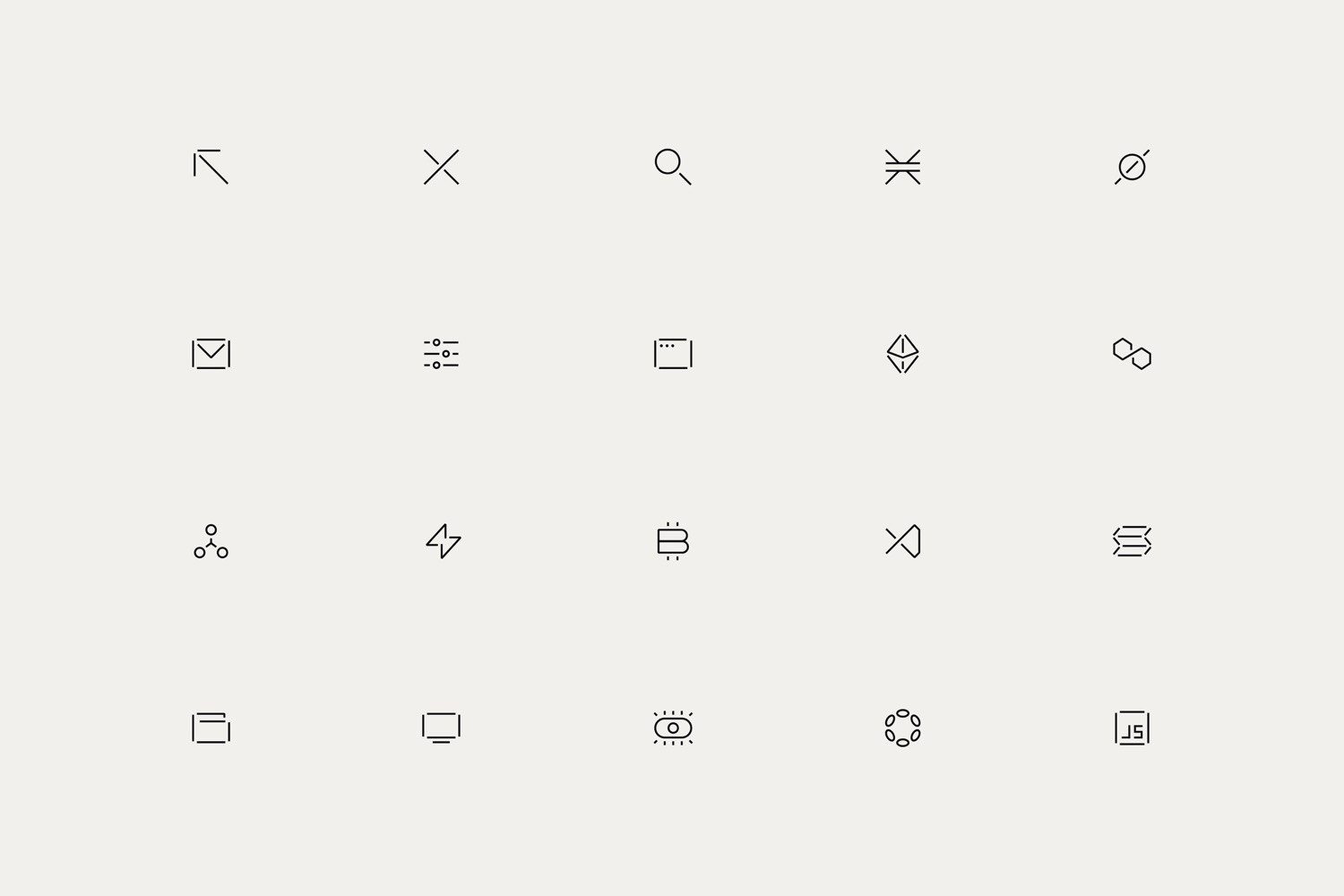
Headlines in Aeonik Bold articulate ambitions with confidence, while Aeonik Fono (its digital-friendly mono cut) works hard across technical touchpoints, from body copy and web components all the way to developer documentation. Hiro/u2019s new graphic language recontextualizes ASCII images to provide flexibility and expand the system in line with the typed-out logo mark.
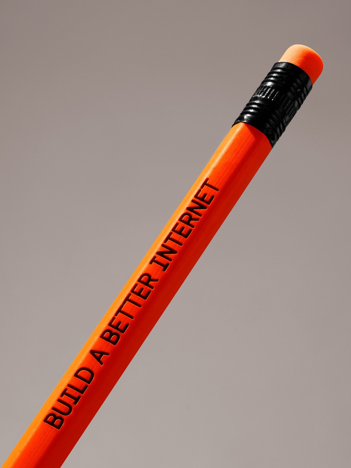
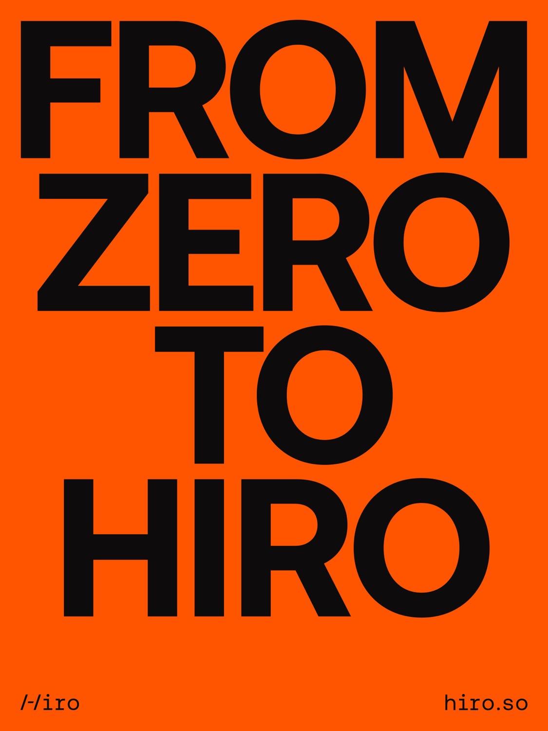
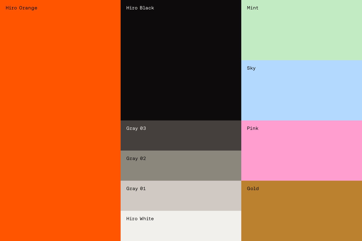
As a gesture to Bitcoin, vibrant orange is at the center of the color strategy, complemented by a secondary palette that references the analog pastels of early computing punched cards. In the crowded space of Web3 startups, the identity establishes Hiro as a new kind of protagonist: sharp, courageous, and a bit unexpected.
Since the identity/u2019s launch last year, Hiro has only gained more momentum: over 2,000 Web3 developers have signed up for the Platform waitlist and they/u2019ve seen record-highs for new database subscribers, surpassed each quarter.
Creator: Porto Rocha


.webp)


