Mamba Studio
August 05, 2022
Mindsparkle Mag


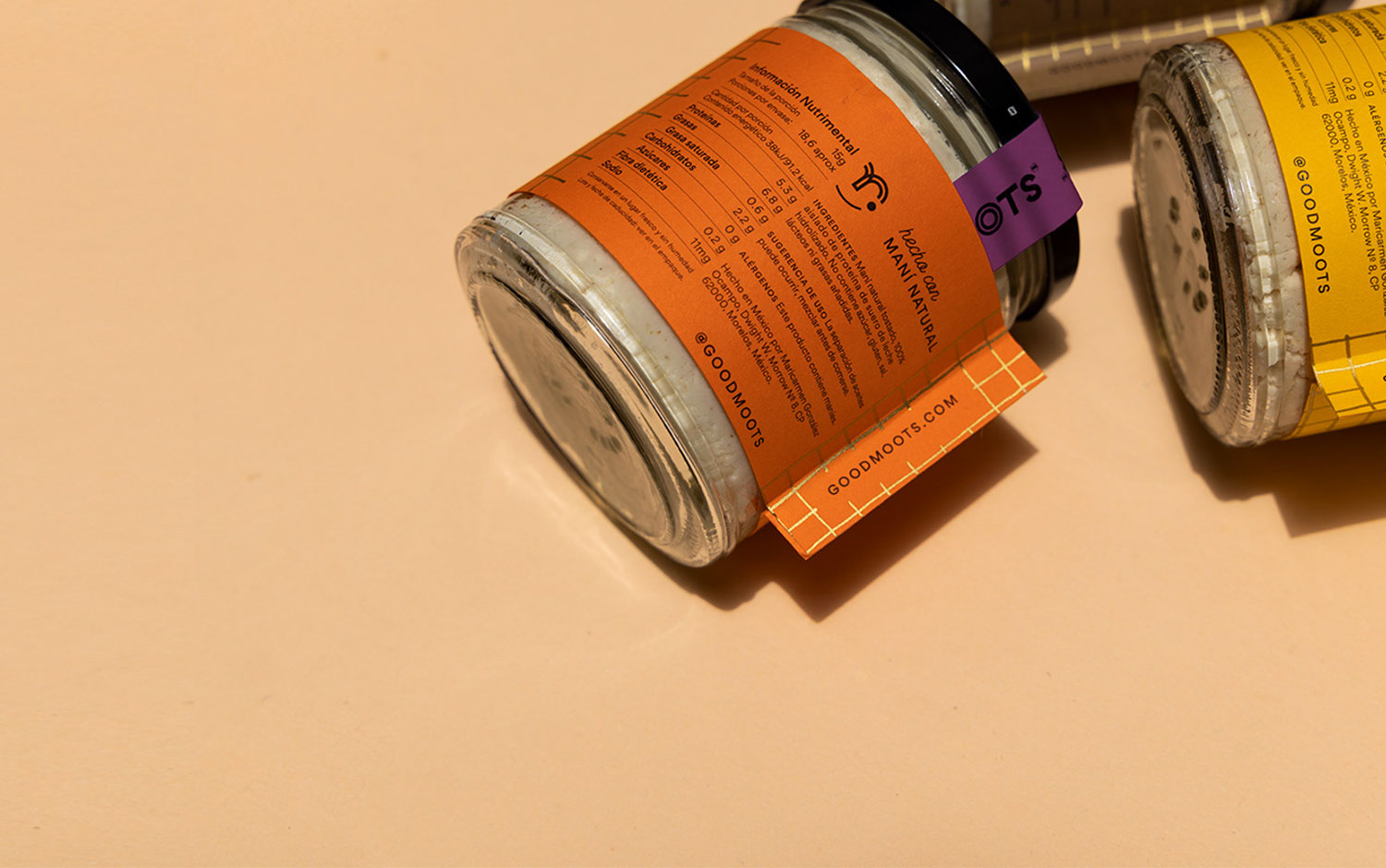
The conceptualization of the brand name was part of the project. With this, we sought to present a proudly Mexican identity through a relaxed and fun tone. The name is a combination of words: good, from the English that we all know, and moots from the Mayan meaning root or origin. In one sentence it would be read as “good roots or good origins”. Mamba Studio® refers to the roots where peanuts grow, and the pre-Hispanic origin of peanuts as a superfood, and how we bring those concepts to a contemporary market.
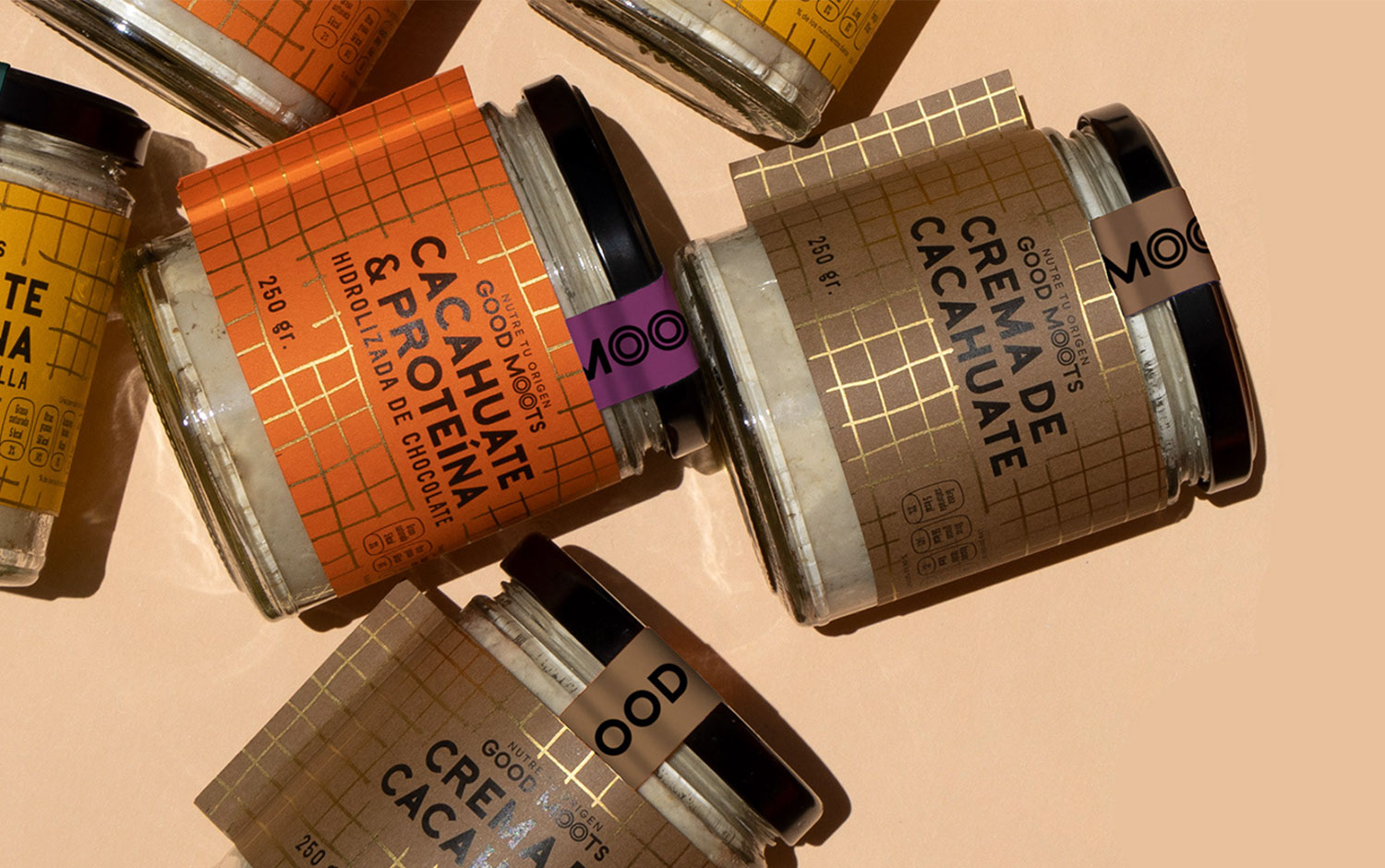
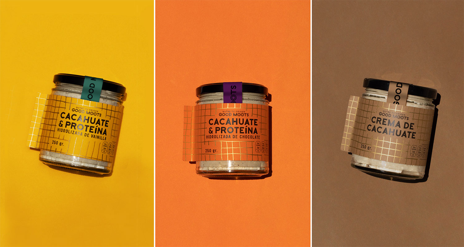
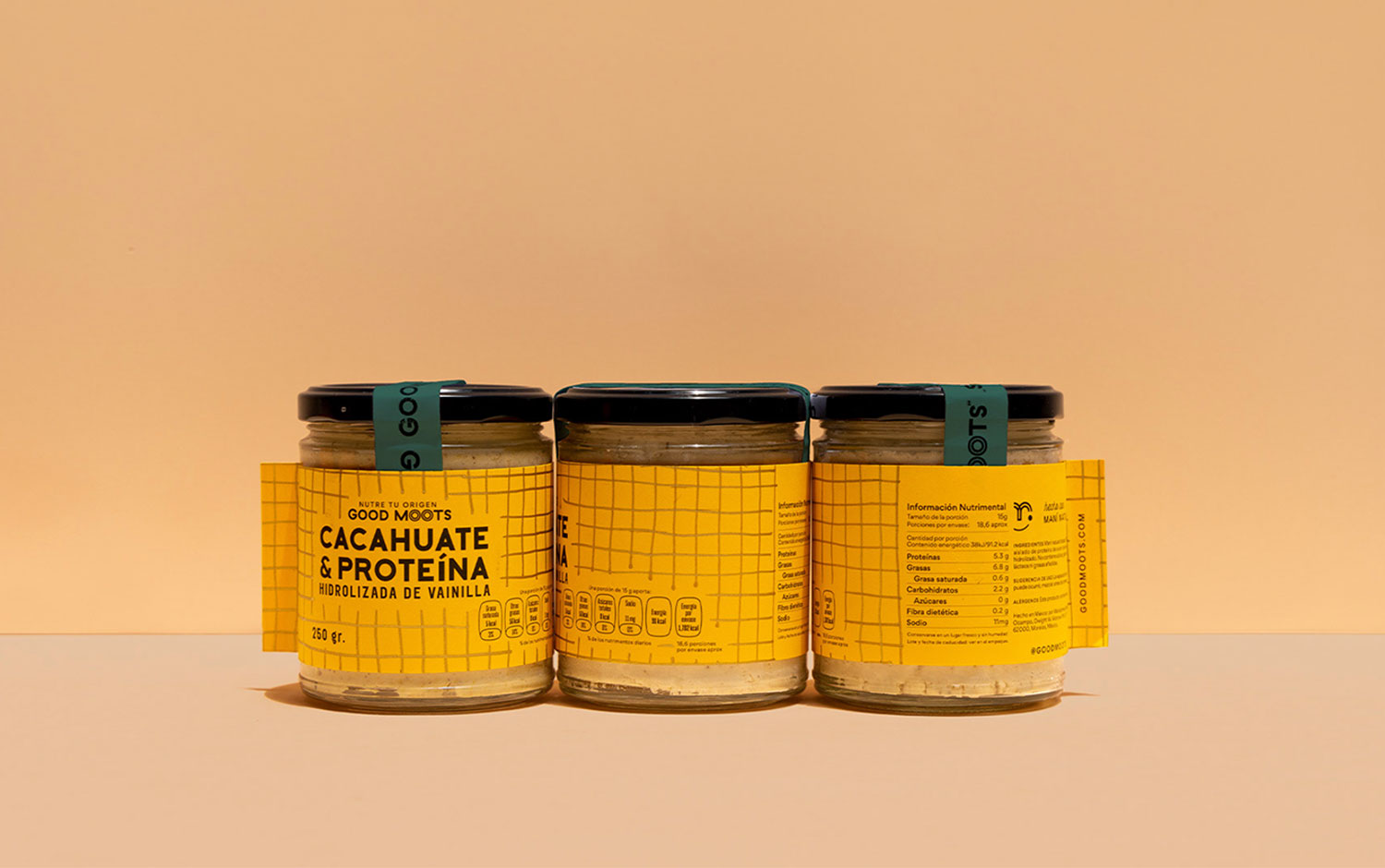
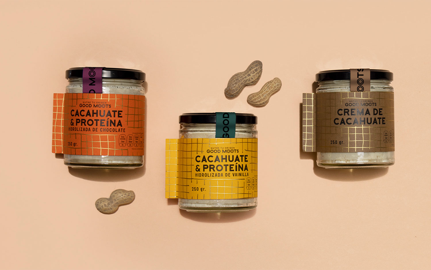
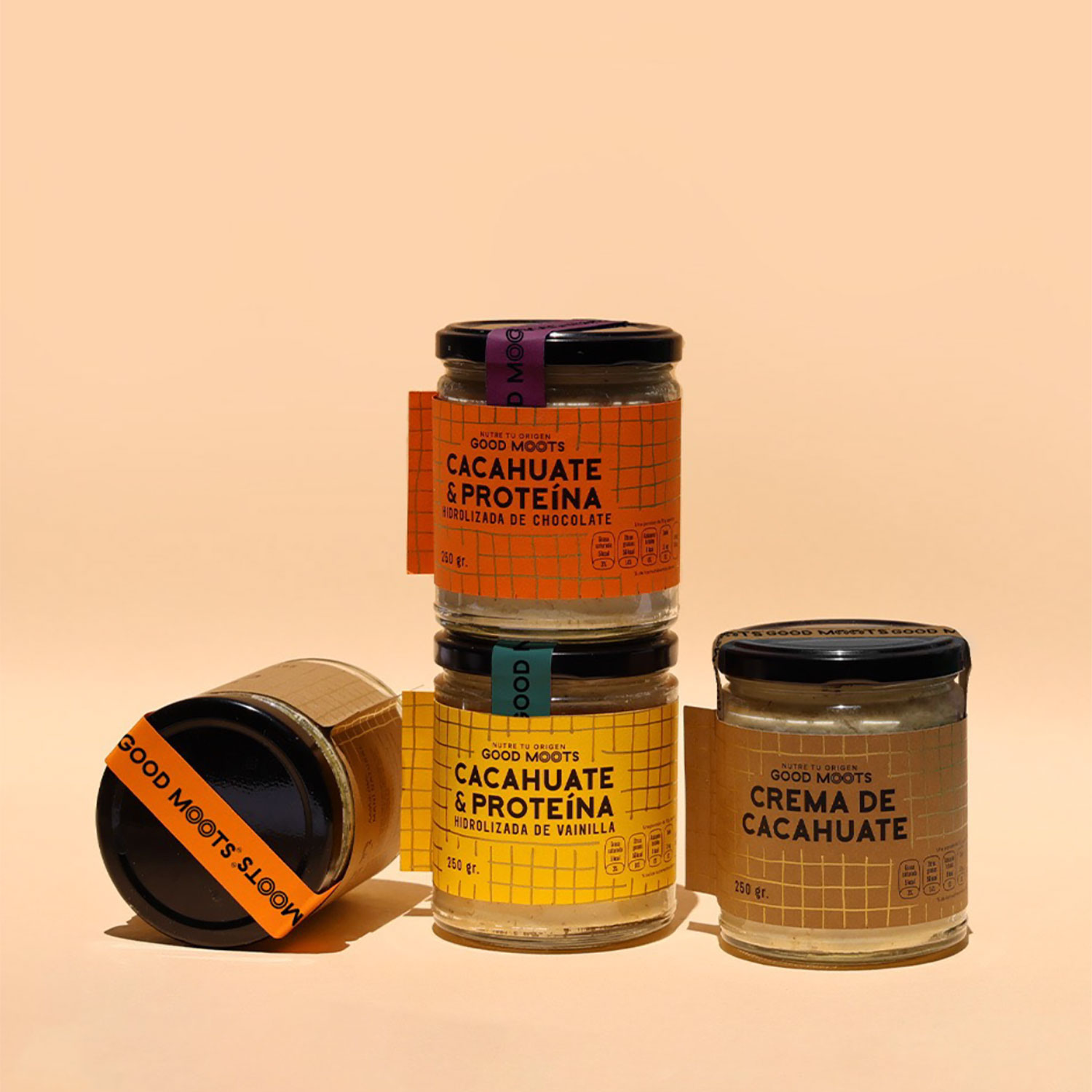
Good Moots' graphic identity is based on bright colors full of energy combined with a gold-tone pattern inspired by the same shell that protects peanuts. Its design concept was to transfer the idea of this same natural wrapper from the shell to the packaging, creating a label that wraps the product with a playful touch and an unperfect feel. The label is paper-made with very little glue, so when you peel it off, you can reuse the container with any other product without a difficult-to-remove glue paste. Plus, the typography is simple and discreet, while the auxiliary graphics have gestures that remind us of Mayan inscriptions.
Good Moots has resulted in a design system ready to grow in flavors, formats, and sizes. The creative team can’t wait to see what’s next for future stages.
Creator: Mamba Studio