


MamboMambo
November 18, 2021
Mindsparkle Mag


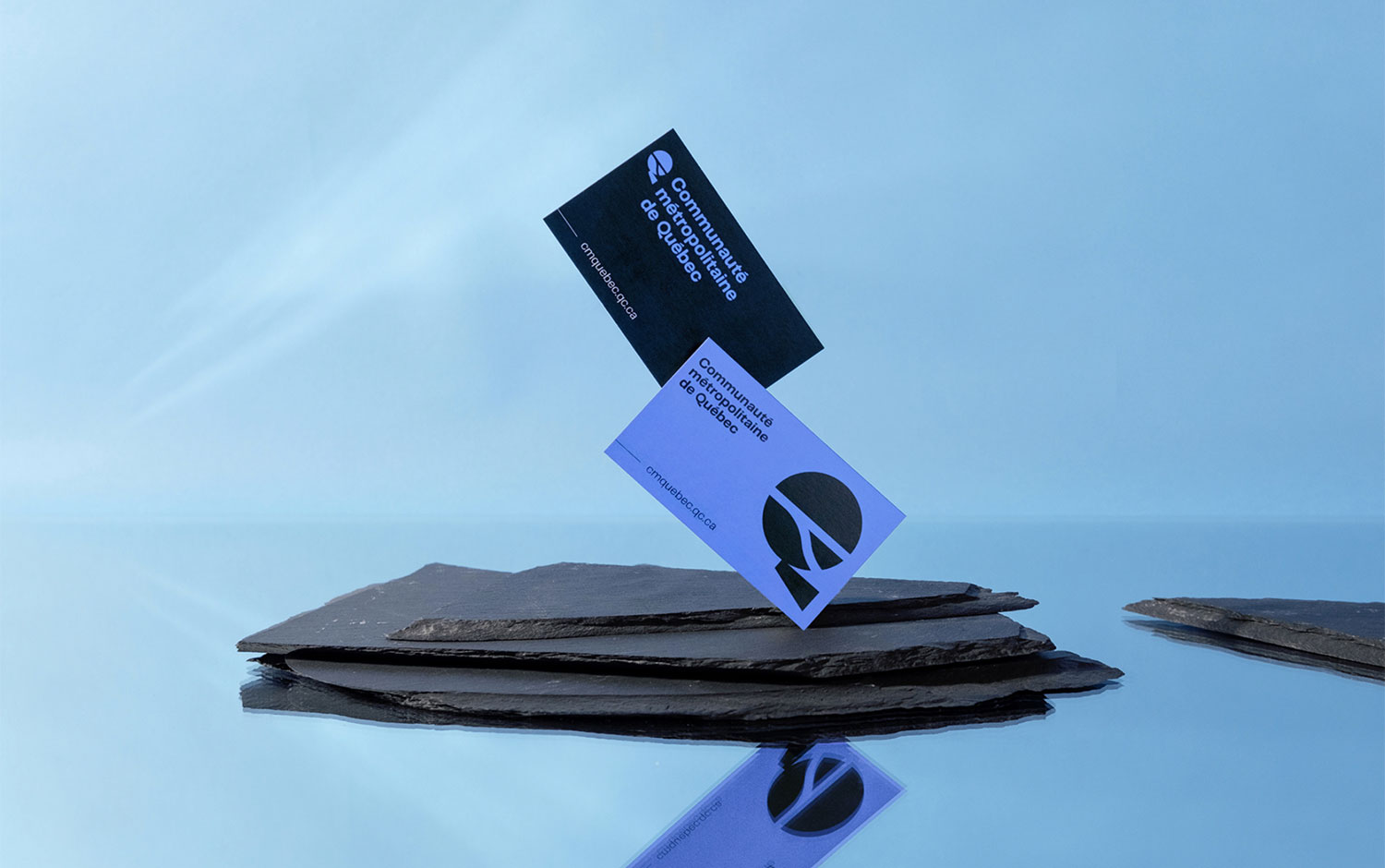
When thinking of Canada, ice hockey and maple are the first things that come to our minds. However, today's branding has nothing to do with sports or breakfast. Specifically, we're traveling to the city of Qu/u00e9bec. With almost 20 years in business, the Communaut/u00e9 m/u00e9tropolitaine de Qu/u00e9bec thought of updating its image. So, they asked/u00a0MamboMambo/u00a0team to refresh it./u00a0
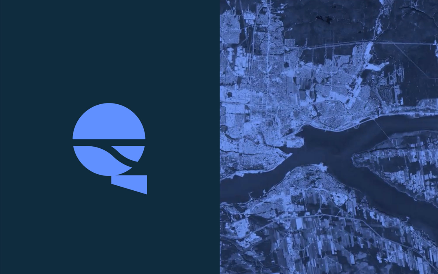
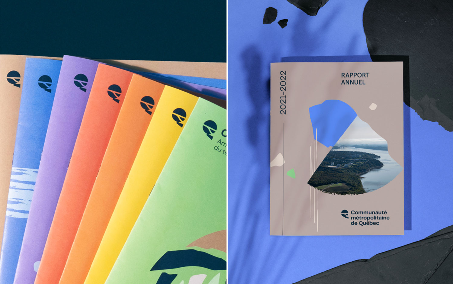
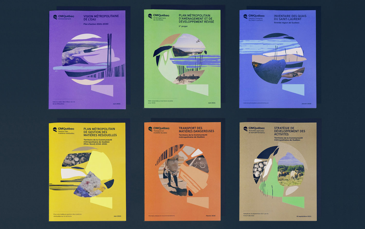
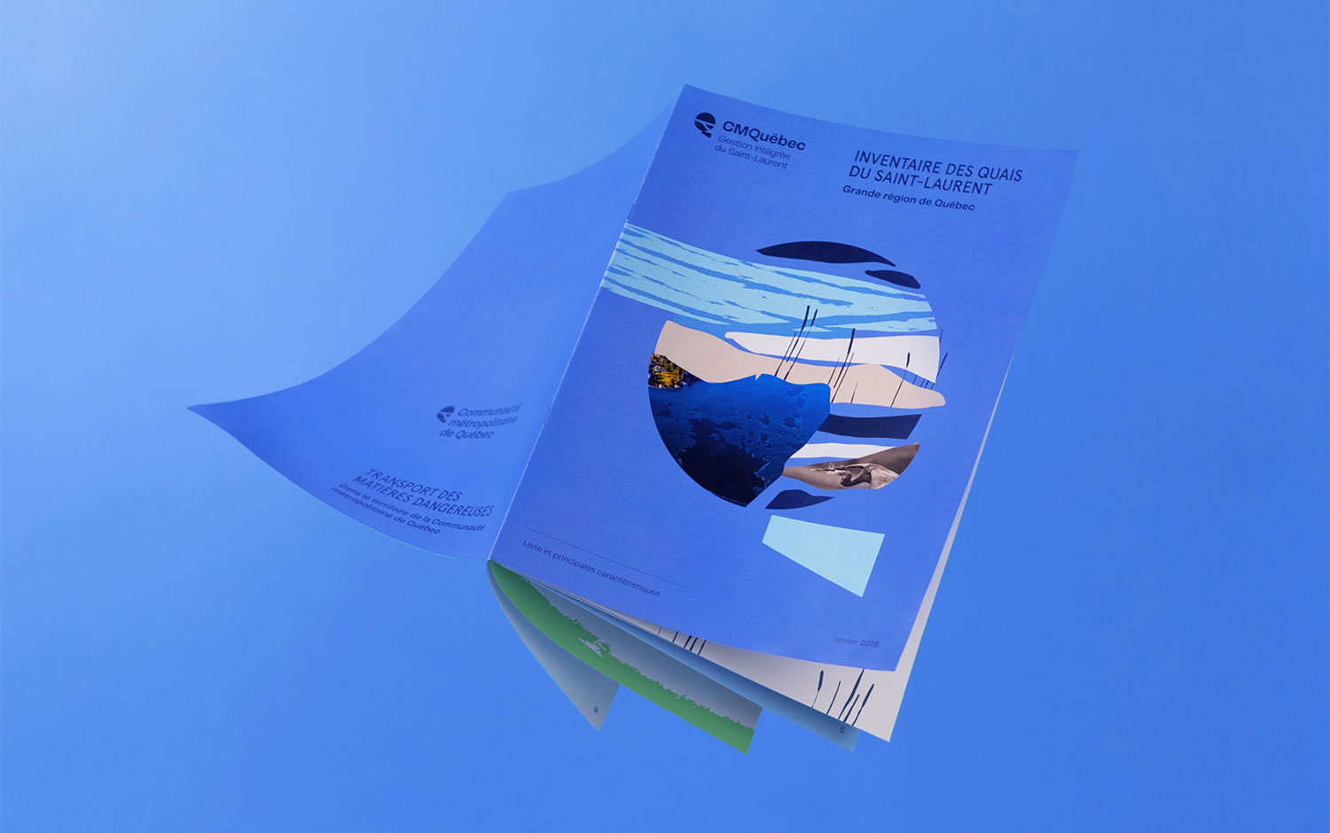
The new brand image carries the CMQu/u00e9bec towards a renewed promise of innovation, expertise, empathy, and transparency. The Promise to Build. Together. It has always appeared current and indispensable in their process. The overhaul echoes both its territory and its vibrant and inclusive community. The color palette reflects all this, as it features all the rainbow colors in bright tones. MamboMambo creatives included many traditional textures and colors from Quebec's landscapes. All combined as a collage intervened with some brush-stroked illustrations. Plus, they came up with exquisite poster designs that perfectly complement CMQu/u00e9bec's rebranding./u00a0
All in all, we're super excited about the incorporation of geographical features for CMQu/u00e9bec's logo design. It gives a unique imprint with a high level of recognition. What do you think of this chill and cool rebrand project?/u00a0
Additional credits Art Direction : Zorani Sanabria Design: Guillaume Beaulieu, Nancy Boivin and Tommy Hachez
Creator: MamboMambo


.webp)


