


Daniel Britton
February 23, 2022
Mindsparkle Mag


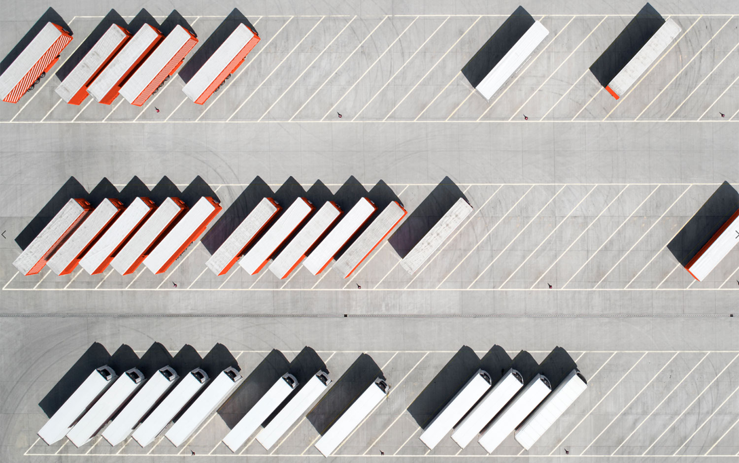
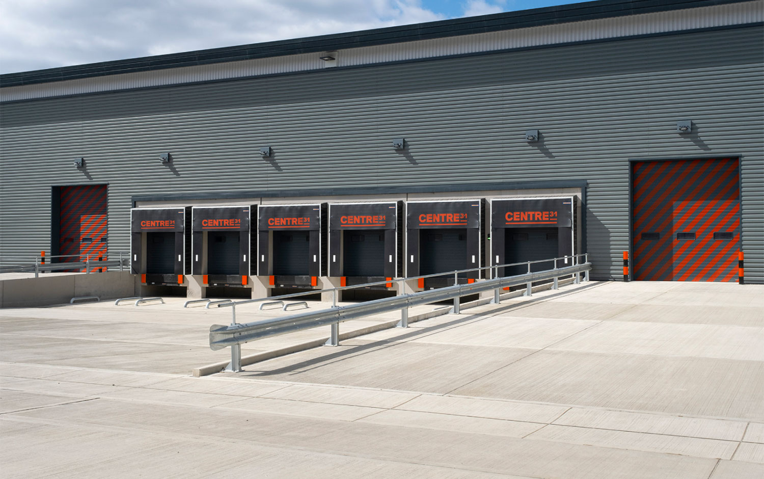
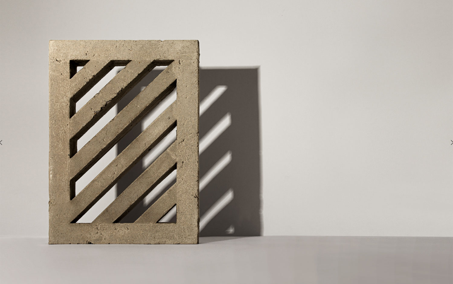
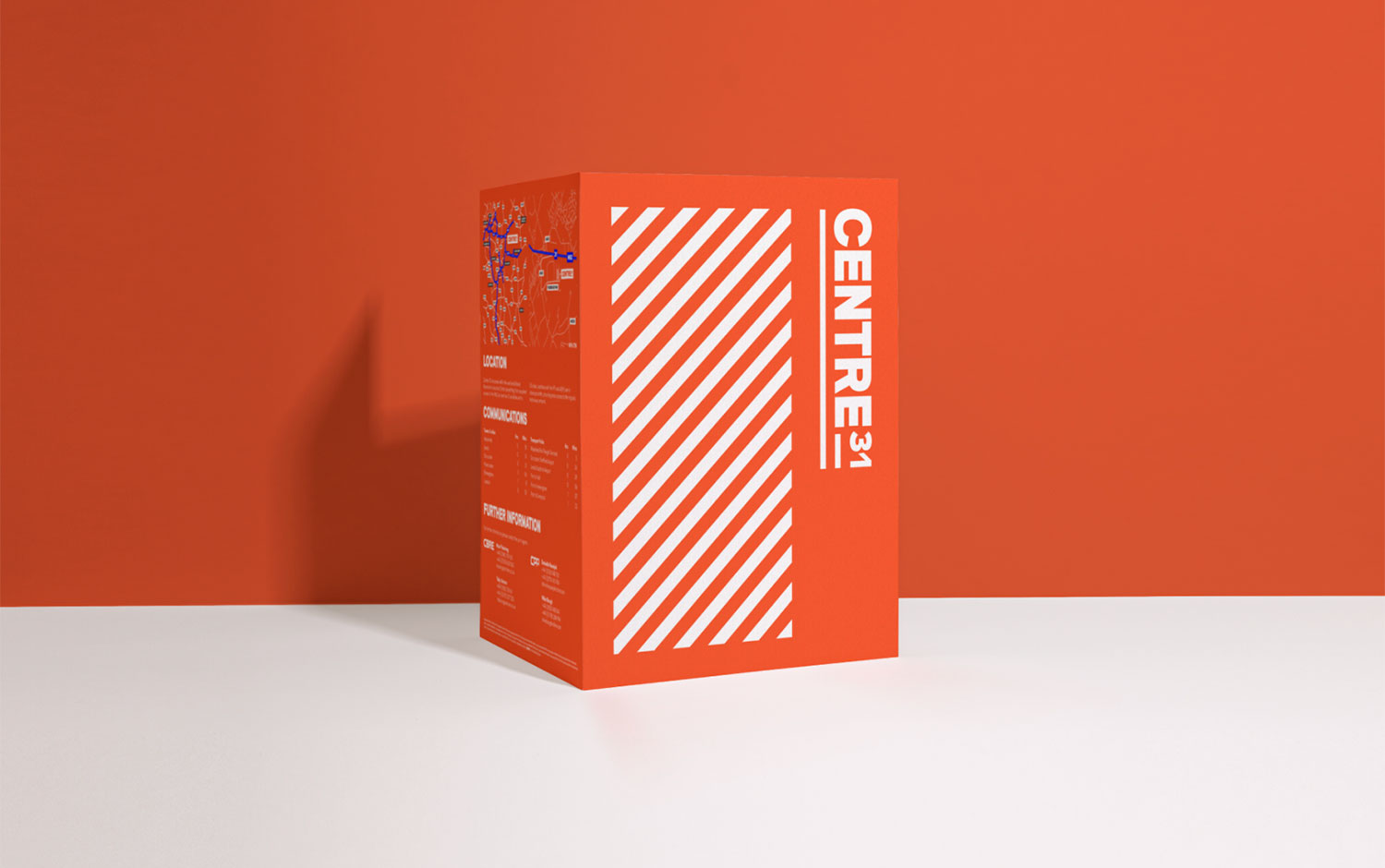
So, industrial aesthetics is not for everyone, and today, we're going 110% into this style. Meet Centre 31's, an industrial warehouse in the north of England. Its branding comes from/u00a0Daniel Britton's creative mind. We find it relevant quoting Miley's song and "shuffling into the diagonals" as this visual identity is all about them./u00a0
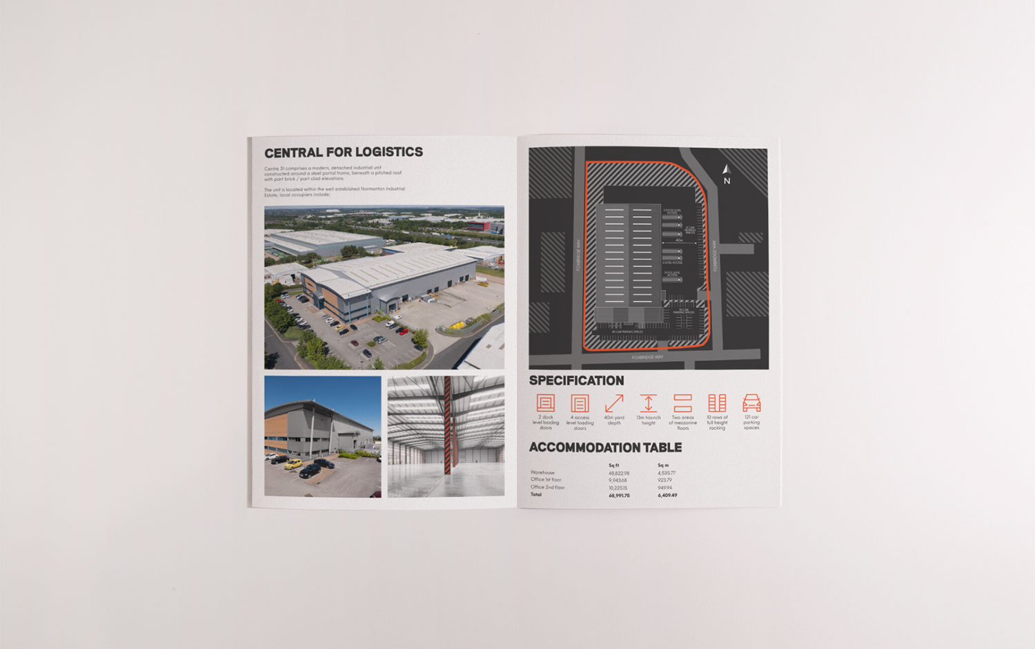
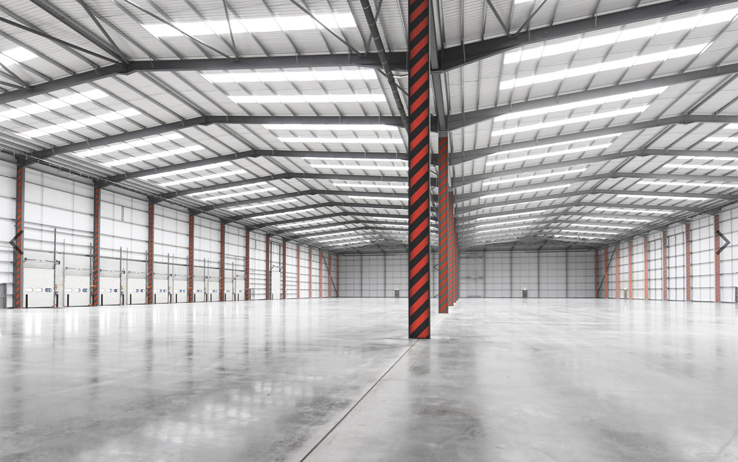
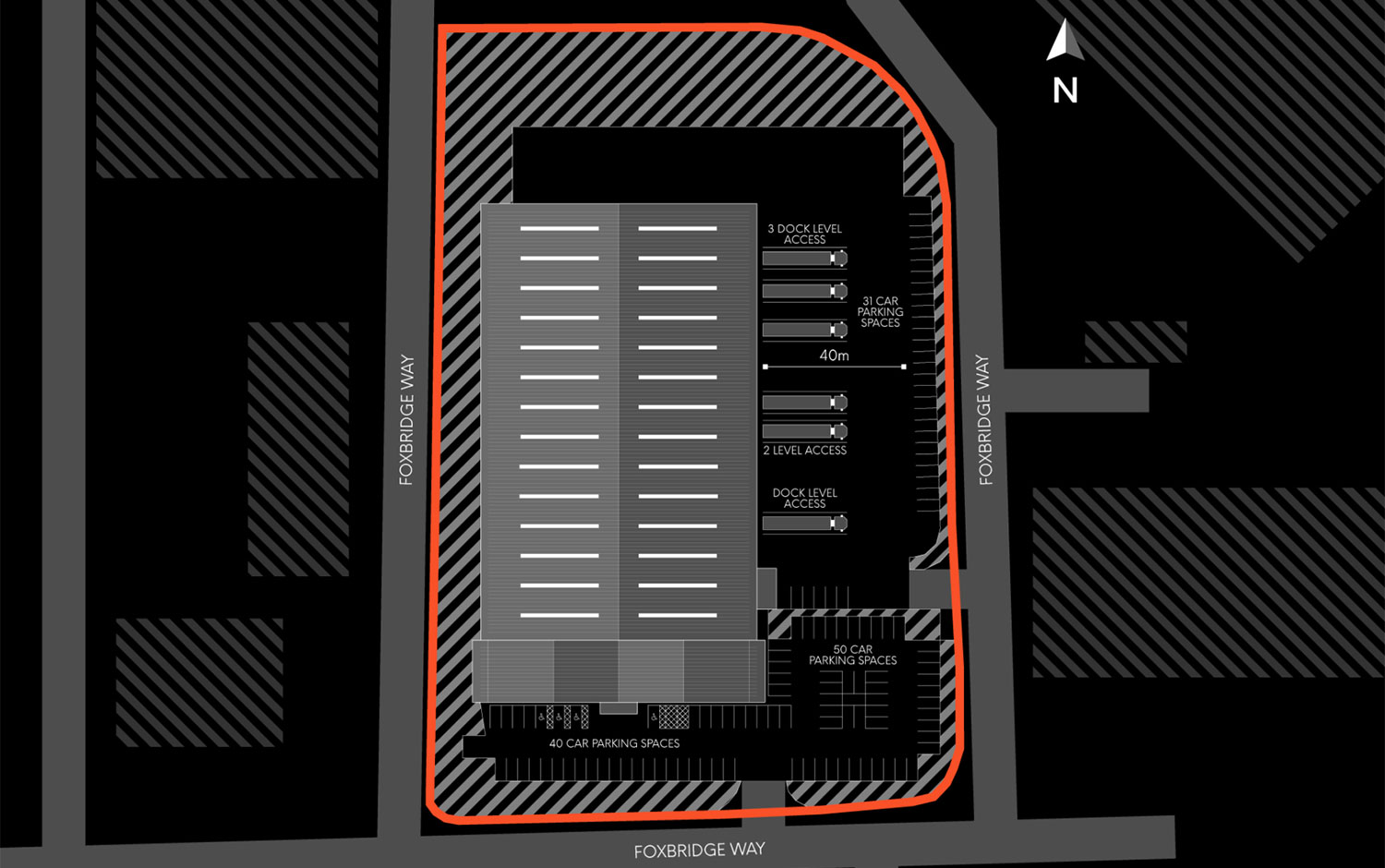
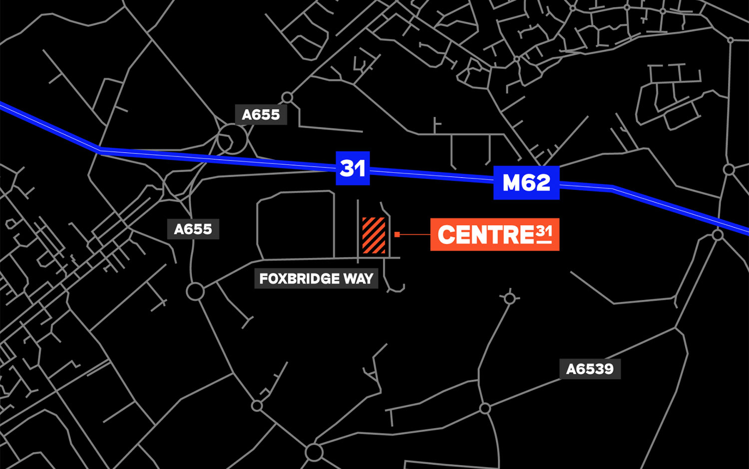
We're excited about this project as it doesn't feature the usual branding elements. Daniel showcases Centre 31's identity in subtle ways all over the warehouse. Featuring a strident red color is how the diagonals come alive! It's super cool to witness how branding is applied on a giant scale :) Centre 31 is an industrial warehouse in the north of England, specifically on junction 31 of the M26 in a prime distribution location. The brand is bold and cheerful while donning a classic industrial look and feel. The brand takes ownership of the classic, industrial 45-degree warning lines and sees this become the foundation of the brand's visual system.
Additional credits Agency: Cormack Designer: Daniel Britton Client: Kennedy Wilson
Creator: Daniel Britton


.webp)


