Plus
Plus

 Menu
Menu


Thought & Found .
August 04, 2026
Mindsparkle Mag


Thought & Found built the brand identity for Imogen Oke, an Australia-based interior stylist and art curator working across furniture, art, and object curation. At the centre of the system is a bold monogram that locks her initials into a single ring-like mark — part camera lens, part loop — built to hold its own whether it's stamped on a business card or scaled up across a presentation box.
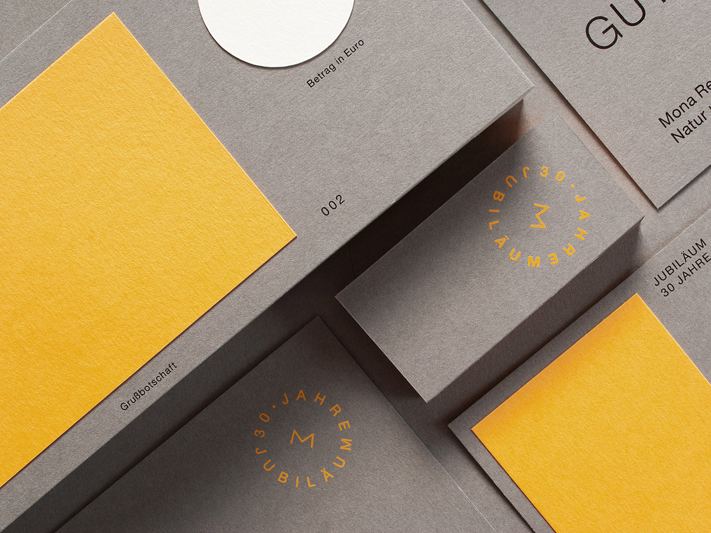
The studio carried the visual identity across a saturated, unexpected palette — burgundy, orange, olive, powder blue, and mustard — so the same mark reads differently depending on where it lands. Swing tags, stacked business cards, and a presentation box lined with fabric and material swatches carry the system into the physical objects Oke sources and styles, tying the identity directly to the tactile, material-first nature of her work.


Credits: Thought & Found .
Brand Identity Studio: Thought & Found .
More in Brand Identity
Stay on top of this week's design. Insights, top picks & more.