


Anaïs Bonder
July 15, 2021
Mindsparkle Mag


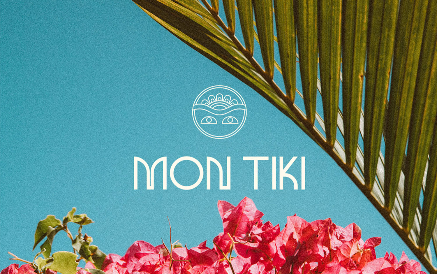
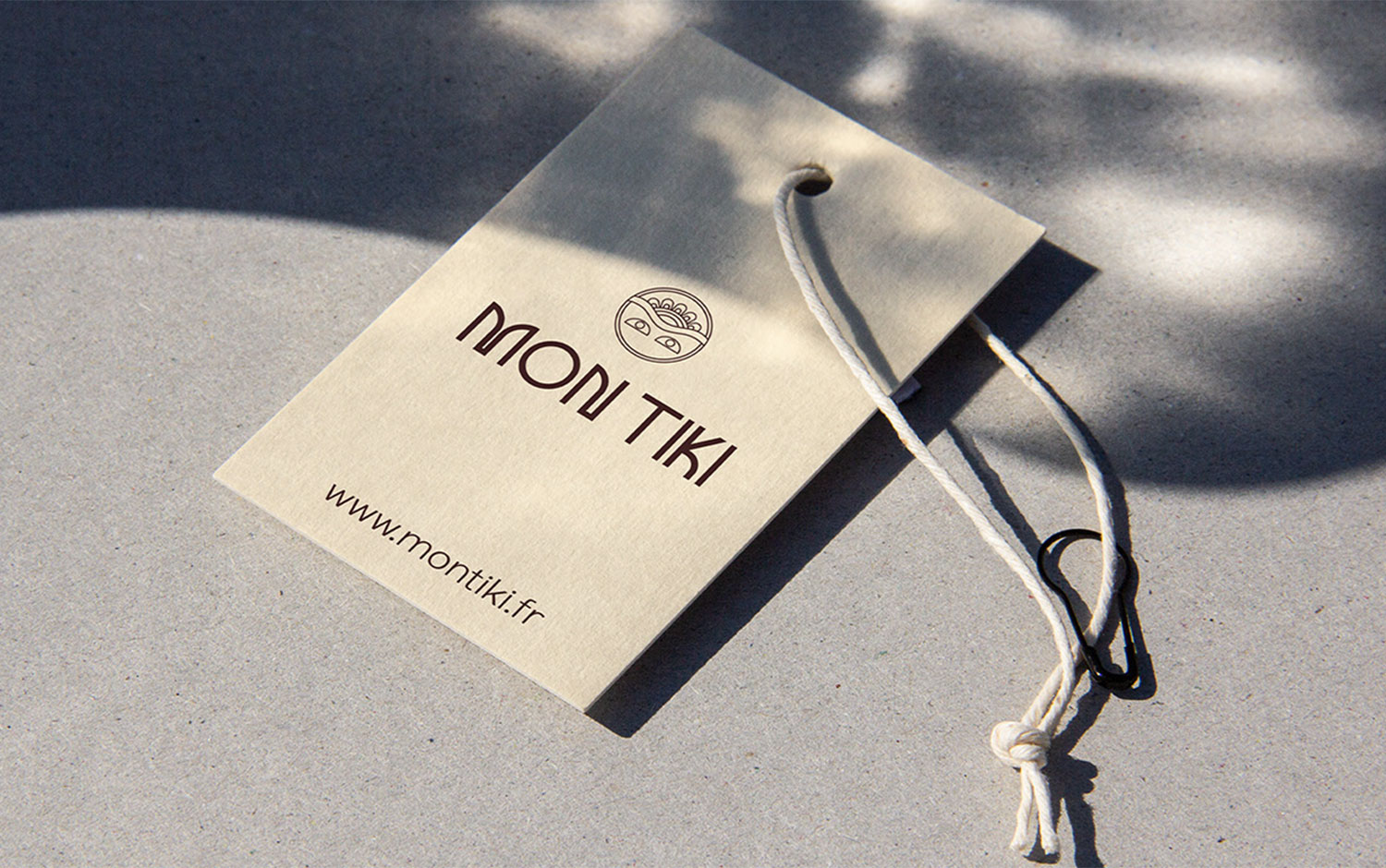
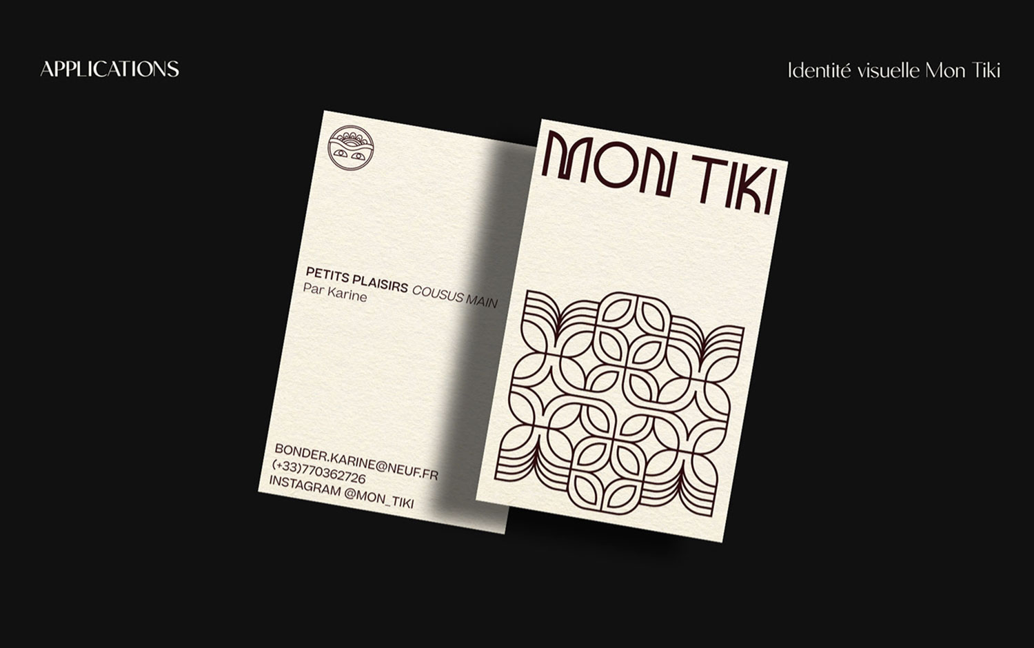
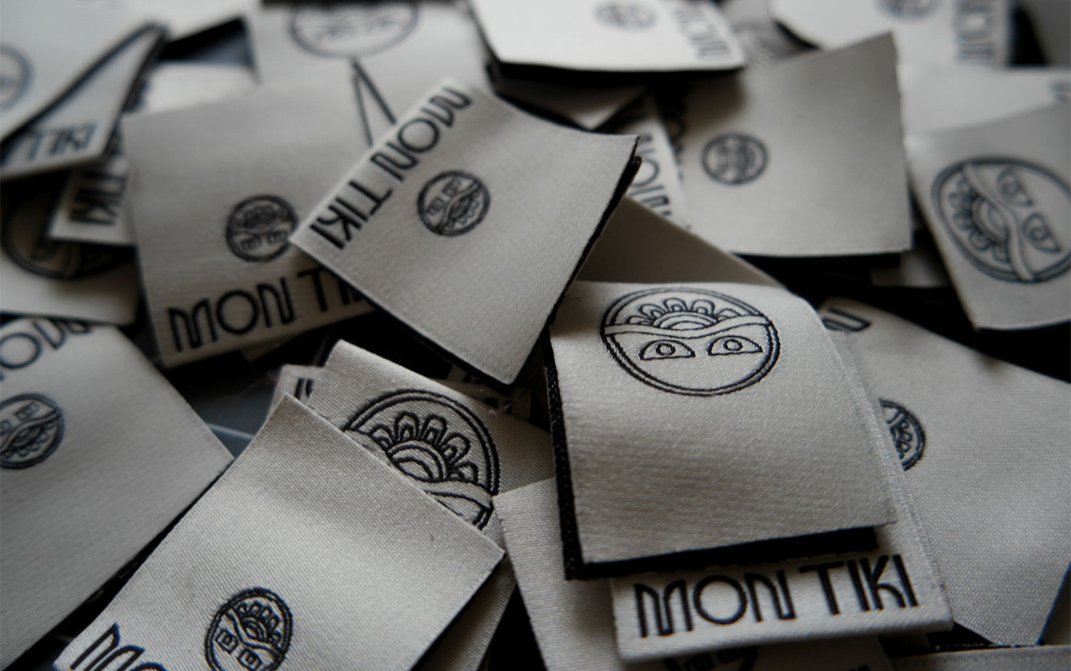
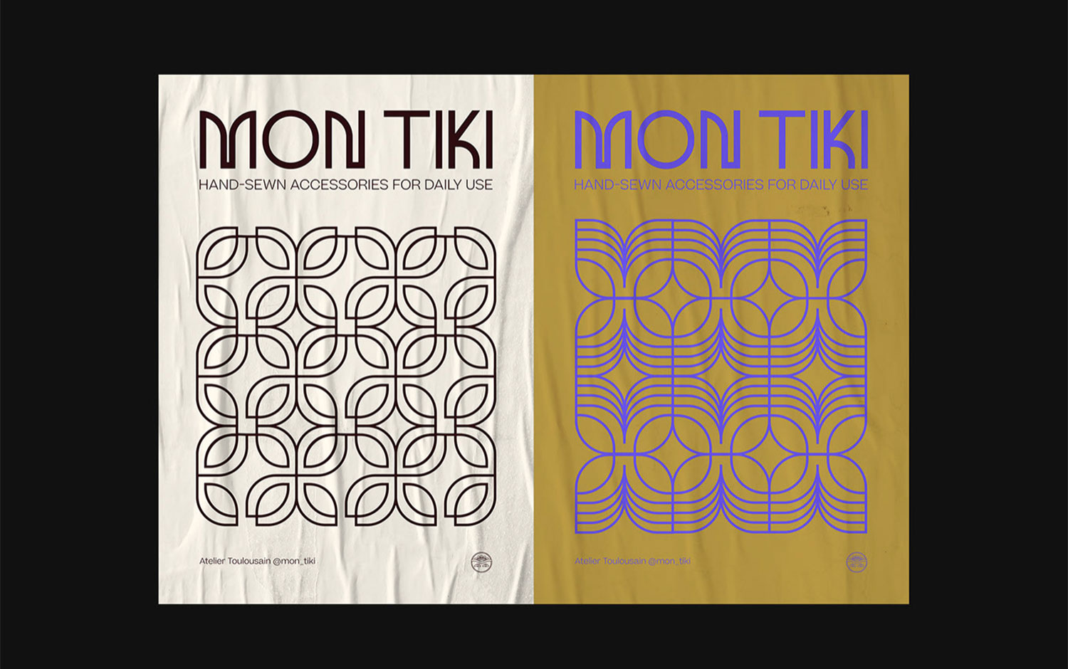
Today we are transporting you back to a Polynesian Tiki myth. The story from these paradisiac islands inspired Anaïs Bonder to create MON TIKI's new visual identity. It is an artisanal brand from the southwest of France and offers hand-sewn accessories for daily use. Originally the Tiki is a sculpture with spiritual and protective energy from the Marquesas Islands, and it means human birth, which brings prosperity and knowledge.
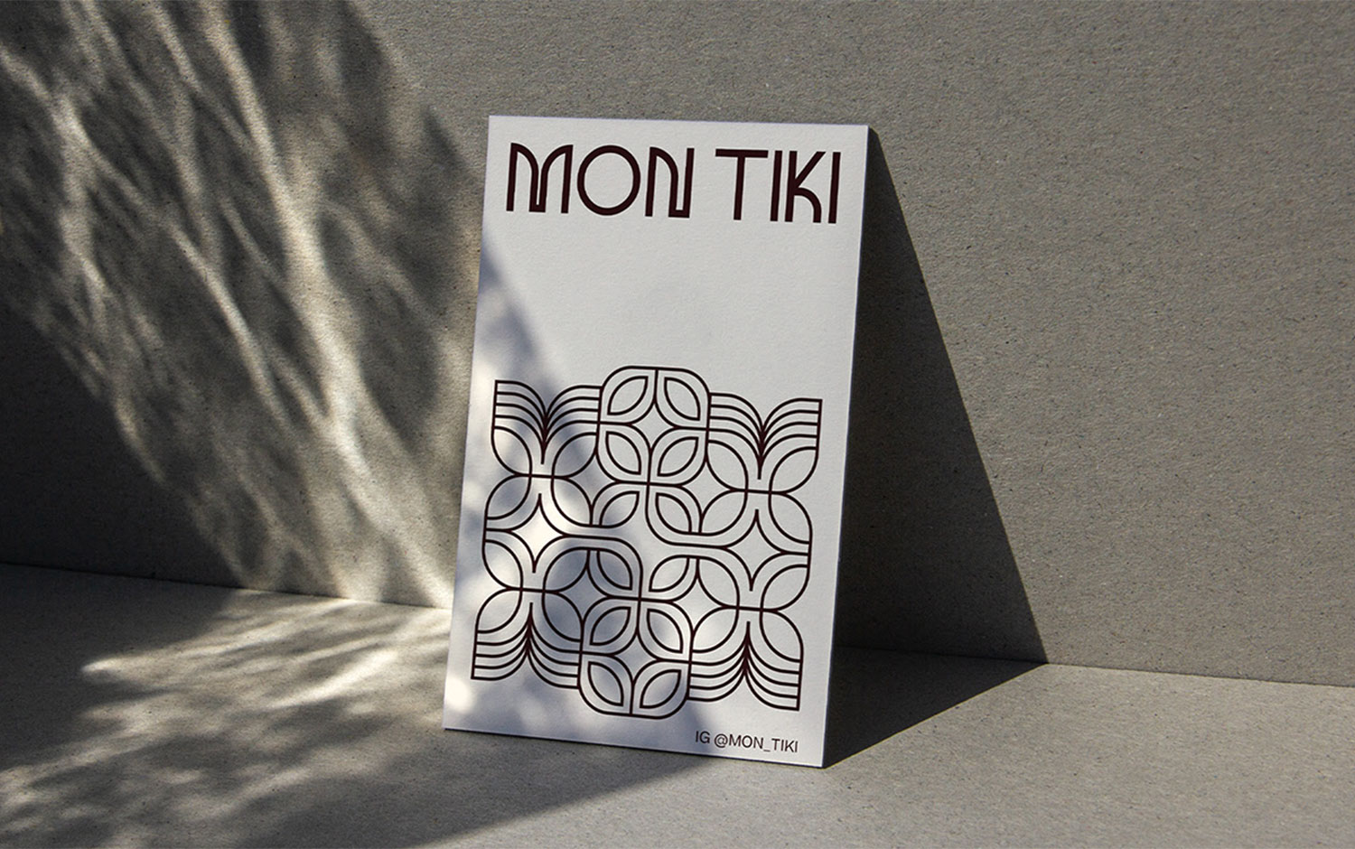
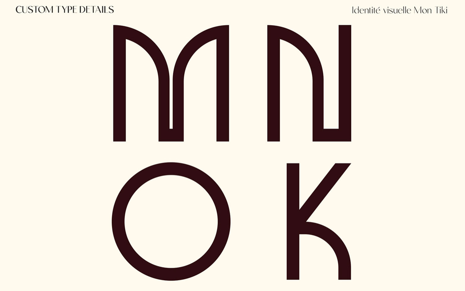
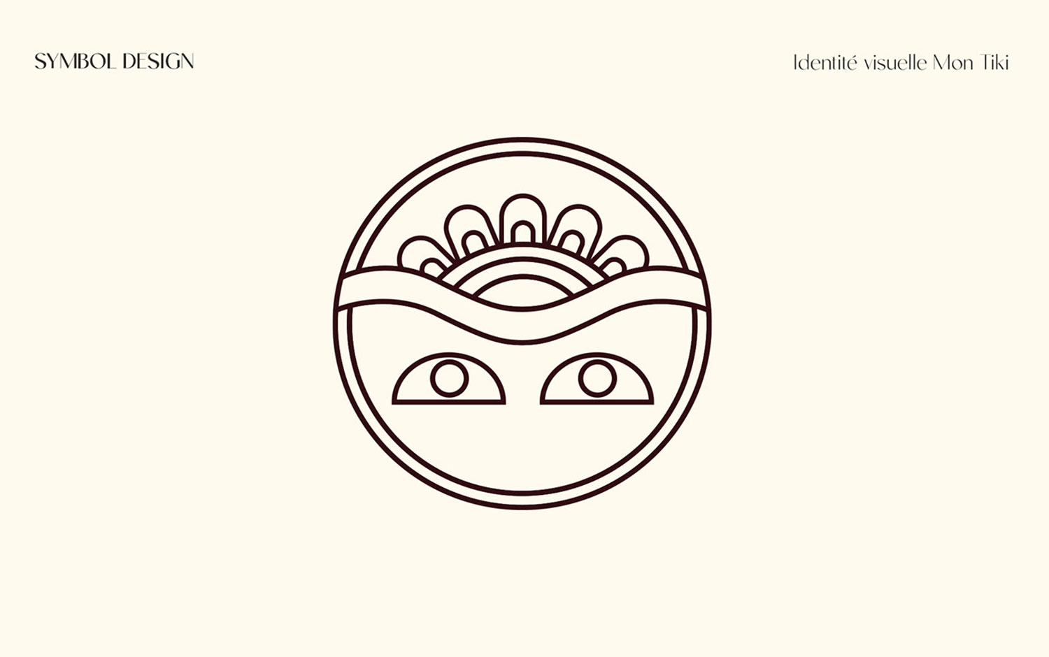
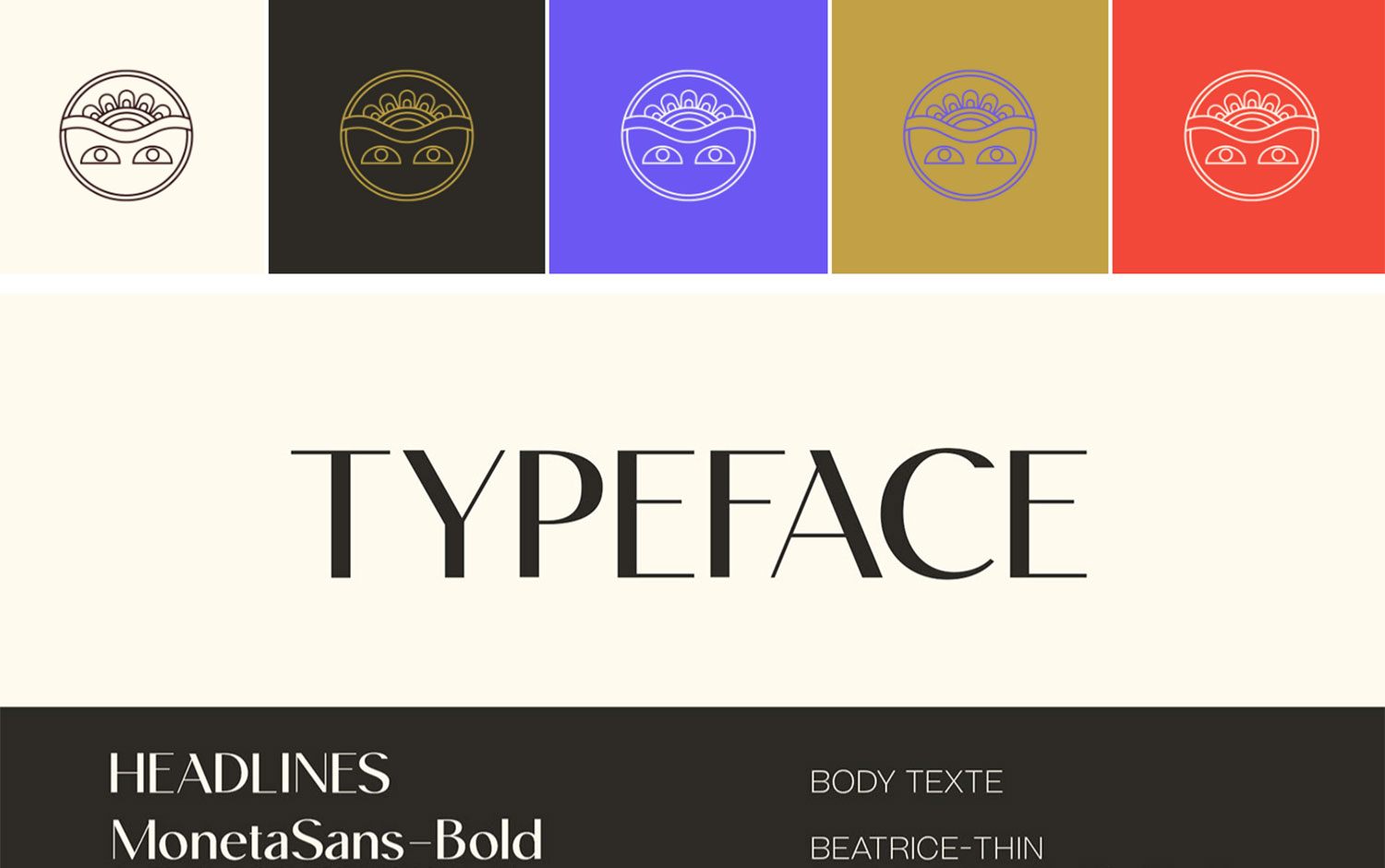
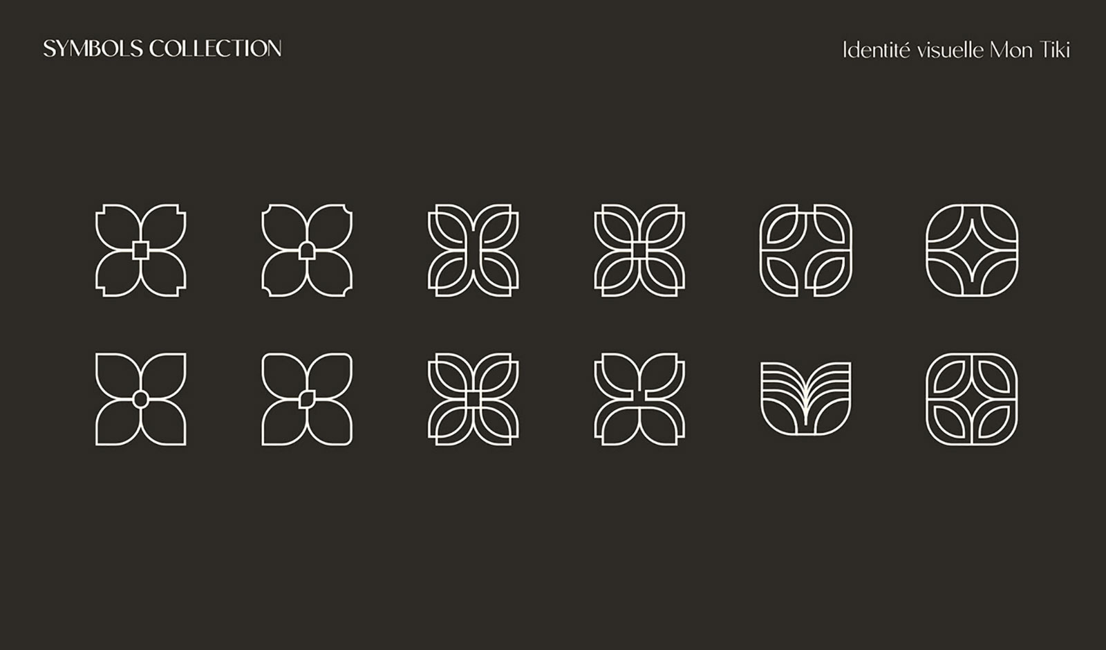
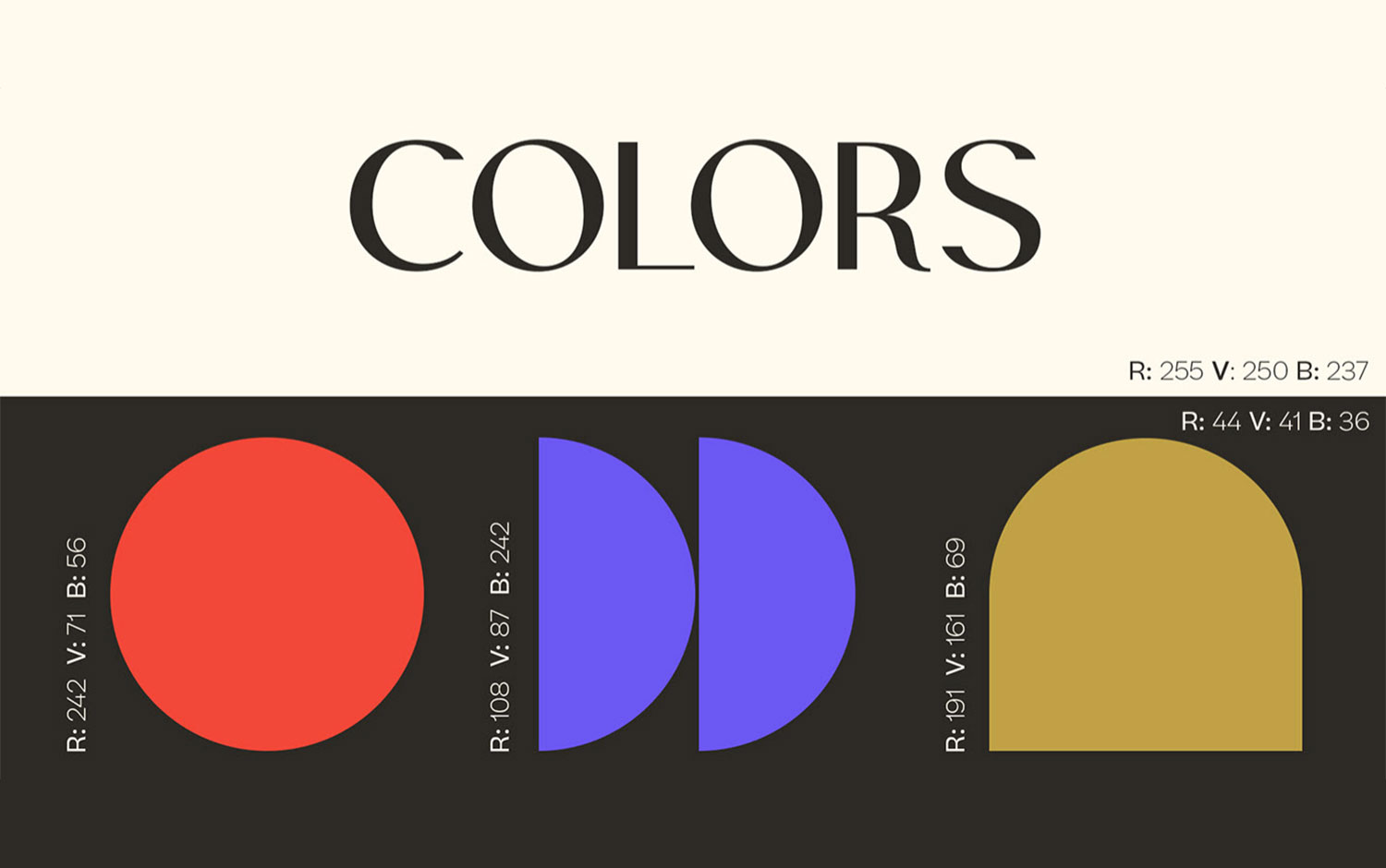
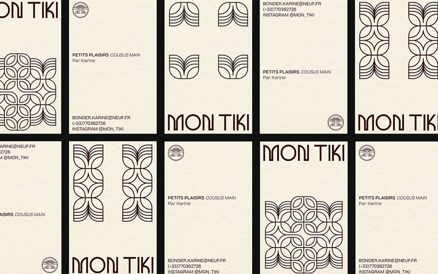
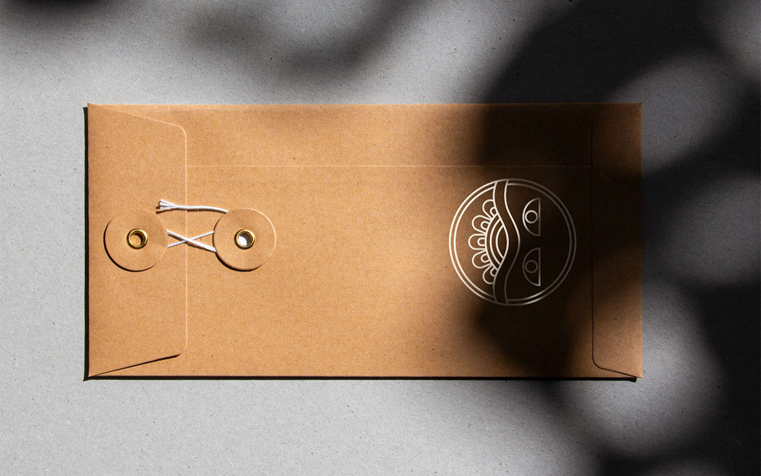
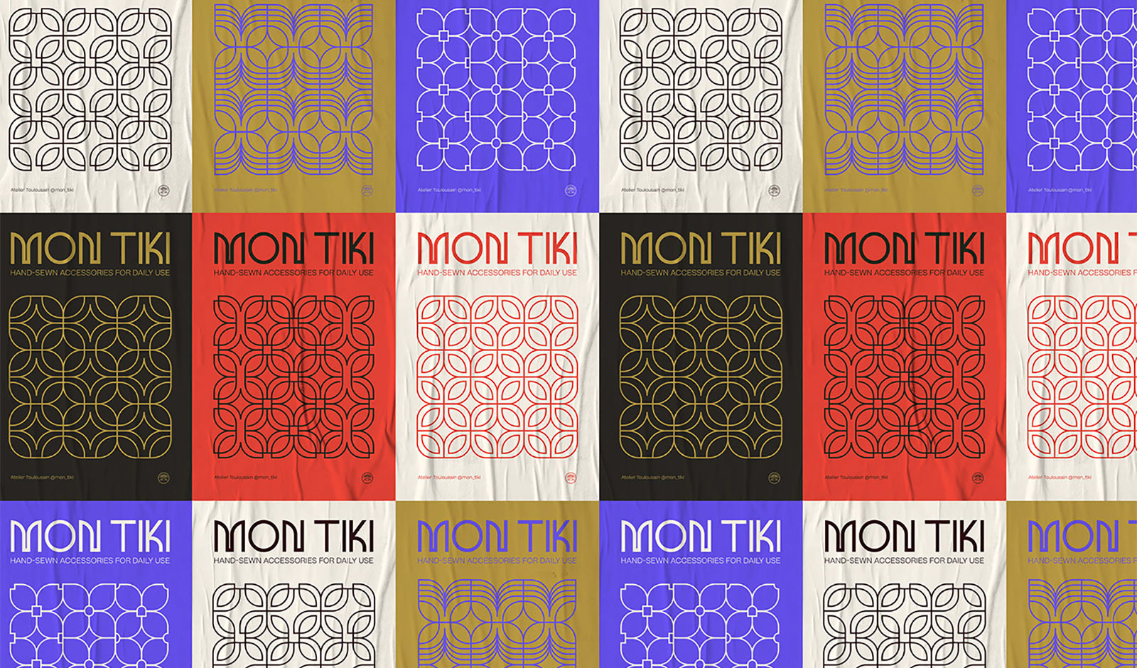
Beyond the culture, there's a background family connection by the brand's owner, who finds sewing like a resource to find oneself with joy and sharing at the heart of the creations likewise, craftsmen when they carved Tiki's on stone with the same passion for timelessly engraving them. The brand products aim to be functional to our everyday life, to become a precious accessory, an essential, your Tiki. Thus, the visual brand identity responds to a need to express creativity and the outcome of a personal achievement attached to a powerful symbol. Anaïs designed the logo based on the Tiki totem, a circle as a timeless symbol, and a pair of eyes to humanize the work done. Also, she created a custom typeface for the brand's name based on a 36-pixel grid. The result? Bold typography with an ancient mythologic imprint. Lastly, the designer came up with varied patterns based on the shapes featured in the logo and some other icons she developed. Business cards have these patterns randomly applied. All in all, it is a convincing visual identity with a clear mythological message and a beautiful color palette that perfectly fits this project.

Credits: Anaïs Bonder


